A warm, welcoming brand that fosters meaningful connection, knowledge exchange, and collaboration.
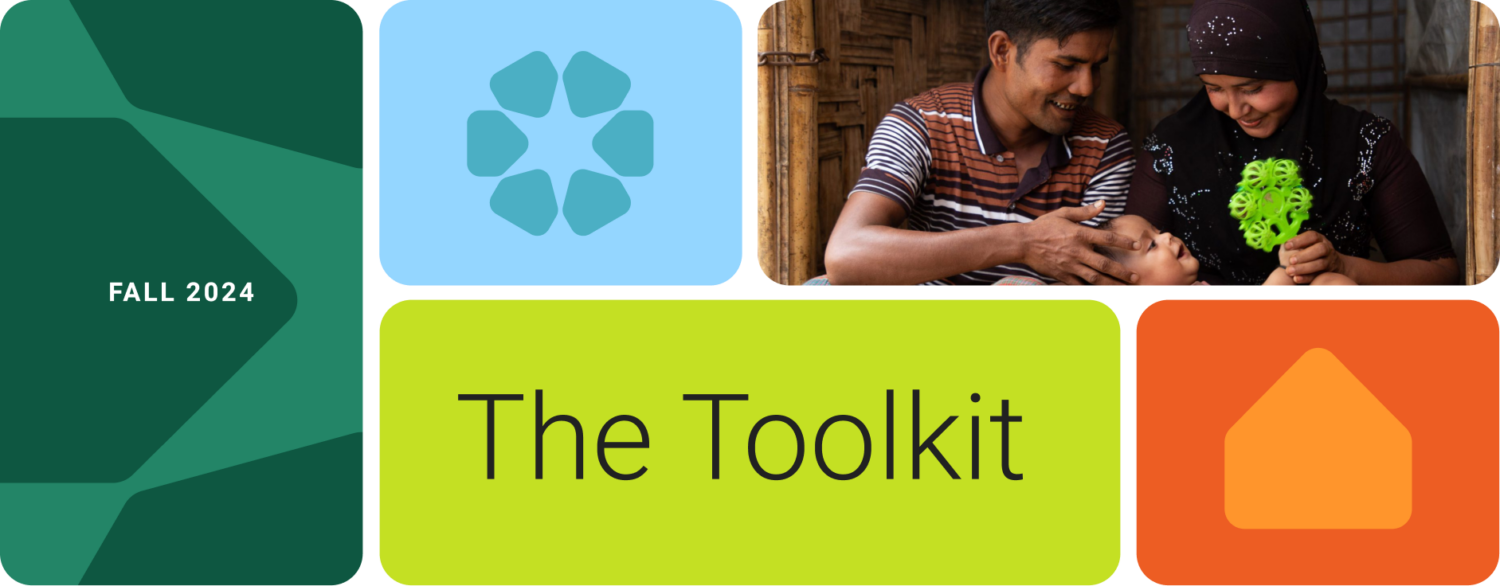
The International Rescue Committee (IRC) Cultural Resource Exchange (CORE) program connects and supports refugee resettlement staff globally to deliver effective cultural orientation to help refugees achieve self-sufficiency in the United States.
IRC CORE had evolved considerably since their inception and the brand was no longer aligned with the program strategy and on-the-ground realities of the program. IRC CORE partnered with Teal to update their overall brand and outreach materials.
Teal led a robust brand audit and assessment that resulted in a complete rebrand, with an updated brand strategy, messaging, and visual identity. Unfortunately, with the recent defunding and closure of USAID, this program no longer exists.
A Brand Where Connection Meets Trusted Expertise
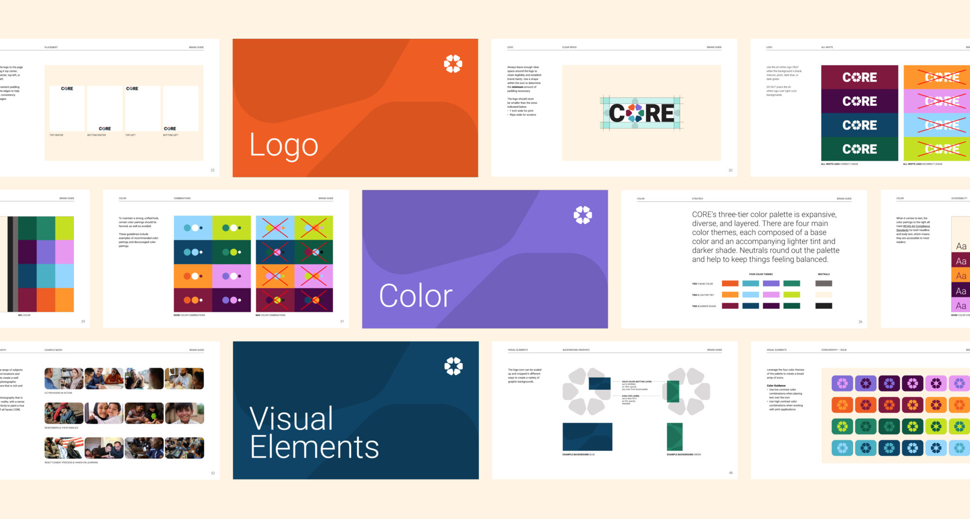
Teal created a brand system using a few simple elements, designed to adapt and take shape in a variety of forms.
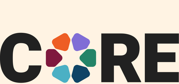
A Meaningful Mark
Teal created a new CORE icon that is the heartbeat of the refreshed logo mark. The icon is made up of three universal symbols that represent what the organization is all about: resettlement, resource exchange, and community. These shapes would then set the tone for the rest of the brand’s visual language.
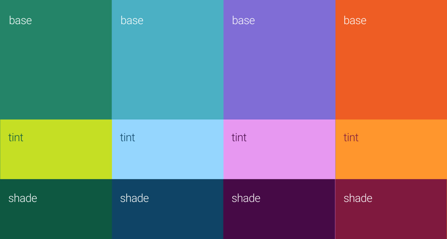
A Sensibly Layered Palette
CORE’s three-tier color palette was intentionally crafted to build flexibility into the brand system. There are four main color themes, each composed of a base color and an accompanying lighter tint and darker shade. Neutrals round out the palette and help to keep things feeling balanced.
An Immersive Environment
Combining color and shape is where the magic lies within the brand system. The logo icon can be scaled up and cropped in different ways to create a variety of graphic backgrounds. Individual shapes from the logo can also be rearranged to form abstract icons.
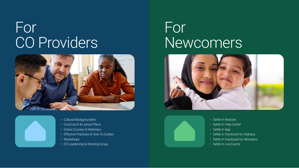
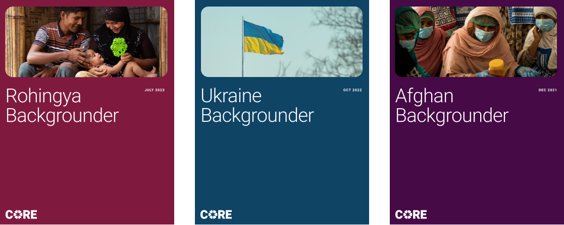
The brand expanded into collateral featuring a rich, colorful palette and charismatic rounded shapes, creating a friendly yet mature look and feel.
Poster designs
One pagers
Report covers
Custom brand icons
Teal rolled out the new brand with a presentation that introduced the refreshed identity, vision, and voice, accompanied by a comprehensive style guide detailing updated messaging, visual direction, and usage standards.
Issues
Services
Project Team
Teal Media is a woman-led creative agency that builds brands and websites for nonprofits, foundations, and mission-driven organizations. We have a core presence in Washington, DC and Detroit, MI.