Rigorous, nonpartisan, and built to last: a visual system that finally matches the work.
30+Separate Pieces of Collateral Designed
40+Custom Icons Created
5Special Project Partnerships
10+Internal Teams Utilizing Our Services
The Challenge
Arnold Ventures is a philanthropy dedicated to tackling some of the most pressing and complex issues in the United States including criminal justice reform, public finance, health care, and education. The organization invests in research, advocacy, and policy solutions that deliver measurable impact. But despite the strength of its work, Arnold Ventures’ visual brand had not evolved alongside the organization’s growing influence or ambition.
Developed in 2018 the existing identity left little room to evolve. Print and digital experiences felt disconnected, programs struggled to differentiate themselves, and a highly saturated color palette unintentionally signaled partisan alignment. As Arnold Ventures expanded its use of data, video, and visual storytelling, it became clear the brand was no longer serving the work.
The Research
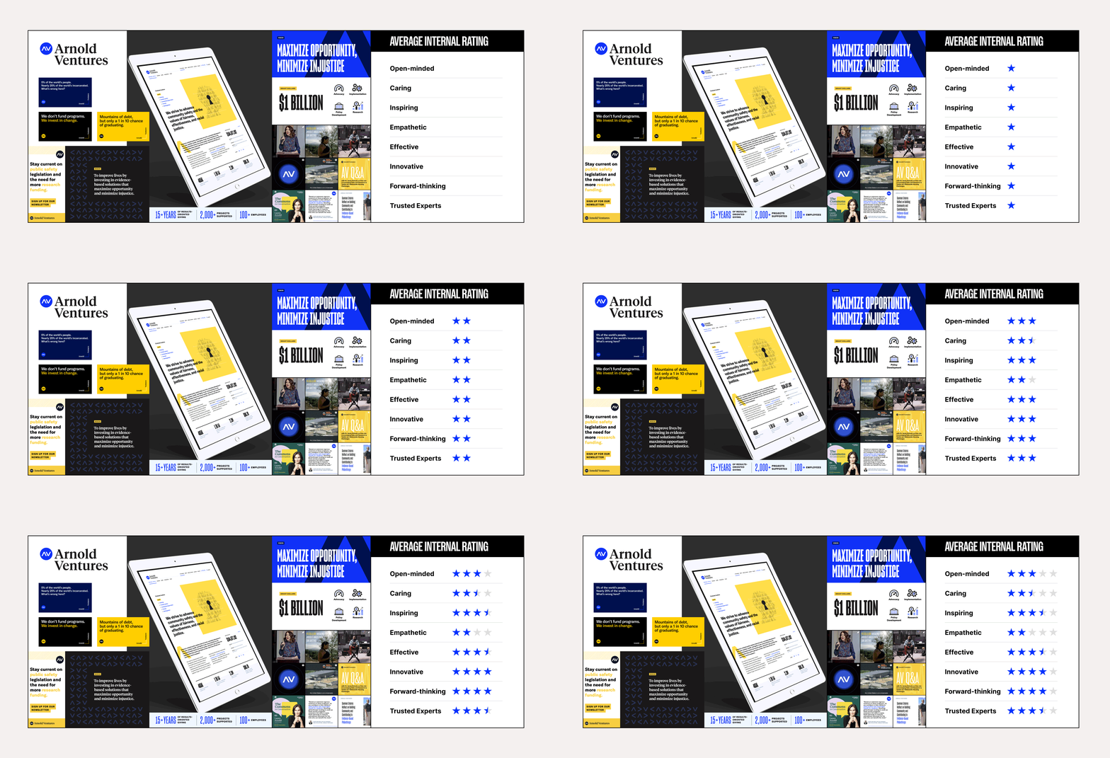
Teal began with a deep discovery process to understand both how Arnold Ventures sees itself and how it is perceived by others. We spoke to program staff, surveyed the broader Arnold Ventures team, and solicited feedback from communications partners. We also conducted a thorough audit of the existing visual system.
Visual Brand Enhancement
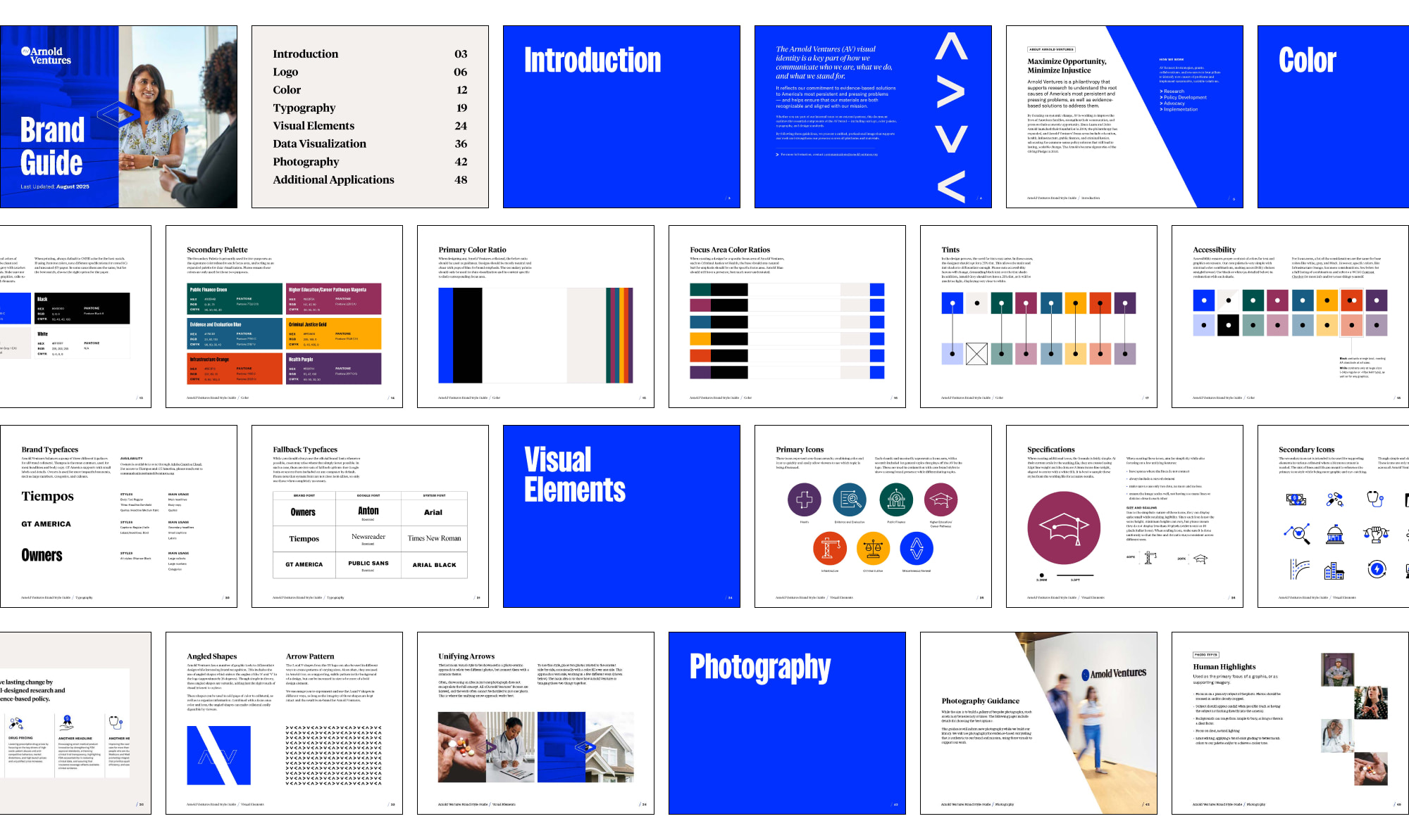
The visual brand enhancement for Arnold Ventures captures the credibility, impact, and humanity of their work without visual noise or political signaling. Rooted in a flexible visual framework, the system balances evidence-based rigor with more human-centered storytelling, pairing clean, structured layouts and straightforward data visualization with authentic photography and warmer supporting elements.
Moving Away from Partisan Signaling to a Programmatic Structure
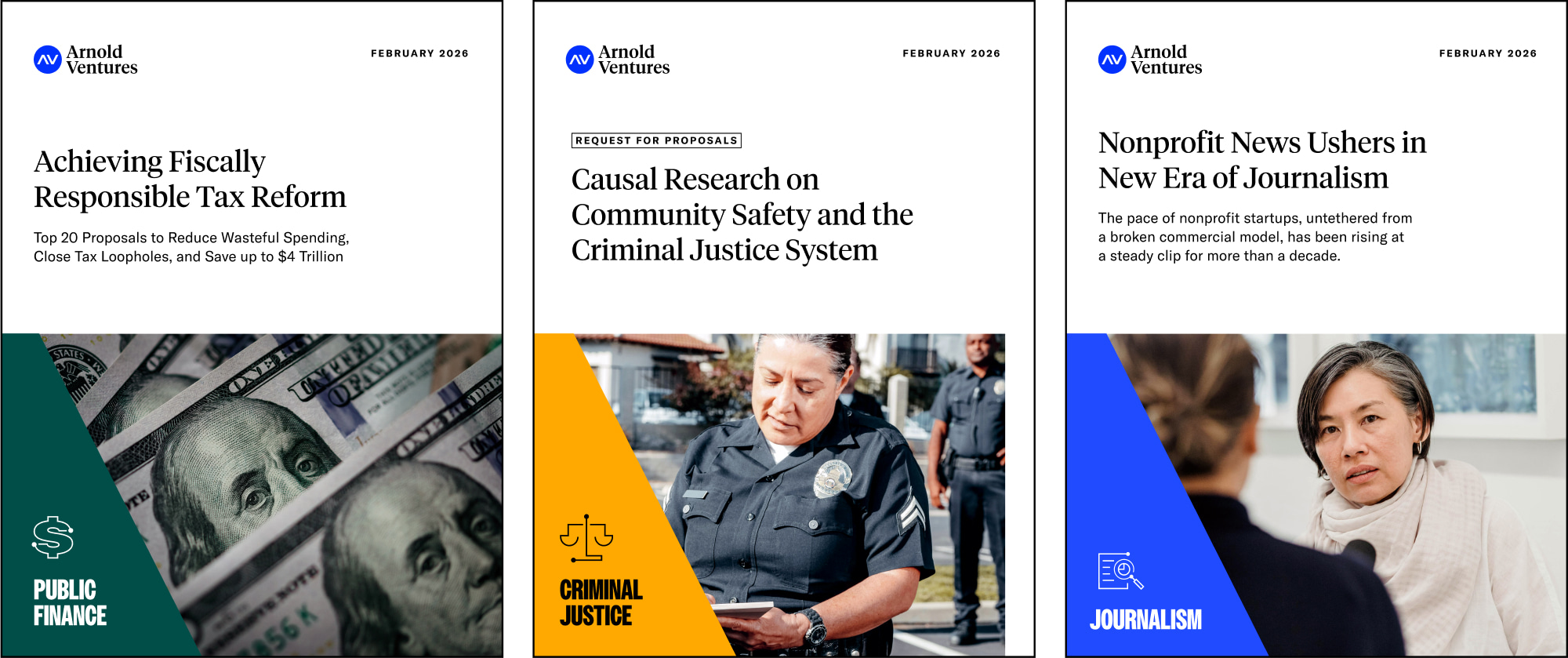
A refined color strategy retains the equity of their core shade of blue while introducing neutral tones, opting for a cleaner, bright look that speaks to energy and hope. Bold accent colors are added, each representing one of Arnold Ventures’ main focus areas, which helps improve clarity, accessibility and program differentiation, while broadening Arnold Ventures’ visual language to not appear overly blue.
Crafting an Expansive Iconography Library
A robust and eclectic body of work like Arnold Ventures’ necessitates a more bespoke, custom set of iconography. We started by exploring different styles for each of the main focus areas, such as Public Finance or Health, landing on a clean, crafted line-and-dot style. This look marked a fairly drastic change from their prior focus-area art, which consisted of much more detailed collages.
When creating a custom set of more detailed icons, we wanted them to complement the focus area icon style while still allowing them to stand alone. The final style strategically mixed line and fill to establish a truly unique yet cohesive look. With the style established, the last step was crafting a unique icon for each of a myriad of different subjects, ranging from sports betting to advocacy. Several rounds of collaboration resulted in a expansive set of over 40 handcrafted graphics.
Comprehensive Brand Collateral
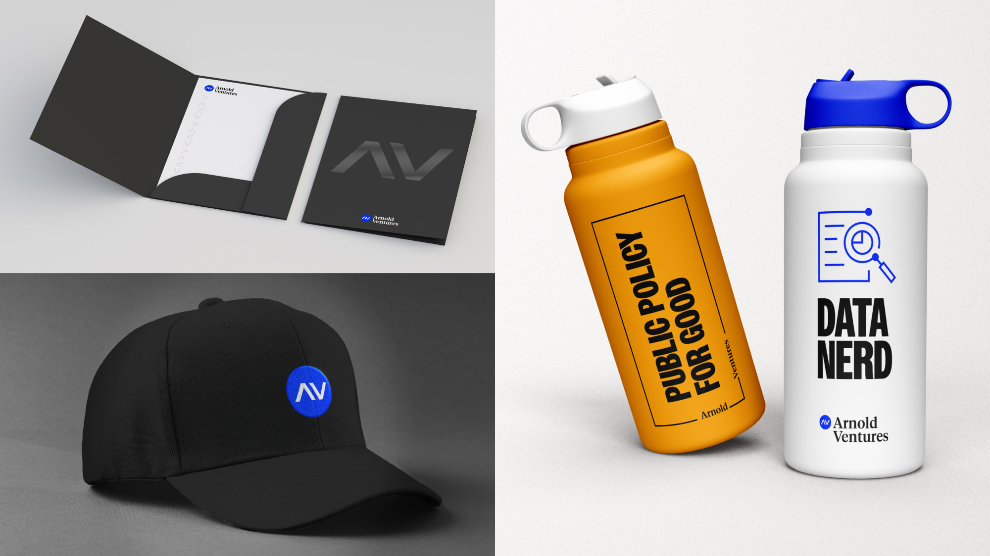
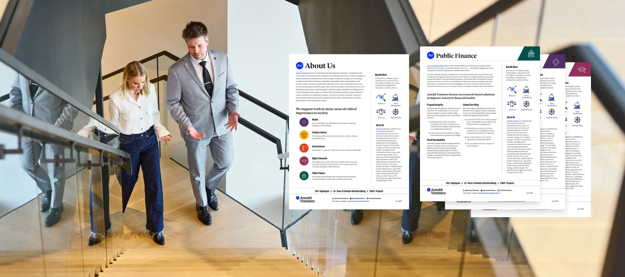
With the brand system established, we then turned our focus to collateral. We worked with Arnold Ventures to conceptualize company mainstays like file folders, letterheads, and PDF styles. Certain pieces were crafted for specific focus areas, while others represented Arnold Ventures as a whole, each with its own special considerations. Together, these items showcase a simple yet flexible framework that makes sorting through multiple documents effortless, with each clearly color-coded by use.
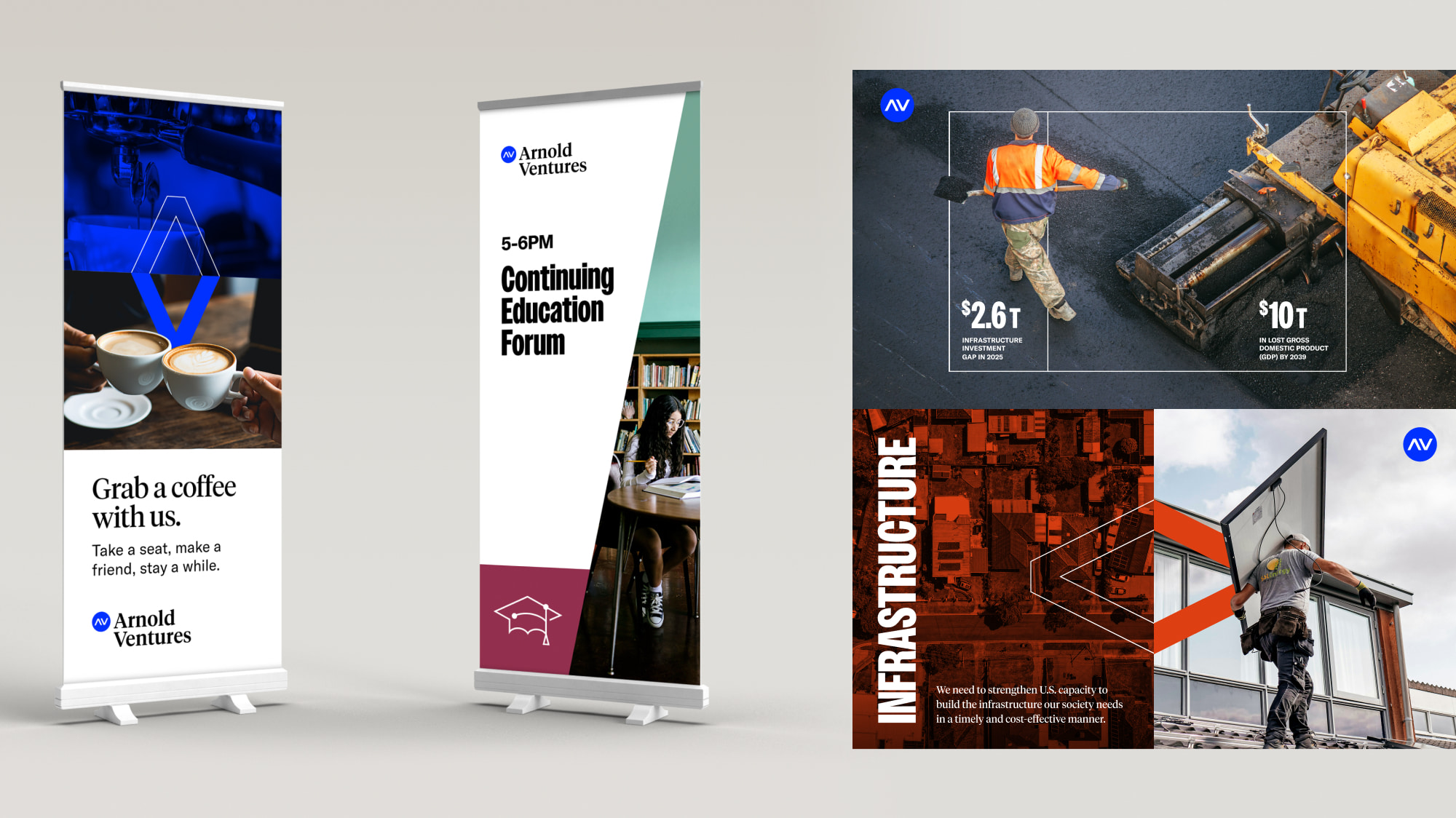
In the spirit of graphics supporting the message, we also proposed a signature infographic style that blends photography with simple, line-based graphics. Rounding out the brand with merchandise for employees and promotional use, we balanced simple branded pieces with others that speak more directly to Arnold Ventures’ culture.
Established Trust Leading to a Continued Partnership
Teal continues to partner closely with the AV team to roll out the refreshed visual system across core collateral, digital platforms, and programmatic materials, while serving as a strategic creative partner to support consistency, evolution, and adoption over time. Through this continued engagement, we help ensure the brand remains clear, cohesive, and adaptable as Arnold Ventures’ work and storytelling continue to grow.
Annual Team Meeting
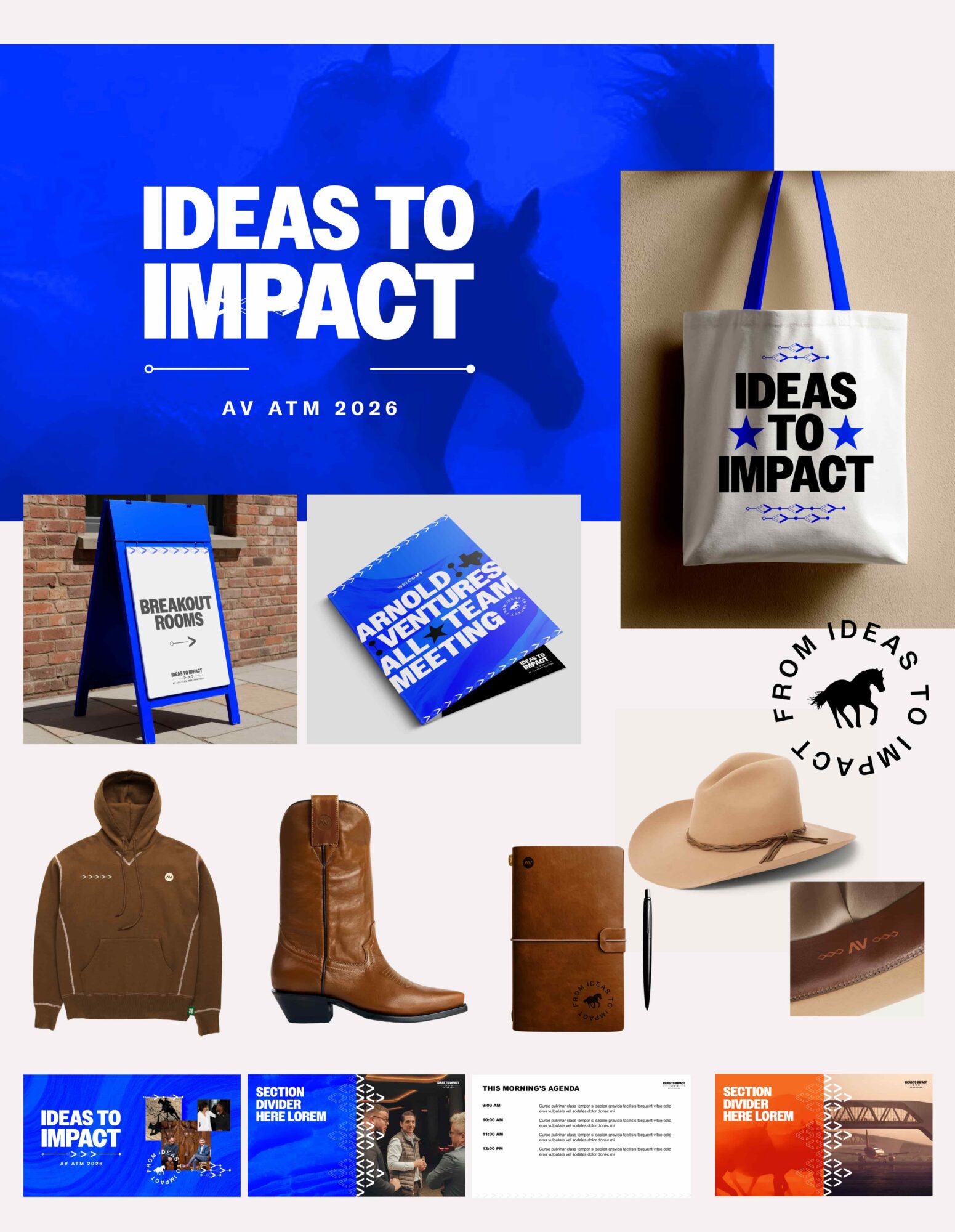
Teal supported Arnold Ventures with campaign branding and collateral for their Annual Staff Meeting. With the team gathering in Texas, Teal developed a visual concept rooted in southwestern elements. Leaning on Arnold Ventures’ core colors and styles kept the look immediately on-brand, while the introduction of a custom “Texas Orange” alongside bespoke patterns and design elements gave the event its own distinct identity.
Each year, staff receive special swag as part of the celebration. Teal worked closely with Arnold Ventures to curate and price a selection of options that felt both unique and premium.
ATM wrapped up tonight and I just have to tell you how incredible the branding looked in real life. I received a LOT of compliments on the branding and seized every opportunity I had to explain the concept behind it. It's rare for creative work to get the spotlight at this organization. Thank you a million times over for your quick, beautiful work on this brand!
Megan Kimmitt
Creative Director, Arnold Ventures
Building a Brand for a Family of Podcasts
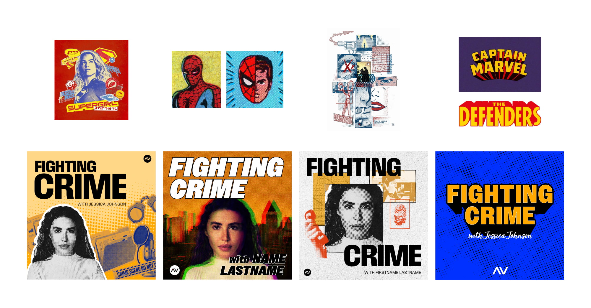
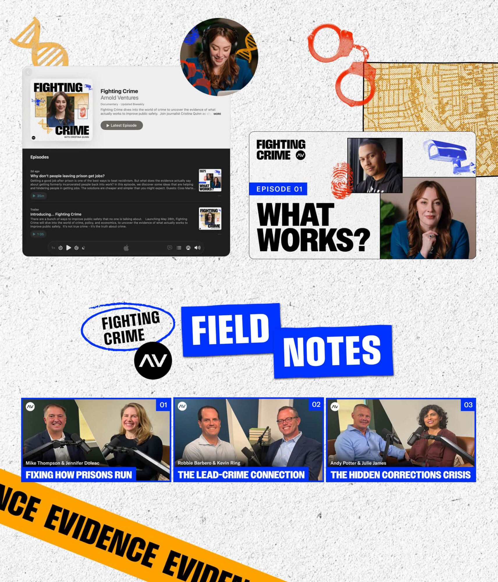
Teal developed the branding and campaign for Arnold Ventures’ Fighting Crime podcast family. The concept began with a broad exploration of criminal justice themes before narrowing to an unexpected direction: superhero motifs. The idea was initially met with skepticism, but Teal was confident they could nod to comics and graphic novel aesthetics while staying true to Arnold Ventures’ core branding, tone, and style.
The result is a dynamic, layered visual system built around panel compositions and halftone textures — while keeping real people and real stories at the center of each episode’s imagery. In a crowded podcast landscape defined by loud, competing designs, the Fighting Crime brand stands out through restraint and distinctiveness.
Links
Year of Completion
2025
Issues
Services
Project Team
Teal Media is a woman-led creative agency that builds brands and websites for nonprofits, foundations, and mission-driven organizations. We have a core presence in Washington, DC and Detroit, MI.