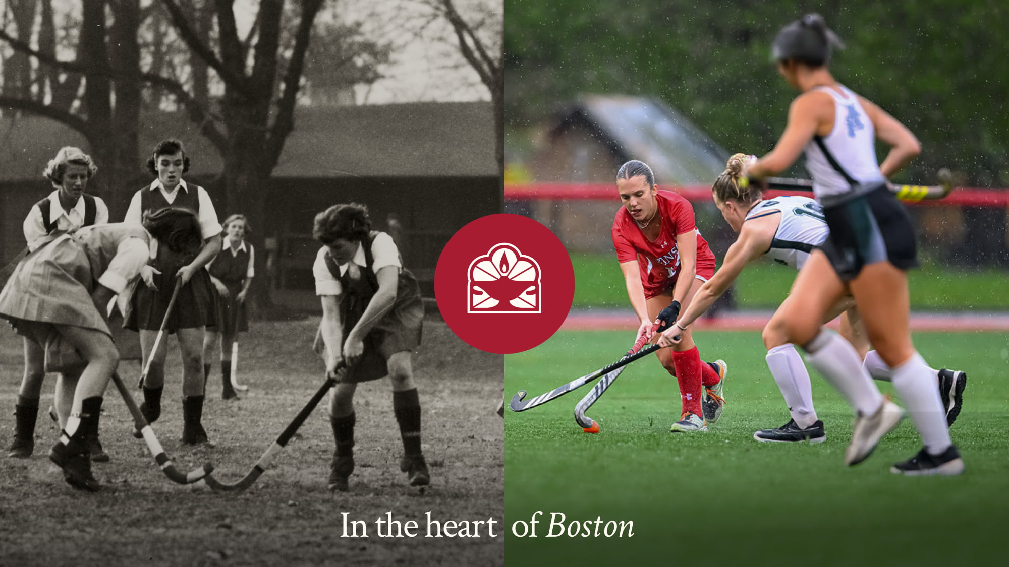
The Winsor School has educated intellectually ambitious girls in the heart of Boston for well over a century. Its reputation for academic rigor is its strongest asset, but outside the school’s walls, that reputation for rigor had become a challenge. To the wider world, Winsor often read as overly competitive, exclusionary/non-diverse, and as an academic pressure cooker.
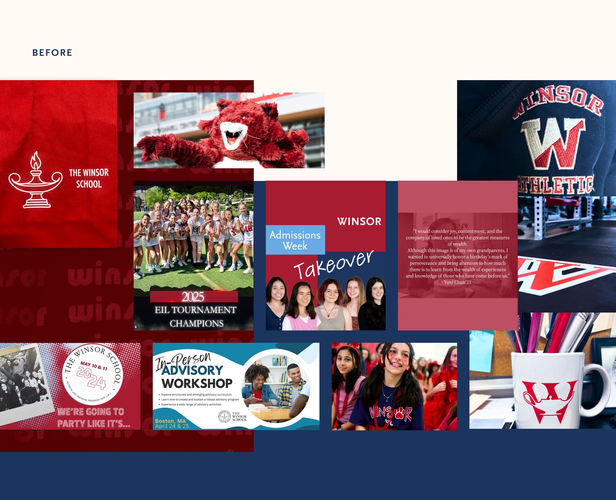
Inside the school, the story was the opposite: a tight-knit, joyful community where a diverse group of students branch out, find their voice, and feel deeply supported. The wider world often missed the joy, diversity, and energy that define the Winsor experience. Winsor’s visuals read as classic New England prep school, the logo didn’t scale or reproduce well, and both departments and students didn’t have an effective way to rep their school, creating confusion instead of cohesion and community. There was a real opportunity for Teal to help the Winsor team showcase their differentiators and more clearly convey what the Winsor experience is like in today’s context.
The approach
Perception vs. Reality
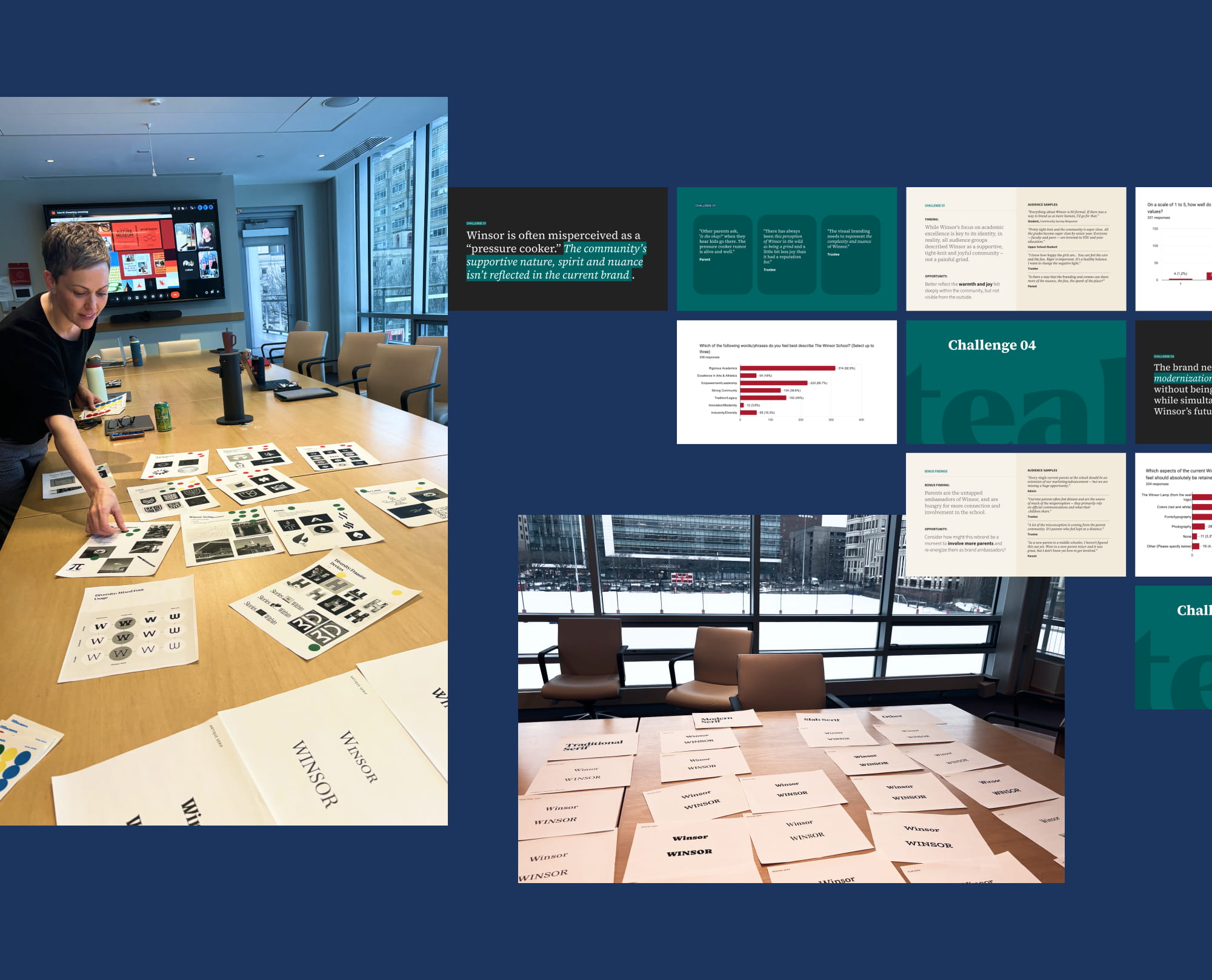
Our discovery phase drew on a 339-response community survey, nine focus groups spanning trustees, administrators, faculty and staff, parents, alums, and Lower and Upper School students, and an in-person brand workshop. The central finding was a gap: every audience said the outside world couldn’t see that truth. That became the rebrand’s mission: share more of Winsor’s joy with the world without losing its history or academic edge.
339Survey responses
9Stakeholder sessions
They don't come here to find their voice, they come here to use their voice. There is a belief in the fundamental agency of girls in the world.
Winsor Administrator
From stakeholder sessions
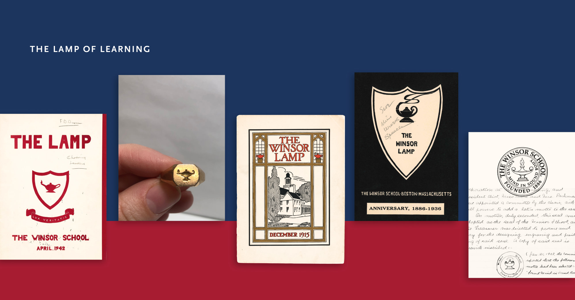
Discovery also clarified what had to stay. Winsor’s alumni community is deeply connected, and holds strong opinions about the brand. We needed to find a way to modernize the visuals while still paying homage to the school’s impressive legacy.
Luckily, our audience research helped us identify some universal areas of agreement. The Lamp of Learning symbol was near-universally loved, even if its execution felt dated. The brand’s traditional feel was a point of pride, and Winsor red was non-negotiable. Rather than replace Winsor’s symbols, we evolved them to be more flexible, more modern, and more human.
After
The Logo
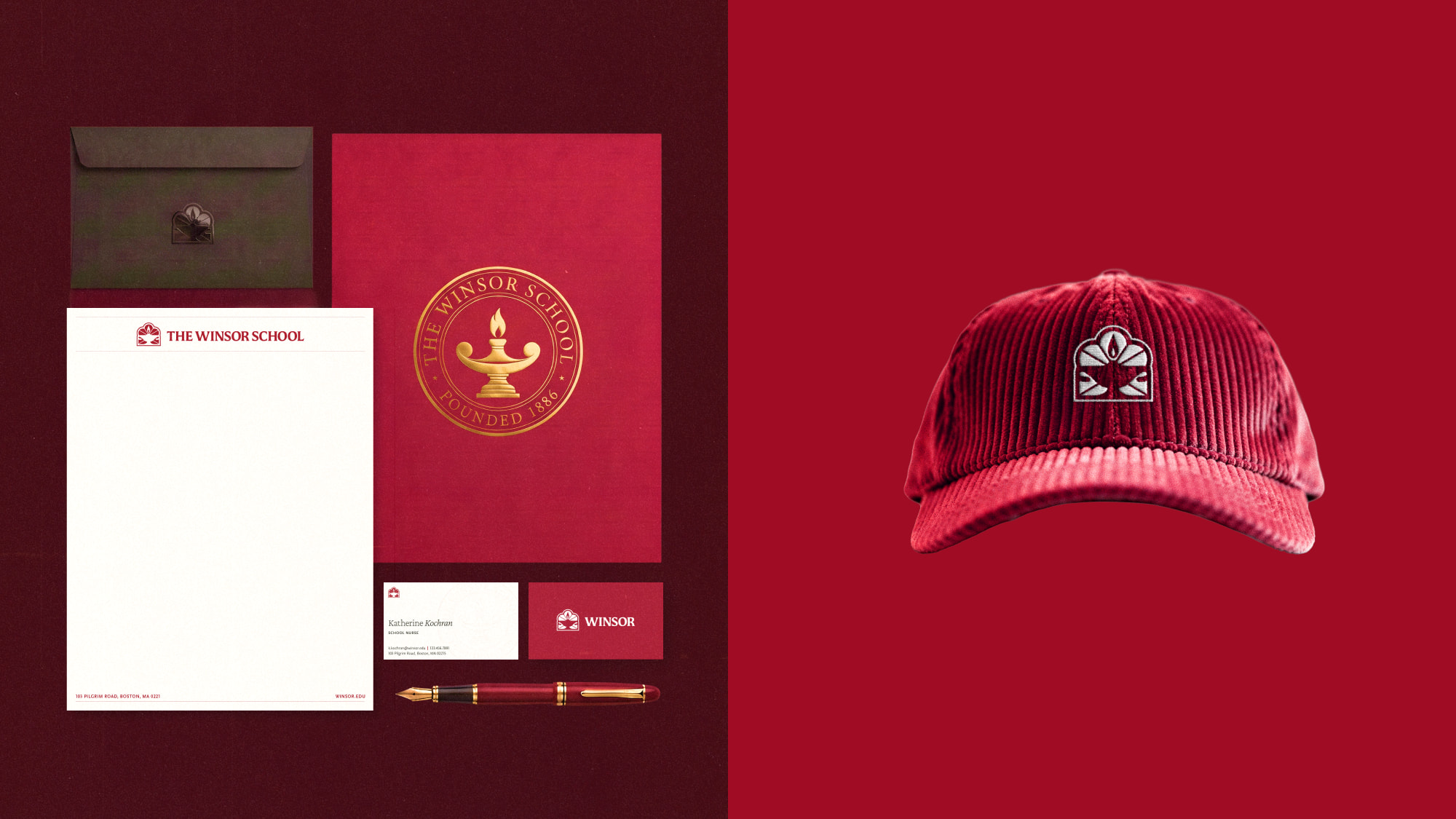
The new primary mark places the Lamp of Learning inside a window drawn from the arches of Winsor’s Academic Wing. That architectural detail ties the mark to a specific place in Boston, instead of generic prep-school heritage. The flame at its center stands for what the community feels and outsiders don’t always see: curiosity, warmth, and spark.
The wordmark keeps the serif that alumni love, with enough weight to feel confident rather than ceremonial. The seal is now reserved for formal occasions, which restores its gravitas. A simplified submark handles social avatars and small details, giving Winsor a three-tiered system instead of one rigid mark. This flexibility lets Winsor show up differently for different audiences, all in a brand-aligned way.
The Visual System
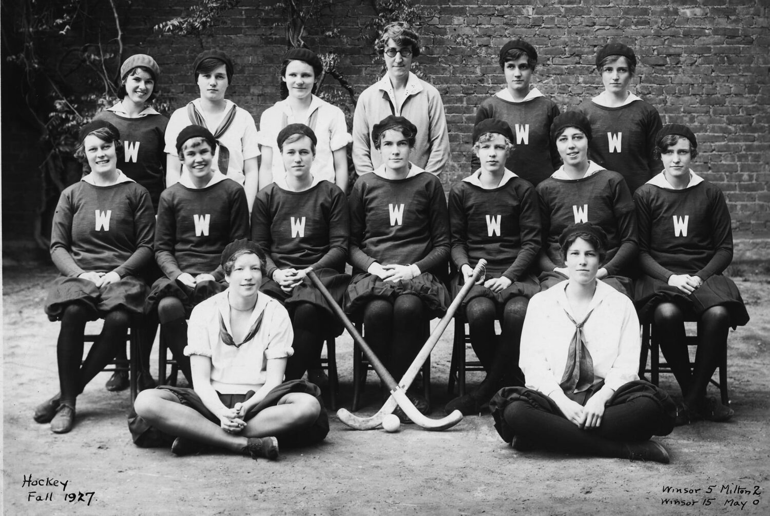
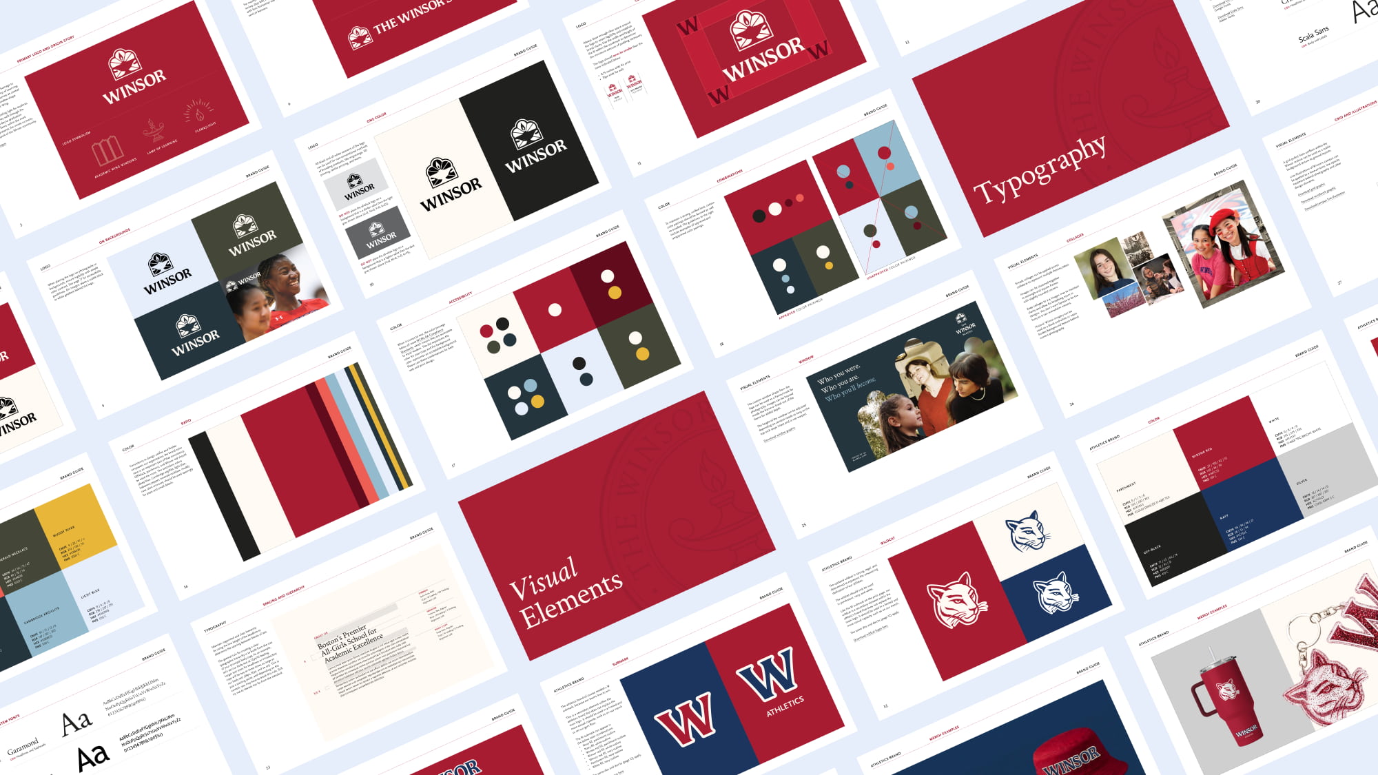
Archival photography becomes texture behind current student imagery, celebrating both Winsor’s past and present. A grid from Winsor’s archive and line illustrations of campus ground the layouts.
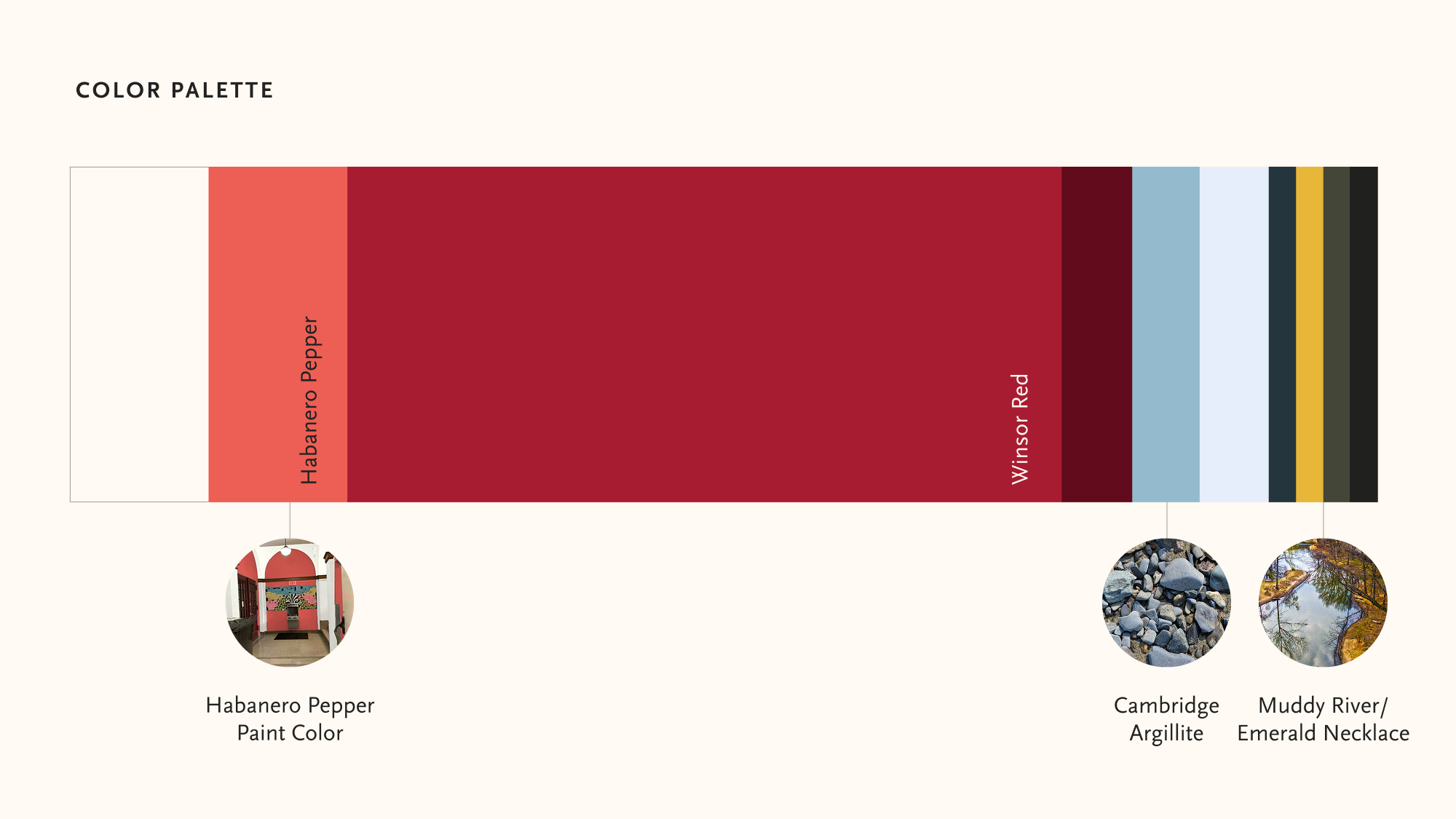
Winsor red anchors the palette, and secondary colors like Emerald Necklace and Muddy River point back to its location in the heart of the city.
Crimson Text and Scala Sans pair a serif for tradition with a sans for warmth. The window shape doubles as a photo frame, keeping the focus on people. All together, the updated visual identity preserves the sense of classic heritage and excellence Winsor is known for, while letting more of what makes it special shine though.
Athletics brand
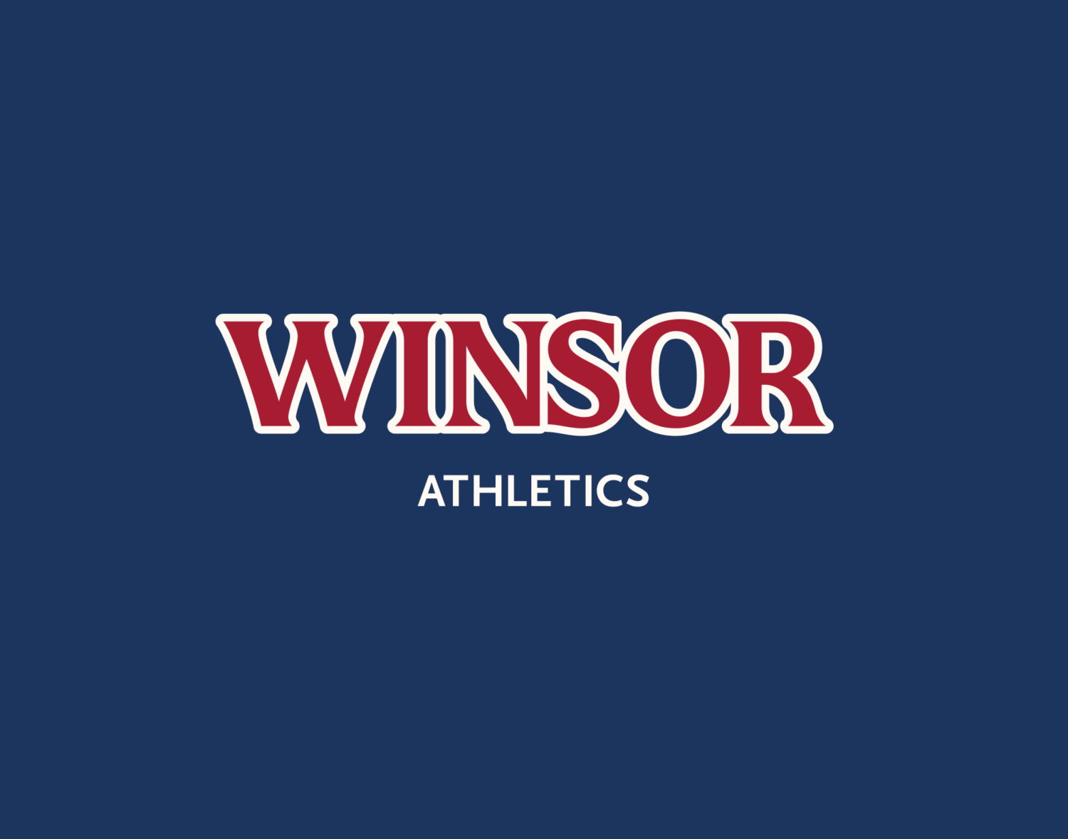
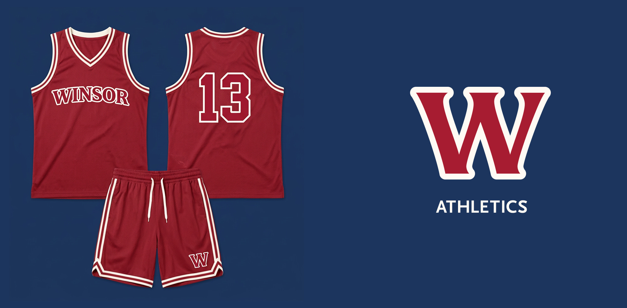
The athletics wordmark adds a varsity outline to the main lettering so the teams read as unmistakably Winsor. A W submark acts as a recognizable athletics emblem.
The impact
The Rollout
Discovery made clear that inconsistency wasn’t a design problem so much as a tools problem. As one administrator put it, the school needed resources that weren’t just technically branded, but flexibly branded. Teal delivered a full brand guide, alongside a suite of templates and training sessions, so that faculty, staff, and communications teams could produce on-brand materials without waiting on a designer.
Discovery also flagged that parents and alums were nervous about the change, and that being clear and upfront about what wasn’t changing would help ease the transition to the new visuals. The system was designed to make that story easy to tell: the seal stays, the red stays, the lamp stays, and each has a clearer job than before.
Winsor now has a brand that holds rigor and warmth in the same frame. The lamp is still lit. Now the rest of Boston can see it.
Issues
Services
Project Team
Teal Media is a woman-led creative agency that builds brands and websites for nonprofits, foundations, and mission-driven organizations. We have a core presence in Washington, DC and Detroit, MI.