Feed the Truth (FTT) is a nonprofit watchdog organization founded by Daniel Lubetzky—a philanthropist and entrepreneur best known for creating the snack company KIND. Feed the Truth holds the big food industry accountable by challenging the global food and beverage industry’s exploitation of our health, environment, and democracy.
Teal created the brand, brand collateral, and website for FTT. Our goal was clear: Develop a vivid, bold, and powerful identity to match both the scale of the challenge and the courage and backbone of this watchdog nonprofit.
This organization is no longer active
FTT’s mission to change our food system so it works for everyone—not just the powerful and privileged—is not popular with the companies and food industry players.
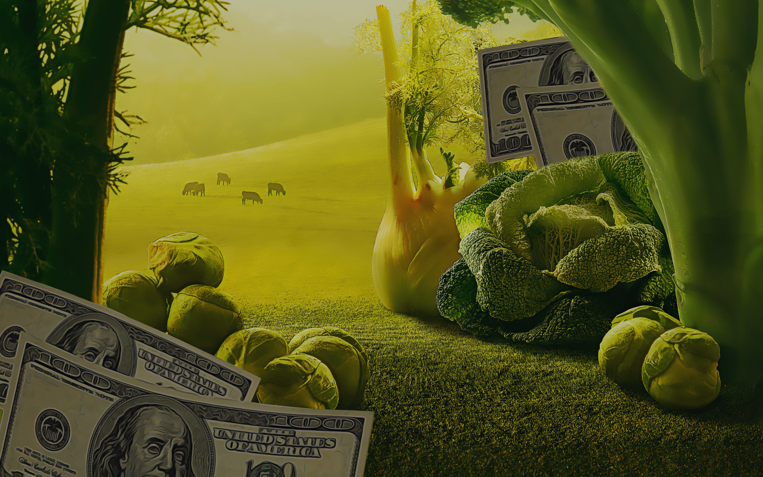
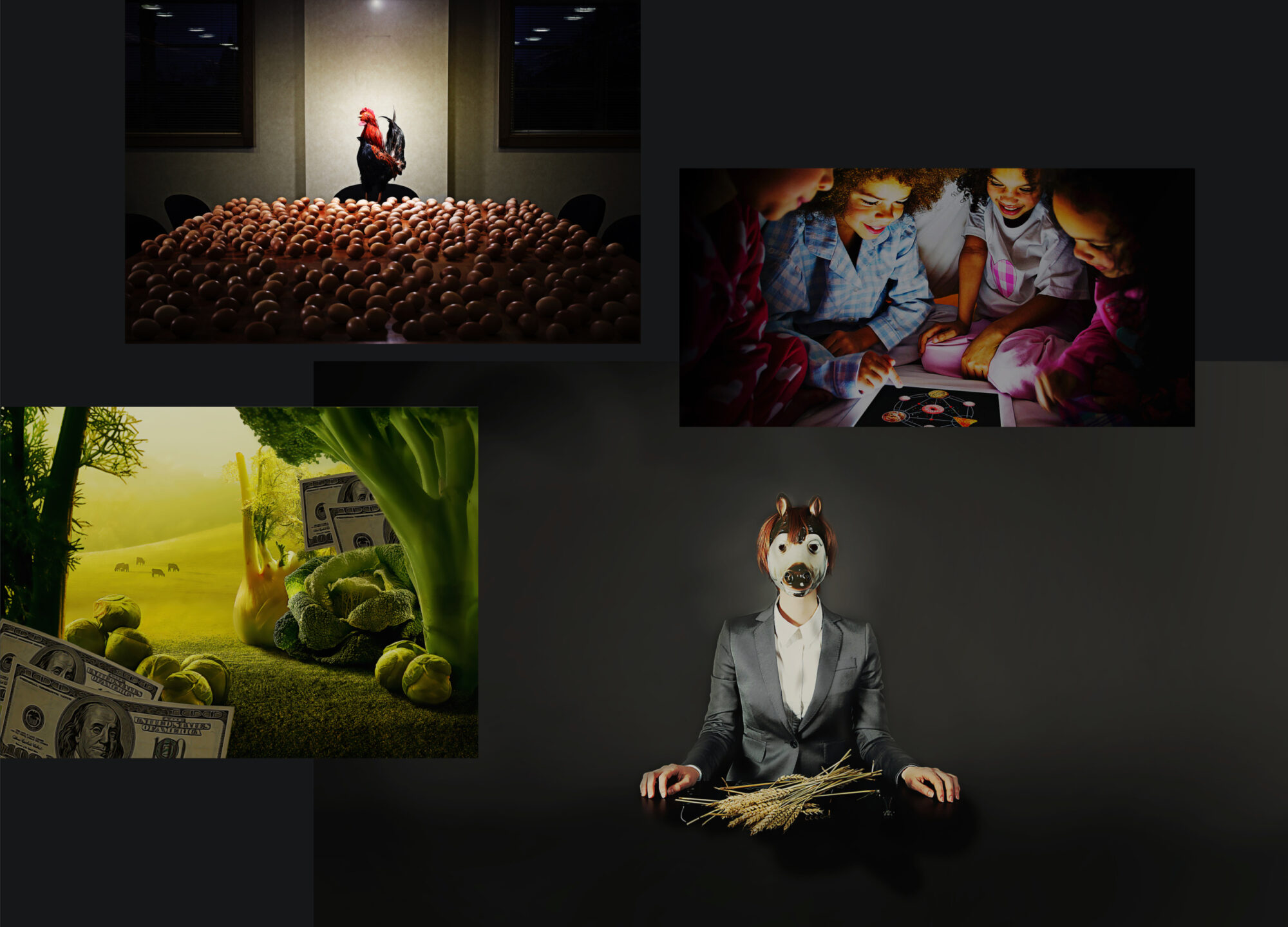
Hyperrealism and dark Americana
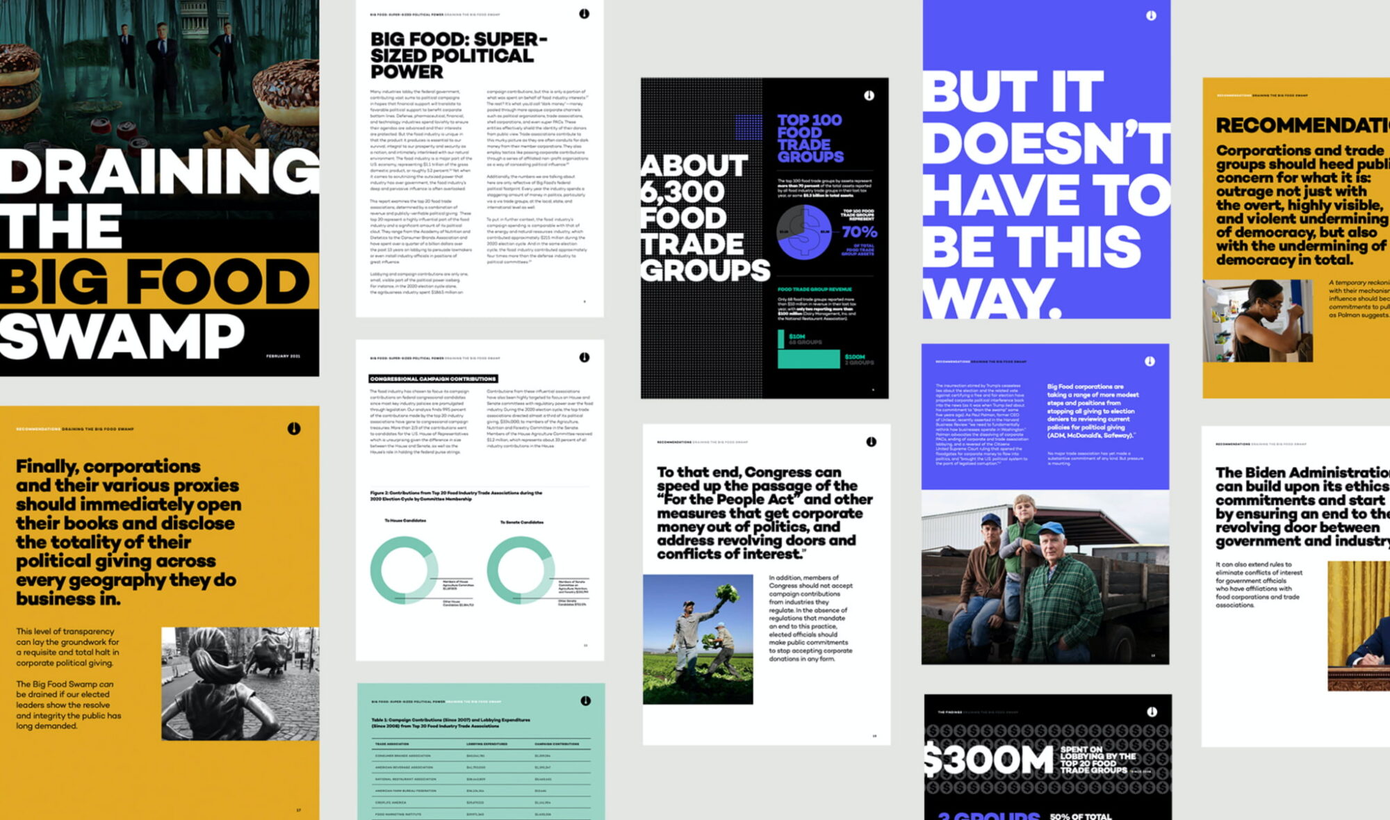
To stand out as a new organization and drive home the uneasy contradictions and hypocrisy in the food industry, Teal created a dark Americana realism illustration style for FTT. This “hyperrealism” brings mystery and layers to the imagery, telling the often darker story about the food industry’s deceitful actions. From corporate suits in animal masks to happy kids around a glowing tablet of junk food, the imagery delivers FTT’s message and looks unlike anything else in their space.
Logo with a “signature spoon drip”
FTT’s new logo centers around a hidden spoon drip in the U that’s a metaphor for “knowing what you put in your mouth.” This strong, symmetrical mark stands out from its more corporate/academic peers in the research space and matches the darker, more provocative imagery in the overall visual brand.
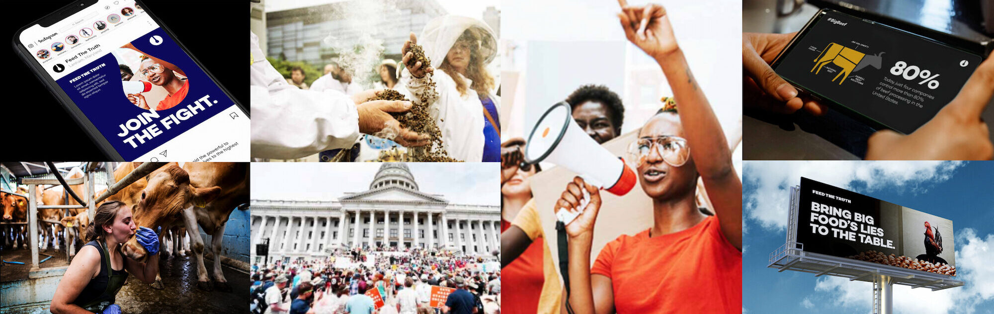
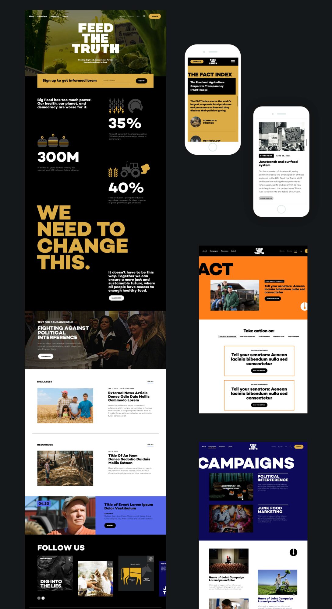
In contrast to this ominous tone for its research work, FTT uses a brighter, more optimistic tone that’s clean, saturated, and vibrant for all of its activism work.
The result is a new brand that comes out strong, delivering a big dose of truth, transparency, and accountability—all supported by facts and scientific rigor.
For the website, Teal collaborated closely with the FTT team to bring that vision and the organization’s core values to life with an unapologetic brand personality and website visual design full of contrast, layers, and textures.
A major challenge like “Draining the Big Food Swamp” required a unique approach, and a FTT-Teal relationship that allowed for risk-taking and creativity. The result of our partnership is a brand that stands out for its hyperrealism and visual storytelling. More than just bold type, the project highlights the disfunction at the core of our food systems. For team Teal, the project offered a chance to flex our creativity to create something novel and thoughtful to help the FTT team reform a powerful, well-resourced industry.
Issues
Services
Project Team
Teal Media is a woman-led creative agency that builds brands and websites for nonprofits, foundations, and mission-driven organizations. We have a core presence in Washington, DC and Detroit, MI.
Teal reimagined the brand and website for CLASP, bringing clarity and urgency to their call for more efficient appliances that help people while healing the planet.
Let’s do this.
The part where we ask you to cough up your email. So we can discuss all the amazing things we’re gonna do together. No pressure. Really.