
ReFrame Resource
A playbook to reduce gender bias and improve hiring and creative decision-making in the screen industry
Work


The Center for American Progress (CAP) is an independent, nonpartisan policy institute dedicated to improving the lives of all Americans through bold, progressive ideas and strong leadership that drives action. Amidst a once-in-a-generation moment to make transformational change, CAP had a legacy website that was visually outdated and carried technical debt that would prevent them from achieving their engagement and conversion goals.
Teal and CAP partnered to reimagine and rebuild the premier destination for progressive policy insights and expertise. Starting with a robust discovery phase, Teal engaged stakeholders from across the organization in rich discussions about website goals; paired those insights with a deep review of quantitative analytics, search/SEO, and CRM data; and collaborated with the core CAP web team on a vision for a new americanprogress.org. Then, with an aggressive five-month timeline, our teams got to work.
Teal’s work with CAP was nominated for a 2022 Webby Award.
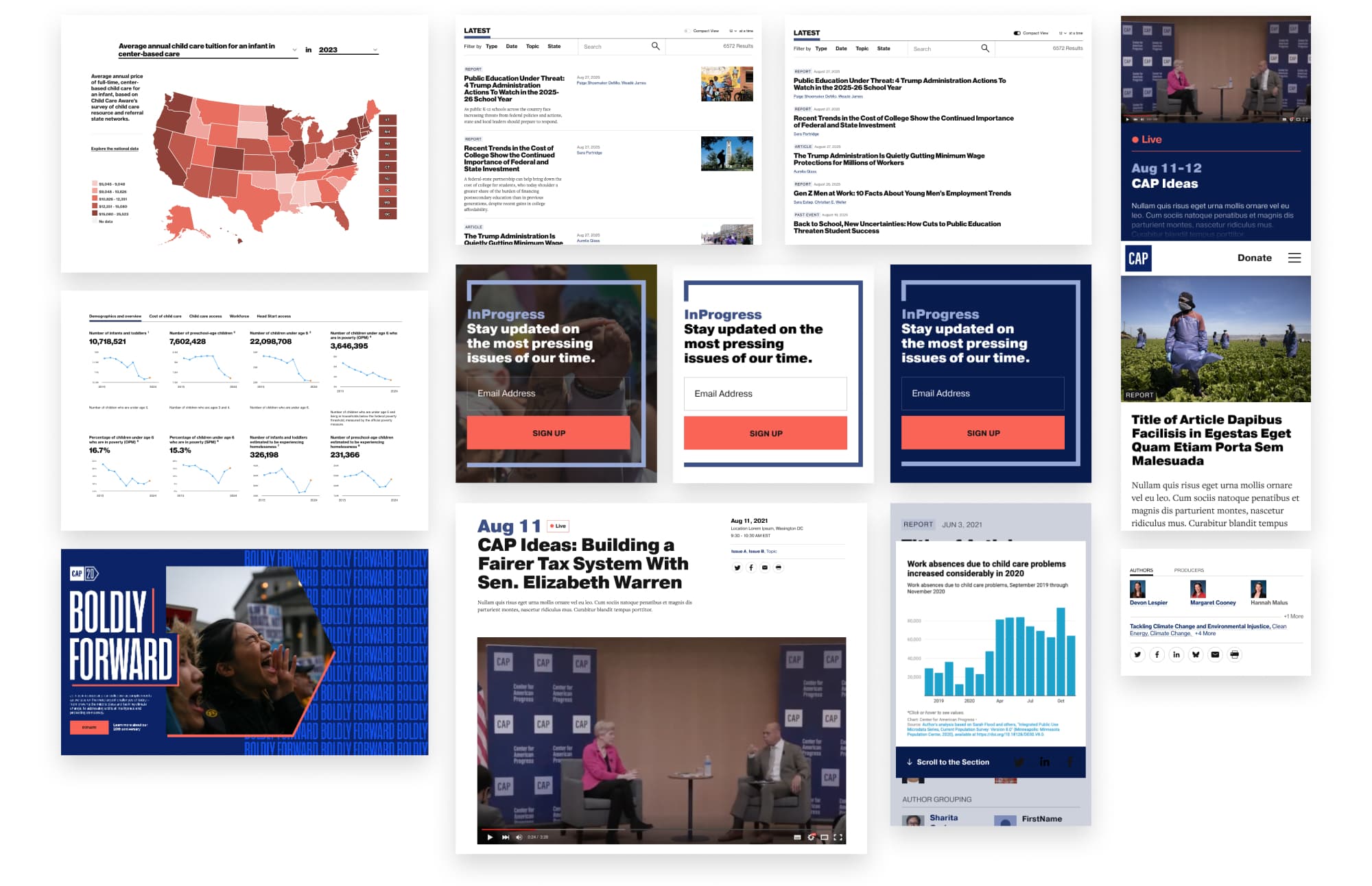
CAP’s small but mighty content editorial team published as many as 20 new pieces per week. They needed a faster, more flexible way to build standard content—articles, reports, factsheets—plus the flexibility to create feature pages with rich, complex layouts. So Teal created a new block layout and atomic design system that’s visually stunning, easy to navigate, flexible to build, and super scalable—so content drives the layout, not the other way around.
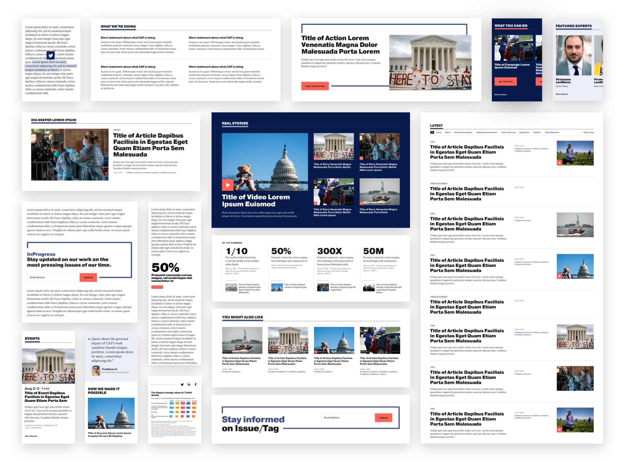
With a rapid response team generating newsworthy posts across a series of top trending topics, along with a mountain of 40,000+ pieces of legacy content spanning decades, users needed a clear path to quickly find and navigate to the most timely, relevant content on the site. Teal structured the new CAP site around trending topics, highlighting a ticker at the top of each page and architecting a home page that flexibly features content that’s focused on the issues driving the progressive political conversation.
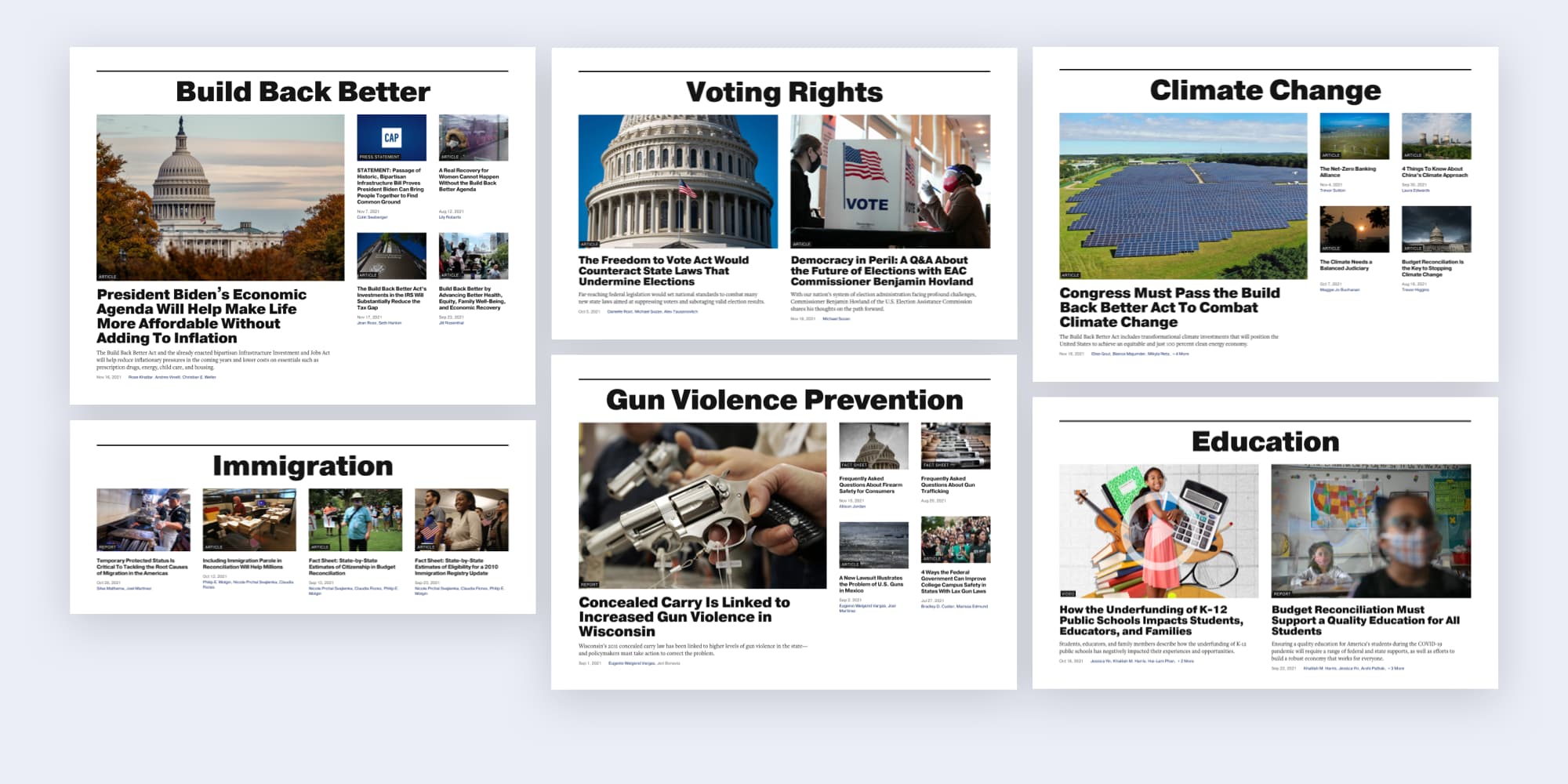
As the leading think tank on progressive issues, CAP’s website was a decade behind what its users—and its internal editorial team—needed. With end-of-year giving season approaching, Teal and CAP mapped out a rapid redevelopment process to overhaul the site in just five short months. Here’s how we did it:
As the Teal team worked quickly to build and launch the main website for CAP, we worked in parallel with the Center for American Progress Action Fund (CAP Action) to shape its new website into a hub for powerful stories, resources for advocates, and clear actions that progressives can take.
CAP Action’s new site leverages the core features of the main CAP website and pairs it with its own functionality to empower advocates and help our nation live up to its potential for boundless opportunity and equal justice. From Climate Change and Infrastructure to Coronavirus and Racial Equity, the website pairs deeply researched articles with events and actions that cover the topics driving the political conversation in America.
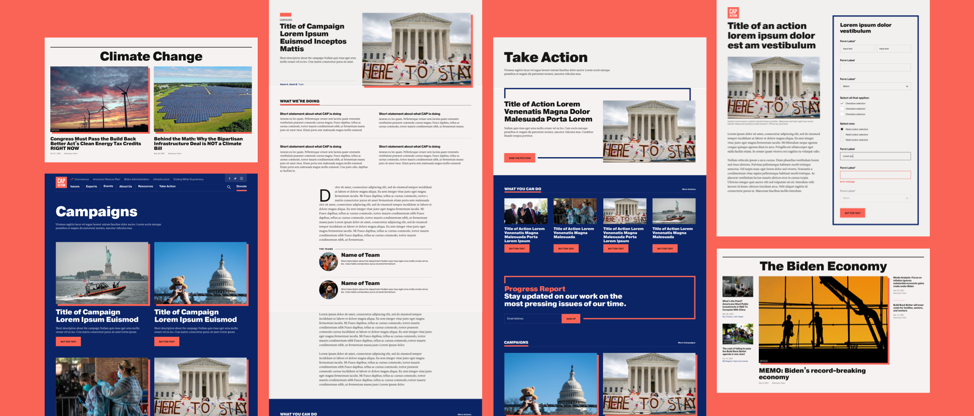
CAP Action uses the same component system as the main CAP site, so it’s fast and easy to create, edit, and deploy dynamic content. No rigid templates, just custom pages that stay on brand, responsive, and accessible—so the content drives layout, not the other way around.
With a new platform to engage Americans in big ideas that can dramatically improve lives, CAP Action is ready and able to, in their words, “drive the conversation and hold leaders accountable to progressive values.” At Teal, we’re proud to be part of this important transformation to support a powerhouse for change.
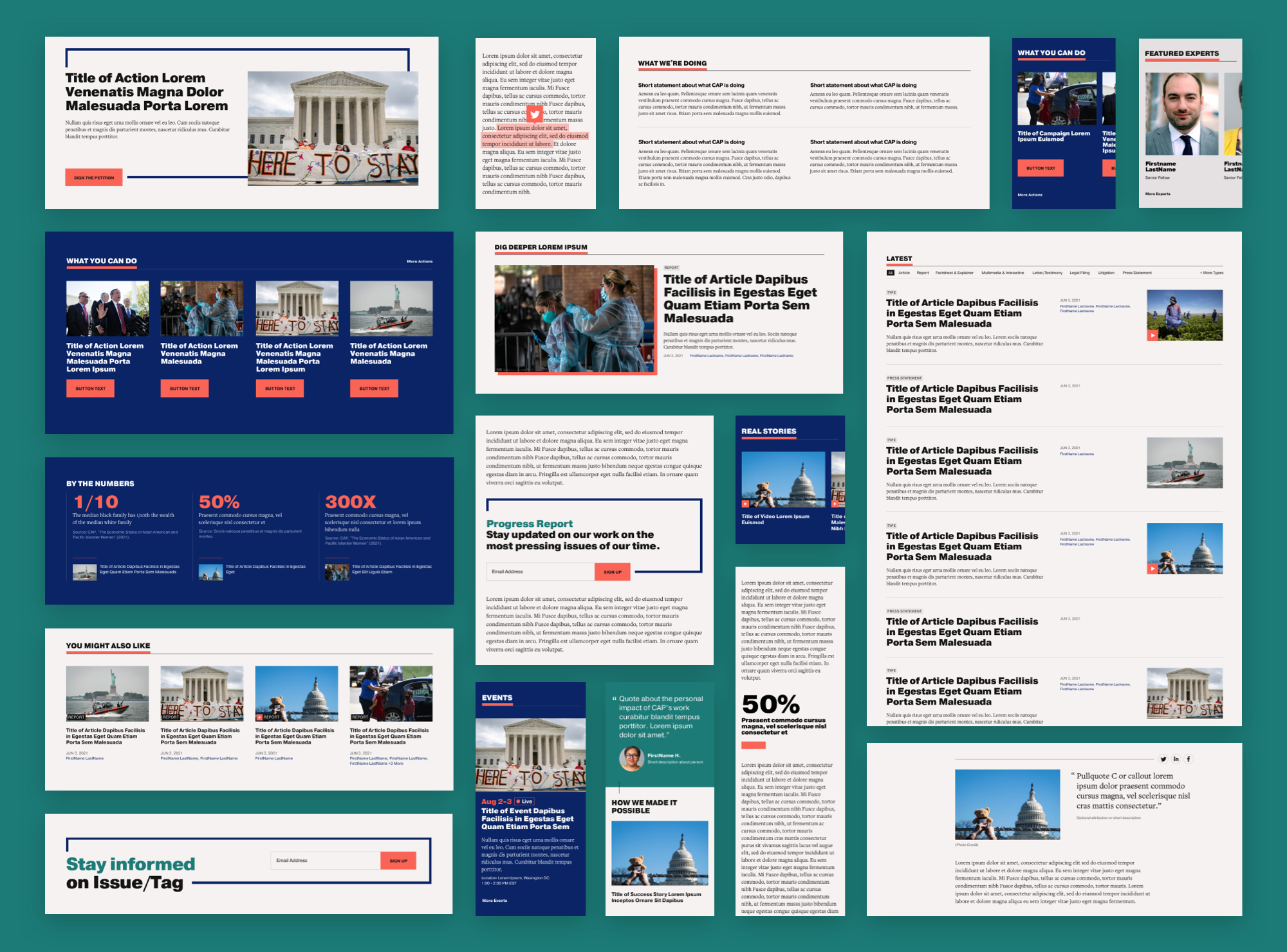
Teal’s partnership with CAP did not end with the launch of their new website. Both teams have continued collaborating to build new ways of delivering CAP’s content to their audience while improving the everyday lives of the editorial team. Updates have included everything from additional components, to data dashboards, to improvements to usage and analytics tracking.
A site as expansive and important as CAP deserves the ongoing improvement and the ability to adapt to meet the moment.
“It’s been great to work with the Teal team. They pulled together a tight group of folks with the skills and experience to work quickly through the groundwork and tackle the inevitable oddities that turn up in any project of scale. Their industry experience helped us get off on the right foot—we’ve been speaking the same language since day one.”

A playbook to reduce gender bias and improve hiring and creative decision-making in the screen industry


The part where we ask you to cough up your email. So we can discuss all the amazing things we’re gonna do together. No pressure. Really.