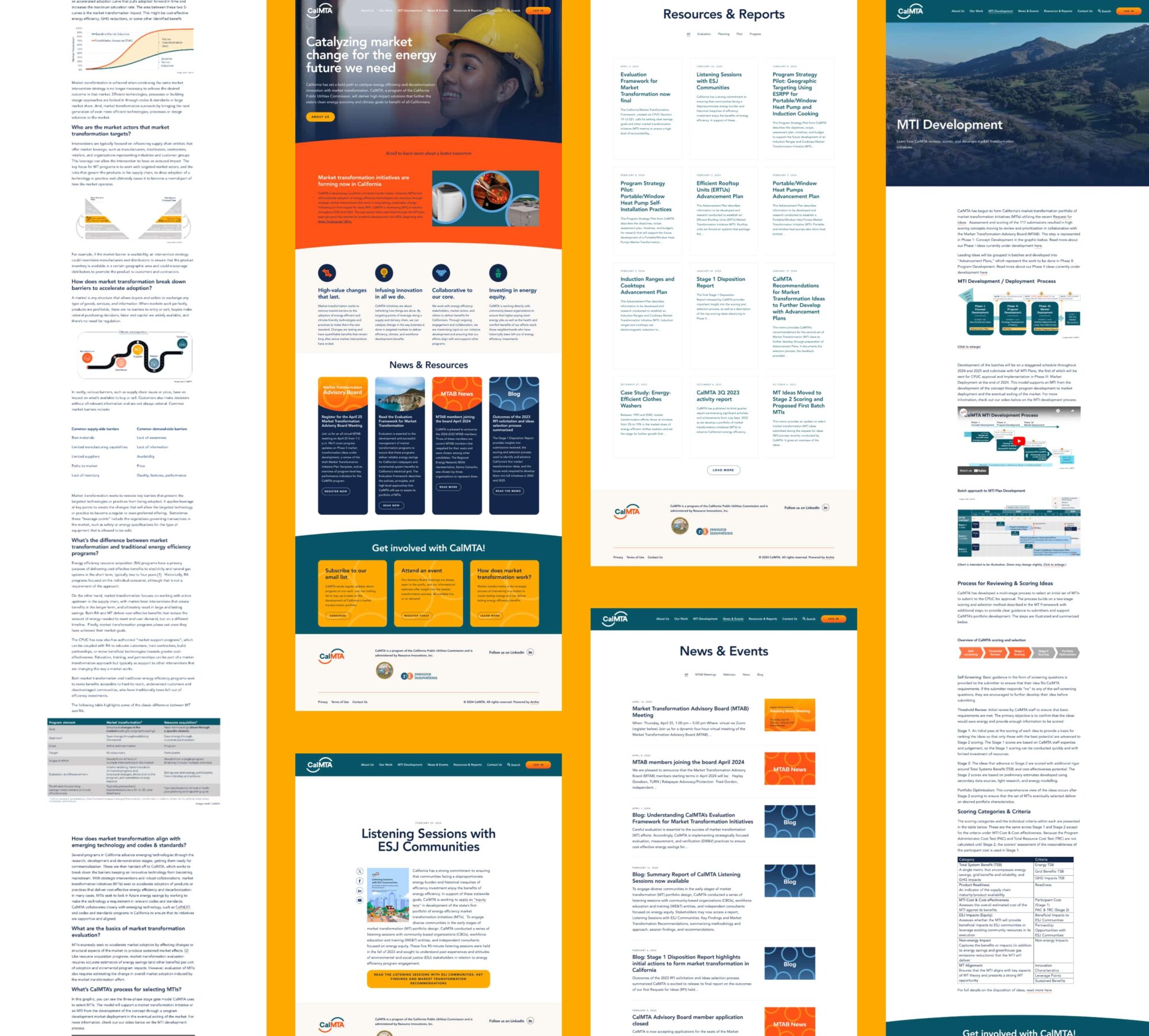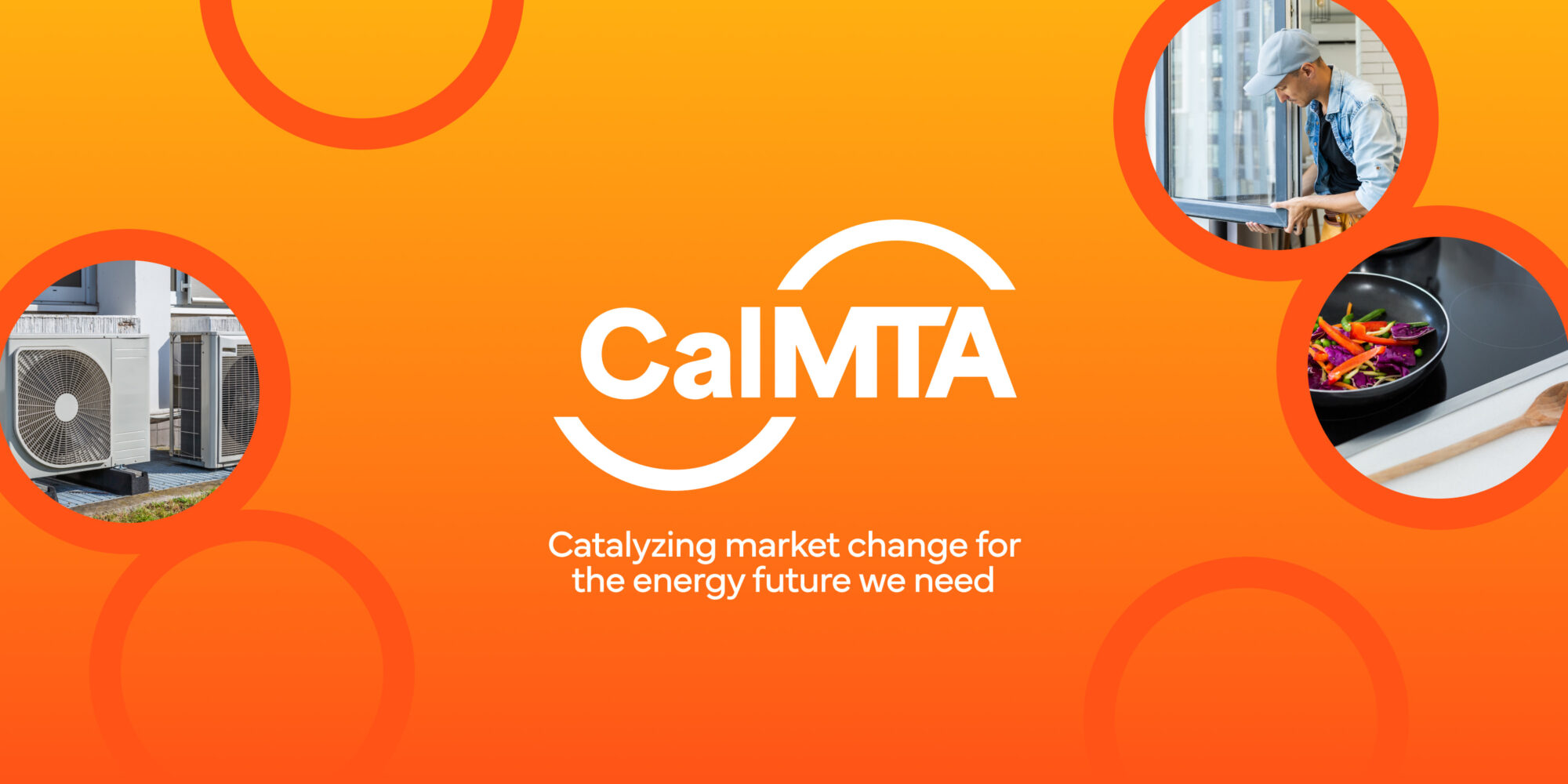
CalMTA is passionate about energy efficiency and dedicated to helping California meet their ambitious climate goals. As CalMTA’s creative partner, Teal worked with them to establish a brand and website to introduce this new organization to the state of California. The brand needed to communicate their expertise and innovative approach to transforming the market and establish CalMTA as a trusted organization that will be involved in meeting California’s climate goals for years to come.
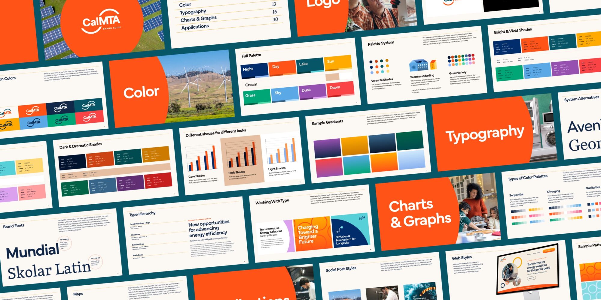
After a series of brand workshops and interactive discovery sessions, Teal went to work to create several logo concepts. It was clear from the beginning that we wanted to steer clear of using green tones that are often associated with organizations in the climate space. With their focus on energy efficiency, using orange as the primary color establishes a tone of authority and optimism as well as helps CalMTA stand out in their space.
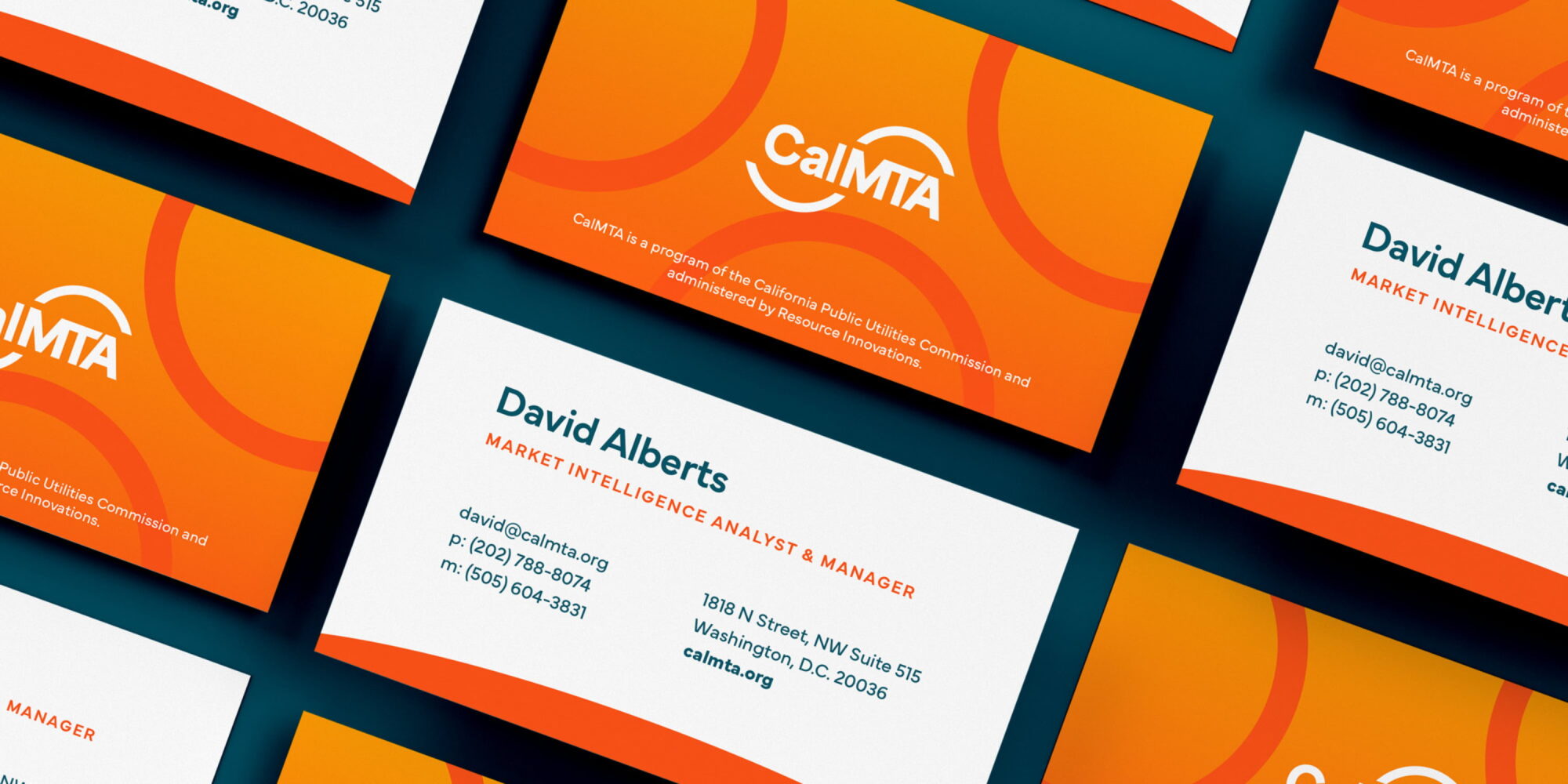
We settled on the half-circle, sun-like shapes in the logo and iterated on that idea until landing on the half circles that flow through the logo, providing a sense of transformation and progress. These half-circle shapes resemble an s-curve, representing the concept of Market Transformation that is central to CalMTA’s identity. They also immediately played a role in supporting graphics and lent themselves well to creating shapes and patterns on the website and in supporting materials.
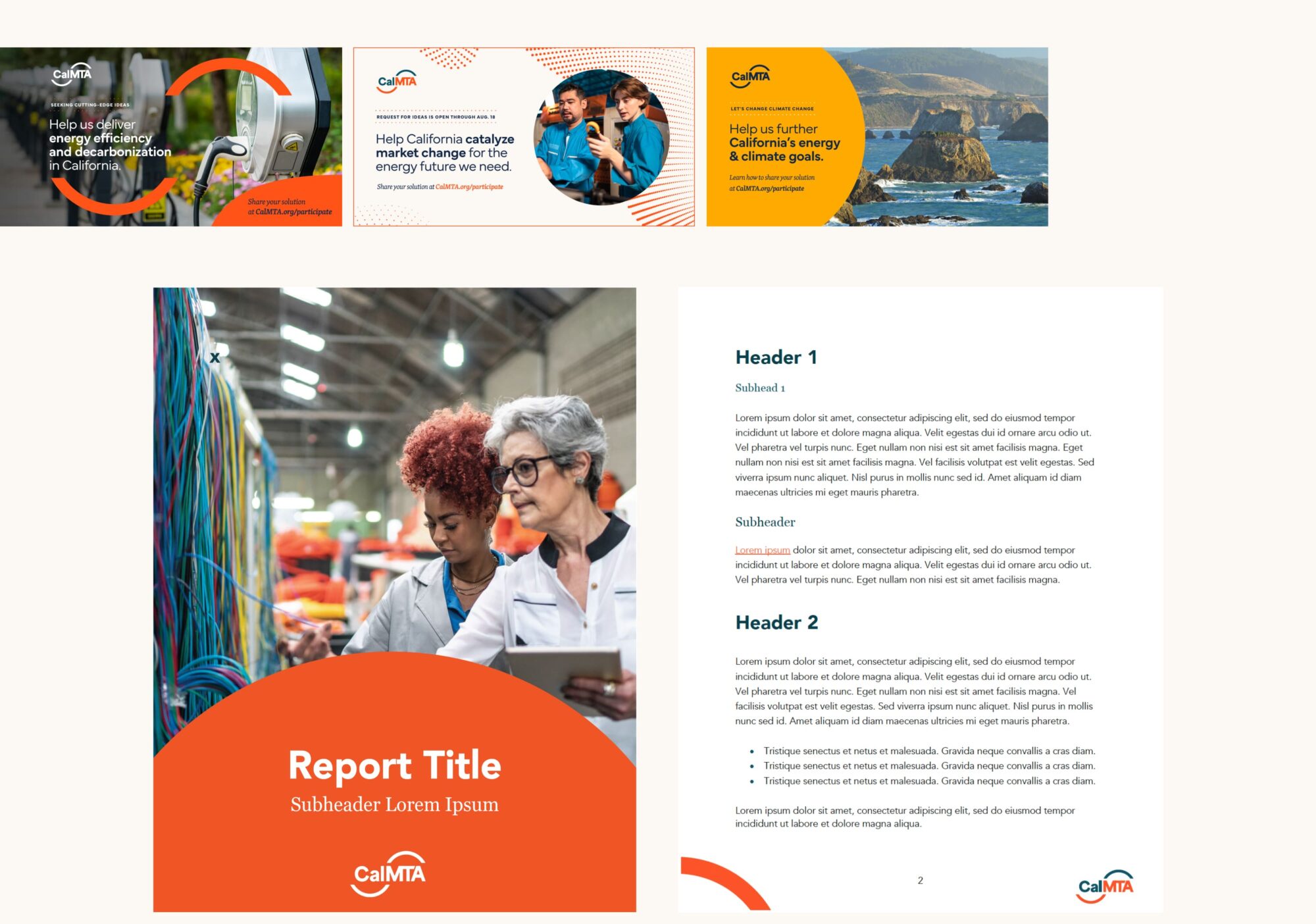
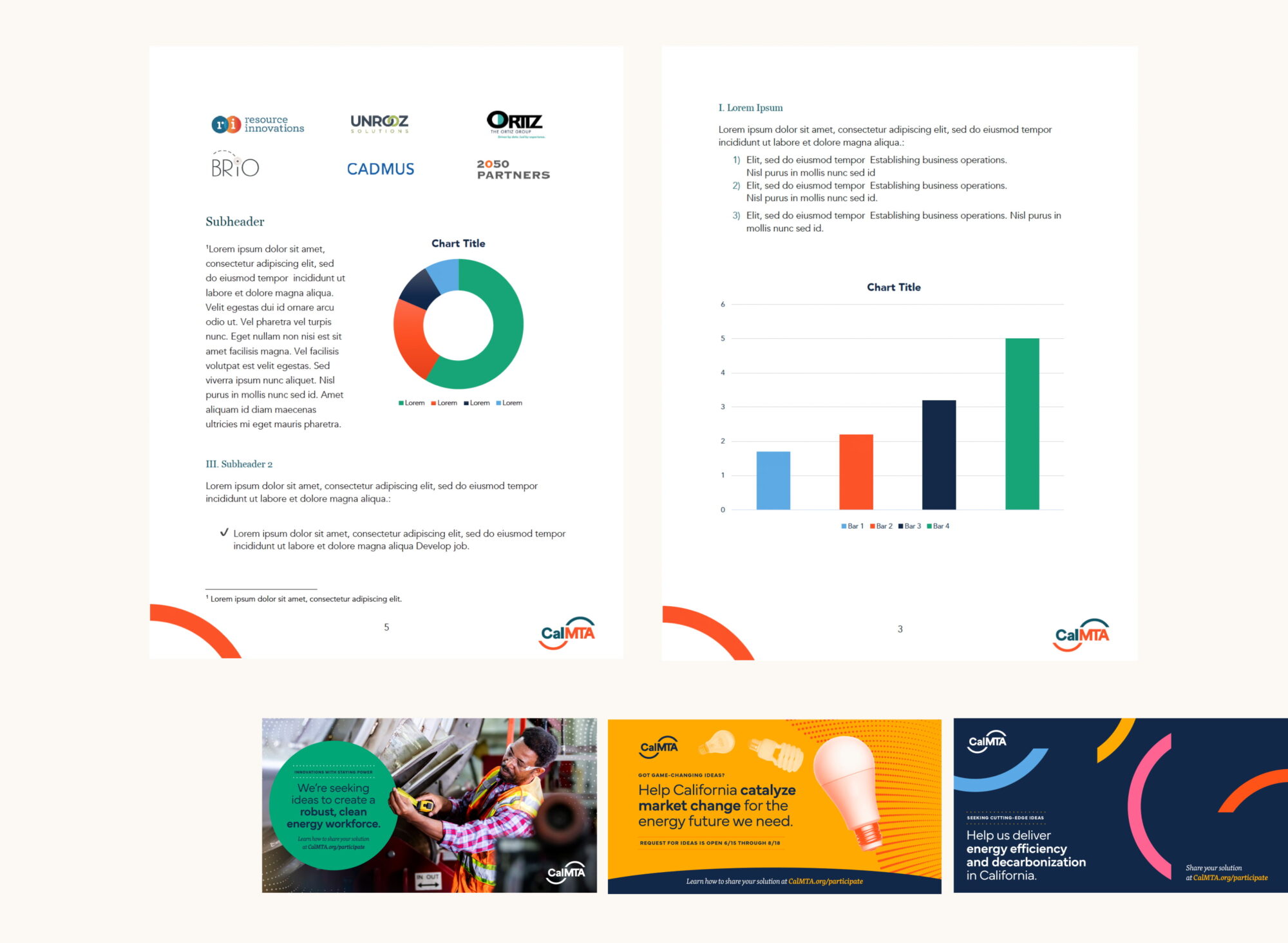
The brand quickly expanded to include secondary and tertiary color palettes to support CalMTA’s data visualization. We were met with a challenge to create a dynamic palette while still maintaining brand consistency. We also developed a series of icons for use throughout CalMTA’s materials, which strike a balance between simplicity and complexity. This suite of custom icons helps to visually explain some of their key terminology and concepts throughout the materials.

CalMTA opted to build their website using our Archie platform, due to its nimbleness in being quick-to-launch, as well as being easy for the team to administer content. The site started off with a few pages and has grown with CalMTA, accommodating the need for more content. They’ve expanded the site to have more reports, resources, details on their Market Transformation Initiatives and more. The site leverages some of Archie’s core features such as the resources and news modules as well as the platform’s flexible components.
