Since 1990, Adoptions Together had been one of the most trusted adoption and family services organizations in the DC-Maryland region. Over time, their services expanded to include counseling, foster care, and post-adoption support under a sister organization called FamilyWorks Together. Research showed that the two organizations were splitting brand recognition, and their relationship to each other was confusing. It was time to merge as one organization. The question wasn’t just what to call the new organization. It was how to honor the equity built in both names while building something that could represent everything the combined organization had become, and aspired to be.
RESEARCH & DISCOVERY
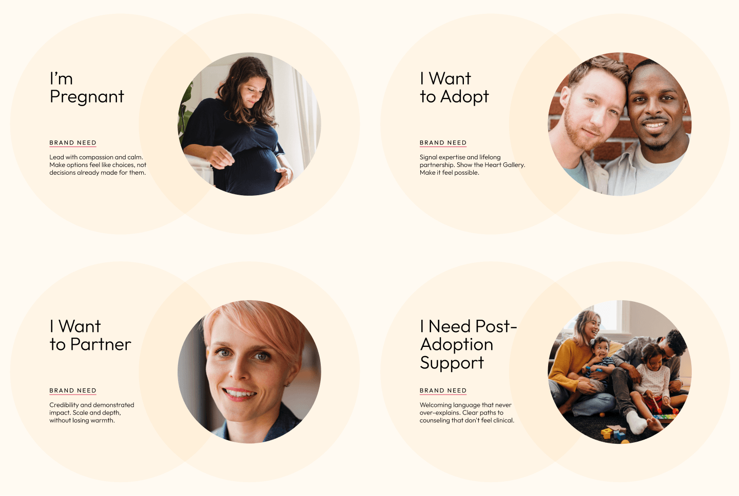
Meeting families where they actually are
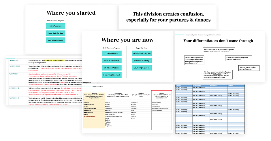
Before a single mark was drawn, Teal led a discovery process, interviewing staff and leadership, auditing existing brand assets, reviewing survey data, and conducting a competitive landscape analysis. Four distinct audience personas emerged from that work and shaped every design and messaging decision that followed, determining how the website would be structured, how navigation language would guide visitors, and which brand attributes needed to flex across different contexts.
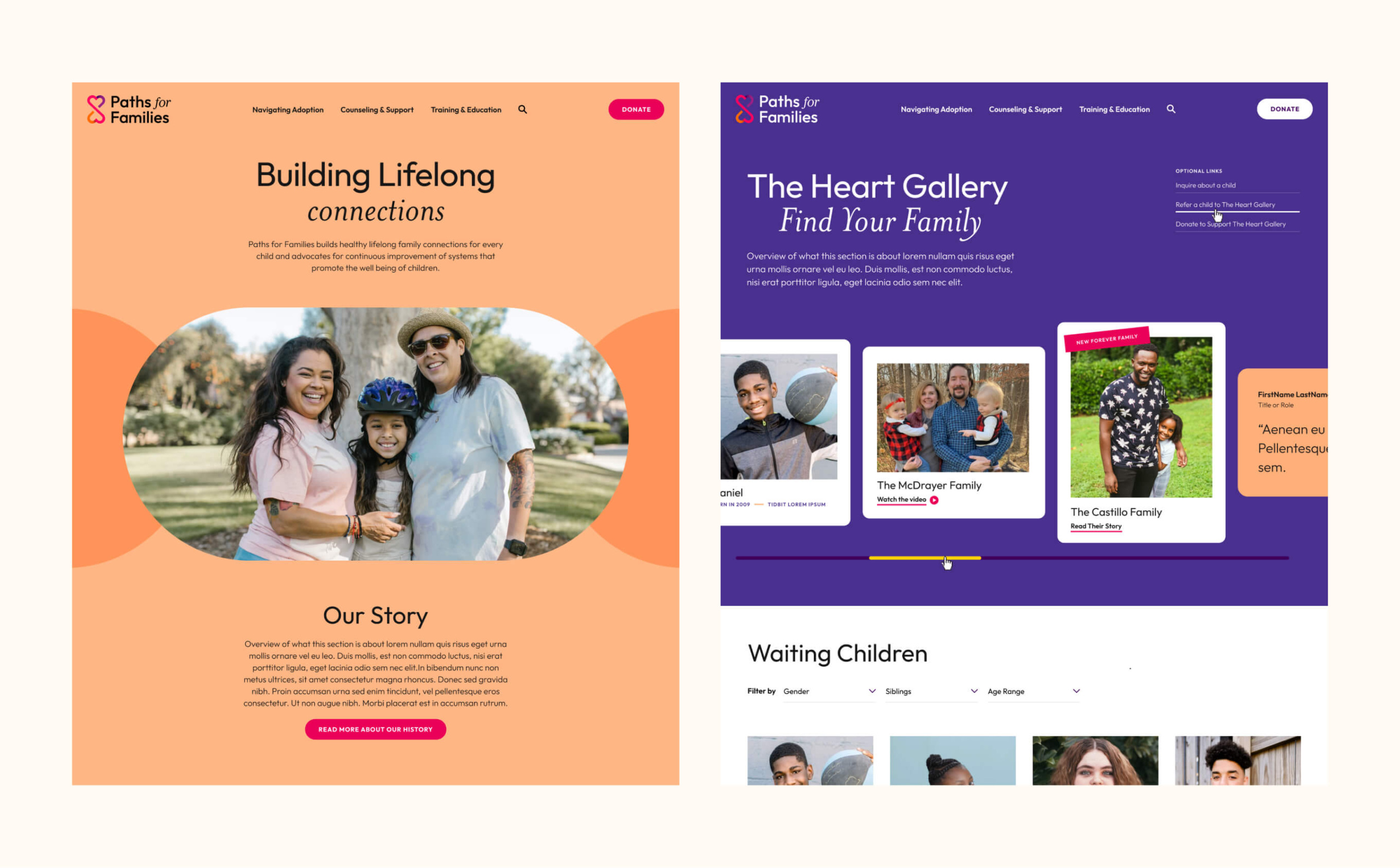
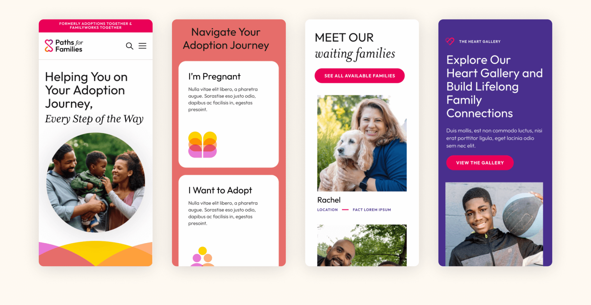
These personas weren’t decorative. They drove real architecture decisions in the website plan — including the “Navigating Adoption” mega menu, structured specifically around audience entry points rather than internal program names. A pregnant person doesn’t search for “placement services.” She searches for someone who understands what she’s going through.
Naming Process
A new name for a new brand architecture
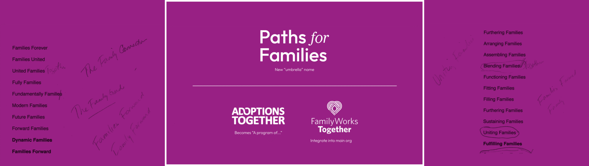
Renaming a 30-year-old organization is one of the most consequential decisions in brand strategy. Teal facilitated name generation workshops with staff and leadership, presented recommendations to the board, and ran a structured testing and selection process before a final name was chosen.
The naming decision also required a careful transition strategy. “Adoptions Together” carried deep recognition among hospital staff — often the first point of contact for expectant mothers navigating adoption decisions — and needed to remain findable by adoptees seeking records decades later. The solution was to retain Adoptions Together as a named program within the new structure, with SEO language, URL redirects, and staff email aliases maintaining continuity across the transition.
Brand Strategy & Messaging
From workshops to words people actually use
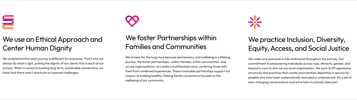
Through a series of stakeholder interviews and facilitated workshops with Paths leadership and staff, Teal developed the strategic foundation that would anchor every decision that followed. Three core values the organization was already living were now given language precise enough to guide everything from a donor pitch to an intake call with a scared teenager.
Those values then shaped how the brand’s personality, voice, and design attributes flex across audiences. With the framework in place, Teal developed a complete brand messaging guide, giving Paths a coherent, consistent answer to the question every staff member eventually faces: how do we talk about who we are?
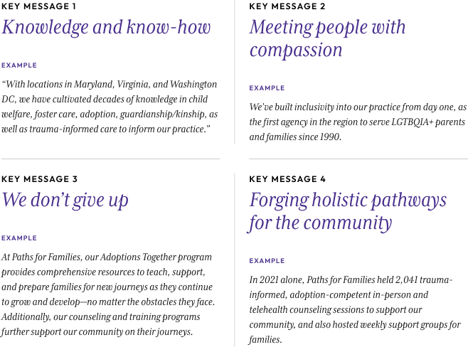
Four key messages give staff, leadership, donors, and partners a shared vocabulary for talking about Paths, with example language that shows how to flex the message across varied audiences
Visual Identity
A mark that carries more than it shows
Two creative directions were developed: one free-flowing and organic, built around soft shapes and saturated color; one more structured and textured, using linework and grid to convey depth. The selected direction, Free Flowing, Solid & Bright, led to the mark that became Paths for Families.
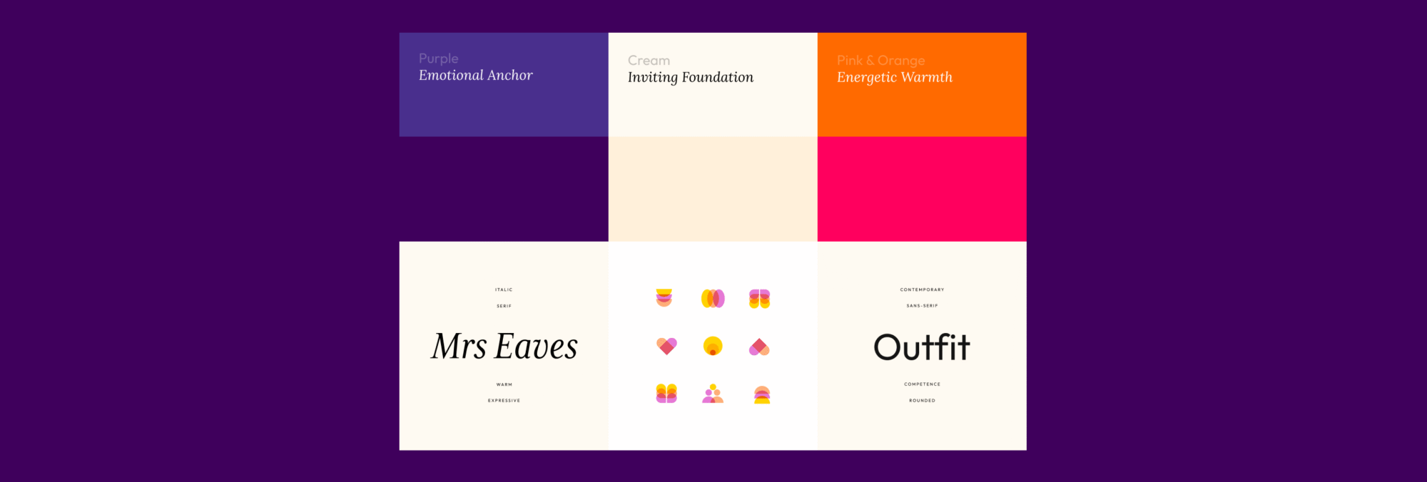
The icon is two interlocking hearts tracing an infinity symbol — a direct echo of the infinity symbol embedded in the original Adoptions Together logo. Two hearts: two organizations, two people building a family, the infinite continuity of that commitment. The gradient moves from pink through deep purple to orange, preserving the legacy purple that had accumulated meaning over 30 years while also introducing a warmer energy that shifts the overall tone from institutional to inviting. Purple’s role here isn’t coincidental. Abandoning it would have been a strategic loss. Instead, it was honored as the brand’s emotional anchor while the warm complementary palette does the work of making the new brand feel forward-looking and human.
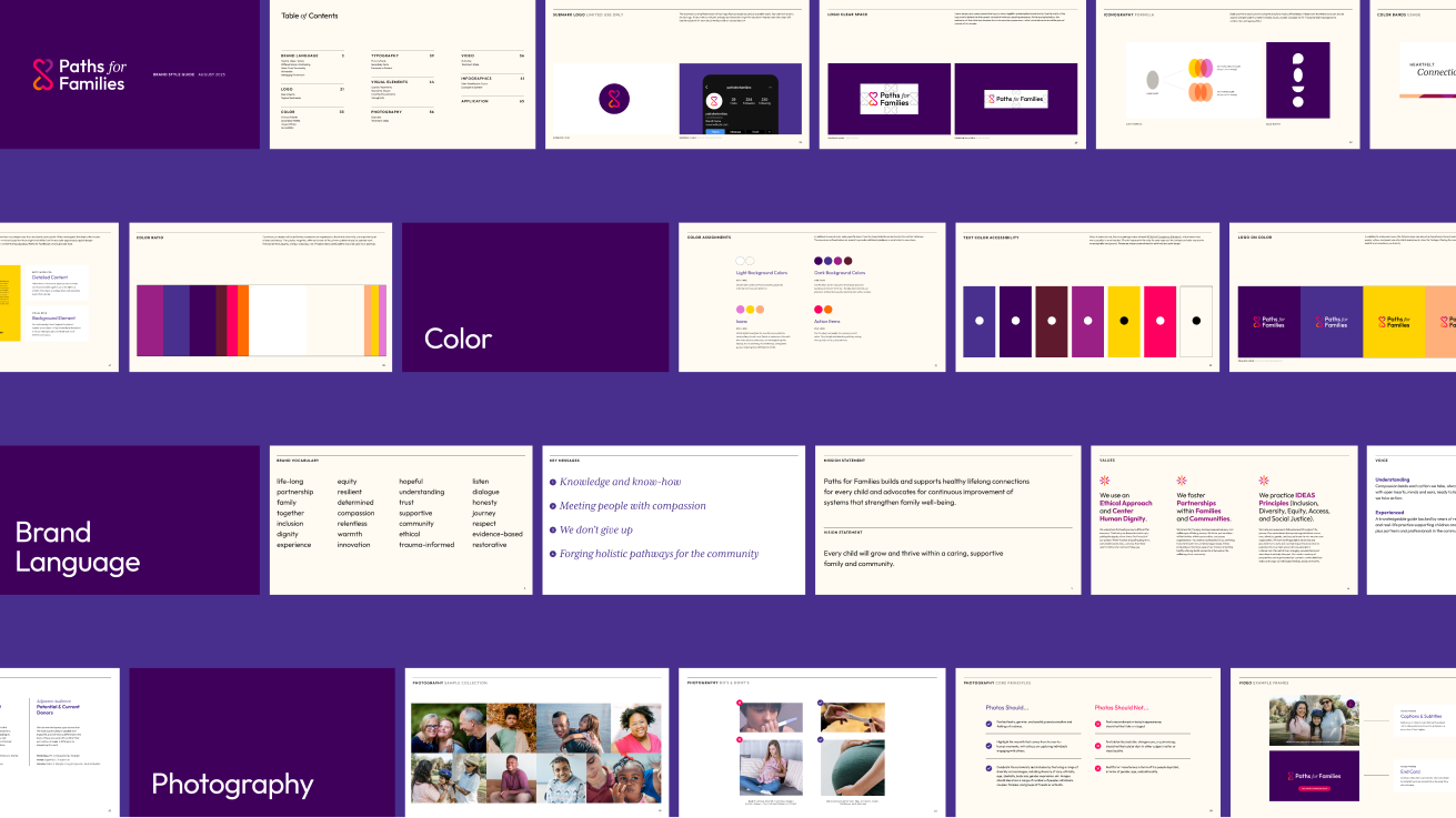
That palette, built in workshop sessions alongside the Paths team, operates across the full emotional register the organization needs. Deep purple anchors major communications. Pinks and oranges bring energy and warmth to family-facing surfaces. Cream provides a soft, inviting foundation across digital and print. The type system holds the same tension: a rounded contemporary sans-serif for the wordmark and UI paired with an expressive italic serif for headlines. The sans conveys competence, the italic brings the warmth that families actually feel when they read it.
WEBSITE ARCHITECTURE & DESIGN
A website as expansive as the mission
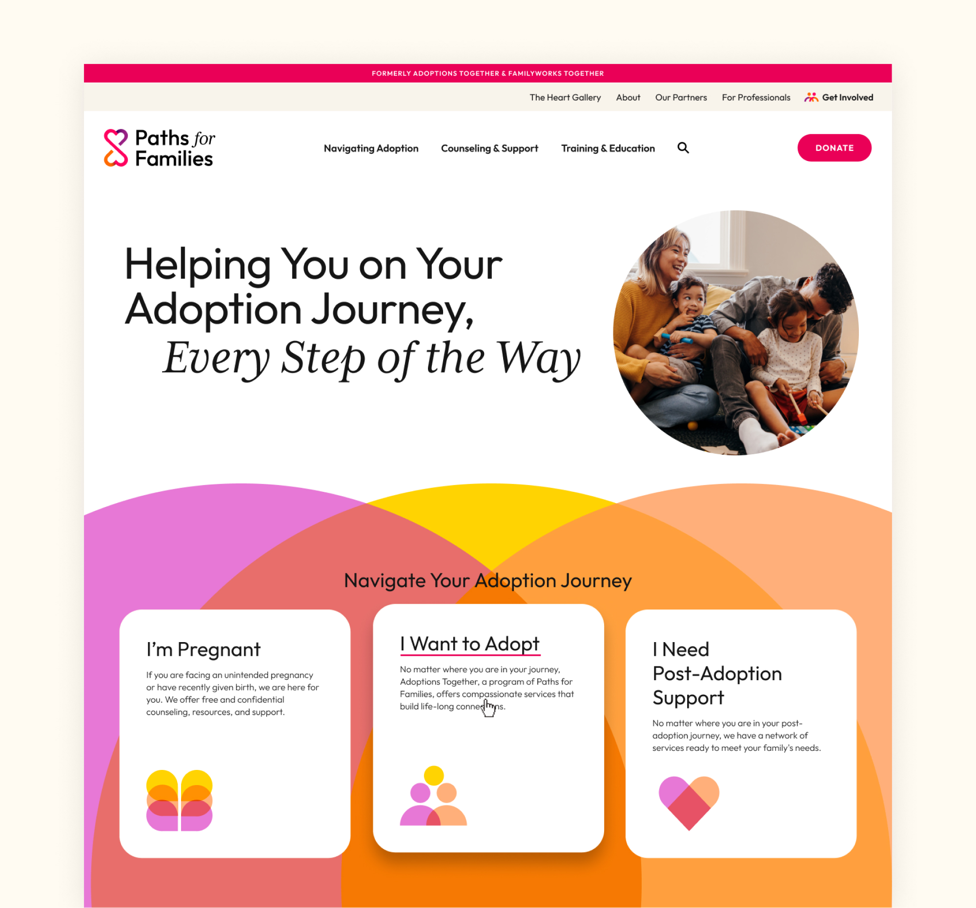
The Paths for Families website was designed around a single principle: meet every visitor in their moment. Whether someone arrives searching for adoption guidance, post-placement support, or a way to give, the site creates a clear and immediate sense of belonging. We created navigation language from the visitor’s perspective rather than the organization’s internal vocabulary, and the overall architecture reflects the same audience-first thinking that shaped the brand strategy.
Visually, the site brings the full energy of the brand to life: warm photography, the gradient icon system, and a type pairing that balances authority with approachability. We paid particular care to The Heart Gallery, which was designed to honor each child’s full humanity rather than reducing them to a profile listing. The result is a website that feels as expansive as the organization it represents.
A SMOOTH INTRODUCTION
Change management as a deliverable
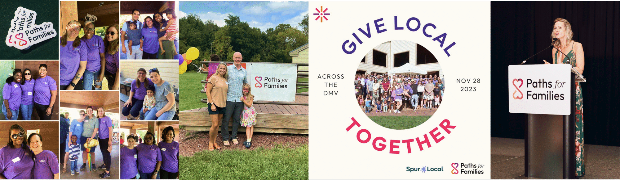
Most agencies design the brand and hand over a PDF. Teal delivered a full staff training and rollout program. We delivered a formal presentation led jointly with Paths’ CEO and Operations Director that covered brand strategy, visual design, messaging architecture, and the very practical question of how to answer the phone starting September 26th.
Paths for Families launched with a unified identity, a new website, a full staff trained as brand ambassadors, and a communications rollout coordinated across PR, social, and stakeholder channels. The brand now operates across a complete collateral suite including business cards, letterhead, slide templates, staff badges, and email signatures, all differentiated by program while unified under a single visual system. Adoptions Together kept its name as a program, its dedicated collateral, and its search equity. The Heart Gallery has a platform worthy of the children it features. And an organization that had been two separate brands for decades now speaks in one voice that is warm, knowledgeable, and built for the long haul.
We knew we needed a partner who could navigate the complexity of our work, multiple audiences, deeply personal services, and over 30 years of brand equity to honor. Teal was that partner. Working with Teal transformed not just our brand, but how we see ourselves as an organization.
Audra Hurd
Director of IT and Operations
Links
Issues
Services
Teal Media is a woman-led creative agency that builds brands and websites for nonprofits, foundations, and mission-driven organizations. We have a core presence in Washington, DC and Detroit, MI.
An annual publication by Theirworld Global Youth Ambassadors highlighting education challenges, barriers, and solutions from communities around the world.
Let’s do this.
The part where we ask you to cough up your email. So we can discuss all the amazing things we’re gonna do together. No pressure. Really.