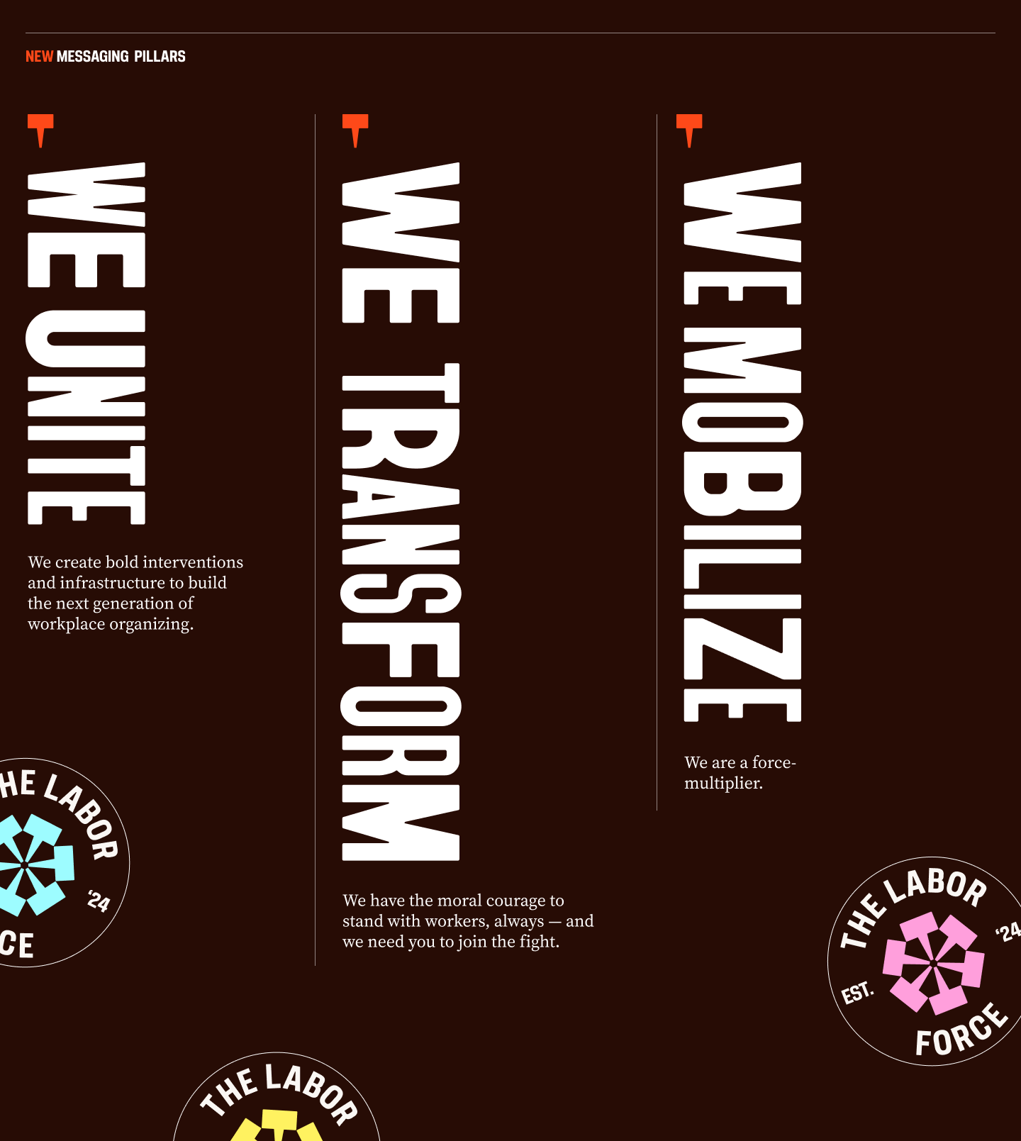
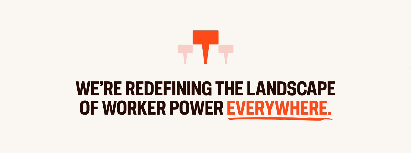
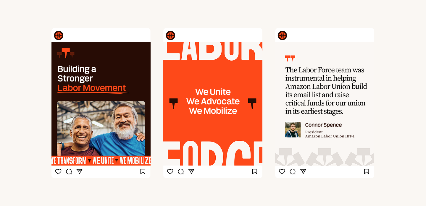
Michigan Hunger Study
Transforming the first statewide assessment of charitable food assistance since 2014 into an interactive digital experience
Work
The Labor Force (TLF) launched in 2024 with an ambitious mandate: unite workers, allies, and activists across the entire U.S. labor movement — not just union members, not just one affiliation, but everyone. The organization had grown fast and was doing serious work, but the brand hadn’t kept up with the scope of what The Labor Force had become.
What The Labor Force had was a brand assembled without budget or outside support. That scrappiness was fitting for a soft launch, but the organization had since raised more than $600K for labor campaigns, grown a community of 200,000+ subscribers, and was forging partnerships with major national unions. The identity hadn’t kept pace. It looked like many other orgs in the space: protest imagery, raised fists, the familiar visual grammar of traditional organizing. Nothing about it signaled that TLF was building something genuinely different: a laboratory for new tools, strategies, and infrastructure for the labor movement.
Without a brand that immediately communicated TLF’s scope, sophistication, and unapologetic point of view, the organization risked being misread as another advocacy group rather than what it actually is: the R&D engine and force-multiplier the modern labor movement is missing.
The kickoff call surfaced a diagnostic problem that would shape everything downstream: TLF’s existing messaging felt “spotty” and needed to do three distinct jobs simultaneously: position the organization as a shared fight (not a charity), clarify that it’s independent of the Democratic Party, and express values that are universal enough to reach workers across every affiliation and sector.
Teal conducted a brand discovery survey with TLF’s core team and a brand strategy engagement that examined existing messaging, competitive positioning, and audience needs across three distinct groups: small donors and activists, funders, and labor union staff and leaders. The key insight that emerged: TLF’s uniqueness wasn’t in any single program — it was in the combination. No other organization provides pro-bono capacity building to independent unions and incubates movement-wide infrastructure and runs public advocacy campaigns for the entire labor movement, regardless of jurisdiction or affiliation. Each area of work reinforces the other two. The brand needed to encode that integration, not just describe the programs separately.
That insight drove both the messaging architecture and the visual brief: the brand had to feel battle-tested and inside the movement while signaling that TLF is pioneering something the movement hasn’t seen before.
The original messaging described TLF’s work accurately but positioned the organization as a provider of services rather than a participant in a shared struggle. The rebrand needed language that put TLF in the movement, not above it.
Teal developed a messaging framework built around three strategic pillars, We Unite, We Transform, We Mobilize, each structured as a “we” statement that collapses the distance between TLF and its audiences. The “We Unite” pillar was specifically engineered to address the charity problem: “We see you. We hear you. We ARE you.” The “We Transform” pillar named TLF’s differentiator directly — that the most critical fight of this generation cannot be won with outdated tactics — and gave funders and union partners a clear reason to engage beyond general solidarity. A new vision statement replaced the original’s internal focus with external momentum: not just describing TLF’s approach, but declaring the stakes.
The messaging architecture also resolved a structural tension: TLF’s three program areas (public advocacy, pro-bono union support, and innovation/infrastructure) had previously been described in parallel, which undersold the integration. The new framework presents them as a unified theory of how worker power actually gets built.
The visual brief explored two directions — a gritty, heritage-inspired Rugged Collage and an energetic Bold Brutalism — before landing on a final identity that carries the urgency and structural boldness of the second concept with the authenticity and warmth of the first.
The logo is built on a single repeating icon — a mark that reads simultaneously as a picket sign and a speech bubble. The idea it encodes is simple and load-bearing: everyone has a voice, everyone has a seat at the table, and the whole is exponentially more powerful than any individual part. That single unit becomes the system. Repeated, it forms the wordmark. Extended further, it becomes a pattern, a texture, a visual language that scales from an Instagram post to a picket line banner without losing its identity. The aesthetic is indebted to historic labor union badges but stripped of nostalgia: geometric, bold, and built for screens and streets alike.
VTC Bayard, a font inspired by the signage at the 1963 March on Washington, was retained from the original identity as a secondary display face, connecting TLF’s new brand to labor movement history while the updated sans-serif system carries the modern urgency of the work forward. The orange stays. It’s a few clicks off from labor’s traditional red: close enough to signal belonging, distinct enough to signal difference.
The visual system extends the “collective strength” idea beyond the logo into every touchpoint. The palette is built around large washes of dark orange — immersive, urgent, designed to demand attention — balanced by lighter accents that keep the system from feeling heavy for audiences who need to feel welcomed, not mobilized. Photography centers real workers in real moments, not stock imagery. The philosophy mirrors the brand personality: authenticity and urgency are not in tension, they’re the same thing.
The graphic system gives the brand room to be loud when the moment calls for it — high-contrast typographic lockups, bold calls to action, data presented as declaration — while the underlying component logic keeps everything cohesive across social content, merch, and digital. The brand had to perform across three very different audiences arriving with different expectations, from grassroots activists on Instagram to foundation program officers doing due diligence. The system holds all of them.
Working with Teal was a real turning point for us. They took the time to understand what we're building at The Labor Force and turned it into a brand that's rooted in labor and built for this moment. What stood out was how thoughtfully they honored labor's visual history, from union bugs to classic organizing imagery, while still making it feel fresh. They listened to our feedback and every iteration came back sharper.
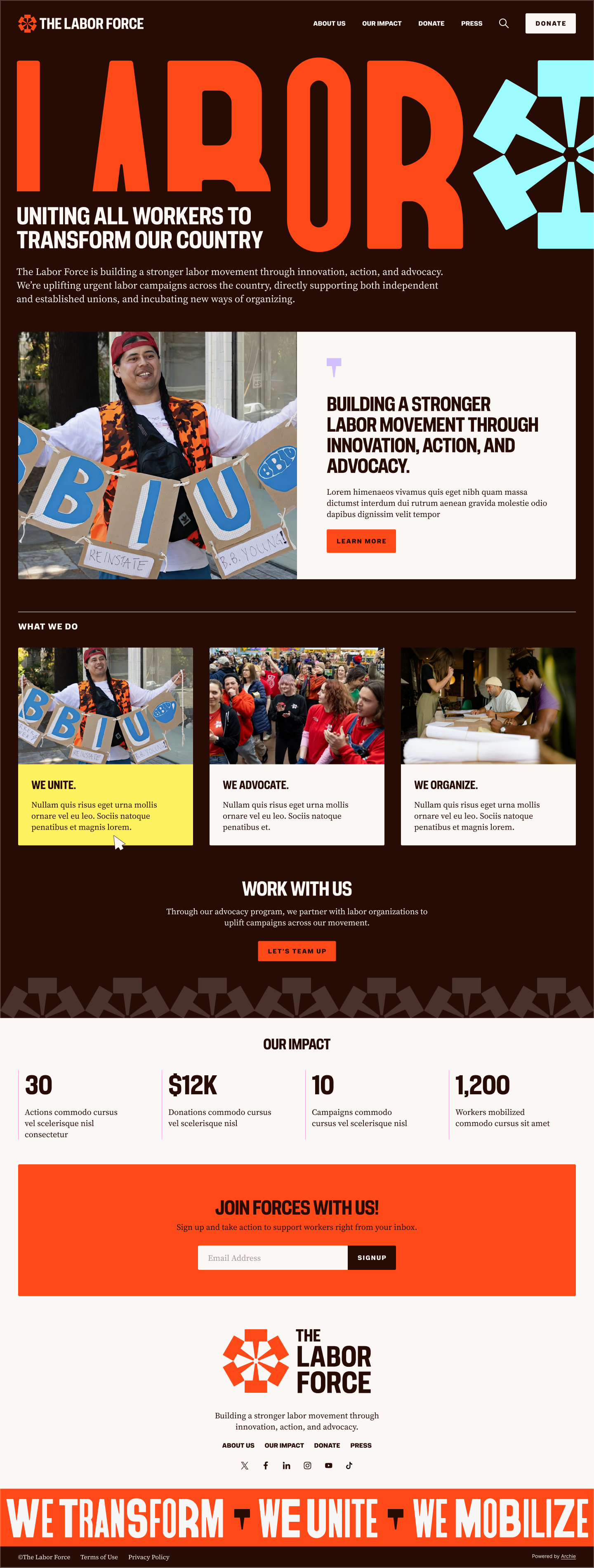
The site serves multiple distinct audiences arriving with different intentions: workers and activists ready to take action, union organizers seeking a strategic partner, and funders and press trying to understand who TLF is and what it’s built. The architecture flows directly from the three messaging pillars, which structure both the content hierarchy and the visitor journey. The navigation was distilled to plain-language actions — About, Advocacy, Take Action — with no org-chart logic and no insider vocabulary required to find what you need.
The homepage is built around momentum. It opens with the mission, grounds it immediately in real impact (350K activists, $937K redistributed, 1M+ actions taken), and routes visitors toward action without burying the organization’s story under program descriptions. The “Take Action” pathway is elevated throughout the site so that mobilization is never more than one decision away, regardless of where a visitor enters. Built on Teal’s Archie platform, the site gives TLF’s small team the ability to manage content independently as the organization grows.
Since launching the new branding and website, The Labor Force team has noticed a difference in the way they’re perceived by peers and funders alike — the team shared they just landed their first big foundation grant.
The Labor Force went from a burgeoning identity that blended into the landscape to a brand that declares its position — as a laboratory, a force-multiplier, and an unstoppable collective — before anyone reads a word of copy. That’s what the work was built to do.
The new branding and website have made a real difference. We show up in coalition spaces and stakeholder meetings with a presence that matches the seriousness of our work. There's a clear before-and-after in how people perceive us, and that's opened doors. If you're looking for a design team that gets movement work, Teal is the one.
Transforming the first statewide assessment of charitable food assistance since 2014 into an interactive digital experience
The part where we ask you to cough up your email. So we can discuss all the amazing things we’re gonna do together. No pressure. Really.