Public Citizen had a dated website that was inflexible, disorganized, difficult to manage, and aesthetically outdated. Audiences also avoided the site because it did not function on mobile, was difficult to navigate, and was overwhelmed with walls of content. Staff avoided updating it because the back end was a hassle. Over time, this resulted in a lack of an organization-wide digital strategy, dated content, and a disengaged audience. That’s when Public Citizen turned to Teal.
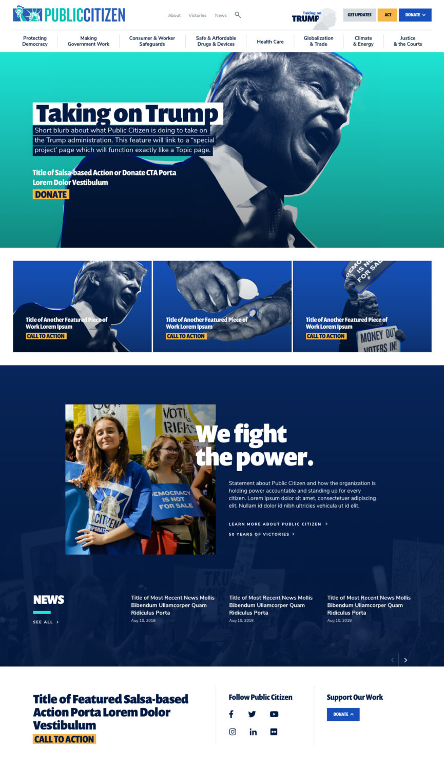
Teal completely overhauled the user experience, look-and-feel, and infrastructure of Public Citizen’s website. The end result is a website that clearly communicates who Public Citizen is and what they do, is easy to navigate, and makes it clear to users how they can get involved and offer their support, all with a bold look-and-feel that is as aggressive and unapologetic as the organization itself.
In order to develop a unified strategy for the website, we led conversations with internal stakeholders to identify where we could remove roadblocks, streamline processes, and introduce consistency. We also talked directly with Public Citizen’s audiences to understand what they needed from the website and how a new digital presence for Public Citizen could inspire them to get more involved. We matched up internal requirements with audience needs to establish the foundation for the new Public Citizen website.
Together with the team at Public Citizen, we crafted a solution that features:
- An overall strategy focused on driving people to action. Our strategy for the website supports Public Citizen’s larger digital engagement strategy, which is powered by email and social media, and focused on bringing a younger audience into the fold.
- A bold look-and-feel that matches Public Citizen’s unapologetic tone and style of work
- A clear information hierarchy and navigation system – site visitors can simply glance at the main navigation and understand the issues that Public Citizen is working on
- A streamlined user experience that ensures visitors can access Public Citizens content in three clicks or less
- An intuitive back-end with flexible page template and modules that make it easy for Public Citizen staff to manage content and create new pages and campaigns
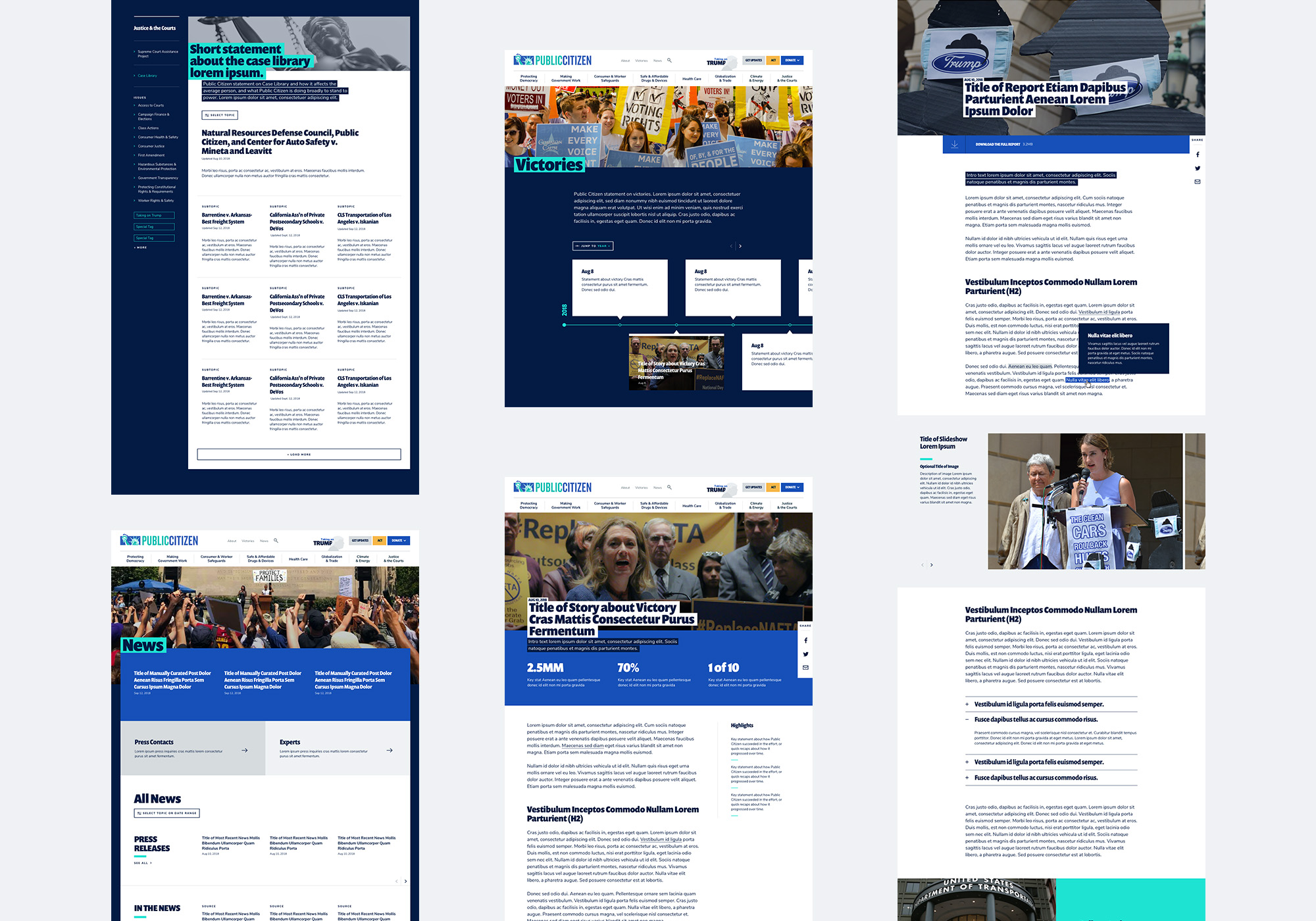
- A custom In-Depth Reports template for long-form content, with components for video, slideshows, infographics, pull quotes, tooltips, expand/collapse units, and more
- Easy way for people to see a variety of opportunities to take action, with differing levels of commitment.
The new site is easy for Public Citizen staff across all departments to maintain and update, ensuring that it stays current, fresh, and relevant to everyone who cares about taking a stand to protect consumers and our democratic values.
I am in awe of how smooth this all went and how much fun we had in the process! The staff here are so excited and I for one had underestimated how much of an impact this revamp would have.