
The National Domestic Violence Hotline provides tools and support to survivors of domestic violence so they can live their lives free of abuse. Their old website was text-heavy and hard to navigate, which slowed down access to critical tools and information for people in moments of crisis. They wanted to redesign their primary web presence and their website for love is respect, an initiative that teaches teens about healthy relationships. Both sites needed to be fully available in English and Spanish, with close attention paid to privacy, security, and accessibility.
In close partnership with the team at the Hotline, Teal created a core design system that we applied across all four websites, streamlining the experience of accessing help. The solution we crafted is driven by the needs of users, easy to navigate, and makes the Hotline’s resources and support easy for survivors to find and use.
A user-informed solution
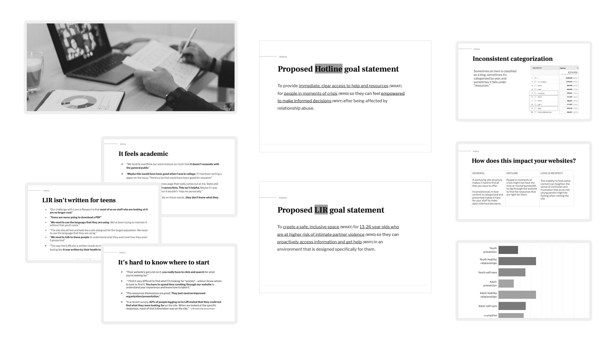
As with most of our website redesign projects, we began with user research. Through learning sessions with the Hotline’s internal stakeholders and external audiences, we gained a strong understanding of what users wanted from a visit to the Hotline or love is respect website.
Some of our findings that informed our website plan included:
- The sites were organized poorly and had an overwhelming amount of content on each page, which made it hard for users to know how to find information or resources.
- Users want the Hotline and love is respect sites to feel safe, warm, and personal. Visitors to these websites are often arriving during moments of confusion or crisis, and they’re looking for an experience that offers support and guidance.
- Users also want to feel empowered! They aren’t interested in an online experience that classifies or treats them as “victims.”
- Interactive content is key! Visitors to these sites were likelier to engage and explore if they were offered content that was visual and highly interactive.
Offering quick access to help and answers
Our research showed that website visitors need quick help and answers. So we created an overarching site framework shared by both websites that organizes content by users’ most pressing questions, allowing audiences to easily find a path to answers and resources.
Our aim was to create a site structure that feels approachable, accessible, and easy to digest, with a clean page layout, large headlines, and plain language. The ultimate goal was to remove any barriers that stood in the way of people in moments of crisis to get the help they need.
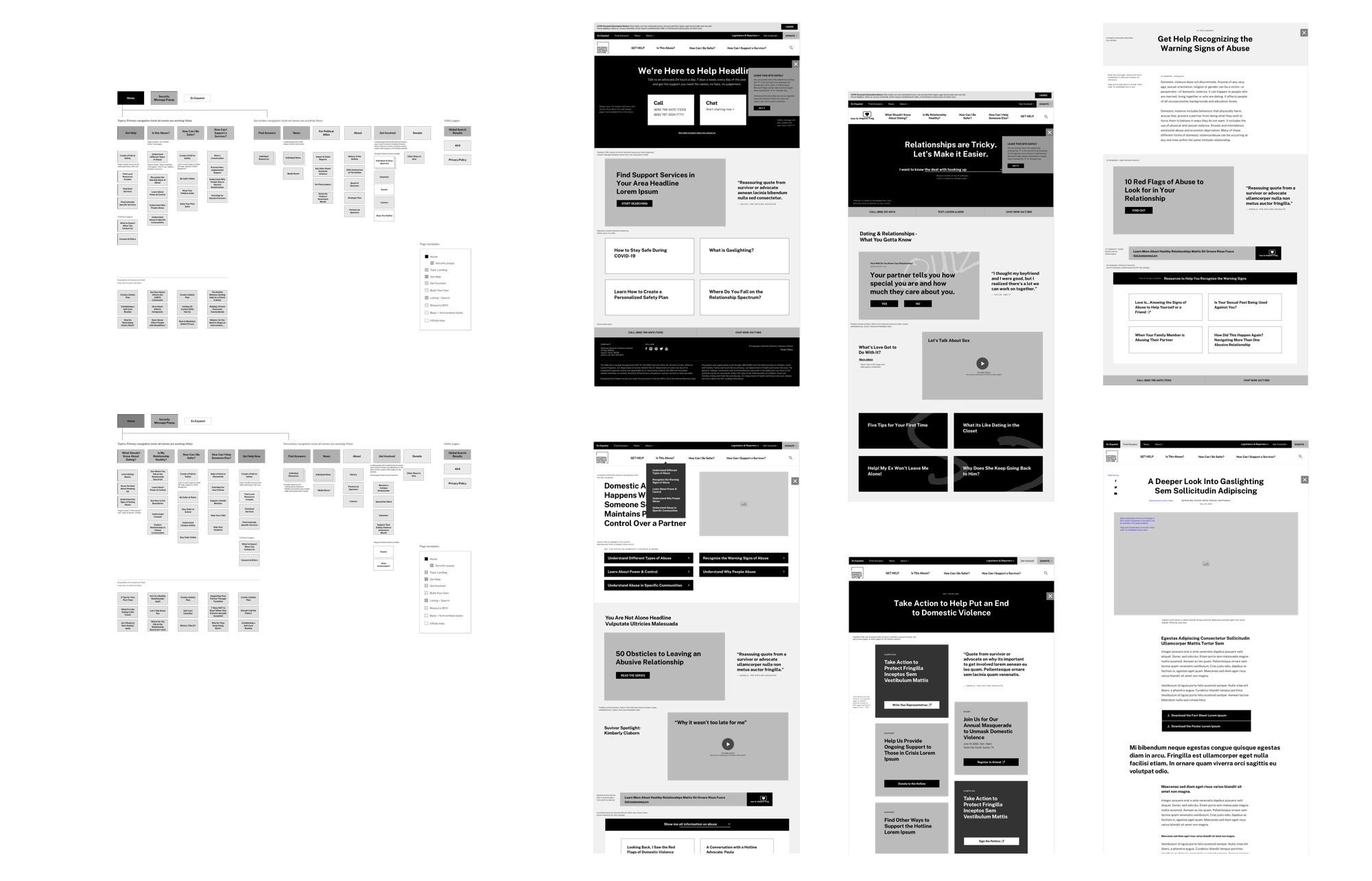
4The websites for the Hotline and love is respect share the same basic architecture, which offers consistency across the sites. We utilized universal page templates with flexible “build your own” components that give the Hotline team the flexibility they need to create new content. The primary differences between the sites are the visual design, on-page content, and select interactive features.
Two distinct visual identities
With a shared overarching site structure between The Hotline and love is respect, we knew we needed to introduce a strong visual differentiation between the websites.
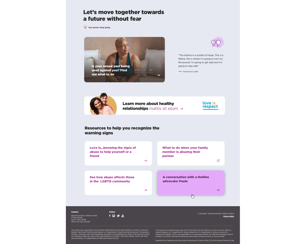
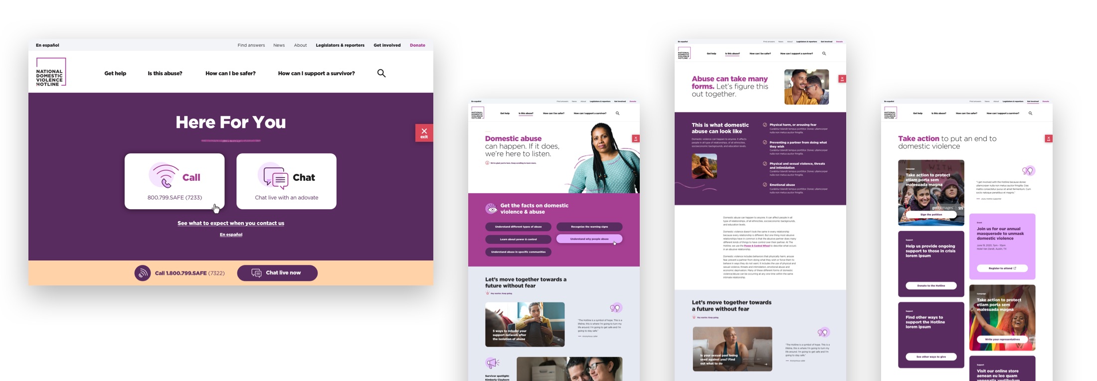
The Hotline visual brand was geared toward a more mature audience that needs immediate help. We crafted a visual brand that feels strong, hopeful, empowering, and warm, to indicate that the Hotline is the go-to place for survivors looking for support and guidance.
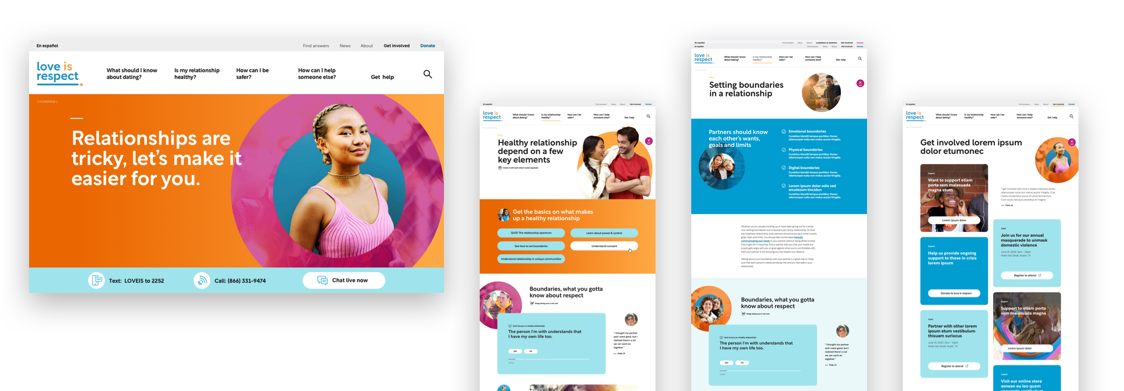
In contrast, love is respect offers information for teens who want to learn about what healthy relationships look like. Its visuals needed to be spirited, courageous, youthful, edgy, and approachable. A confident and welcoming tone lets younger users feel like they have the freedom to ask questions, and the power to make their own decisions.
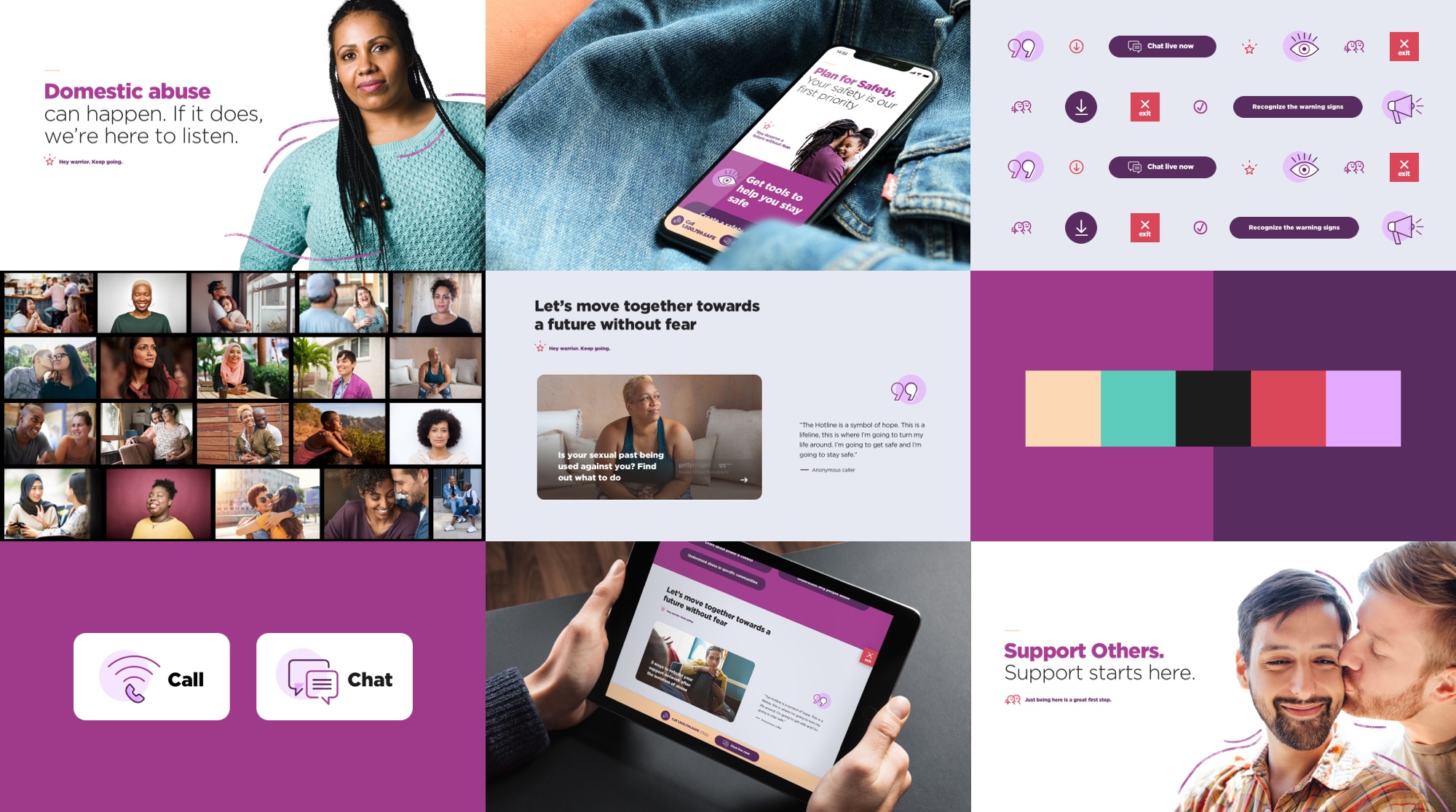
The expanded visual identity for the Hotline needed to express a sense of clarity, reassurance, and hope, and convey the message that “you’re not alone.” Teal incorporated shades of purples and plums paired with lighter tones of peach and green to allow the color palette to feel strong, yet uplifting. The rich colors are balanced with ample white space, and punctuated with strong “energy lines” that provide encouraging messages to users. Teal also introduced a photography style with a warm, diverse, community-oriented focus to reinforce the message that no one is alone on this journey.
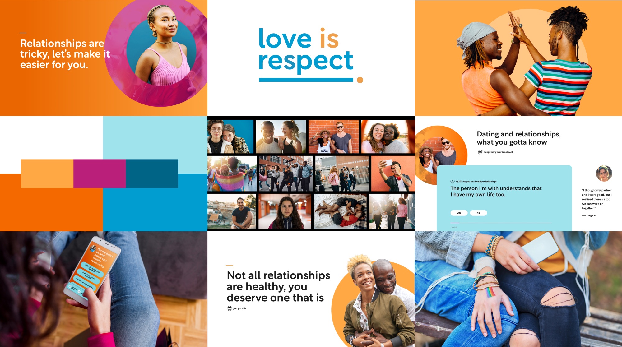
The new love is respect brand expands on their existing brand guidelines and incorporates heavy use of the period and circle. When applied to the logo, this becomes a symbol of disruption and prevention. The heavy use of the circular shape is also a nod to the fact that learning about healthy relationships is a long-term and ongoing process. We incorporated that element as anchoring feature to the key sections of content across the site.
Creating a holistic design system
To maximize budget and timeline, Teal developed a code base that is shared across the English and Spanish versions of the Hotline and love is respect websites. The websites all have a “safety escape” feature that allows visitors to quickly exit if they are in a threatening situation. Each site leverages ElasticSearch, a suggestive search tool, to help users who know exactly what they’re looking for, and incorporates interactive features like live chat, quizzes, and an interactive safety plan.
A Flexible Shared Code Platform
The flexible page-building components that we created enable the Hotline team to create unique page layouts that feel authentic to each brand and help the Hotline and love is respect teams to meet the needs of all of their diverse audiences.
The page-building components Teal developed enable the team at the Hotline to create content that feels customized to the Hotline’s more mature audience.
On the love is respect site, the Hotline team is able to use the same component system to craft pages that feel authentic to love is respect’s target audience, which skews younger.
By doing the research and working in close collaboration with the team at the Hotline, Teal was able to create a sophisticated design system that carries through across multiple sites and is driven by the needs of the Hotline’s target audiences.