For 40 years, MAPS built the infrastructure the psychedelic renaissance runs on, and nobody outside the movement knew it. This campaign was built to change that.
The Challenge
They Started the Movement That Almost Left Them Behind
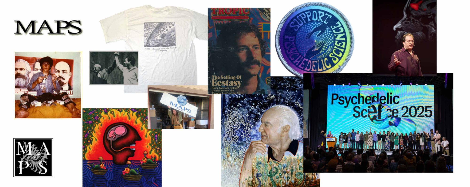
MAPS, the Multidisciplinary Association for Psychedelic Studies, revived banned research, fought decades of regulatory battles, and built the legal and scientific precedents that unlocked the entire psychedelic field. Without MAPS, there is no psychedelic renaissance. But as that renaissance turned into a multibillion-dollar industry, newer organizations with bigger marketing budgets and simpler stories were crowding the space — and the organization that made it possible was at risk of being overshadowed by the very movement it helped create.
As psychedelics commercialized, the field increasingly risked losing the equity, rigor, and public-benefit commitments that MAPS had spent 40 years defending. The 40th anniversary was a rare moment of leverage: a chance to stake their claim as the organization that built the infrastructure for it all and repositioning for the next era.
The Approach
The Movement Is Bigger Than Any One Organization — and That’s the Point
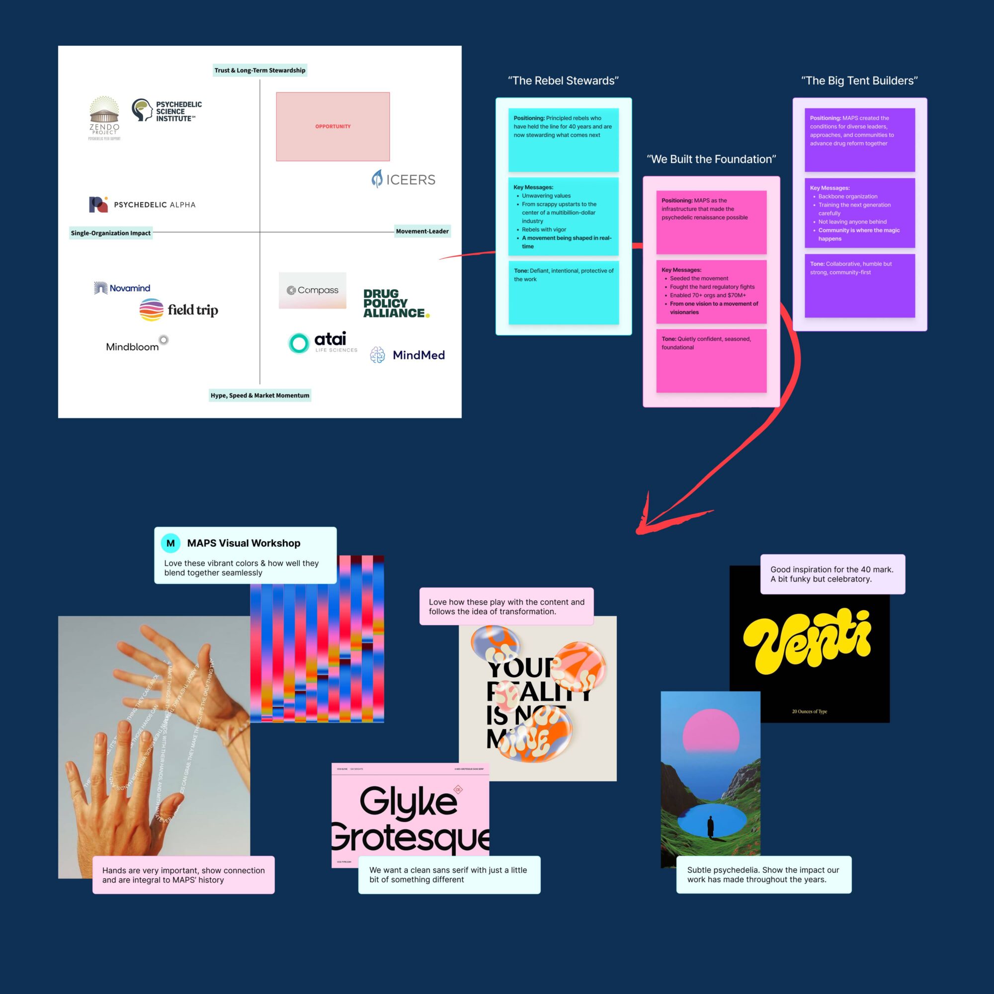
Teal’s discovery process, including stakeholder workshops, a team survey on success metrics, and deep analysis of MAPS’ positioning in the broader landscape, surfaced a tension that became the campaign’s organizing insight: MAPS has an instinct toward humility and collective credit that, left unchecked, was actually obscuring their irreplaceable role.
The psychedelic ecosystem is full of organizations doing important work. What MAPS does that no one else does is build the conditions for all of it: funding research, training therapists, shaping policy, convening the movement, and maintaining the principled standards the field depends on. Teal identified that the campaign’s job wasn’t to make MAPS bigger in the room. It was to help MAPS articulate, for the first time, what happens to the room without them. That insight shaped everything: the campaign theme, the visual system, and the tone. Bold enough to claim credit, yet grounded enough to center the movement MAPS built rather than the organization itself.
Holding Space for the Bigger Story
For an organization that had spent 40 years operating with principled humility, being asked to claim credit boldly was its own challenge. As we embarked on the creative work, departing from the existing brand more than some of the staff expected, MAPS needed more than a brand guide. They needed support navigating the internal shift a campaign like this requires.
Teal was there for that part of the work too. When feedback rounds surfaced anxieties, we helped the team reframe what they were seeing: not a replacement of who MAPS is, but a brand system capable of expressing the scale of what MAPS has achieved. That work, building the internal confidence to own their story, was as much a part of the deliverables as the campaign itself.
The Work
The Campaign Identity
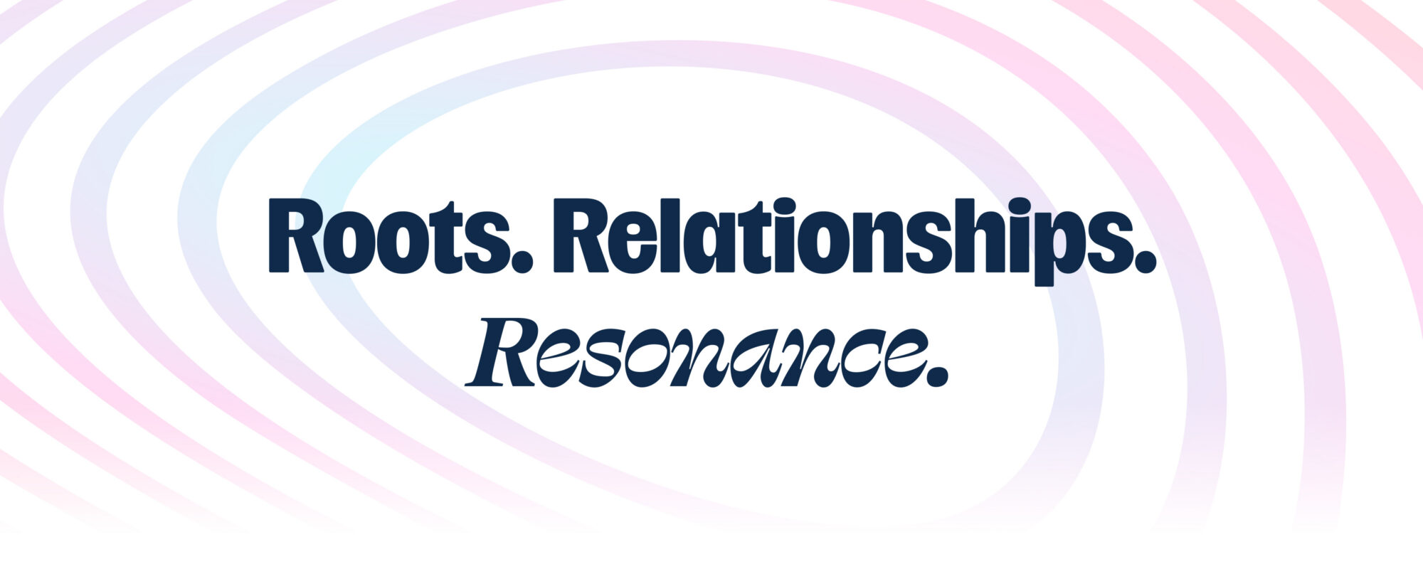
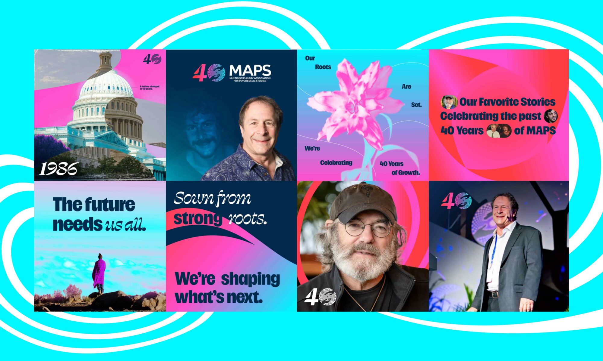
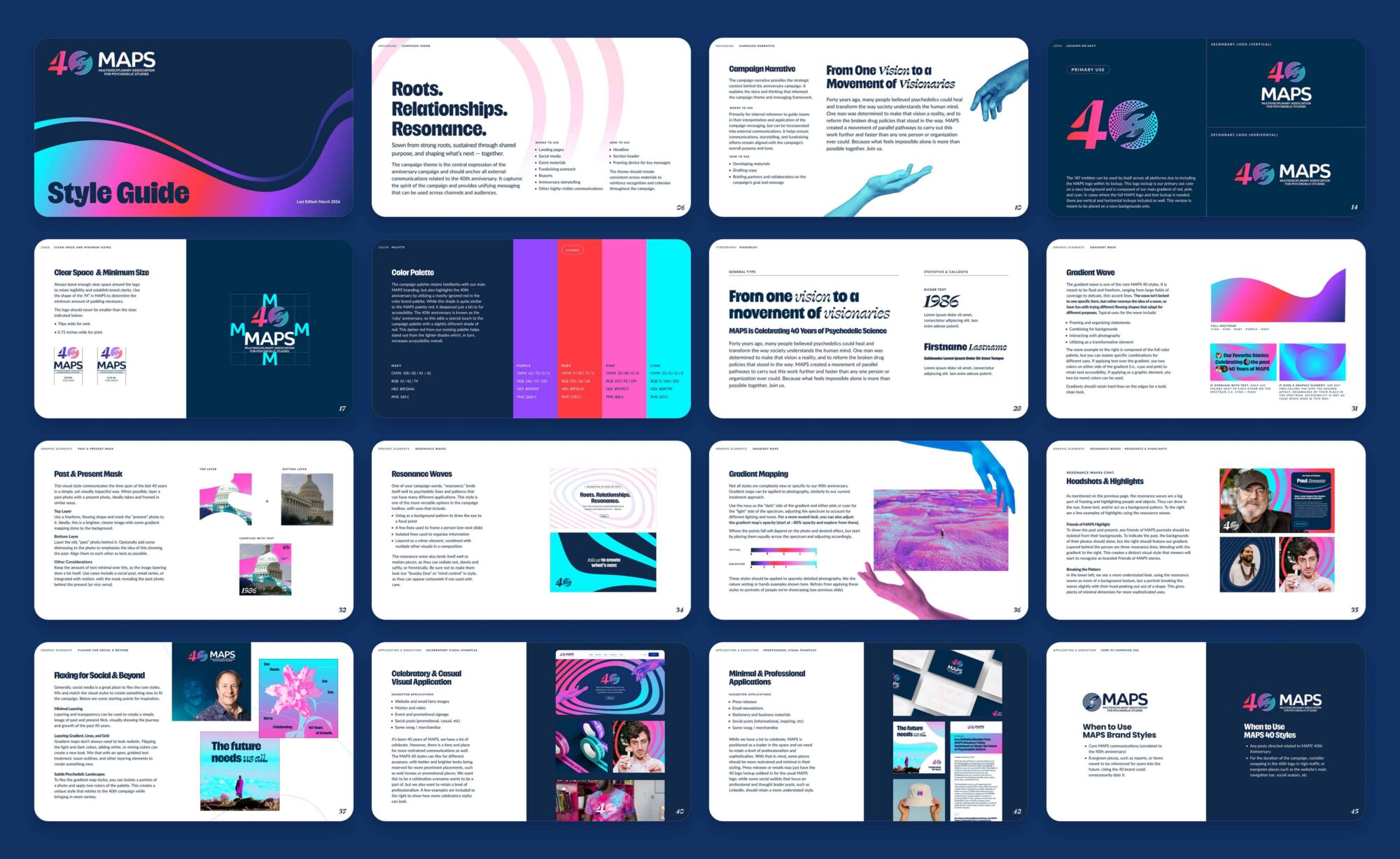
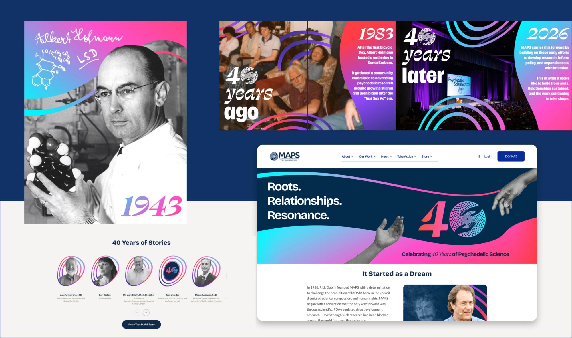
The campaign theme, “Roots. Relationships. Resonance.”, syncs directly to MAPS’ 40-year arc — the founding conviction that grounded the organization, the network built through decades of collaboration, and the ripple effect of work that has shaped an entire field. The theme also served as an umbrella for every deliverable that followed, giving both the messaging framework and the visual identity a single organizing idea to build from.
A Messaging Framework Built to Scale
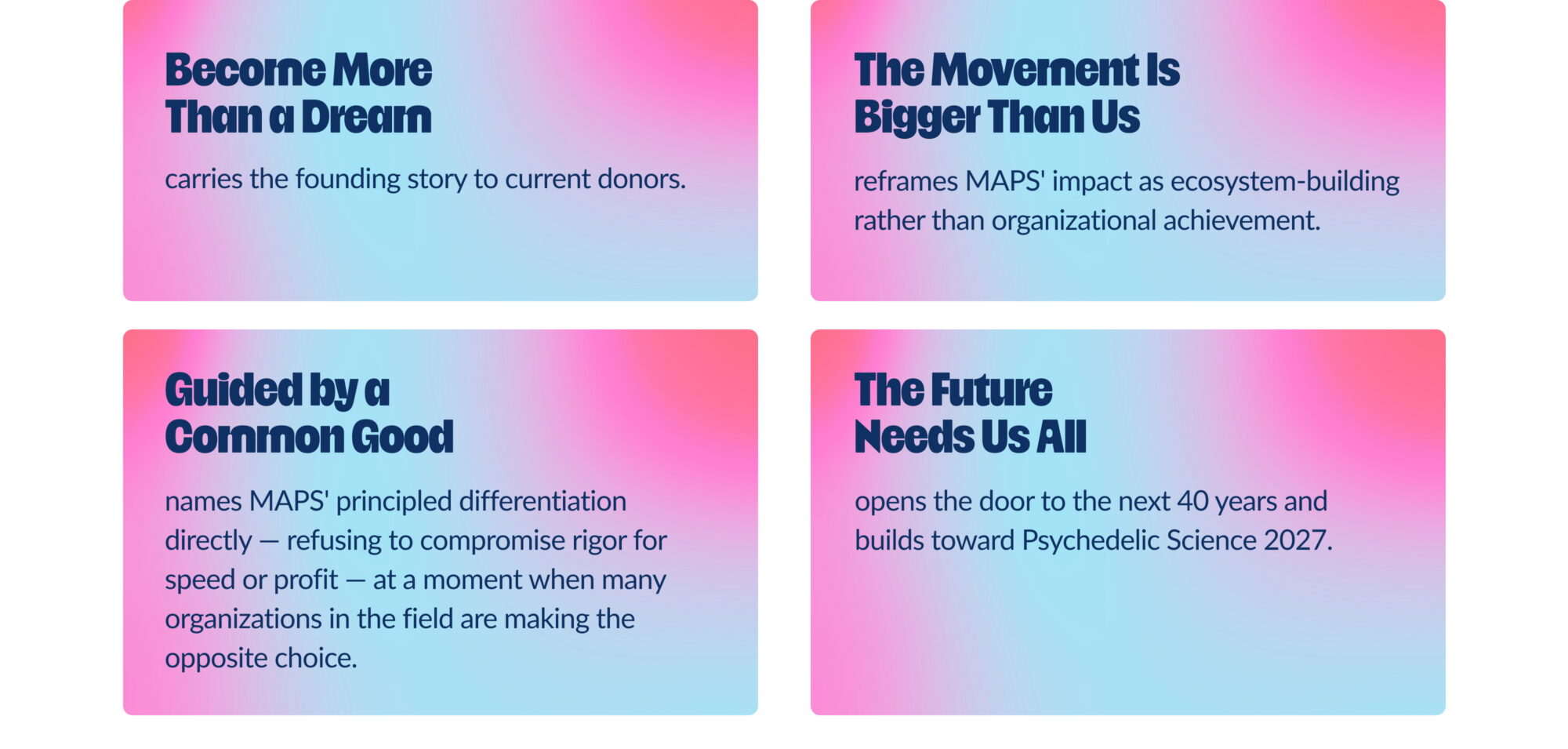
From the campaign theme, Teal developed four messaging pillars that give MAPS’ communicators flexible language without diluting the central idea.
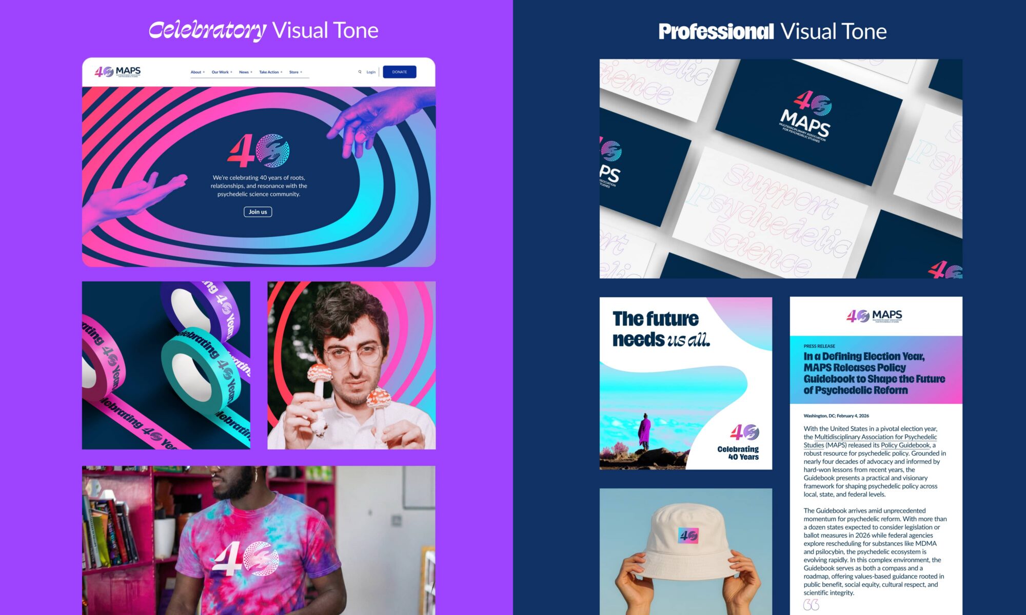
Teal also developed channel-specific voice and tone guidance, calibrating the campaign’s register from bold and celebratory for web heroes and events to restrained and professional for press materials and LinkedIn.
Visual Form Follows the Movement
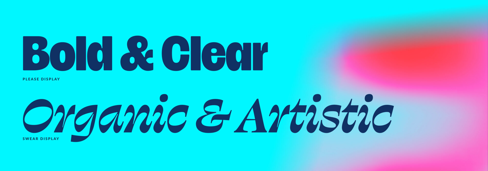
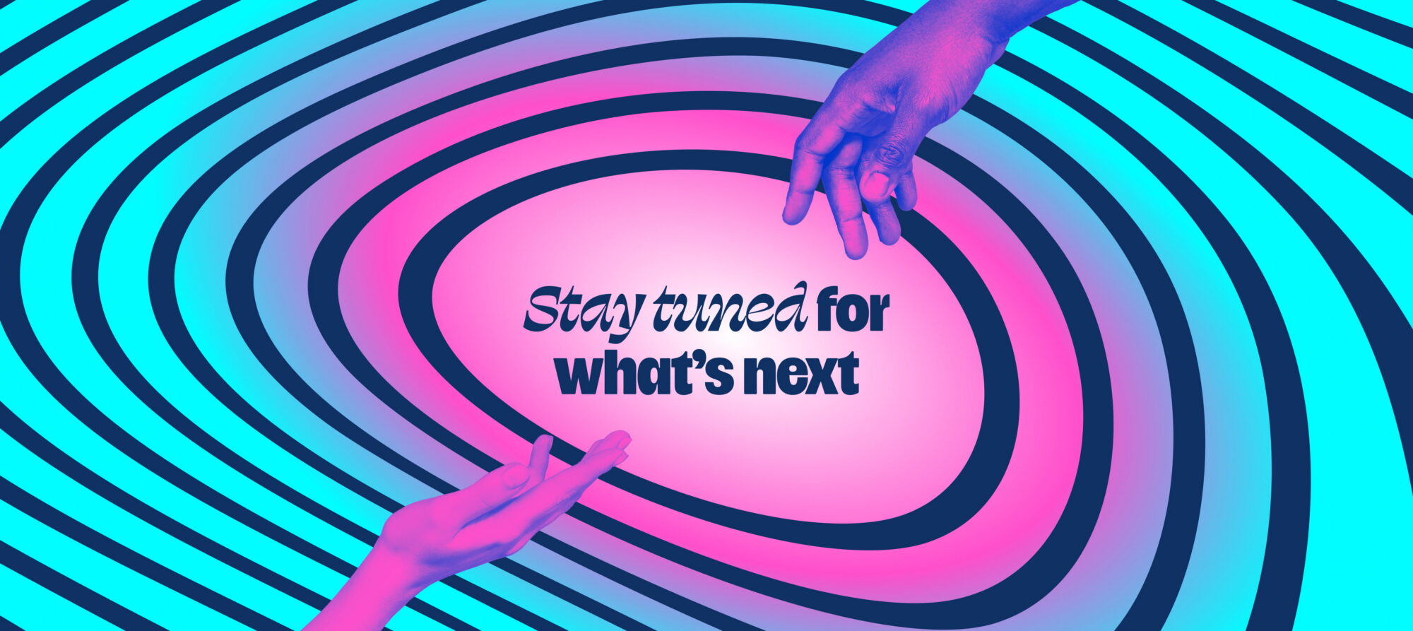
The visual system translates the campaign theme into a coherent aesthetic language. Fluid, gradient-driven forms are the visual backbone — shapes that shift and blend to evoke a future still being written, and a movement that continues to evolve. The typography draws inspiration from MAPS’ iconic Psychedelic Science sticker, a retro, expressive letterform that carries decades of movement identity. The warmth and handcrafted quality grounds the campaign’s bolder gradient moments, balancing the visual system. A full-spectrum gradient cycling from ruby red through pink to cyan runs through the system as a unifying thread. The ruby red is a deliberate nod: the 40th anniversary is known as the ruby anniversary, drawing a direct line between the milestone and the palette. Hand imagery is woven throughout as a supporting motif, an expression of the relationships and collective effort at the heart of the campaign, but it’s the fluidity of the system that carries the theme.
A multitude of typefaces were tested, each with their own faults ranging from poor legibility to cost ineffectiveness. Please Display and Swear Display ultimately rose to the top, each bringing something distinct to the ‘Psychedelic Science’ aesthetic. Please Display, the main font, brings a bold and exciting energy to the anniversary. At first glance it is clean and clear, but a closer look reveals subtle psychedelic nuances, with slightly off-beat choices in certain letterforms. Swear Display takes a more organic and artistic approach, referencing type from historical psychedelic poster art to amplify those psychedelic qualities. Used too liberally, Swear Display can easily overwhelm, so the two typefaces required careful balancing. Swear Display serves as a supporting face for short, punchy statements and subheadline styles, while Please Display anchors the broader brand expression.
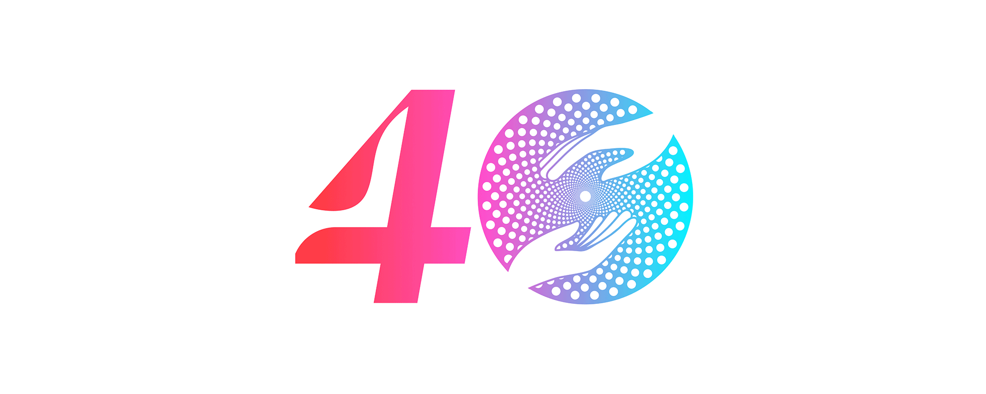
The Mark Itself…
The campaign mark itself is beautiful in its simplicity. The MAPS logomark stands in as the zero in “40,” combining the organization and the milestone into a single graphic statement. Two unrefined, freeform paths intersect to create the letterform — controlled on one side, expressive on the other — a visual metaphor for the tension MAPS has always held between principled rigor and bold possibility. The mark works at scale, in gradient across navy, and as a restrained single-color lockup in professional contexts, giving the campaign flexibility without sacrificing coherence.
The Application System
A Toolkit the Whole Team Can Use
To ensure the brand could be executed consistently across MAPS’ full communications operation — including staff using Canva — Teal built a complete application system with channel-specific guidance. Social templates are designed around two structural approaches: progressive tiling gradients for multi-slide carousels, and element-over-flat-color layouts for cohesion across slides. The system specifies where to flex the bolder aesthetic and where to keep it restrained.
The guidance is explicit about a critical executional principle: the 40th anniversary mark and visual system should be woven into existing MAPS communications rather than replacing them completely. The campaign earns recognition through consistent, repeated presence, and not by overwhelming every channel simultaneously. Over time, audiences will come to identify the anniversary posts as distinct and deliberate.
The Impact
The Infrastructure to Carry the Next 40 Years
On April 8th, MAPS’ 40th anniversary, the campaign launched simultaneously across every channel: a refreshed website, social media, email campaigns, and staff email signatures, all bearing the new visual identity and messaging for the first time. The anniversary mark replaced the standard MAPS logo in high-traffic placements, and the “Roots. Relationships. Resonance.” theme anchored communications across platforms.
MAPS entered its fifth decade with something it hadn’t had before: a shared language for its own irreplaceability. The campaign gives MAPS’ staff, donors, and allies the words and images to make the case that this organization isn’t just part of the psychedelic renaissance — it’s the reason the renaissance has resonance.
Teal moved through an extremely compressed timeline without missing a beat. From start to finish, they were flexible, accommodating, and navigated our internal complexities and the multidisciplinary nature of our work with grace. Teal was the right partner for this campaign and a partner I'd choose again.
Zane Bader
Associate Director, Communications
Year of Completion
2026
Issues
Services
Project Team
Teal Media is a woman-led creative agency that builds brands and websites for nonprofits, foundations, and mission-driven organizations. We have a core presence in Washington, DC and Detroit, MI.