Johns Hopkins’ Planetary Health Alliance (PHA) is a global consortium of over 480 institutions working at the intersection of human health and environmental change. They approached Teal Media for a full website redesign to create a more compelling digital presence. Their previous site was a valuable but overwhelming repository of content and lacked clarity in showcasing the impact and breadth of their work. PHA sought a site that would energize audiences—from new visitors to long-time advocates—getting them involved in the community and helping them understand how they can play a part in improving planetary health.
THE CHALLENGE:
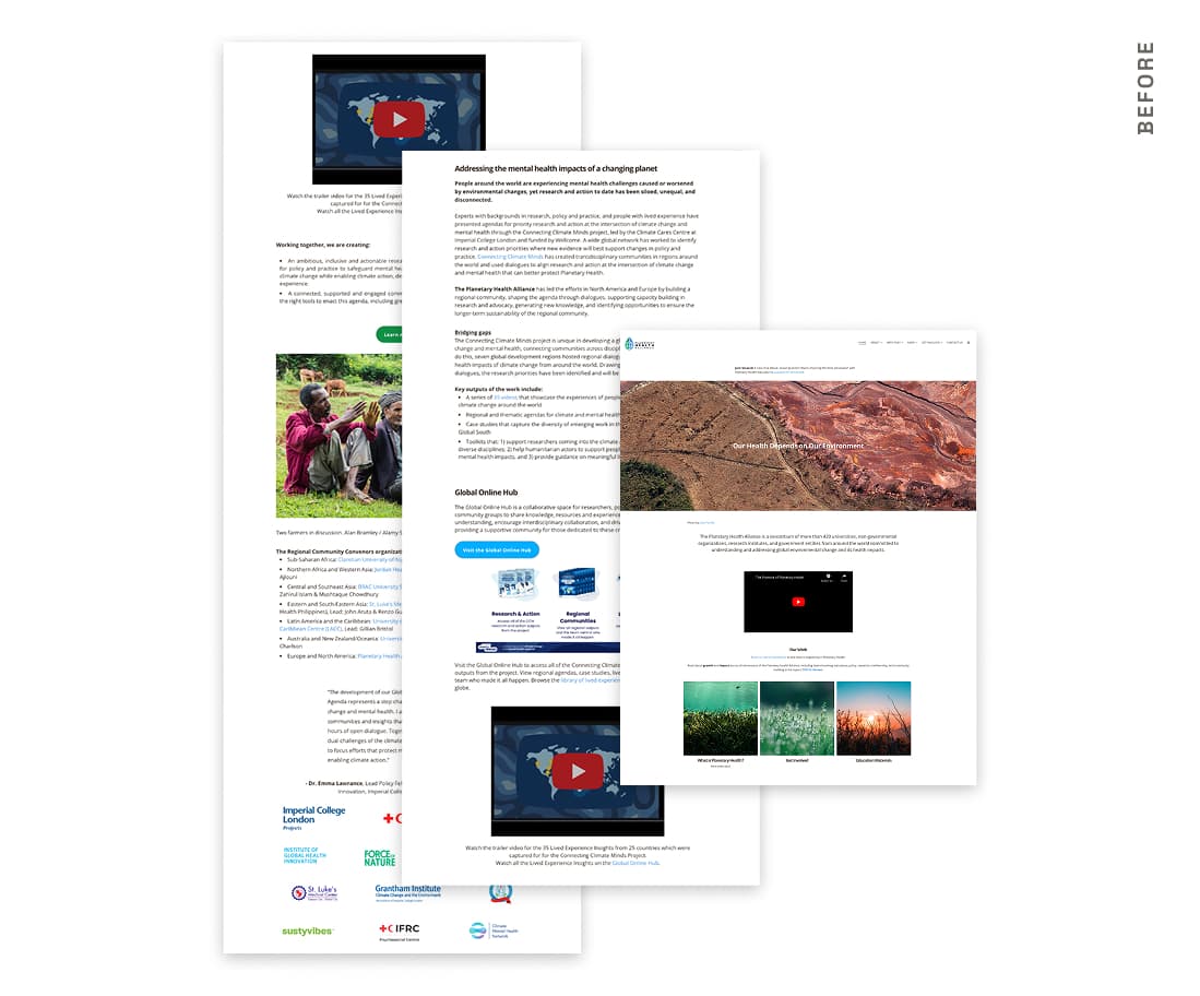
Before: Content Overload
During the discovery phase, we conducted wireframe testing with key stakeholders and representative users to validate our content strategy and information architecture. Feedback showed that users wanted clearer distinctions between community engagement and action-based opportunities. It also surfaced opportunities to refine language, simplify navigation, and prioritize high-impact content.
OUR SOLUTION:
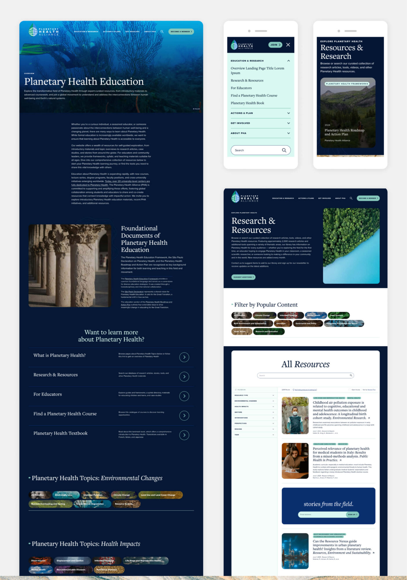
After: Clarity, Structure and Scalability
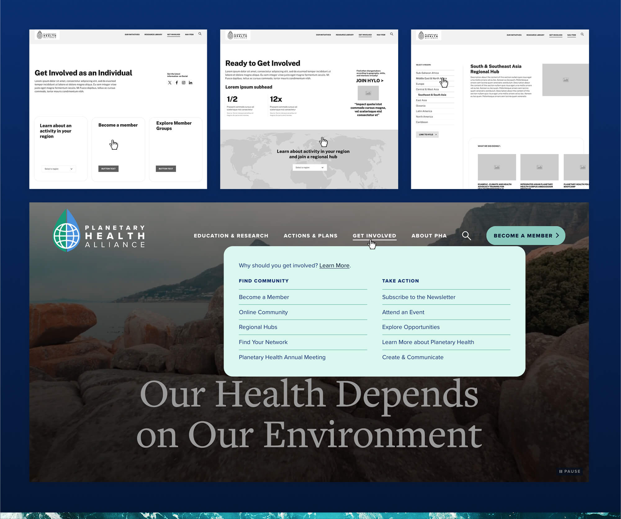
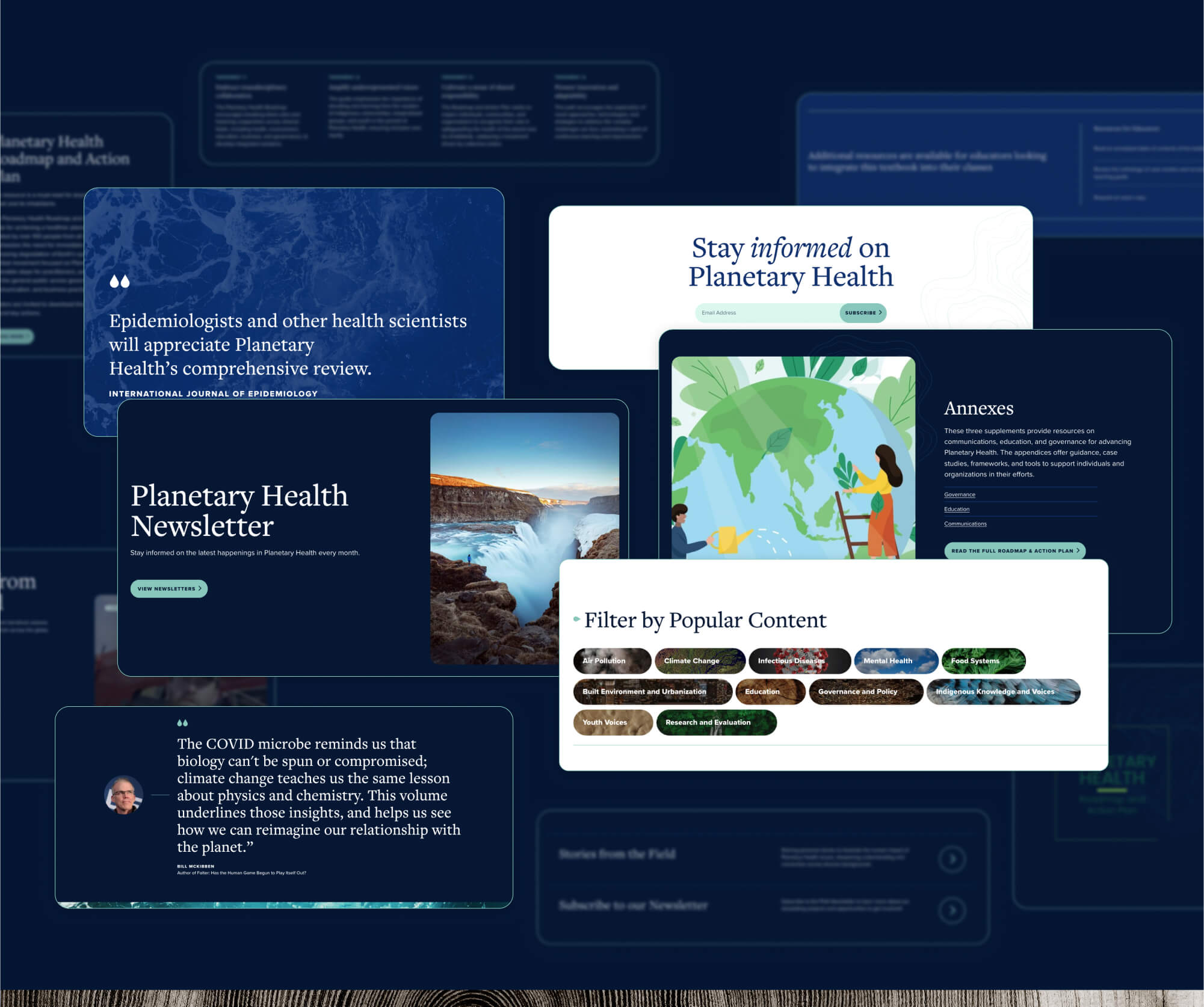
We focused on simplifying the user experience, especially for the resource library. A new, intuitive structure helps users quickly access meaningful content through improved tagging and filtering systems based on popular topics. A megamenu structure under “Get Involved” clearly separates ways to “Find Community” and “Take Action,” offering tailored paths for both new learners and seasoned advocates. Visually, we embraced a dark-mode design that uses less energy to load and display, aligning our design practice with the brand’s environmental ethos.
User Input
During the discovery phase, we conducted wireframe testing with key stakeholders and representative users to validate our content strategy and information architecture. Feedback showed that users wanted clearer distinctions between community engagement and action-based opportunities. It also surfaced opportunities to refine language, simplify navigation, and prioritize high-impact content.
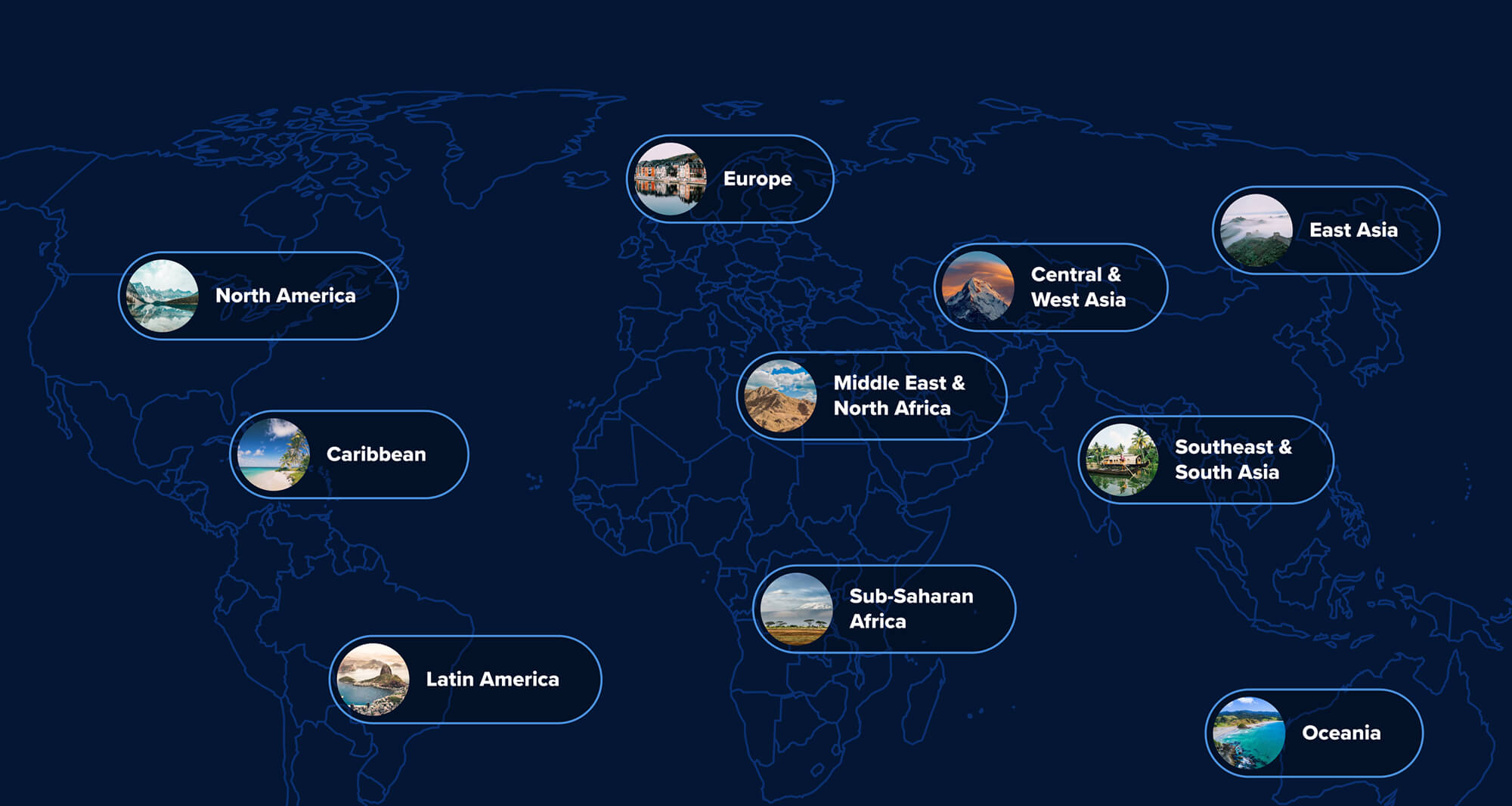
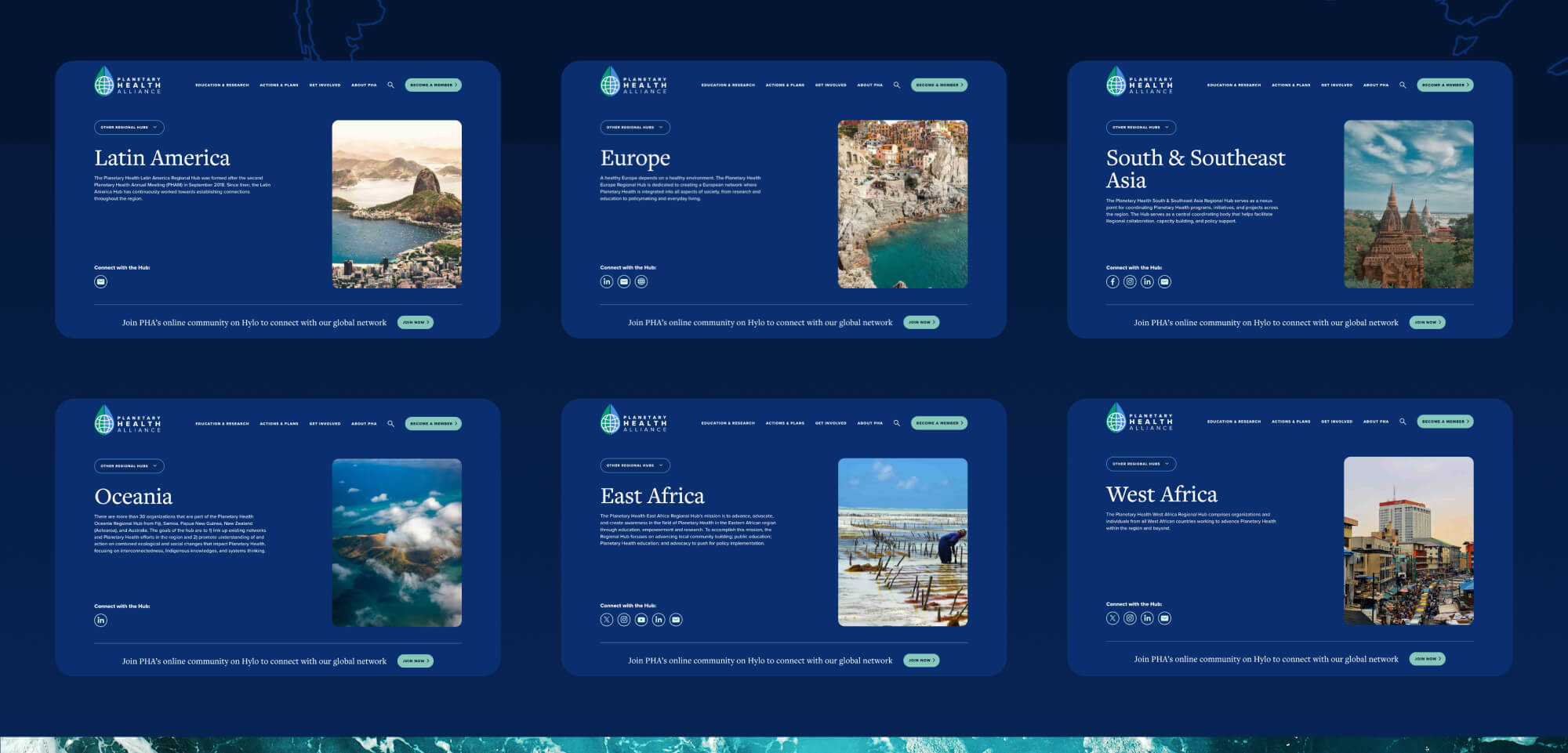
Activating Regional Hubs
PHA has a global footprint. We streamlined their international groups into a simple map of Regional Hubs, each with its own landing page compiling all relevant information for audiences in that part of the world automatically for a seamless admin experience. Regional Hub staff have the ability to publish and manage their own content, with main landing pages aggregating content from all locations. All listing pages throughout the site include the option to filter by location, so that visitors can find relevant content via multiple paths.
Flexible Components
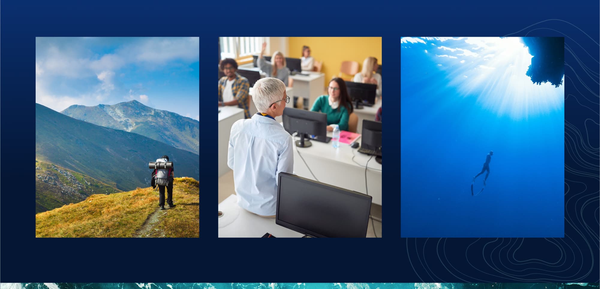
Since PHA’s existing brand guide was very slim, we had a lot of leeway when it came to the visual brand. We embraced a dark-mode design that uses less energy to load and display, aligning our design practice with the brand’s environmental ethos. We also recommended high-quality natural photography and video to create a warmer, more inviting feel for new users. Once this visual system was in place, we were able to build out a robust library of mix-and-match BYO (build-your-own) components for PHA to use to build any future page they may need, allowing the website to grow and change with them.
Massive Content Migration
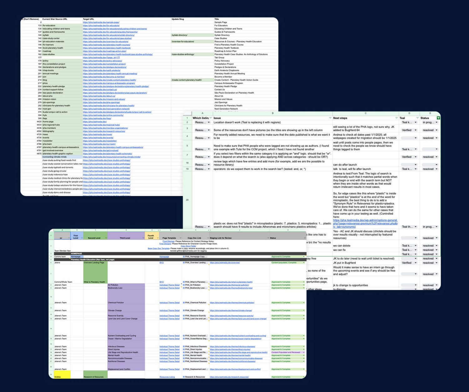
PHA had a lot of content to bring over to the new site. We received an export of over 2,250 imported records from a proprietary content management system, including resources, member orgs, and team bios. This export, combined with a tremendous amount of additional material prepared via spreadsheet, was seamlessly imported to WordPress to give the Planetary Health Alliance team a head start in content population.
To manage the volume of content and complexity of the new site, Teal built a master content tracker that gave PHA full visibility into content preparation, taxonomy requirements, and page templates. It streamlined content development, guided population and QA, and served as a visual roadmap to keep both teams aligned through migration and launch.”
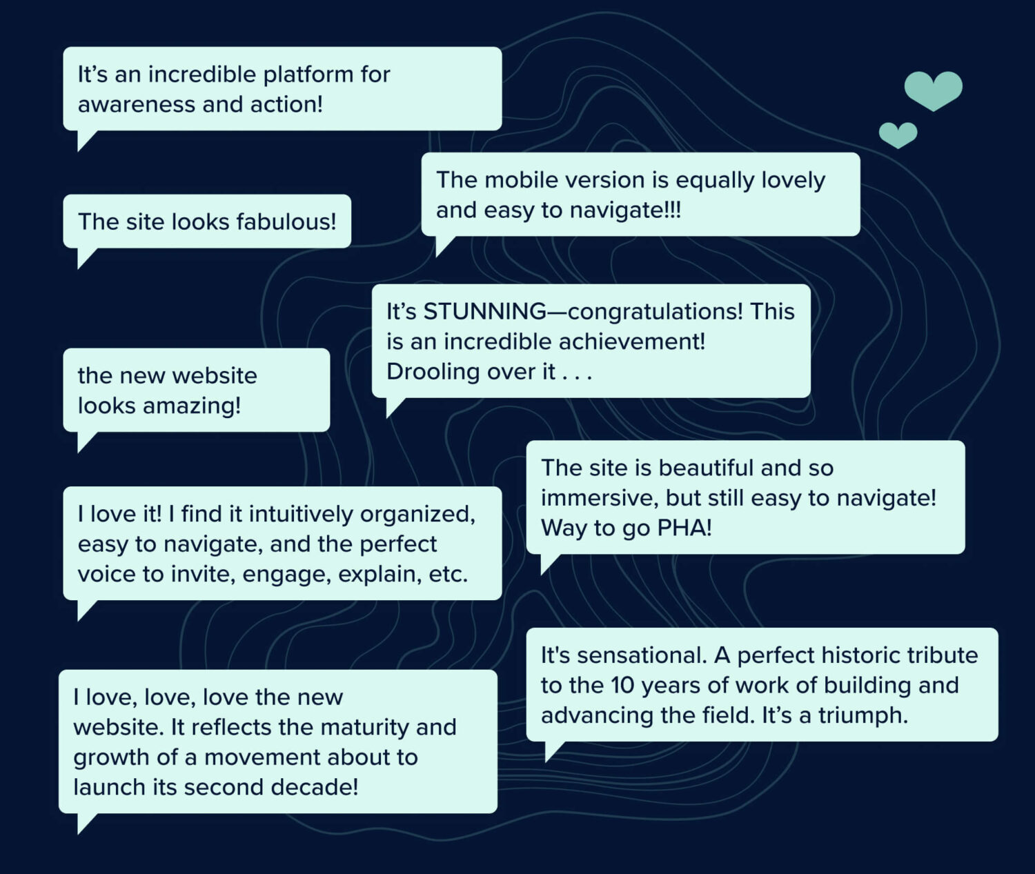
The immediate response from PHA’s community has been overwhelmingly positive. Users have consistently praised the site’s aesthetic appeal, noting its visually engaging design and intuitive layout. The new platform has also been recognized for its enhanced utility, serving as a valuable resource hub and fostering greater engagement within the planetary health community.
I am so incredibly excited about our new website. It is visually very striking and the backend is equally impressive. The more than 2,000 posts in our resource library are now easily discoverable, thanks to a sophisticated tagging system. Teal has made it so much easier for us to efficiently expand that library and our events & opportunities listings ... our close partnership with Teal was essential in producing this highly functional website.
Teal Media is a woman-led creative agency that builds brands and websites for nonprofits, foundations, and mission-driven organizations. We have a core presence in Washington, DC and Detroit, MI.
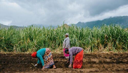
A full digital ecosystem for an independent nonprofit (with an initial investment from Patagonia) that supports Indigenous communities leading climate action with nature-based solutions.
Let’s do this.
The part where we ask you to cough up your email. So we can discuss all the amazing things we’re gonna do together. No pressure. Really.