
AAHA
A warm, welcoming look and custom integrations to advance excellence in veterinary medicine
Work
8% increase in Google search results
57% increase in mobile visit duration
$10K/mo earned media value on search visibility
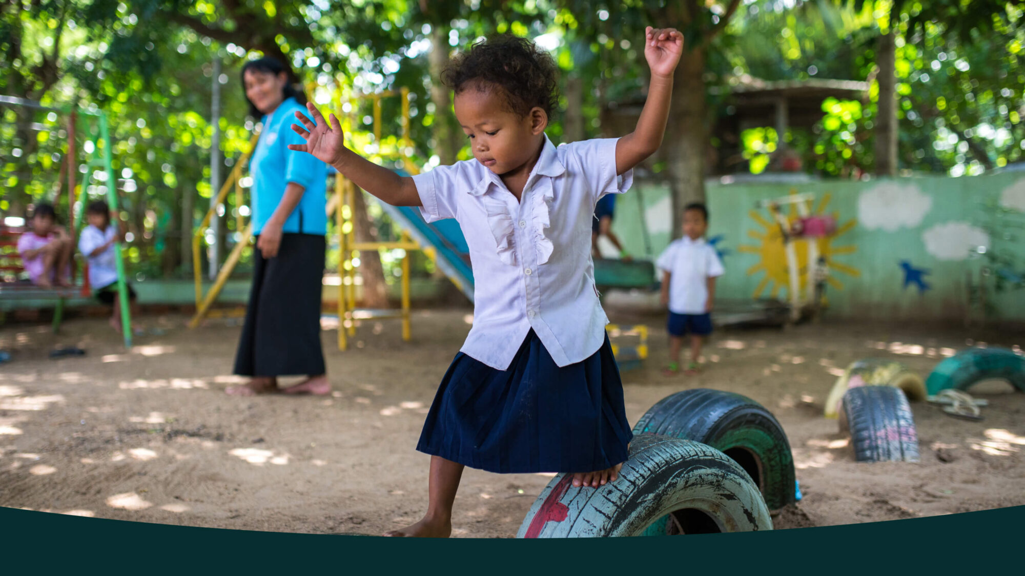
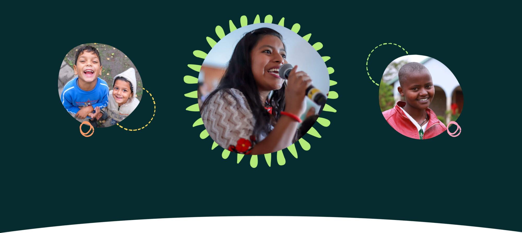
Global Fund for Children supports grassroots organizations around the world that protect and improve the lives of children and youth in their own communities—empowering them to reach their full potential. They support community-based groups to shift social norms, policies, and practices that foster lasting change for children and youth, and they center young people as leaders and changemakers. Global Fund for Children helps these organizations get better at what they do by providing flexible cash, coaching, and connections that they wouldn’t otherwise have access to.
Global Fund for Children came to Teal with a website that was hard to navigate, was visually cluttered and outdated, and generally hard to maintain.
With 30 years experience pioneering philanthropy, Global Fund for Children needed to ensure their website clearly reflected who and what they are and how they embody their mission through their work. Ultimately, a website redesign should enable them to raise more money, grow their donor portfolio, and prompt people to join their movement.
With our mission clearly outlined, Teal got to work formulating a new website strategy. We had a series of discovery working sessions with the GFC team that focused on primary audiences, organization of content, and how exactly to talk about their work. Global Fund for Children has a large team of stakeholders, so we made sure to talk everything through and leave space for opinions and needs from all departments.

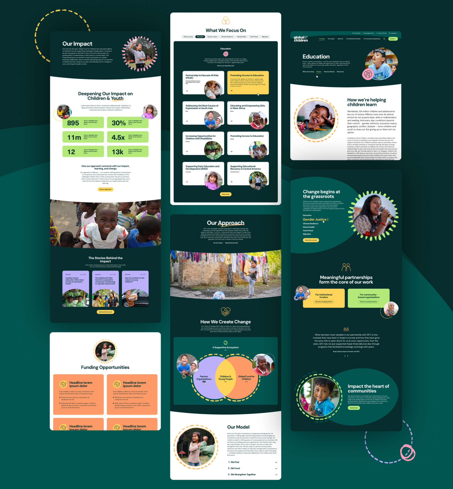
When we began talking about the visual look and feel of the new site, words like “fresh,” “modern,” “youthful,” “active,” “bold,” and “brave” were used. Global Fund for Children had recently undergone a rebrand, and wanted to bring their new visual identity to life on the website. They understood that a beautiful and visually engaging site would help to motivate people to stay on longer, take action, and join their mission.
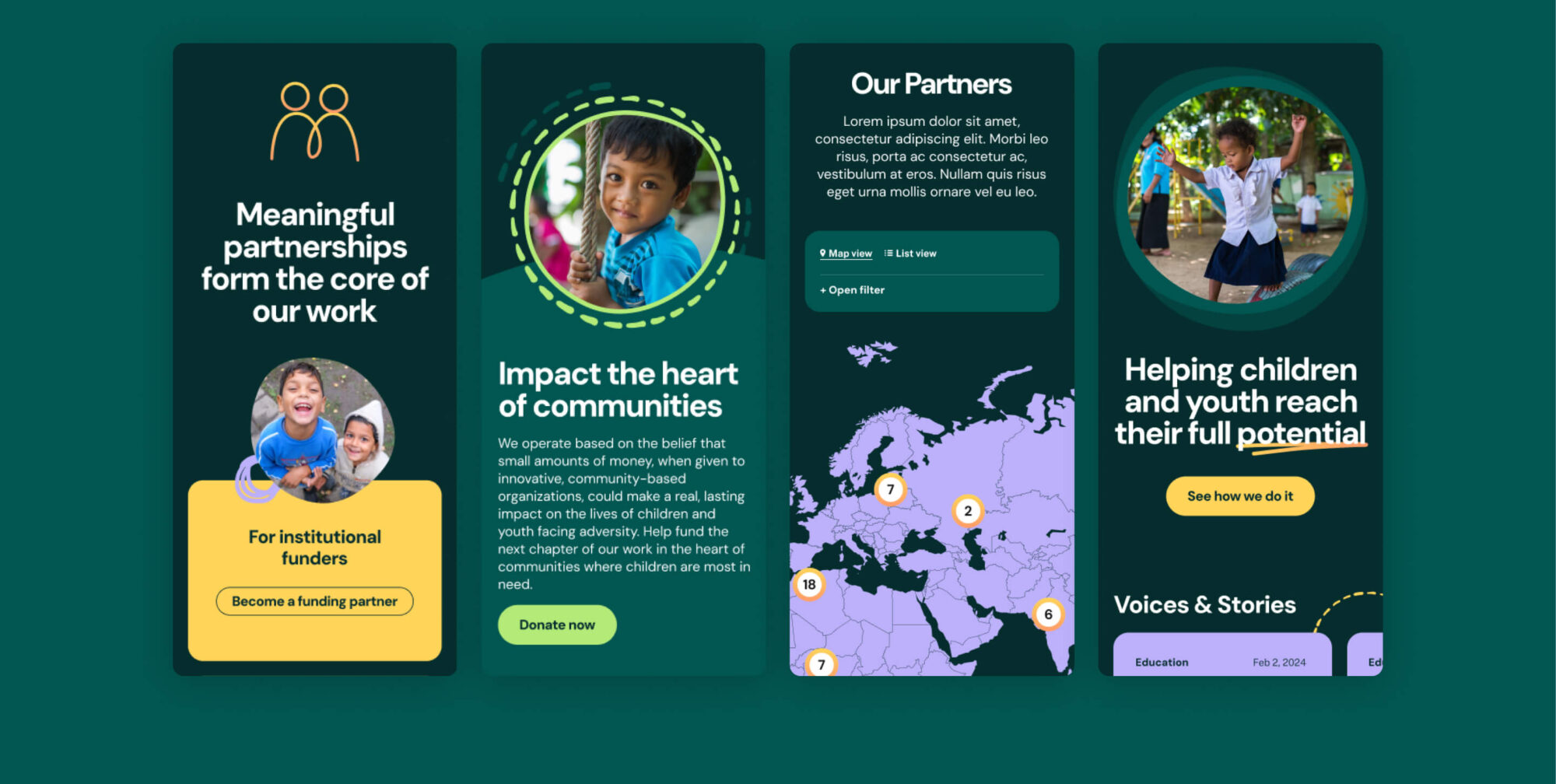
57% increase in mobile visit duration
8% increase in Google search results
3.1% click through rate on search appearances
Since our first engagement with Teal up to the launch of our website, they have been an absolute pleasure to work with. What made Teal stand out to us was the time and energy they invested in getting to know our mission as a non-profit and translating that understanding into bespoke, creative solutions. If you’re looking for a professional, friendly team that ensures mission alignment and gets the job done, then Teal is for you.


A warm, welcoming look and custom integrations to advance excellence in veterinary medicine


The part where we ask you to cough up your email. So we can discuss all the amazing things we’re gonna do together. No pressure. Really.