Skip to Content

Work

NTI GHS/AHS Index

The Map to a Safer World

The Global Health Security Index has been the world’s benchmark for pandemic preparedness since 2019. When NTI launched the Africa Health Security Index in 2026, Teal Media helped rebuild it into a platform that matches how people actually need to use it.

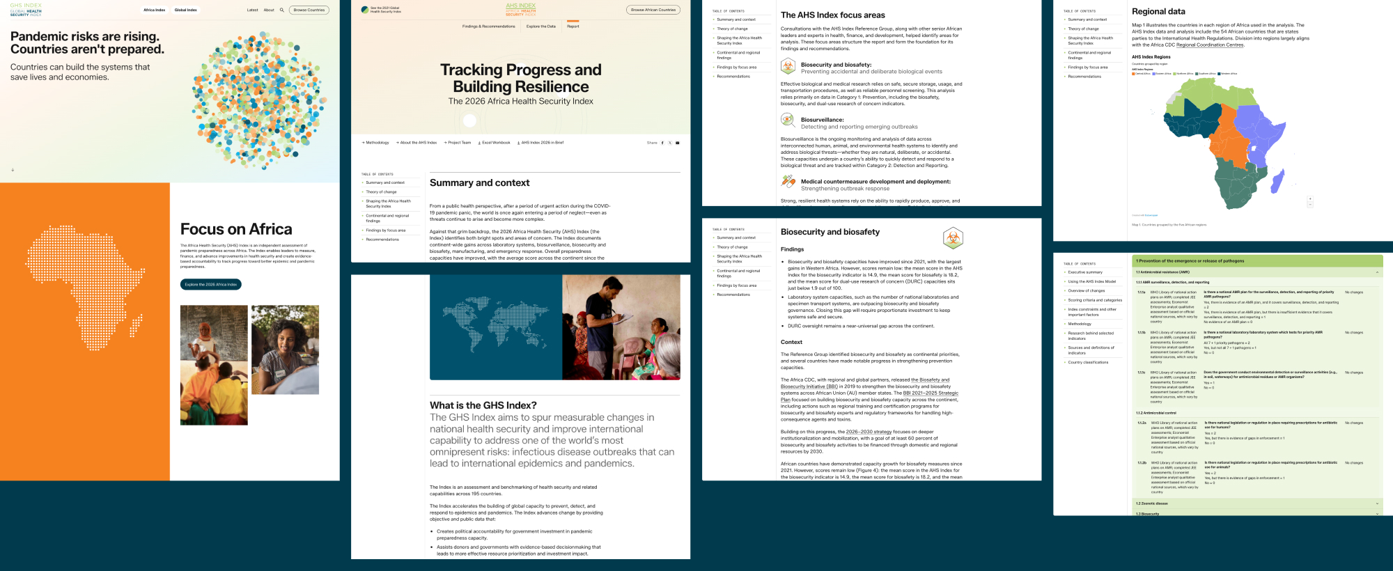
Collage of countries with their score

The Challenge

  • Going beyond the score

    Developed with African institutions and built around Africa’s own health security priorities, the AHS Index brought new scores for 55 countries on the continent. The existing GHS Index, with its 2021 global scores for 195 countries, wasn’t going anywhere; the challenge was bringing both datasets together in one coherent home without either getting lost.

    But the launch was also an opportunity to address something deeper. The data was reaching people, but not as far as it could.

    • Top-line findings were accessible, but the site didn’t make it easy to compare countries, track progress over time, or understand what the data means for making decisions. There’s also a common misconception that high-scoring countries will handle the next outbreak well.
    • There was a lack of a cohesive story to go along with the data.
    • The platform needed to grow along with the launch of the Africa Health Security Index.
    • Past reports have taken on a PDF-first approach which users had to download to get the rest of the content.

    The Approach

  • Designing with depth

    During discovery we learned that their audiences come to the index with very different needs. Some merely want to see findings and recommendations for their country. Others want to go deeper by comparing countries by region or income level, track how scores have shifted since 2019, and find specific indicator gaps; meanwhile researchers, analysts, technical advisors want immediate access to the underlying data itself.

    • We rebuilt the experience around these needs, so users can explore the site however they choose.
    • The narrative sections are now easy to scan because there’s more context around them. It’s more intuitive to interact with the data because we’ve rebuilt how they’re visualized, including allowing users to create their own report.
    • We’ve woven the AHS Index into the platform through a palette shift and its own dedicated navigation.
    • We also moved the report content off PDFs and onto the web, with chapter navigation and a variety of components to display large bodies of text.
    Collage of other pages of the site, including the homepage

    Engineering a data platform

    We created a custom integration pipeline to bring together hundreds of indicators, multiple years of results, 195 GHS country profiles, and 55 AHS country profiles. The system reconciles country information, indicator hierarchies, scores, demographic groupings, supporting narratives, and report links across multiple source files, then turns them into one consistent structure that can power the entire site.

    To do this, we needed to build an import process that could interpret multiple file structures, connect every record to the correct country, year, and indicator, and flag incomplete, duplicated, or mismatched data. After this validation, the pipeline automatically updates country profiles and generates the data behind the maps, comparisons, group averages, report builder, and downloads. This process provides a repeatable path for future updates: new source files can be imported across the entire platform without manually rebuilding hundreds of pages, charts, and tables.
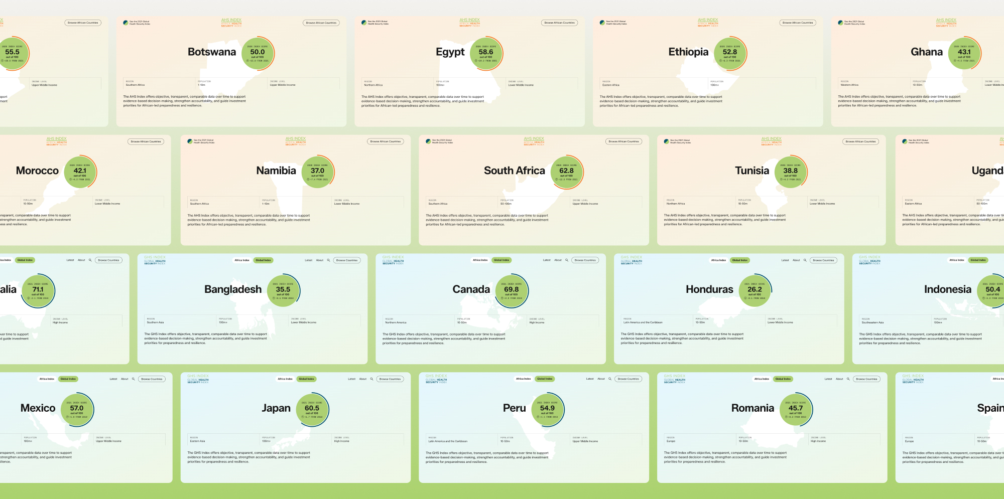
     

    On the front end, we built a performant visualization system that turns this structured data into a fast, connected experience. Rather than presenting a collection of fixed charts, the platform recalculates results around each user’s choices: changing a year, indicator, or peer group updates the scores, comparisons, group averages, and downloadable data together. The report builder can combine individual countries with regional, income, and population groups in a single table or chart, while the broader system supports multiple indexes without blurring the important differences between them. Users can move from a global view to a specific indicator, compare countries with their peers, track changes over time, and create a dataset tailored to their own questions.

    Next Project

    MAPS 40th Anniversary Campaign
    MAPS40 Case Study Thumbnail

    MAPS 40th Anniversary Campaign

    For 40 years, MAPS built the infrastructure the psychedelic renaissance runs on, and nobody outside the movement knew it. This campaign was built to change that.