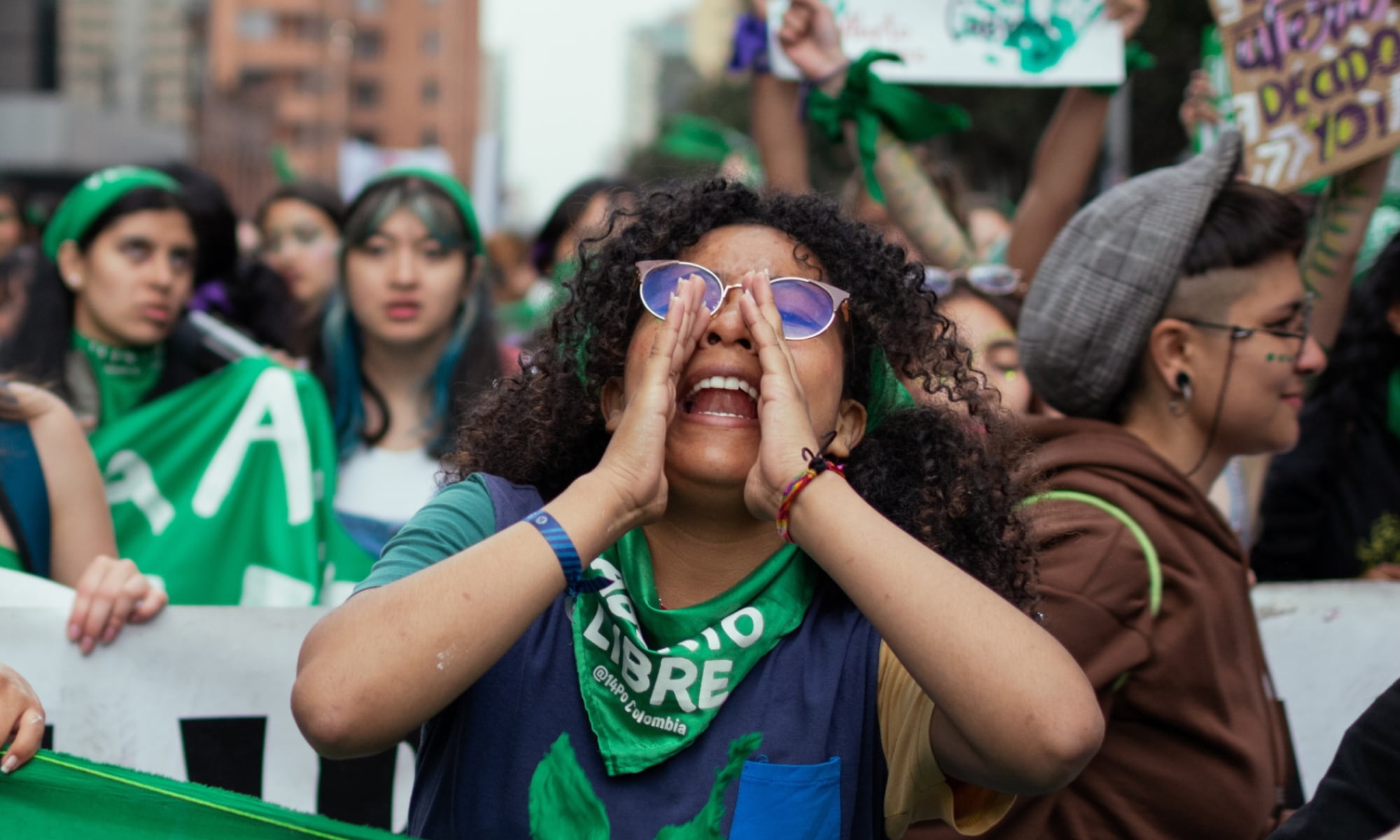
Since 1983, MADRE has been fighting for women’s rights around the globe, with a special focus on issues of race, gender, disability, and climate. Even with support from prominent celebrity champions, interest in their cause was waning noticeably by 2022. MADRE realized that their brand needed a refresh to fully represent the impact of their work and to effectively engage younger audiences.
Our challenge was to modernize MADRE’s brand, illustrate their unique characteristics, and establish a compelling digital presence to attract new supporters. The first step was to identify and retain what had worked for MADRE since its founding—namely, their boldness and compelling story.
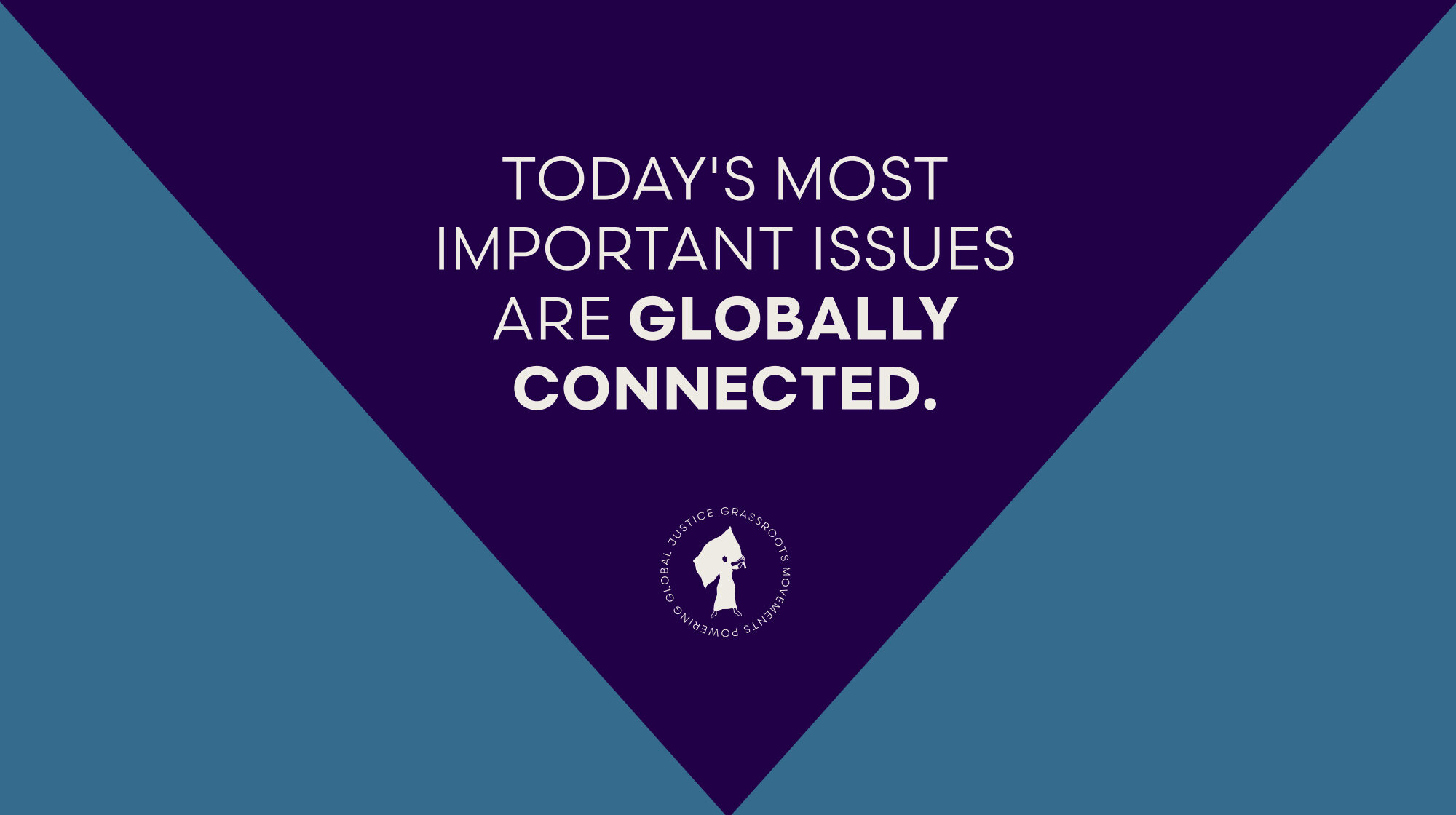
A Radical Voice for Liberation
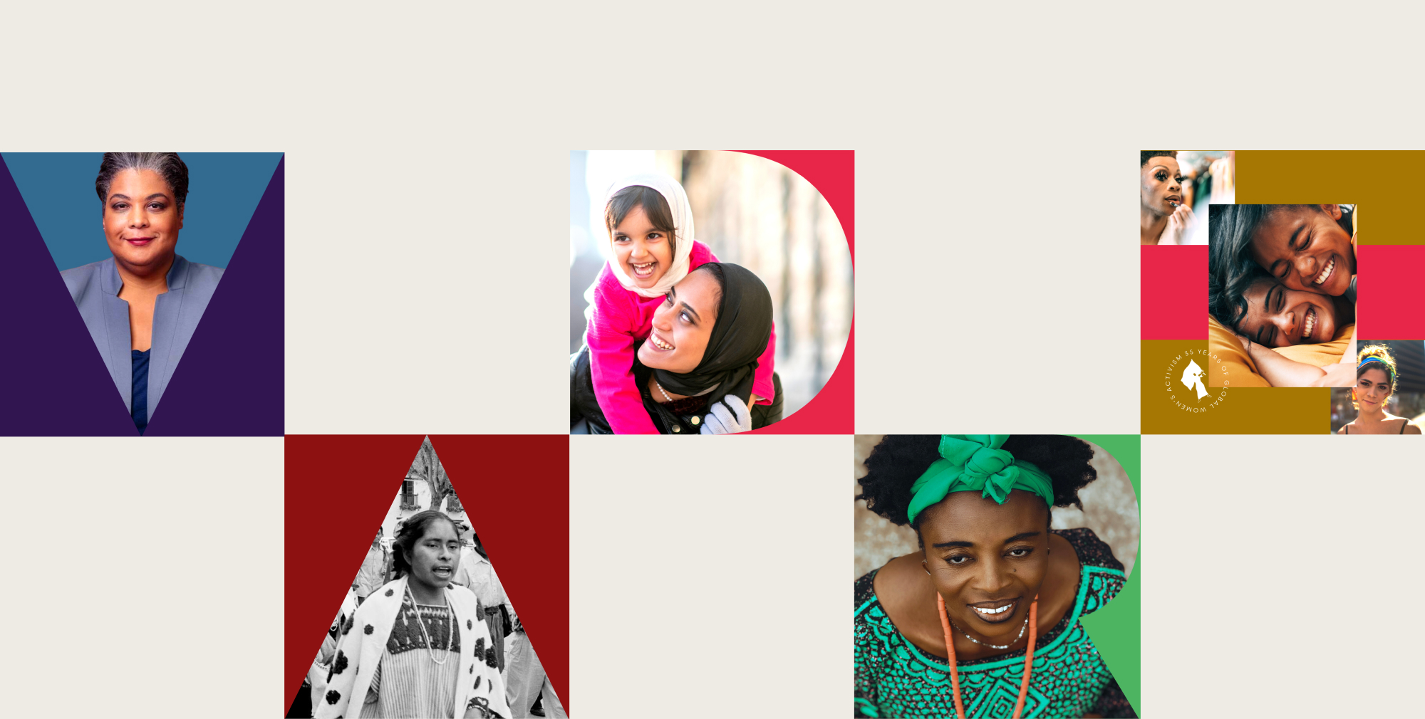
We collaborated with the MADRE team to center the women, girls, and LGBTQIA+ people they serve through every syllable, word, and sentence. Through extensive workshops, stakeholder sessions, and audits, Teal crafted MADRE’s brand messaging framework with nuance and intention, providing:
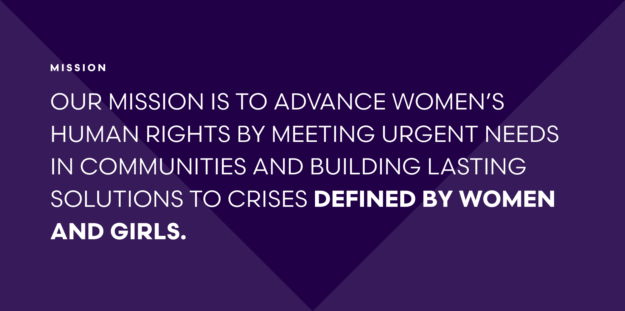
Mission and vision
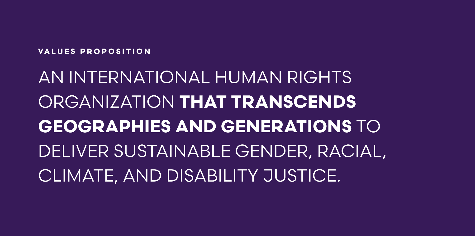
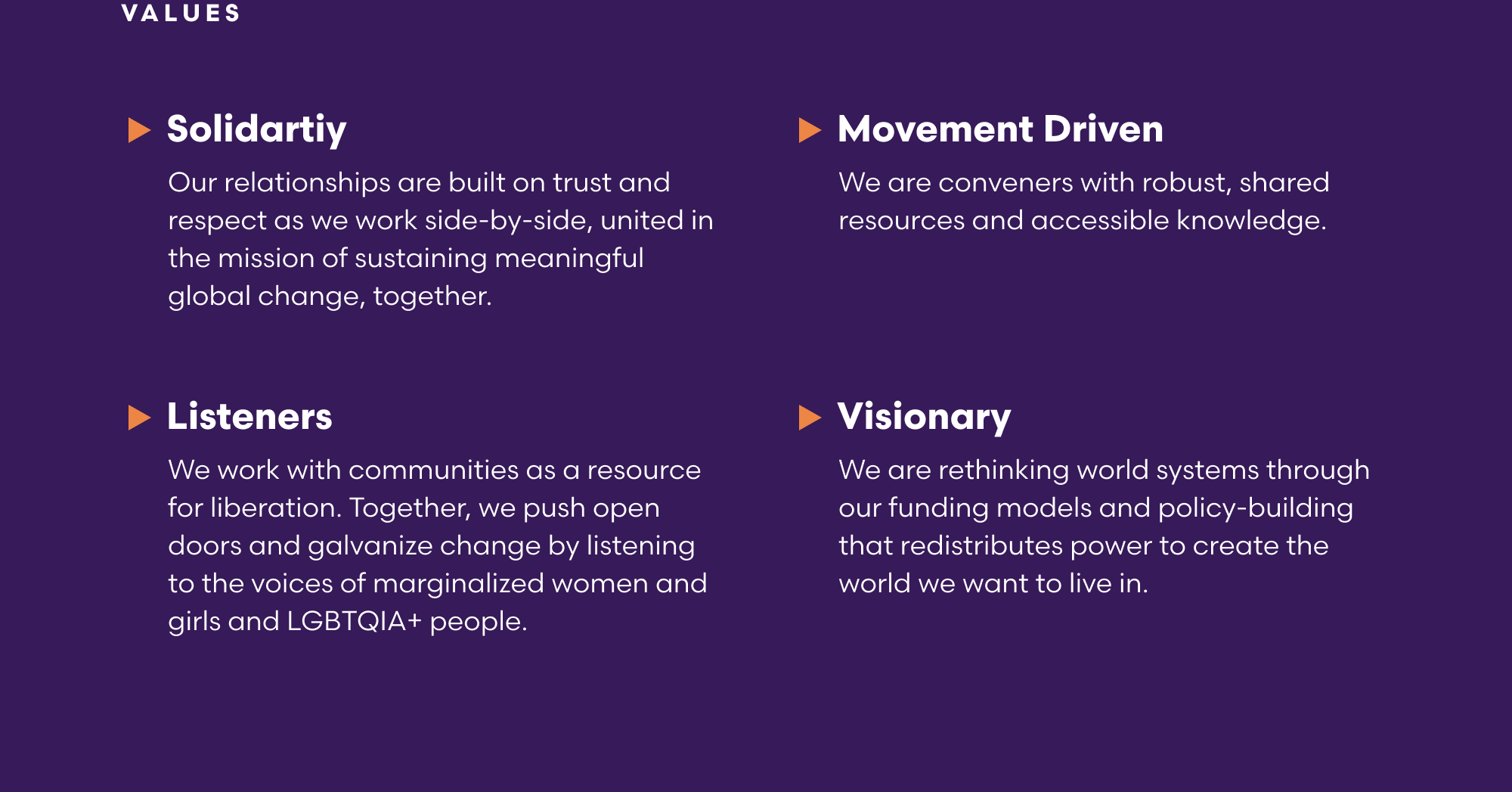
Values and value proposition
Voice and tone
Differentiators
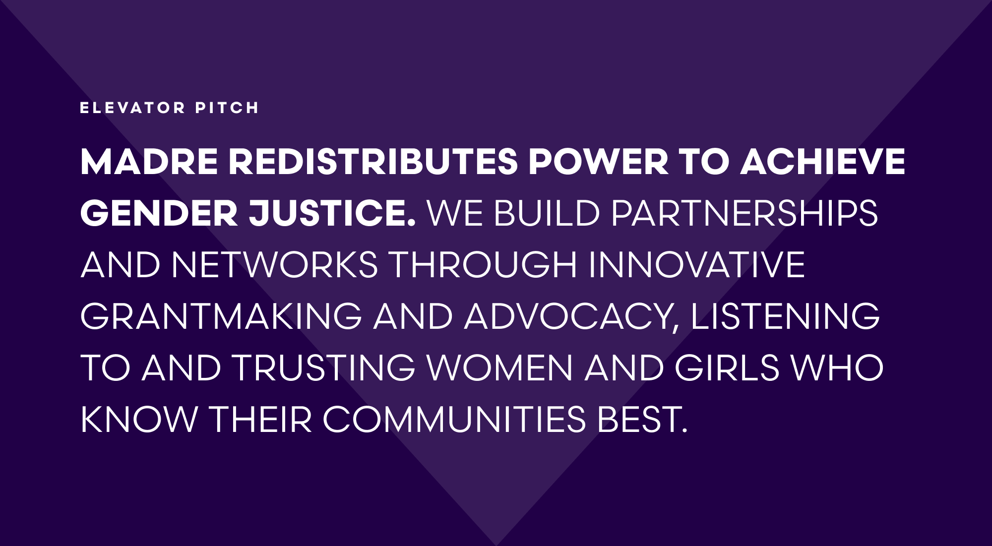
Biolerplate and elevator pitch
An extensive messaging architecture
MADRE represents a radical voice for liberation–they are unwavering in their beliefs for justice, and their updated language boldly reflects this.
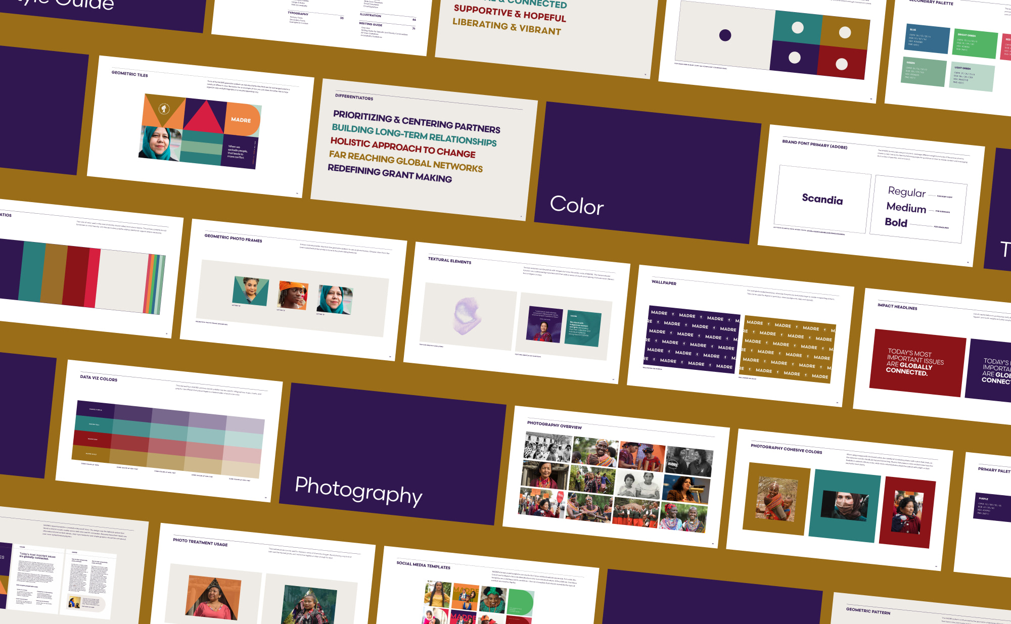
Visual Brand
An Interwoven and Overlapping Approach…
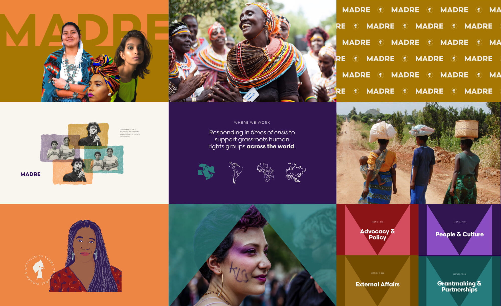
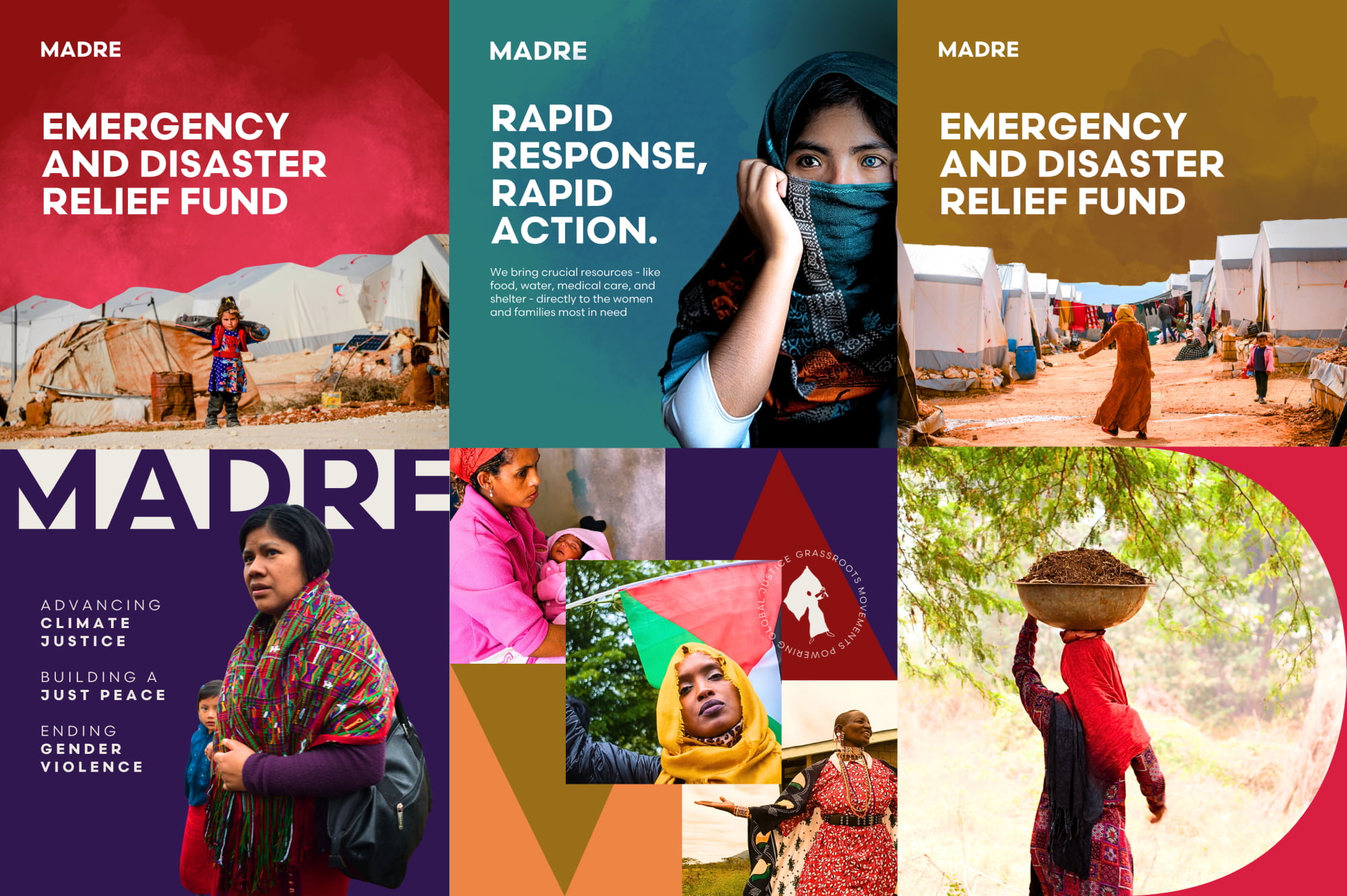
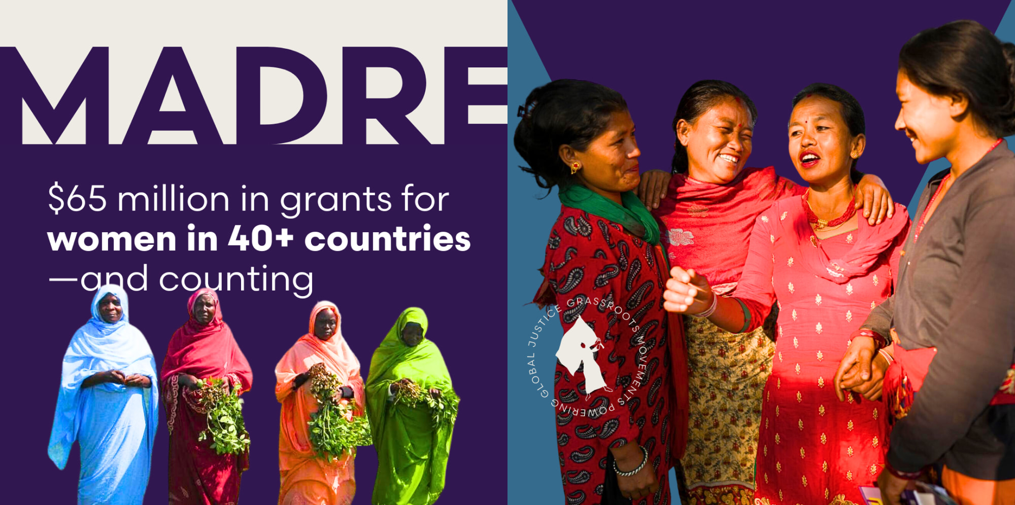
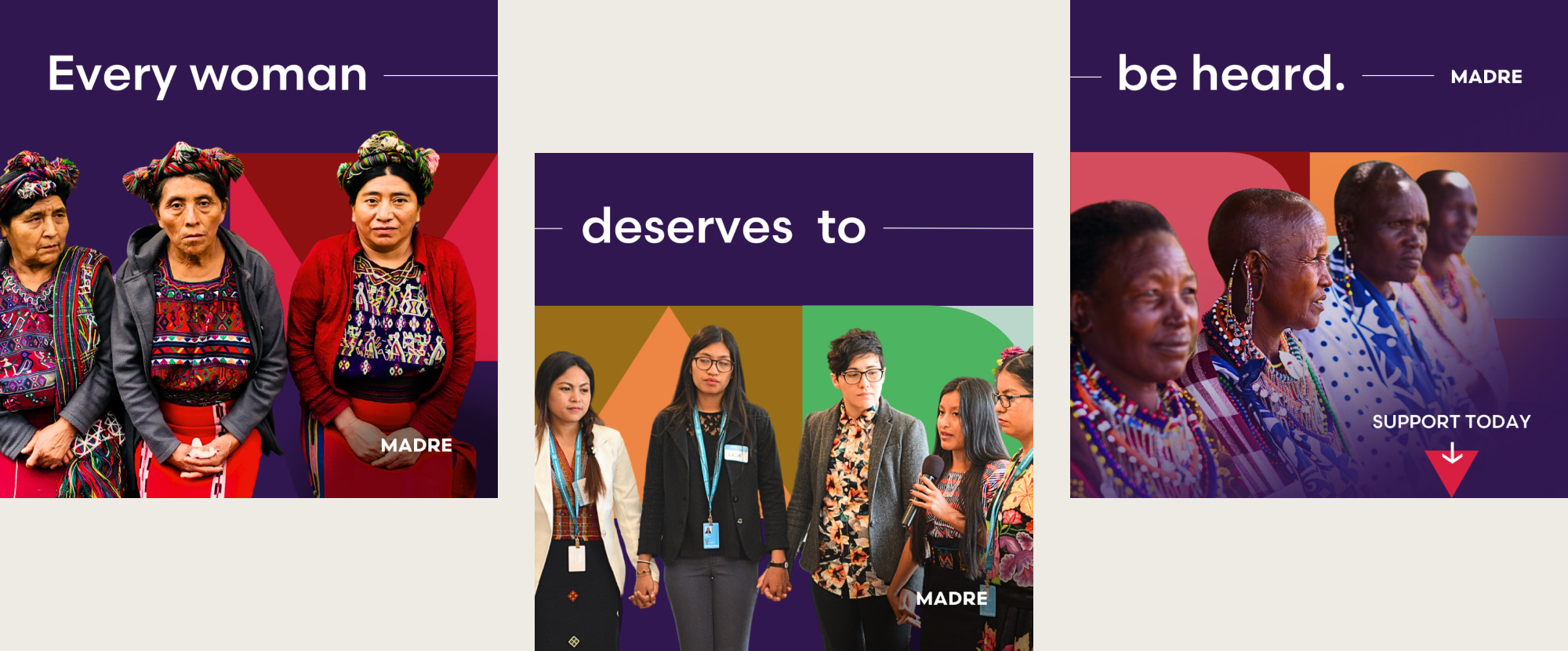
During the visual design process, we worked to preserve MADRE’s legacy while giving it a modern touch, opting for an interwoven visual style that mirrors their global reach and focus on interconnectedness.
One of the distinctive aspects of this project was MADRE’s focus on humility and empowerment, particularly in their messaging strategy. Teal worked closely with MADRE to ensure that their partners’ voices took center stage, making MADRE a humble empowerer rather than a perceived savior.
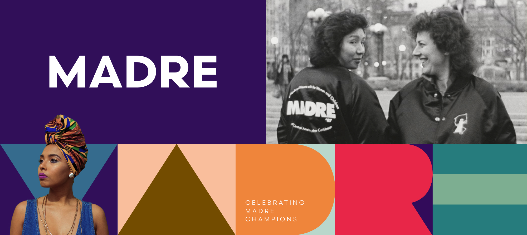
…With a Brand Palette to Match
We developed a brand palette to complement MADRE’s vivid photography, and updated their logo, giving it a more mature and credible look while retaining historical elements from previous versions.
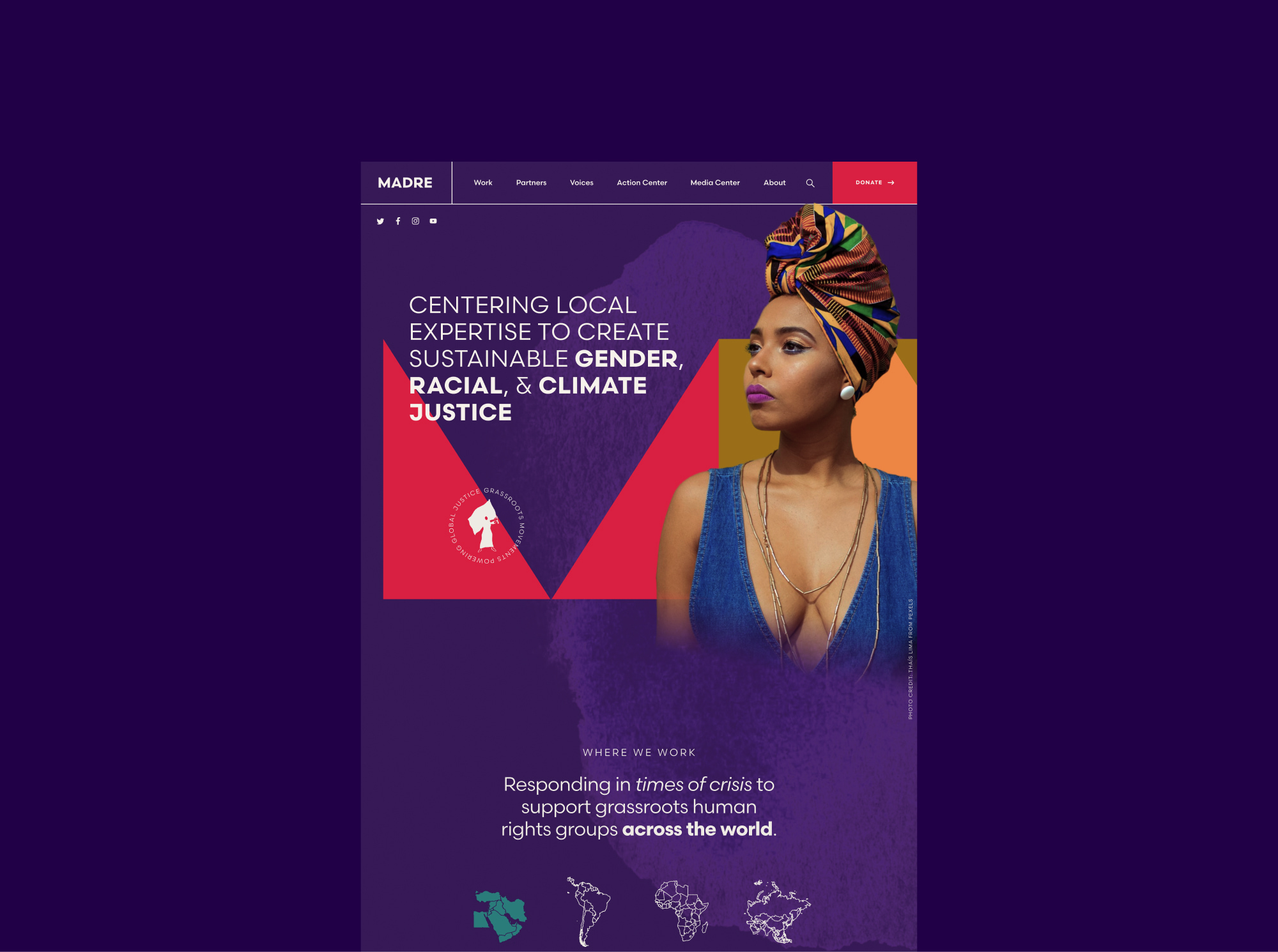
The Website
Redesigning with Energy and Organization in Mind
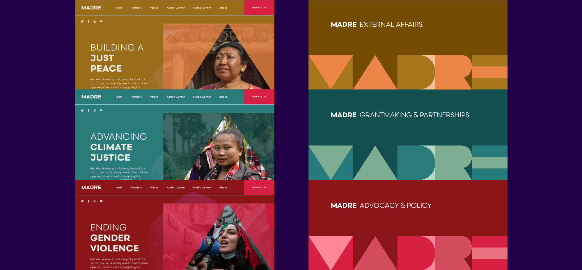
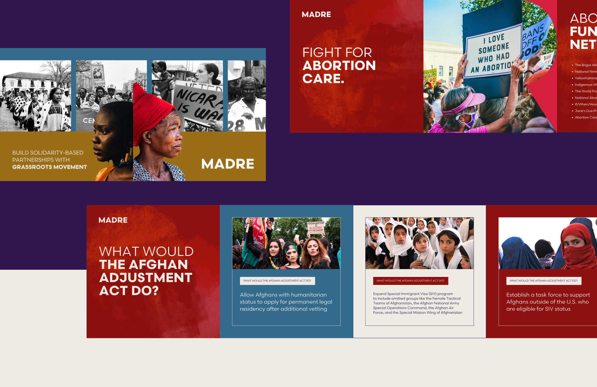
We redesigned MADRE’s website to include big images, vibrant colors, and different visual plays on the logo throughout.
The color-coded sections communicates MADRE’s three main themes and work areas. The website structure caters to new audiences, engaging visitors immediately and driving them toward action, while still resonating with existing supporters. The website employs reusable components to tell MADRE’s story consistently on each page, and includes an action area and shareable content.
Brand Expansion
Consistency and Detail
The visual brand refresh was about more than aesthetics; it was about consistency and attention to detail. The color themes for different areas of MADRE’s work are carried across various platforms, and help users quickly identify different sections and themes on the site as well. Updated email templates also reflect the new visual language, ensuring every interaction reinforces the brand’s identity.
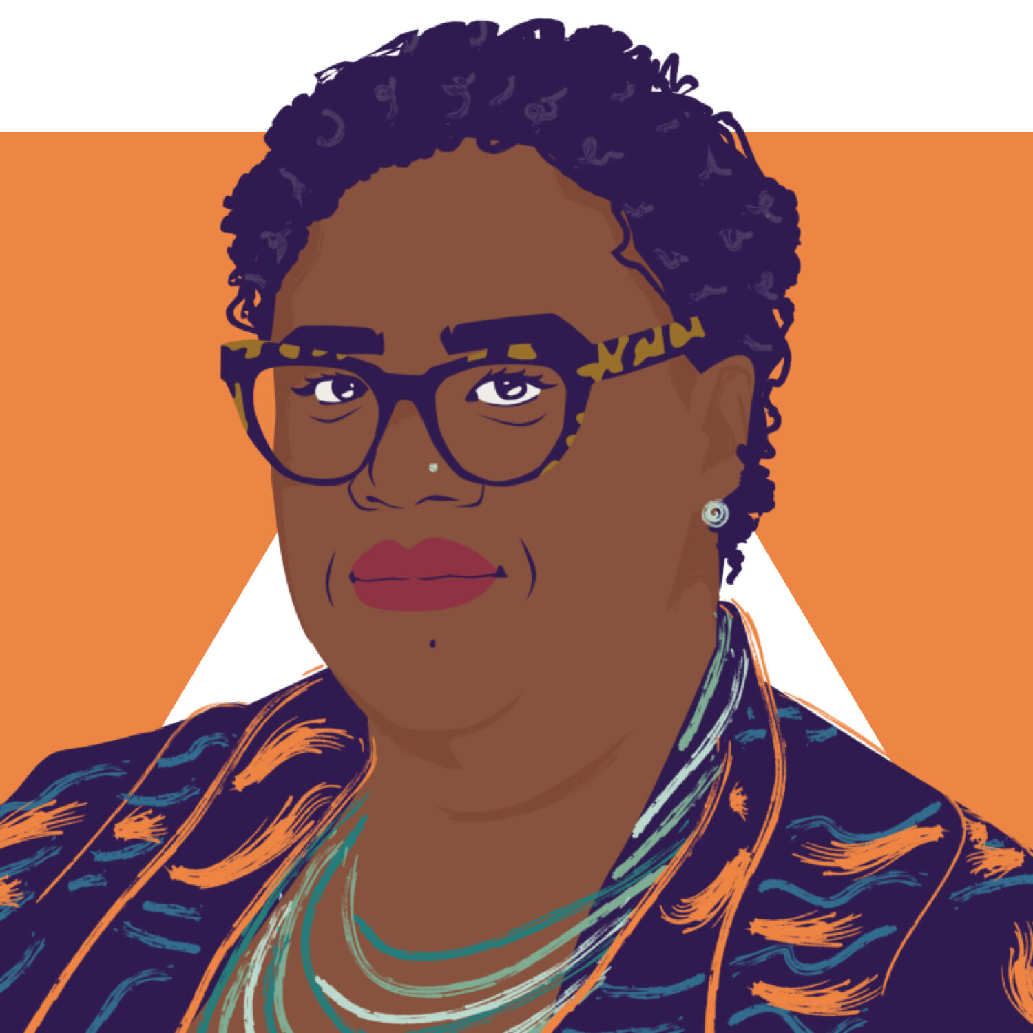
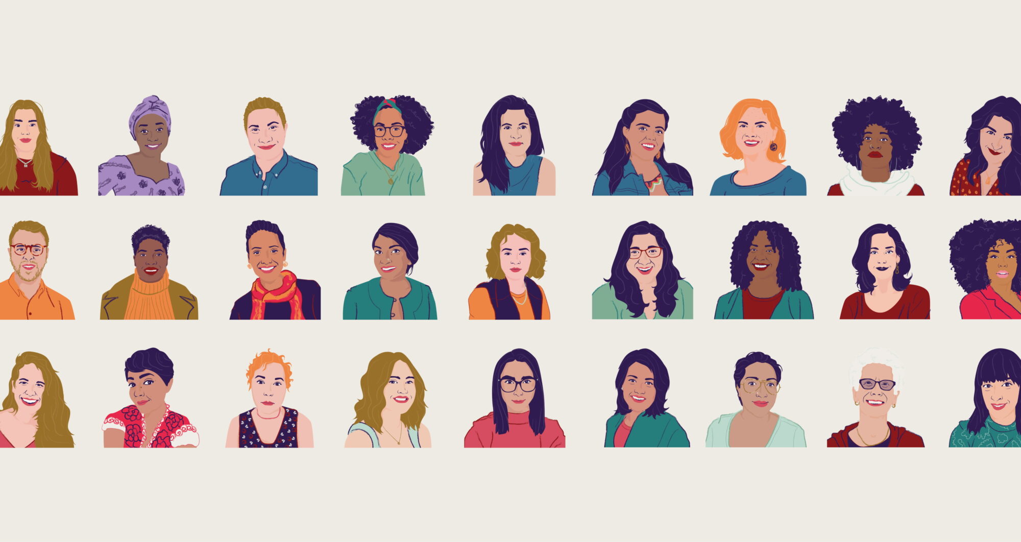
Illustrated Staff Showcase
To respect security concerns and showcase the team without revealing their identities, we illustrated the entire MADRE staff—a unique opportunity to tap into the brand’s artistic roots. We also supported MADRE with a digital marketing campaign strategy designed to engage younger audiences, using the refreshed website and brand to drive awareness and participation.
Ultimately, MADRE achieved more than a rebrand—they accomplished a digital evolution that reflects their mission, values, and vision, while continuing to inspire change and action.
DIGITAL MARKETING
A Radical Transformation Across All Platforms
After Teal Media updated MADRE’s brand and designed their new site, our Digital Marketing team audited the org’s digital ads, social media, and email, suggesting new strategies and tactics for them to pursue on their own.
PAID ADVERTISING
Teal then created an awareness campaign dubbed “Who is She?” which illustrated the incredible stories of the women and girls MADRE supports, encouraging audiences to visit the new site for more.
The campaign surpassed its goals across more than a dozen key performance indicators.
2.6million+impressions
+1.3Kfollowers on LinkedIn, a 16% gain
46%increase in LinkedIn comments (with fewer posts)
+90%increase in Instagram engagements, compared to the previous span, equating to 3K+ engagements
Links
Issues
Services
Project Team
Teal Media is a woman-led creative agency that builds brands and websites for nonprofits, foundations, and mission-driven organizations. We have a core presence in Washington, DC and Detroit, MI.