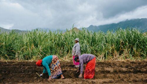
Home Planet Fund
A full digital ecosystem for an independent nonprofit (with an initial investment from Patagonia) that supports Indigenous communities leading climate action with nature-based solutions.
Work

The Foundation for Food & Agriculture Research (FFAR) does complicated and nuanced work that’s at the intersection of science, research, and policy. Their staff had trouble talking about this work in a clear and consistent way – each person told a slightly different story. This brand confusion showed through on the FFAR website, which was also dated, poorly organized, and made key information hard to find. FFAR needed a new brand to reflect the nature of their work, and a website to match.
Together, Teal and FFAR reinvigorated the entire FFAR brand, from core language to visual identity, centering it around their key values of audacity and innovation. This refreshed brand is reflected in the new website, which tells the FFAR story of impact, makes information easy to find, and offers a range of ways to get involved.
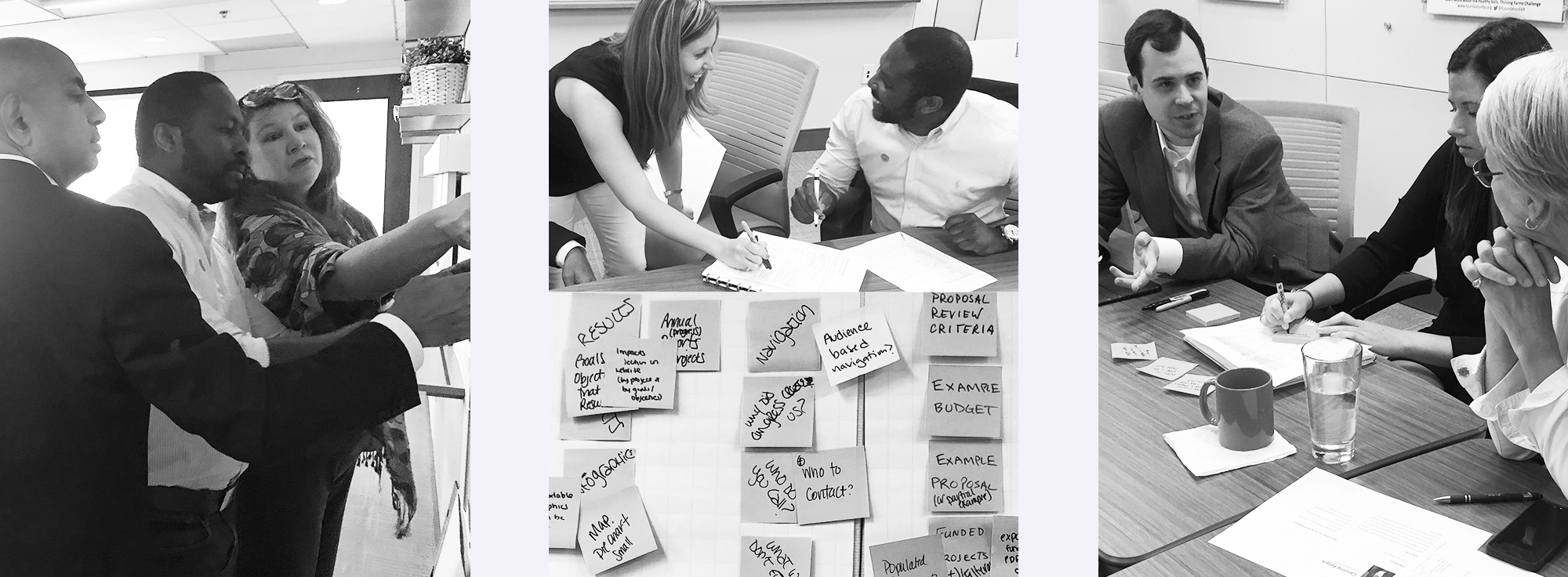
Our partnership began with an intense phase of Research and Discovery. Through surveys, user interviews, and a series of in-person workshops, Teal and FFAR honed in on a new set of core values, developed refined brand messaging, and generated ideas for how we could better engage FFAR’s primary audiences.
Through robust research and interactive workshops, Teal and FFAR clarified FFAR’s strategic vision, and brainstormed ideas about how their new website could embody that vision.
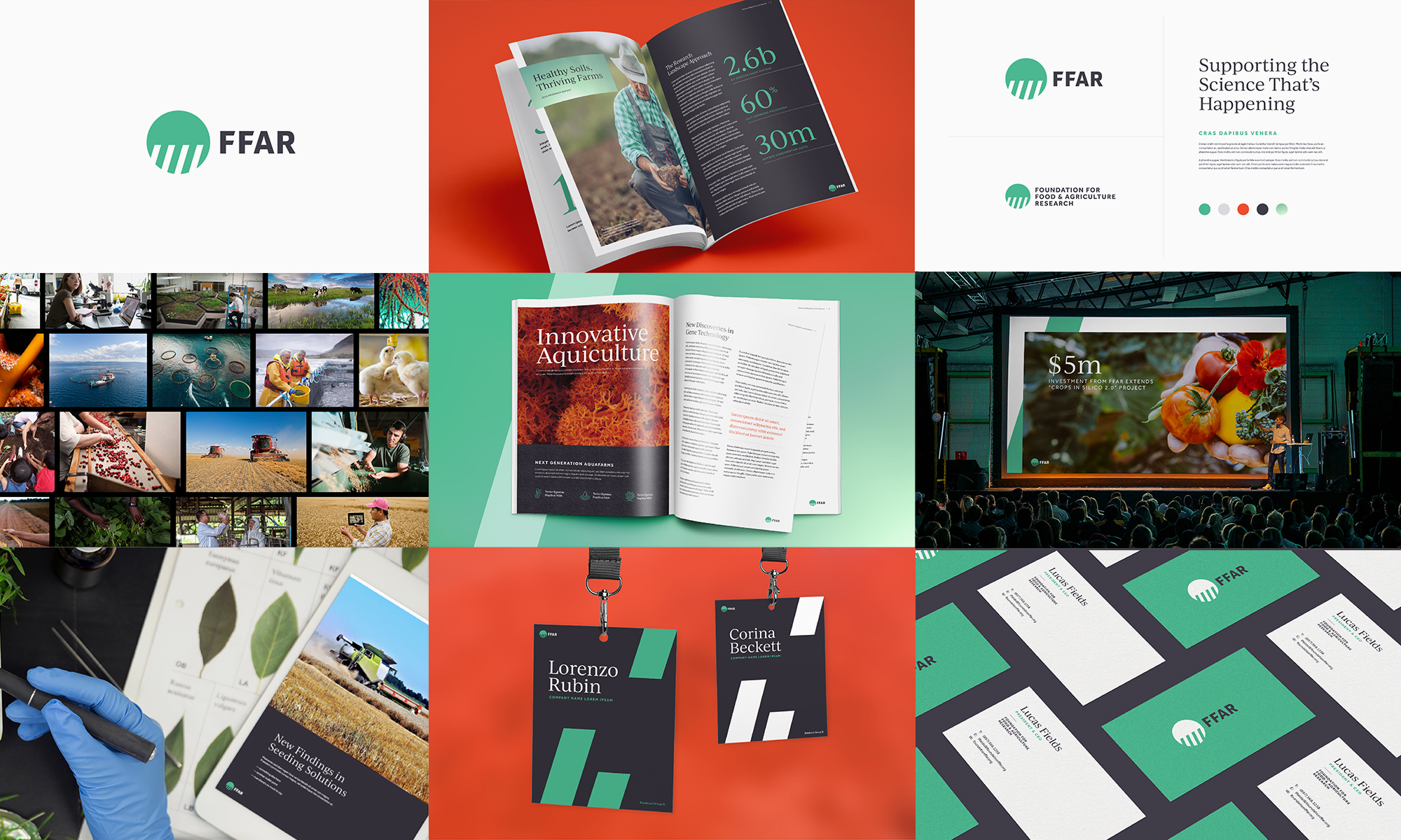
In the years since their founding, FFAR had grown more sophisticated and complex, and they needed an updated visual identity to reflect this growth. Teal updated the original logo mark and visual brand with a fresh color palette and mature fonts. Modern tones of green paired with grounding grays and pops of orange helped the new brand feel true to its roots, while giving it a modern spin. Teal also introduced a photography style that highlights the innovative nature of the agriculture research that FFAR supports.
The new visual brand Teal created pays homage to FFAR’s roots, while more accurately reflecting their values and the way they work today.
With our new brand strategy and visual identity guidelines in place, we began to dig into a solution for the new FFAR website. We started with a detailed content strategy process that informed the site’s user experience and visual design.
In the User Experience and Content Strategy phase, we built a system that dramatically streamlines the way content is presented on the website. The new content strategy draws clear connections between FFAR’s web content and their strategic vision.
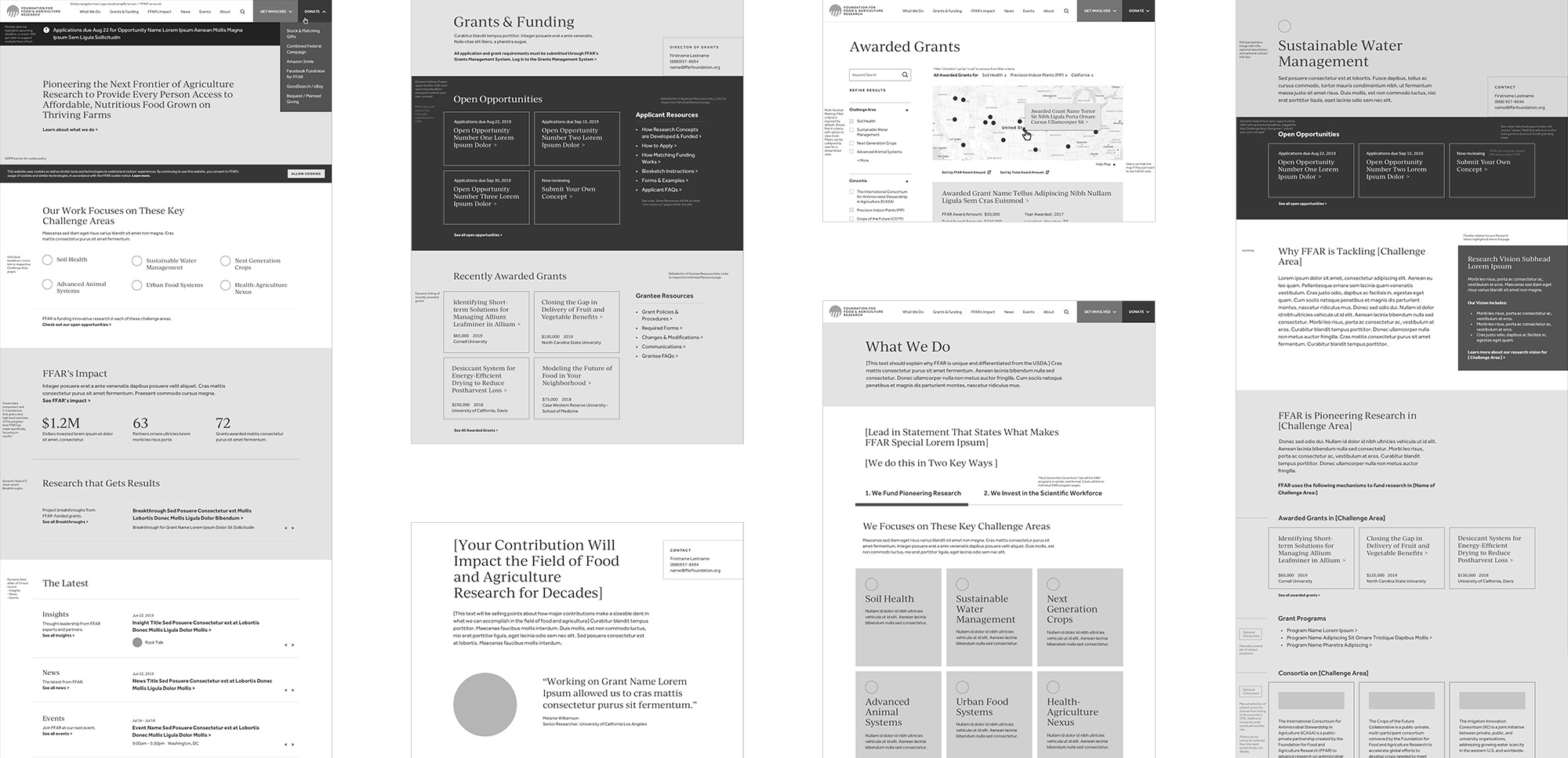
The website Teal created for FFAR introduces their modernized visual identity, offers an intuitive user experience, and makes it easy for FFAR’s diverse audiences to understand the value that FFAR offers them and see how they can get involved.
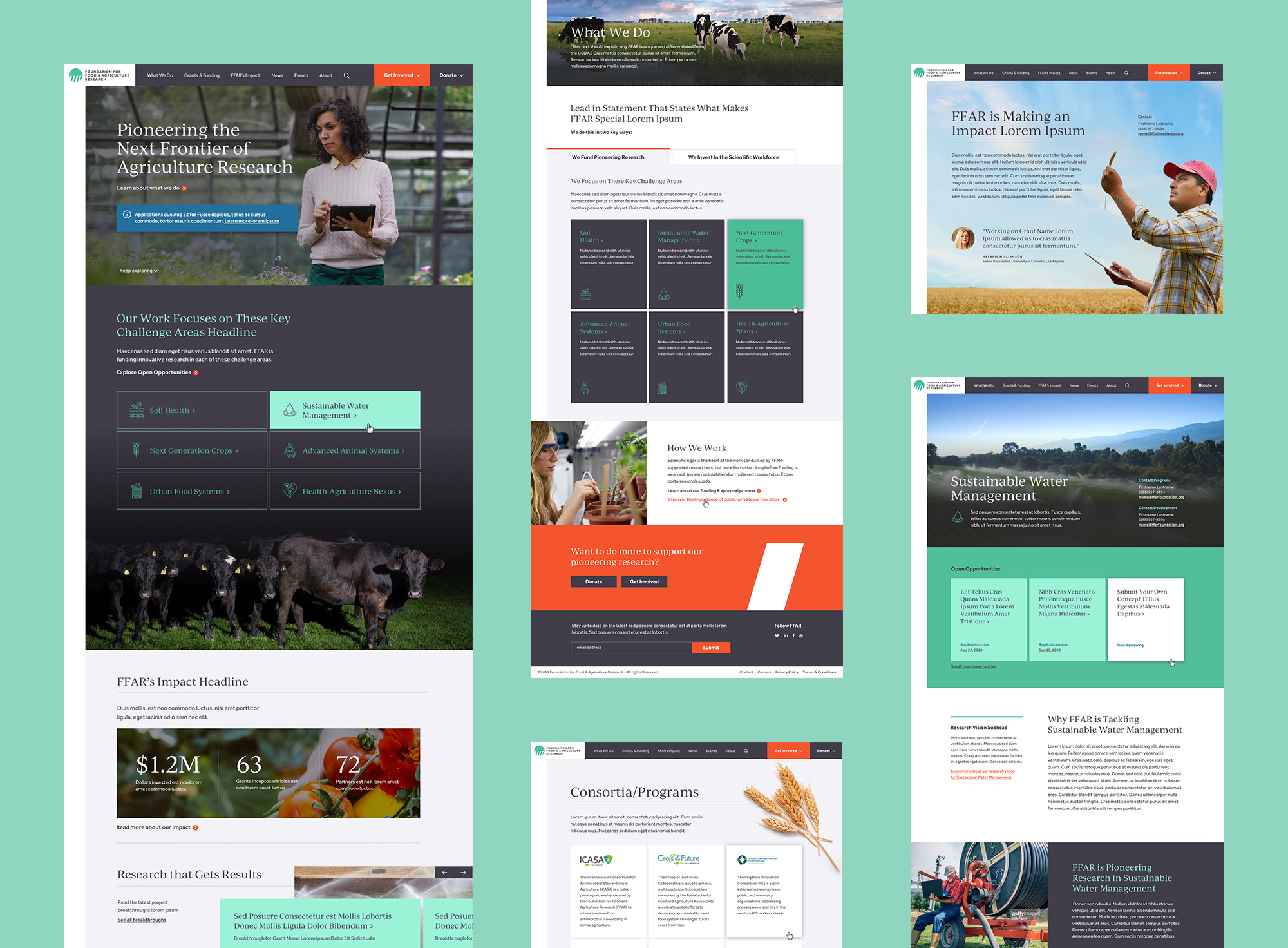
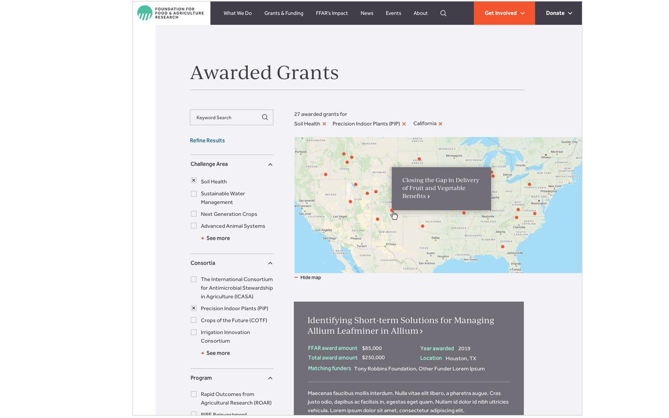
FFAR needed a way to let users search their large library of awarded grants. We introduced a site-wide taxonomy system to dynamically display content on relevant pages, along with a robust filter system on key search pages so users can easily find what they need.
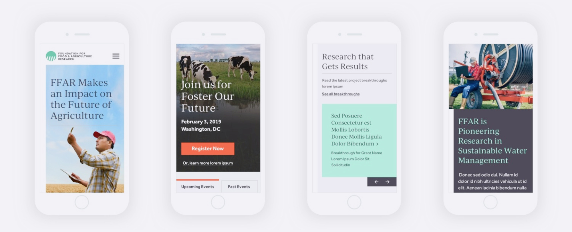
The website was designed with modern responsive web principles, so it seamlessly scales down to various device sizes.

A full digital ecosystem for an independent nonprofit (with an initial investment from Patagonia) that supports Indigenous communities leading climate action with nature-based solutions.


The part where we ask you to cough up your email. So we can discuss all the amazing things we’re gonna do together. No pressure. Really.