Since their formation in 2000, DPA has led the charge to advocate for and create approaches that have fundamentally changed the way we devise drug policy in the United States and beyond.
DPA has been around for more than twenty years – over that time, they’ve achieved some massive wins, and the drug policy landscape has seen seismic shifts. But amidst all that change, the DPA brand and the way they presented their organization wasn’t keeping up. Their personality wasn’t shining through, and neither was the impact they’ve made in the space.
With a new CEO on board, and a new strategic plan in place, the time was ripe for a transformation.
Introducing new energy and a fresh vibe
DPA wanted to amp up the brand’s personality and edginess. At the same time, we needed to balance that new bold tone with the seriousness and thought leadership that’s core to who DPA is.
Coming off of a series of focus groups with DPA staff, we went through several iterations of the new DPA logo and visual identity. The new logo we created for DPA is declarative and unapologetic. The fact that the “orb” shape is not a perfect circle helps to convey the dynamism and flexibility behind DPA’s work, and the expressive typography anchors the brand around action.

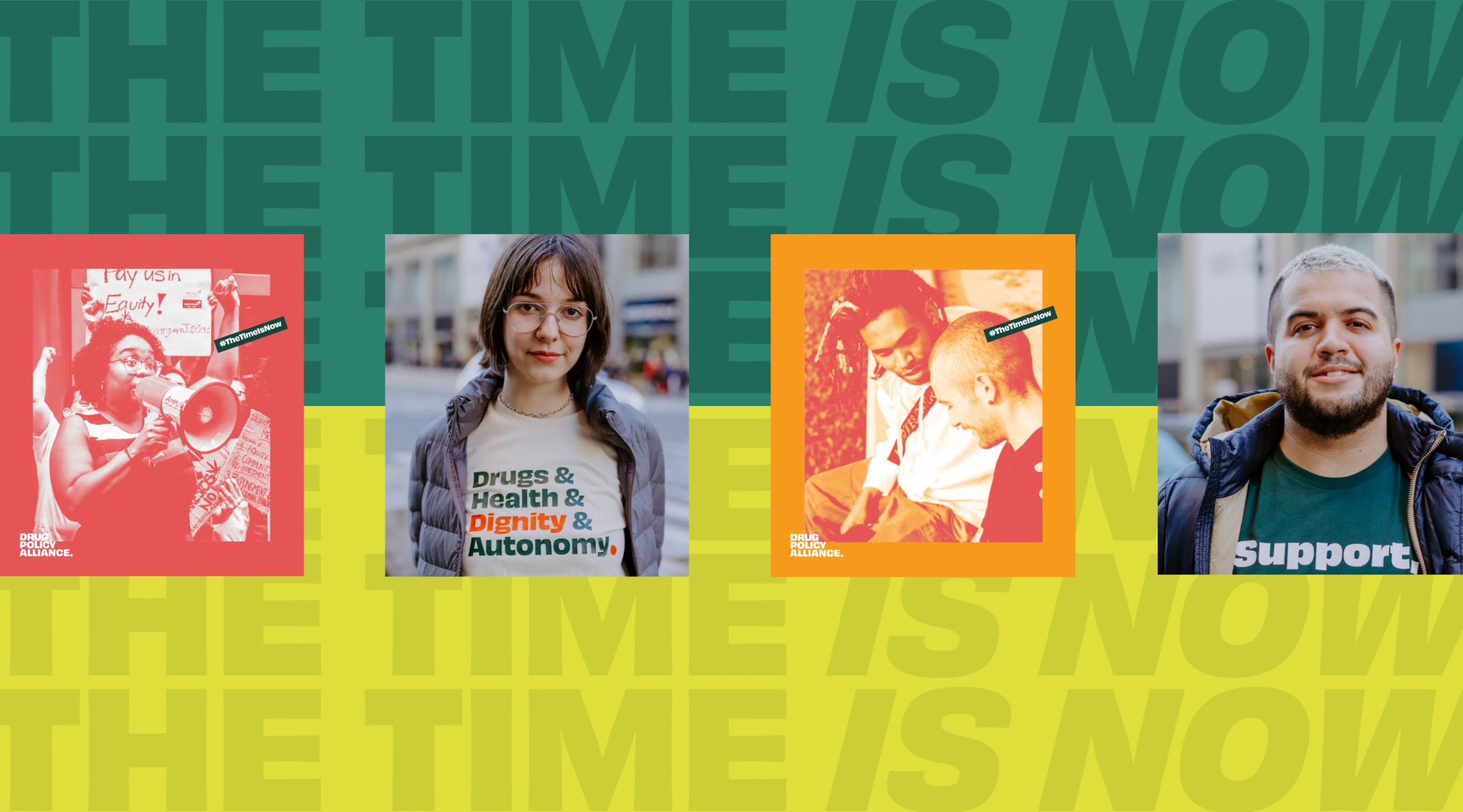
The DPA team is strongly committed in accurately representing the people behind their movement. It was important to them that the photography for the new brand feel authentic and convey the humanity of the real people whose lives are impacted by drugs and drug policies. Teal was on-hand to guide what makes those photographic moments authentic to DPA – celebrating the individual, and making sure to convey the spirit and authentic qualities of the community, while highlighting what actually goes into doing the work.
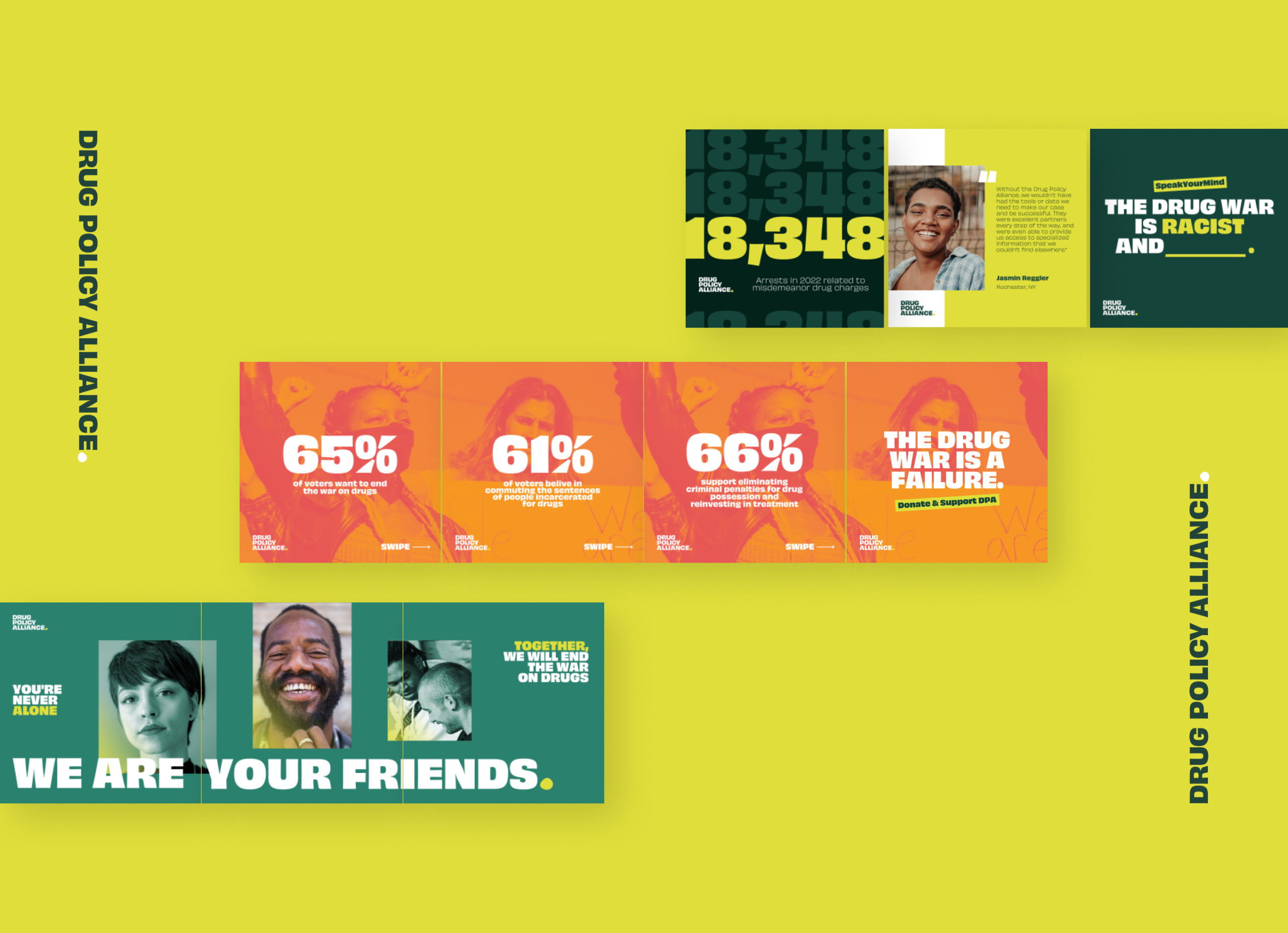
By mixing statistics with photographs of real people, DPA is able to communicate that while doing their work has impact at the macro level, at the end of the day it all boils down to increasing opportunity and improving individual lives.
We also created a hype video, as seen at the top of the page, for the DPA team to use as they rolled out the new brand. The video shows how the DPA team is honoring their history, while at the same time entering an exciting new era of change and momentum.
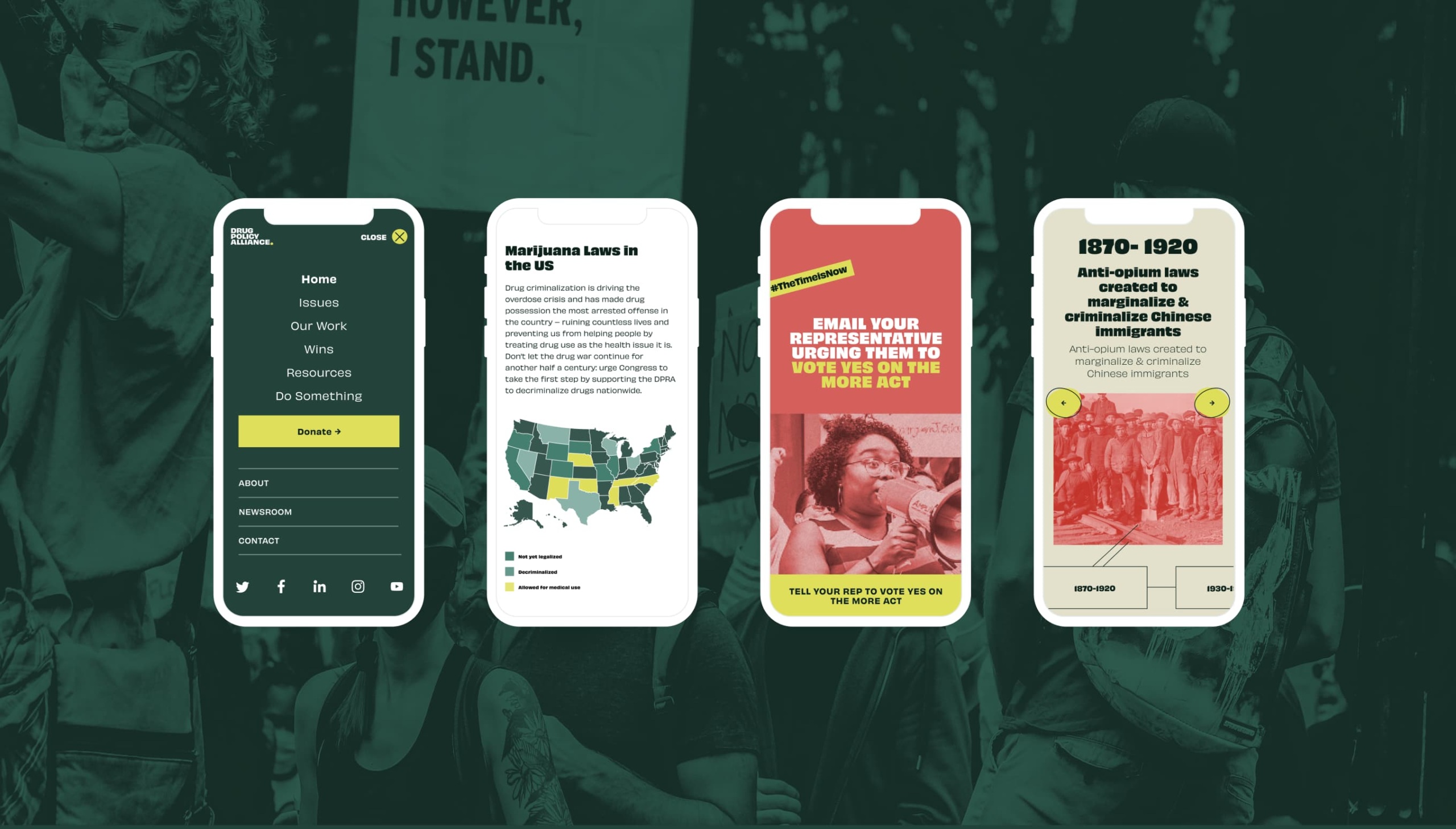
We paired the new brand with a completely reimagined website experience. The new mobile-responsive website elevates DPA’s most popular content, like their Drug Fact Pages. The site includes animations and exciting surprises throughout to encourage scrolling and engagement, with interactive maps and stories of impact sprinkled across the experience to convey the breadth and impact of DPA’s work.
The new website is easy to navigate, and when users arrive at individual fact pages, they’ll find that they’re very visual, and not overwhelmingly text-heavy. We also took care to preserve the strong SEO value that DPA’s most popular pages possessed.
The end result is a website experience that:
- Helps visitors easily understand who DPA is and what they care about
- Makes it easy to find key fact sheets and resources
- Showcases DPA’s critical wins and impact over the years
- Highlights how website visitors can get involved to take action and donate to support DPA’s mission
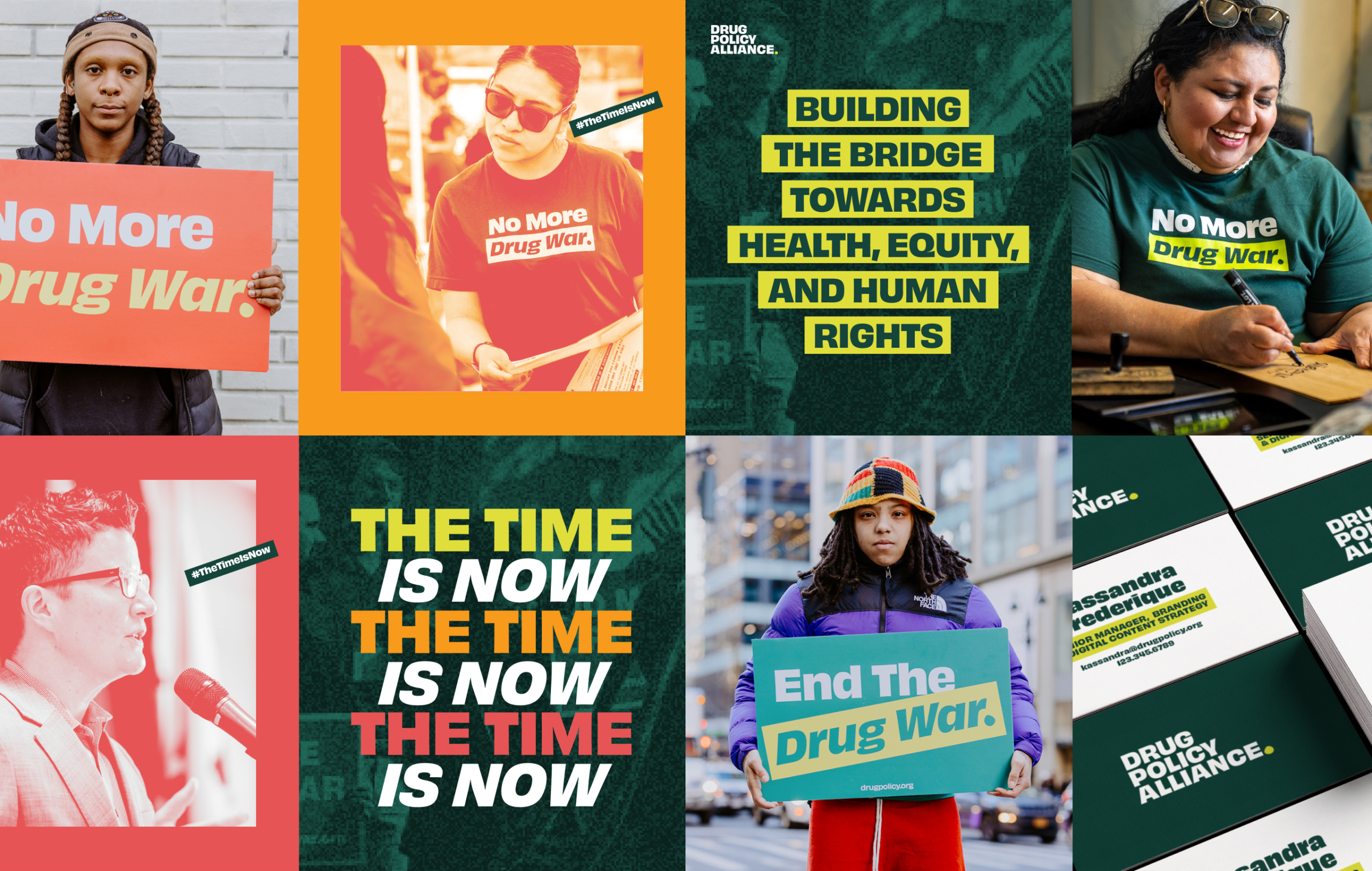
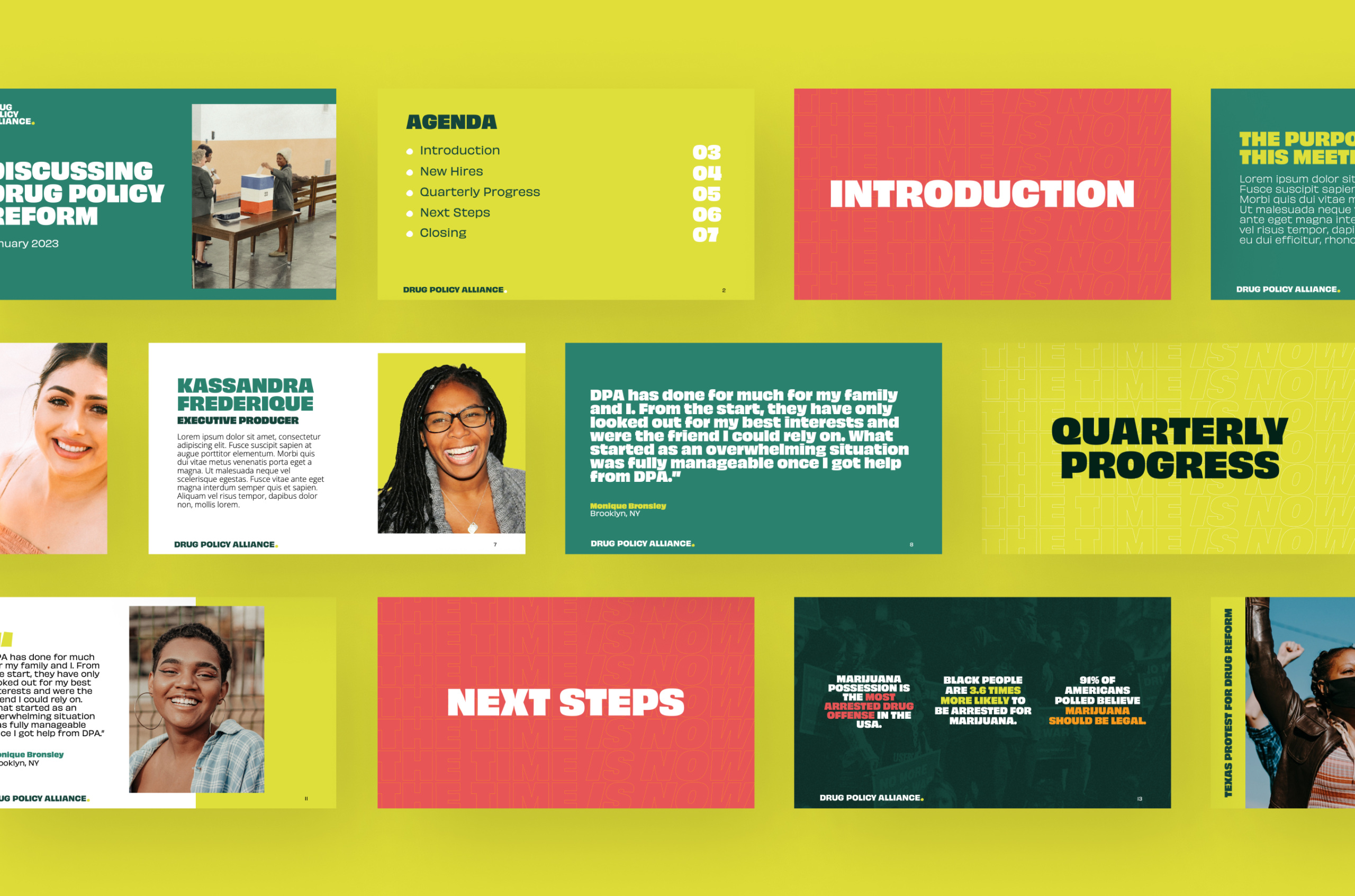
To make sure DPA had everything they needed to execute their new brand in a consistent and coherent way, Teal also designed a new set of collateral that features the updated brand. We flexed the design system, especially with social media, and were able to bring new energy and vibrancy to the way DPA engages with and connects audiences across all of their communication channels.
From the start, you showed such an openness and excitement to work with us, while listening to our feedback and concerns with care. You have been phenomenal partners to us. Not only did you deliver a stellar final product, but held our hands across the way. Leidy was a fantastic project manager and took deep care of this project.
