For 75 years, Americans United for Separation of Church and State (AU) has worked tirelessly to protect the wall of separation between church and state—so we can all live in a more fair, inclusive, and just society. It’s crucial work, and on the precipice of their big anniversary, AU needed a fresh brand overhaul to match their impact while still paying homage to their storied legacy. Because, in their words, “after 75 years of fighting for truth, justice and church-state separation, every superhero needs a wardrobe upgrade.”
With the opportunity fully reset the brand to match its modern, sophisticated advocacy, legal, and policy work, Teal and AU, along with their partners, committed to a full exploration of what a new AU could be. We kicked off the extensive rebranding process with in-depth research and stakeholder conversations, and leveraged those insights to create a compelling new umbrella brand and a guiding vision for updates to all of AU’s communications channels.

Brand Redesign
A Modern Refresh
The result? A clear and memorable charge: “Freedom Without Favor, Equality Without Exception.” A cohesive new brand that honors AU’s legacy while modernizing it for the next generation of advocates. And a comprehensive website overhaul that appeals to younger audiences and integrates seamlessly with AU’s action and donation platforms. It’s the most significant overhaul in the organization’s history at a moment when religious freedom is under repeated attack. But, as they have been for three quarters of a century, AU is ready to fight when the stakes are the highest.
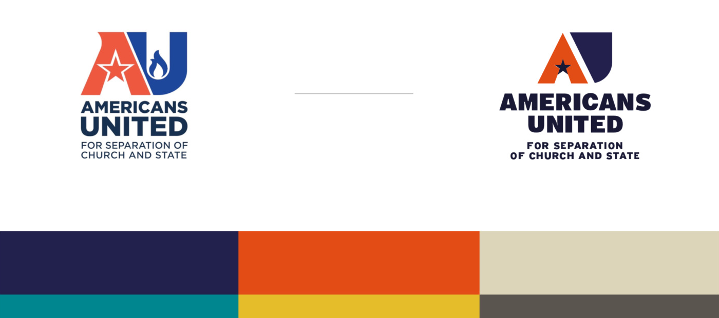
Teal and AU commited to a full exploration of what a new AU visual identity could be. We modernized the color palette and transformed the logo while maintaining its essence and power—and AU’s 75 years of brand equity.
Flexing the brand to connect with key audiences
Insights from our research and data analysis drove our decisionmaking on this project. Teal conducted 1:1 interviews, focus groups, and surveys to understand perceptions, explore high-level messaging, and understand what people needed and wanted from AU. In partnership with a leading communications agency, the team identified the top target audiences AU needs to reach to maintain and grow its brand. The audiences fell into three main categories: Long-Standing Supporters, Easier-to-Get Supporters (Growth), and Harder-to-Get New Supporters (Stretch).
Teal created a brand system that flexes to reach each audience group across a variety of channels. Because every audience is crucial, and one size does not fit all.

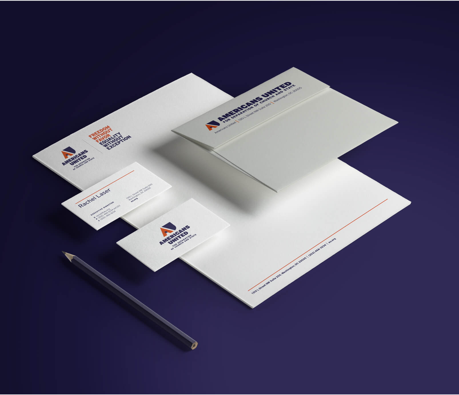
Long-Standing Supporters: Conventional use of brand elements that convey a sense of welcoming and underlying patriotism. Straightforward typography for more traditional leaning audiences and editorial-esque layouts that feel familiar.
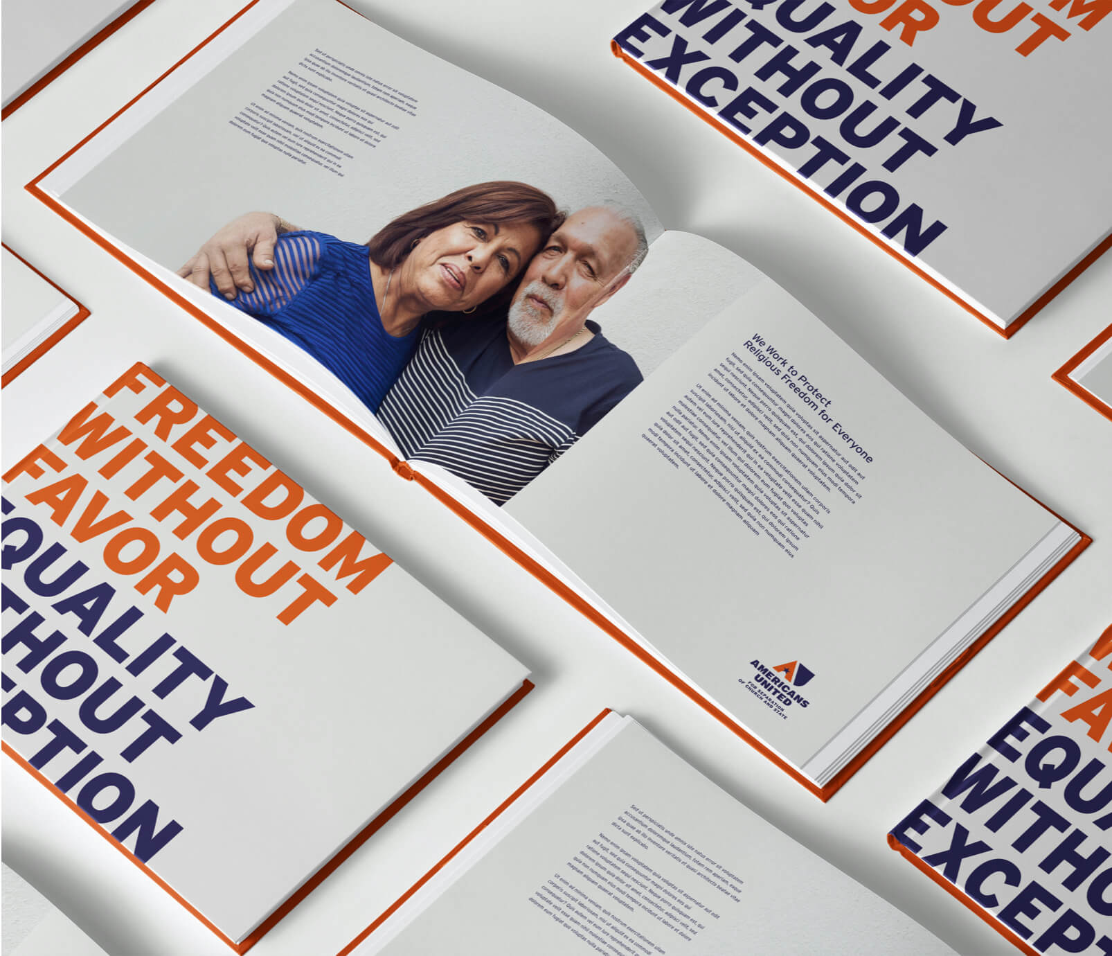
New Supporters (Growth): Simple use of brand elements with a touch more boldness. Incorporating photos of middle-aged individuals, couples, families paired with straightforward typography for savvy layouts that feel fresh and intriguing.

Hard-to-Get New Supporters (Stretch): Liberal use of brand elements that convey a sense of inclusion and authenticity. Incorporating photos of younger individuals/couples/families paired with strong typography and ample pops of color for more modern layouts that feel energized and of the moment.
A comprehensive rebrand
AU is a deep-rooted organization known for its dogged defense of personal equality. To bring that identity to life, Teal led a rebrand process grounded in AU’s values and history, backed by research, and all tied together into a large umbrella brand that all the unique, flexible elements can fit underneath. The result is a fresh cohesive presence that appeals to younger, more diverse audiences while honoring AU’s long history of impact.
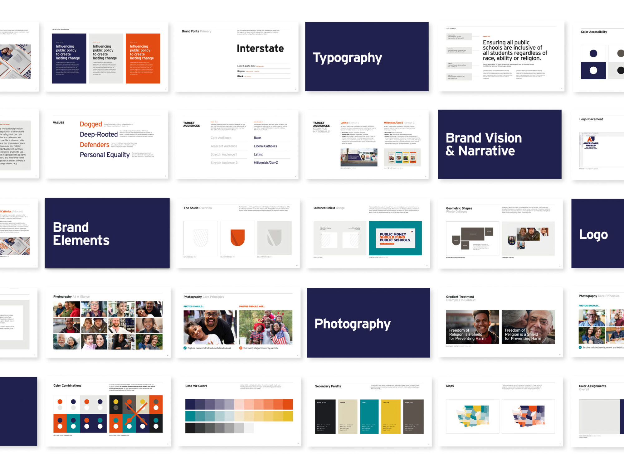
Teal wrapped all of it together into a clear guiding vision and worked with AU to update all of their communications channels to express it. The practical, easy-to-use brand guide below gives the AU team the tools they need to put the brand into action.
Bold new site for defenders of religious freedom
Teal ran the brand development and website projects on simultaneous tracks, so as AU’s new brand was finalized, we were wrapping up wireframes and ready to translate the brand to their dynamic new website.
The result is an approachable new site that speaks to all of AU’s audiences, clearly explains the urgent threats to religious freedom, and drives home how AU and its supporters shield all of us from bad laws and the extremists who use religion to harm others.
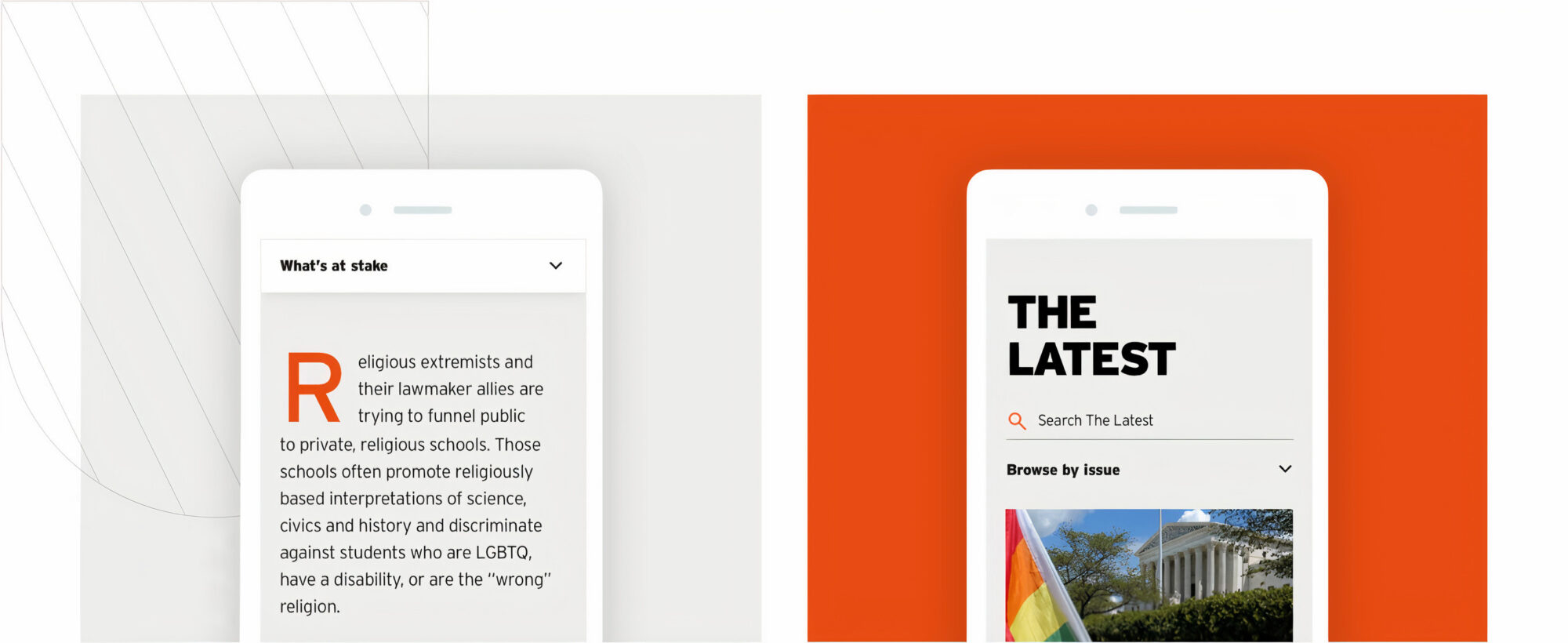
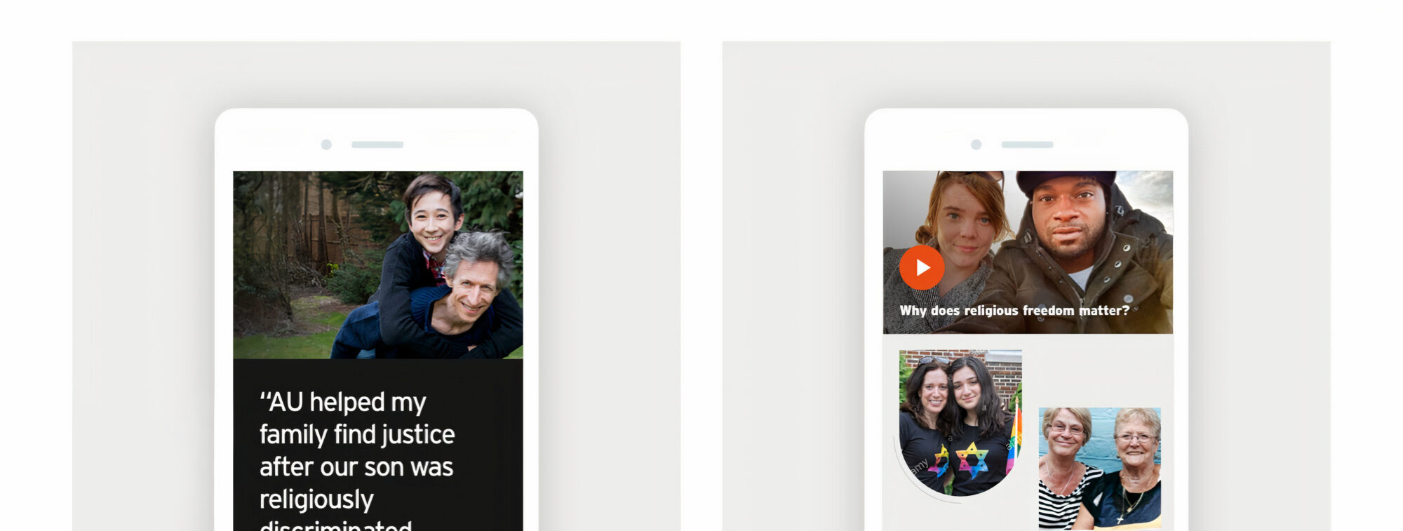
Teal crafted an inspiring, engaging user experience for the site by following a few key principles:
- Show how AU fights for religious freedom in the courts, in the legislature, and in the public square—with a history of making history
- Foreground real people whose lives have been affected by attacks on religious freedom, and lift up the supporters fighting for change
- Make the site accessible to everyone, regardless of device or ability, with WCAG 2.1 AA compliance
- Create an administrator experience that’s fast and easy for the AU team to use, so they can respond quickly to emerging threats and help supporters take action
Summit for Religious Freedom
Expanding the brand for an annual conference
Teal also flexed the new AU brand to create a new look and feel for the upcoming Summit for Religious Freedom. The result is a subbrand that feels like a “close cousin” of AU, but is strong enough to stand on its own.
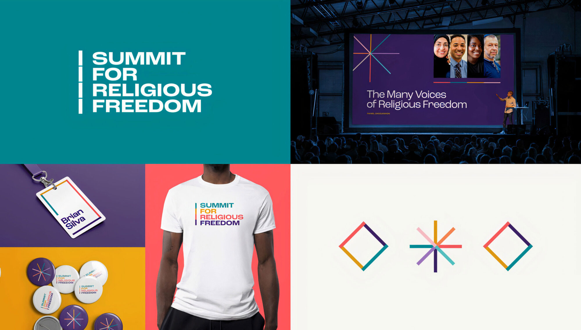
The theme, “uniting diversity,” comes through in color, iconography, and a feeling of differences united together.
We’re delighted with their work; they’ve provided us with incredible results on our website and the new look and feel of our cause. They know how to understand our cause to make it come alive in a beautiful and accessible way in modern times.


