Ultraviolet
For over a decade, UltraViolet has combined organizing, technology, creative campaigning and people power to prove that gender justice can win.
Work
+1,100% Google Discover traffic
96% Core Web Vitals rating
#1 Search ranking for key content for pet parents
+154% Traffic to job listings for partners
+30% Organic social and email traffic
+28% Average click-through rate
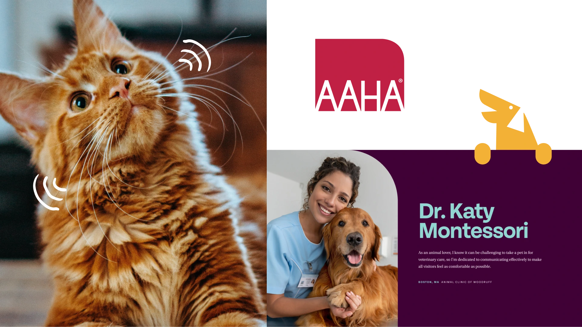
Veterinary professionals pour their hearts into tending to pets, but unlike human health providers, they lack compulsory care standards. As the only accrediting body for companion animal practices in the U.S. and Canada, the American Animal Hospital Association fills that gap with its stringent protocols and industry-leading resources. When pet parents see the AAHA seal, they can rest assured that their beloved cats and dogs will receive exceptional care.
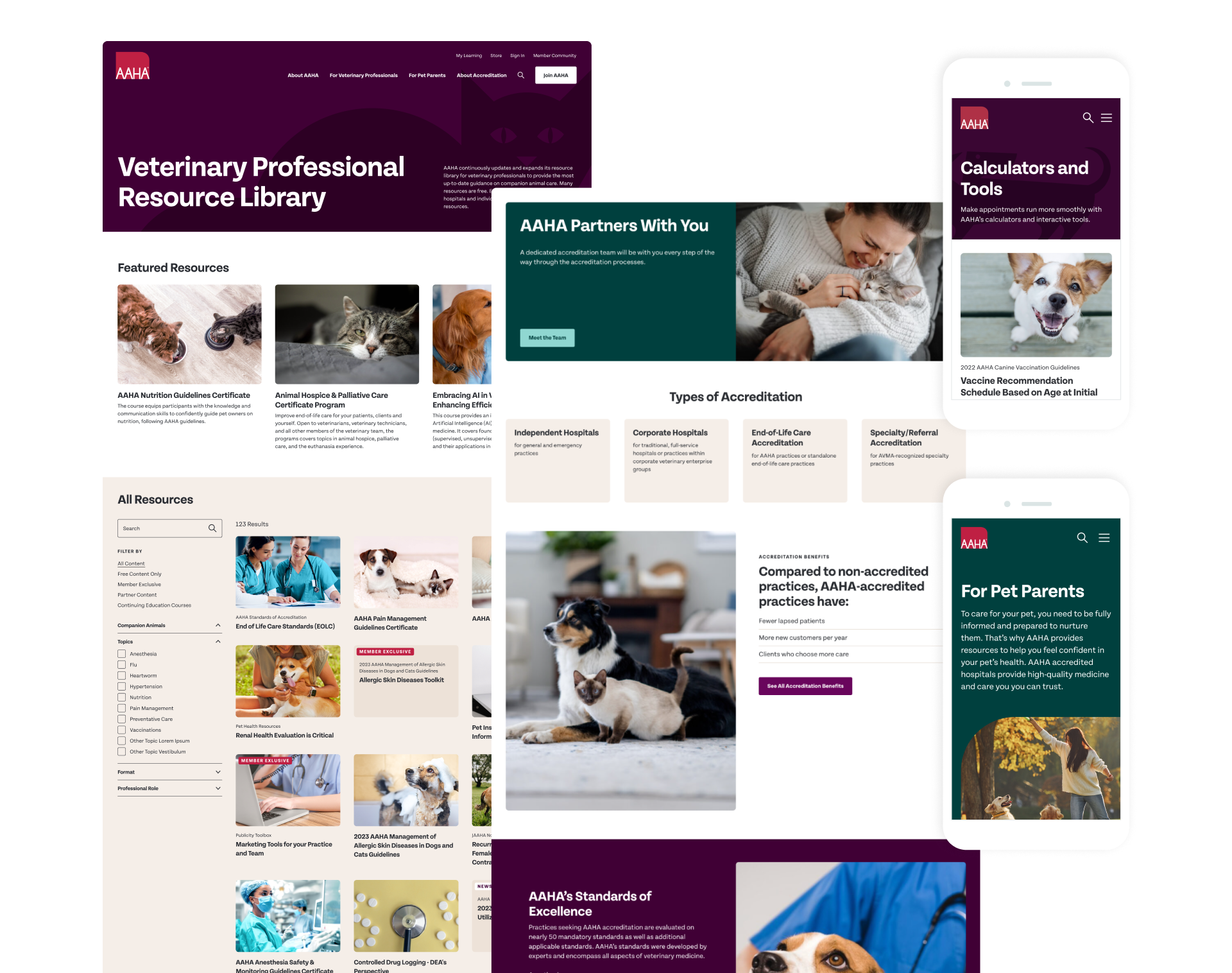
But the website didn’t clearly convey that value. The staid design evoked “your grandpa’s vet,” not the diverse, doting providers of today. Teal transformed the site with a warm, approachable look that was serious enough to show the business case for making a major, voluntary investment in excellence through accreditation and individual membership. Thanks to intuitive site navigation and custom integrations, it’s now easier for visitors to access the right educational materials, join the organization, and begin the accreditation process online.
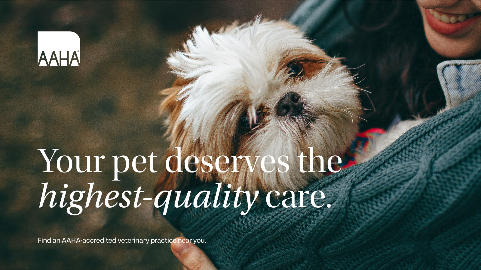
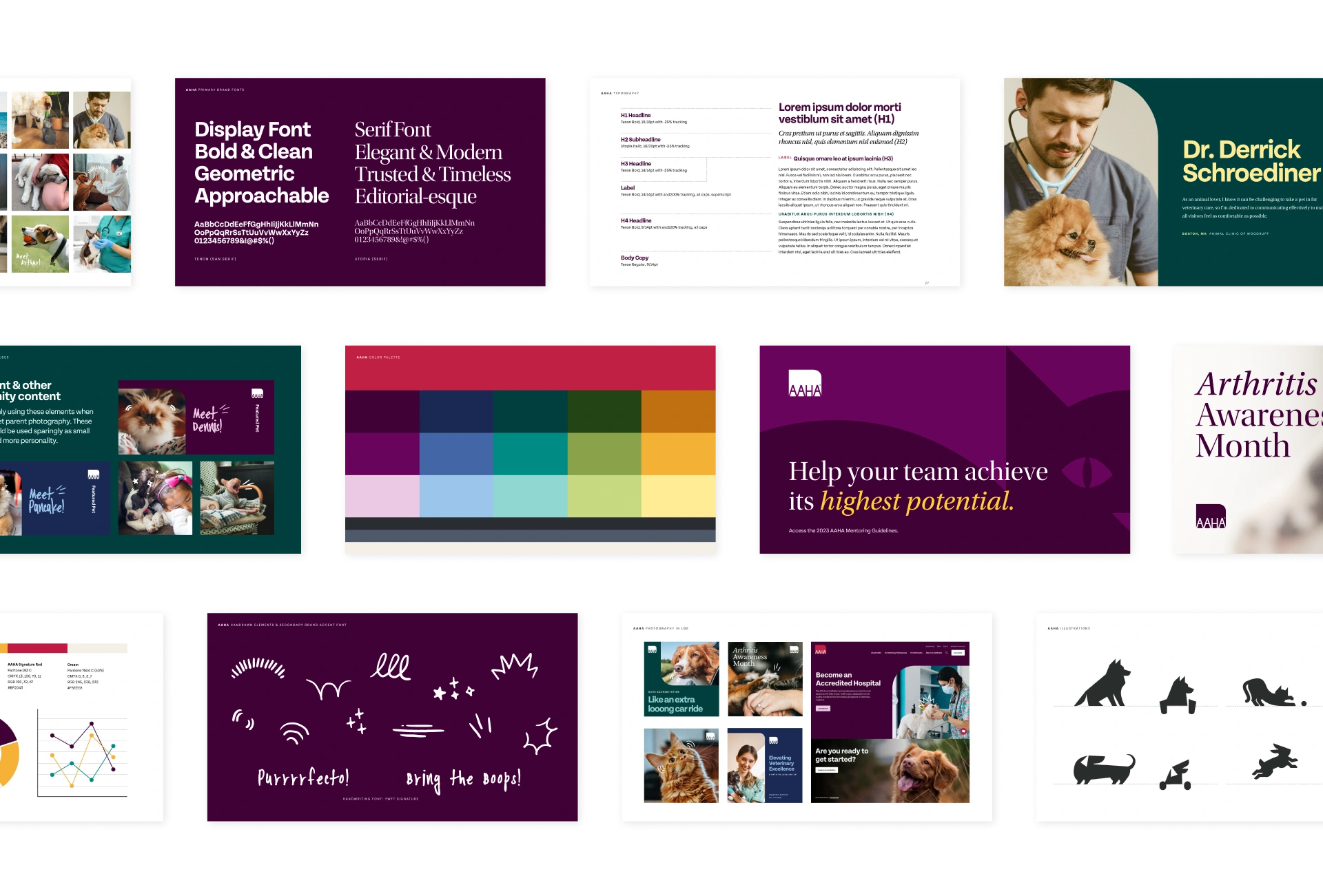
The refreshed brand peels back the curtain to humanize the veterinarian profession, infusing a newfound sense of confidence, joy, and warmth into the visuals. While the logo remained untouched, Teal focused on building out the surrounding environment to better reflect AAHA’s fun-loving personality, all while keeping a level of professionalism and polish to demonstrate the quality, trust, and relevance integral to their DNA. The result? A modernized look and feel, filled with heartfelt illustrations, friendly fonts, natural photography, and a deeply energizing color palette.
As a nonprofit, AAHA’s mission is to simplify the journey towards excellence for veterinary practices. To succeed, it must meet its business targets as a membership association.
During discovery, Teal took a deep dive into products, services, and sales models. Based on this understanding, Teal crafted a content strategy for proving the value proposition, as well as sharing free resources to fulfill AAHA’s mission and build a pipeline.
Additionally, AAHA wanted to expand by building brand awareness among pet parents. The purpose was twofold: to deliver superior care to more animals and to attract clients to AAHA hospitals. The new navigation maps separate user journeys for the two very different audiences. Pragmatic content written for pet parents is clearly divided from the scientific, both visually and tonally.
The animal hospital locator is an essential tool that not only drives traffic to the website but also directs new clients to AAHA-accredited hospitals and practices. By leveraging API integrations with Google Maps and and a separate AMS database, Teal enabled visitors to easily find their nearest accredited animal hospital, highlighting the extensive reach of AAHA’s accreditation program. This locator is one of several tools Teal rebuilt to seamlessly integrate with the new site’s styles, providing a cohesive user experience and allowing for future enhancements and customizations.
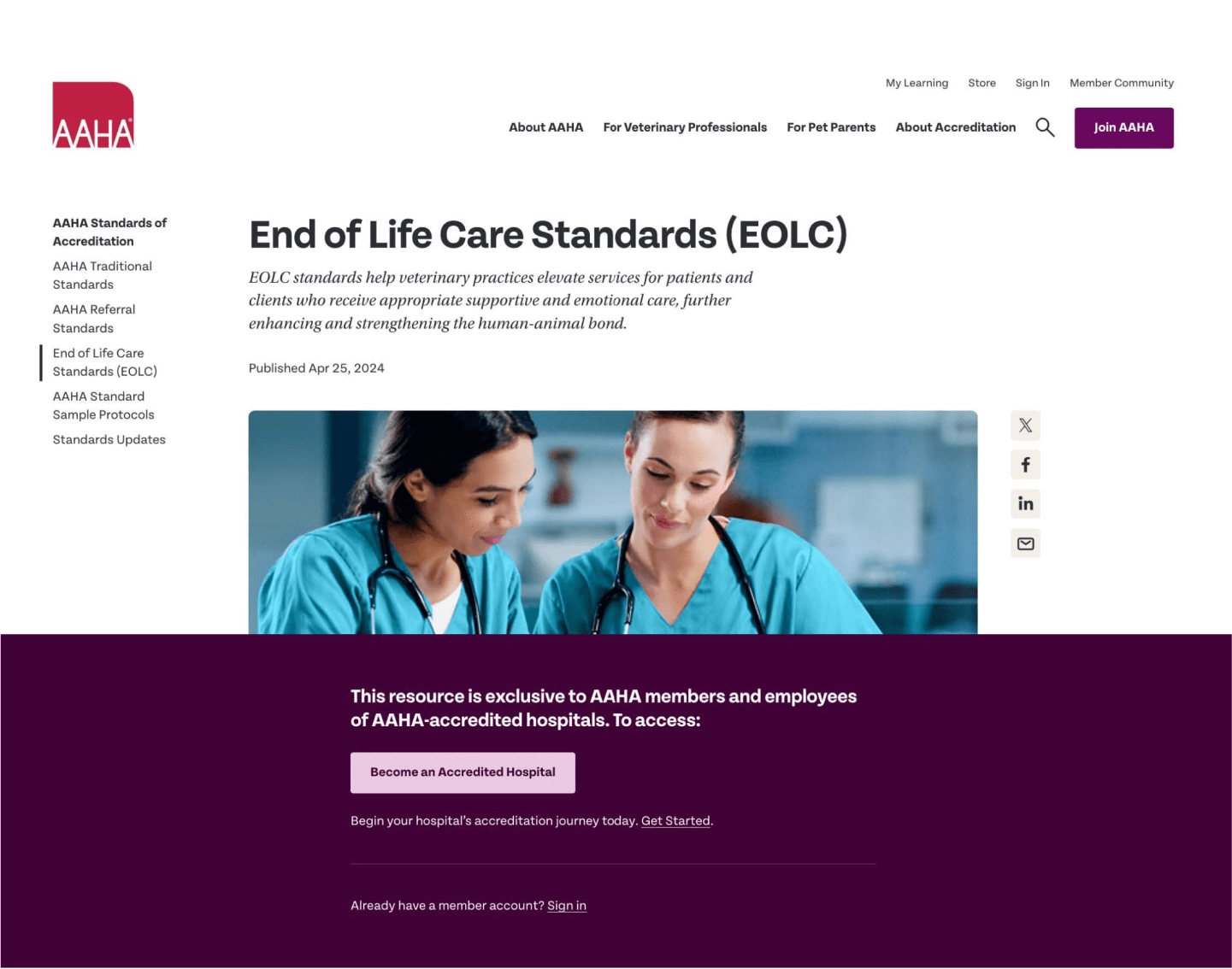
Exclusive research, resources, and calculators are core membership benefits. Single-sign-on offered a seamless user experience: when members log into the website to unlock content, their credentials carry over to additional benefits on separate third-party platforms.
Strong visual cues about member exclusivity also serve as a marketing tool. The site makes it easy to access a multitude of free resources, while also demonstrating the value of joining.
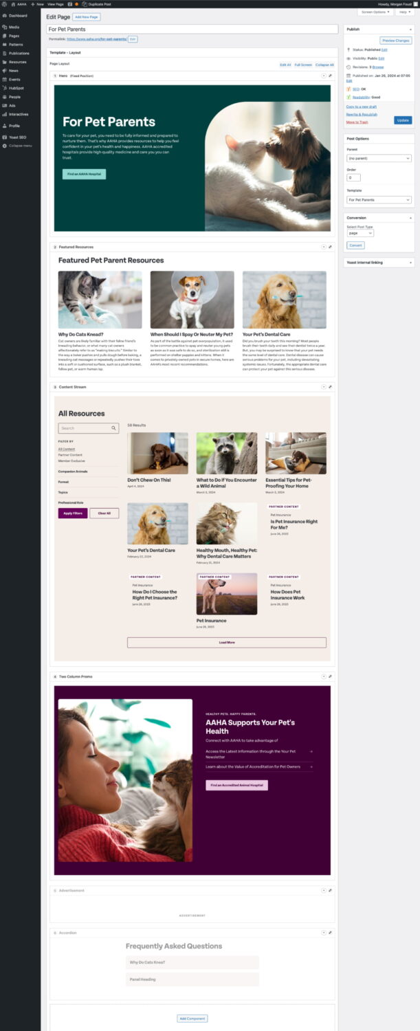
AAHA had a wealth of valuable content, but their outdated and unintuitive content management system hindered their ability to effectively showcase their work. Teal wanted to create a CMS that would be easy to use while still offering a powerful and flexible way to create unique and engaging layouts.
The system, built on WordPress, boasts an intuitive layout builder featuring distinct, customizable components that can be effortlessly added, removed, rearranged, and previewed directly within the admin interface. This innovative design offers a more efficient editorial workflow, empowering users to create layouts worthy of the content.
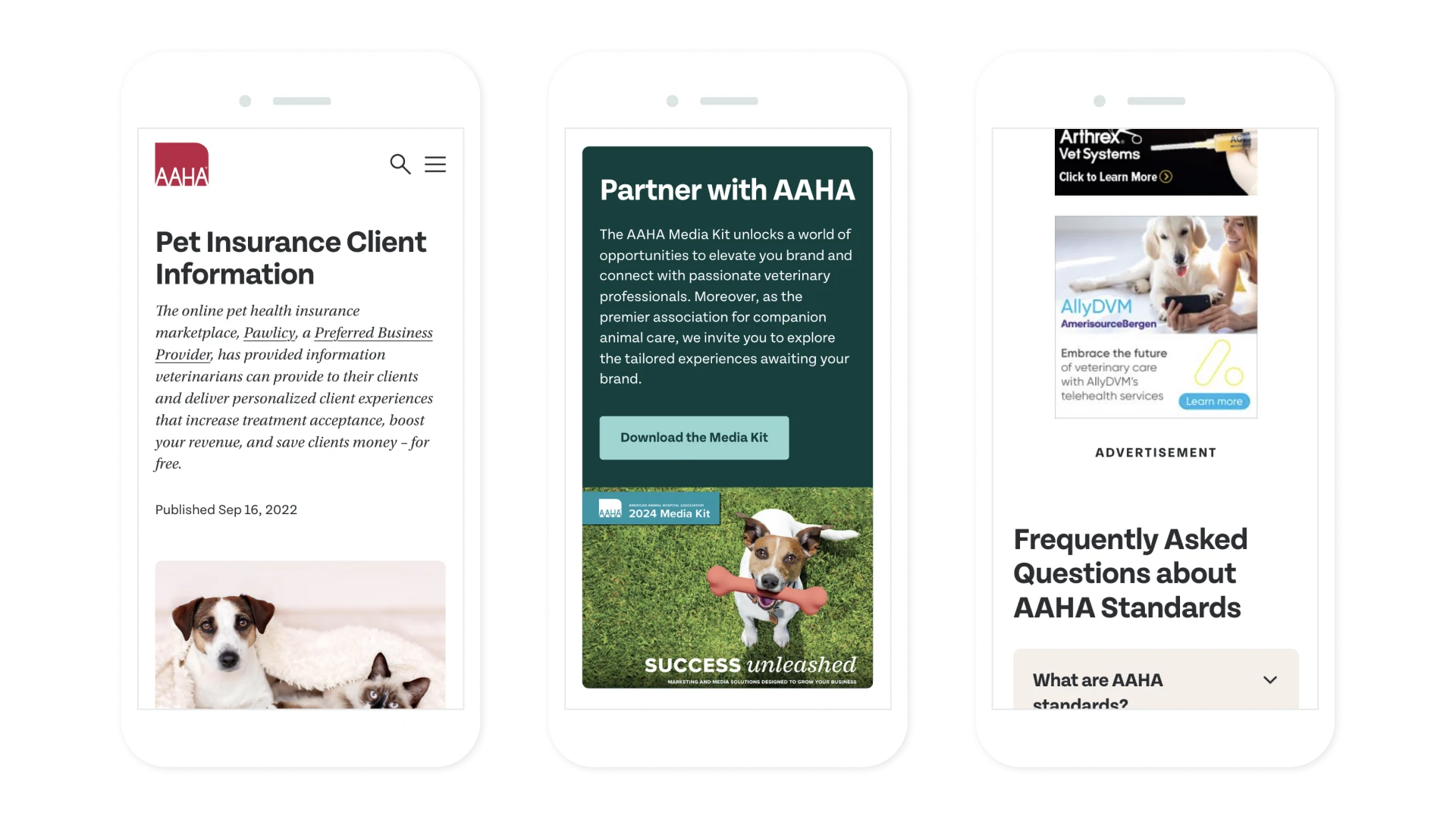
With the new website, AAHA’s sponsorship and ad sales team shifted its focus from print publications to digital.
The new design provides flexible options for ad placements and sponsor recognition in multiple configurations across many page types. Teal also mapped out a thorough plan for tracking user engagement for sales reporting. By combining the power of Google’s analytics and ad management platforms, the sales team will be able to track interactions and impressions for its customers and grow the program.
It was love at first sight when we met the Teal Team. We knew we had found our perfect match to reimagine our website. Gathering input from all corners of our organization is no easy feat – it can feel like – oh, herding cats! But the Teal Team showed up, honoring our 90+ year history and delivering a tangible evolution to streamline resources we create for the veterinary community. With an incredible group of experts and a deep understanding of user experience and design, they embraced our mission as their own and led us on a thrilling journey to revamp our online presence.



For over a decade, UltraViolet has combined organizing, technology, creative campaigning and people power to prove that gender justice can win.


The part where we ask you to cough up your email. So we can discuss all the amazing things we’re gonna do together. No pressure. Really.