Drug Policy Alliance
Teal introduces a new energy and a fresh vibe to the storied brand of the Drug Policy Alliance.
Work

University of Chicago’s Crime Lab evaluates innovative policies and programs that address gun violence and criminal justice, in the hope of scaling what works. And its Education Lab identifies new approaches that personalize teaching with a focus on diverse student populations. Housed under the university’s Urban Labs program, both divisions were hamstrung by sites that made it difficult for policymakers, funders, and press to quickly access critical information. And that hurdle made it harder to drive change in the public sector.
After U. Chicago’s in-house team updated the Labs’ brand, Teal was brought in to clarify site navigation, provide visual impact, and make content like reports, slide decks, data visualizations, and press releases easy to find.


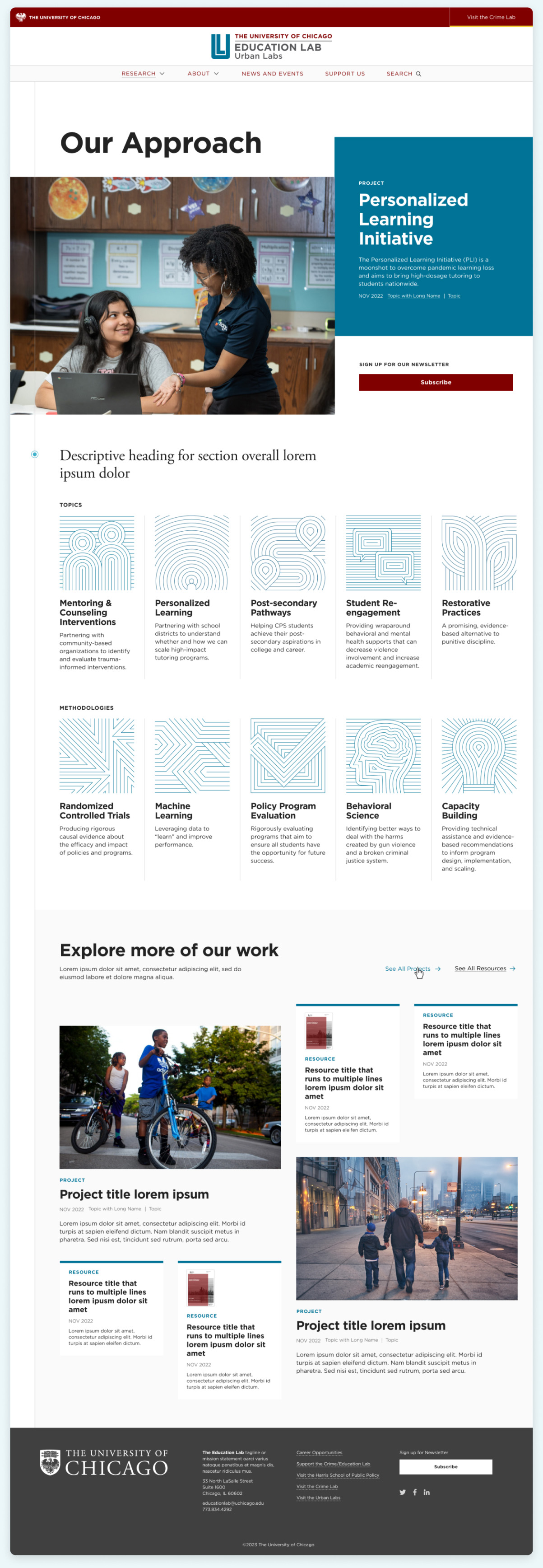
Teal’s design solution included two sites built with one design system, and colors that correspond to each lab.
We also included custom icons that break content into discrete categories for readers, using abstract linework to reflect key themes.
To provide a pathway for users to explore the breadth of the Labs’ work, we designed components that combined different content types, such as projects and resources.
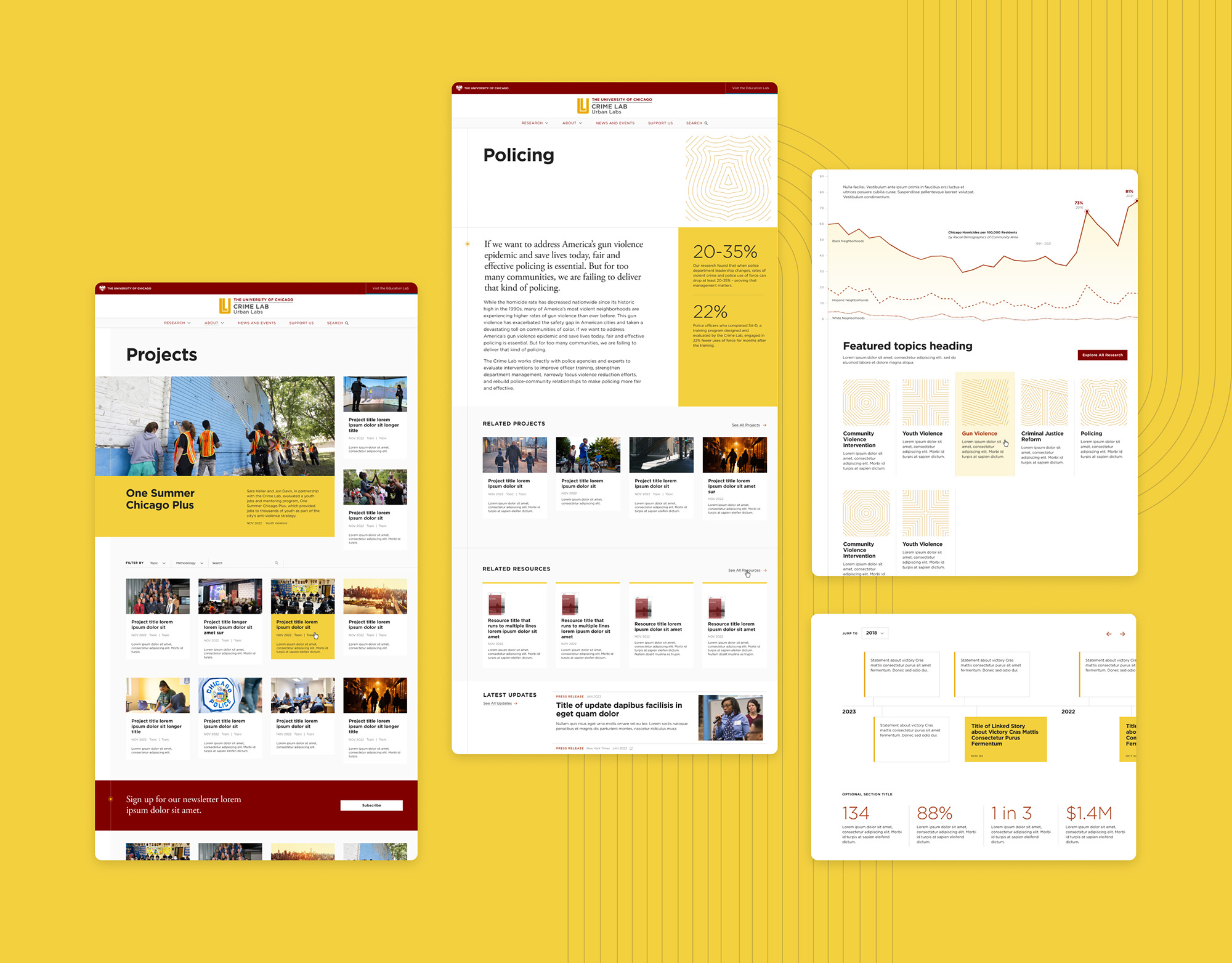
The new sites now showcase the labs’ work in ways that are more accessible to a wide variety of stakeholders, so that visitors immediately know what they do (and don’t do), what type of research they conduct, and what projects they’re working on. Audiences already have a much better understanding of the value the labs provide to Chicago—and the outcomes of turning their research into practice.
Below, the new sites’ much friendlier “magazine” feel, with key data points, data visualizations and research findings.

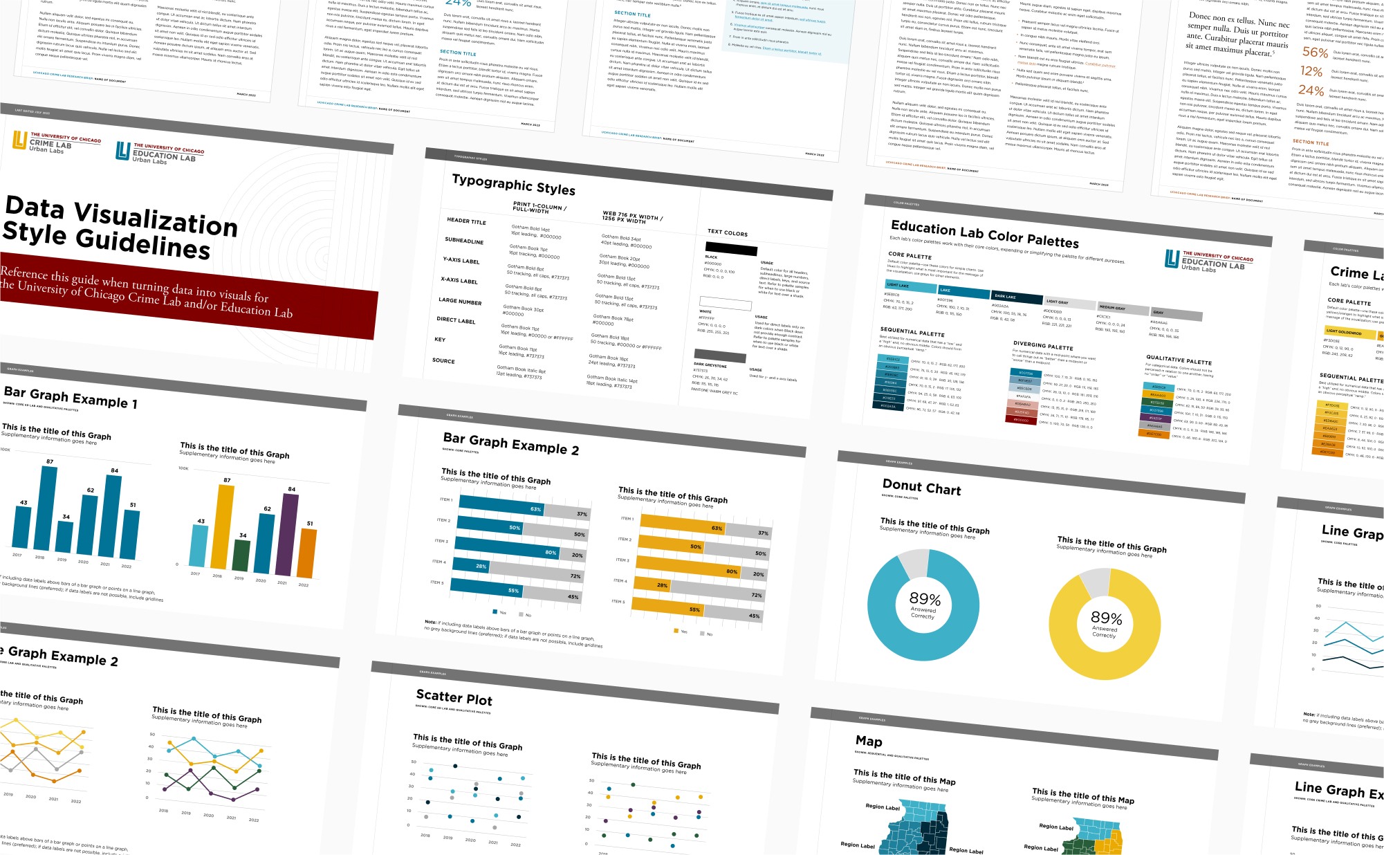
After Teal designed the websites for the Crime and Education Labs, we continued to work with U. Chicago to design collateral, including stationery, Powerpoint templates, report templates, and a data visualization style guide.

Our team’s experience was nothing short of exceptional. Teal embodied creativity, flexibility, thoughtfulness, and a solutions-oriented approach that made the entire process not just productive but also enjoyable. The final product they delivered exceeded our expectations and has undeniably elevated all our communication efforts.


Teal introduces a new energy and a fresh vibe to the storied brand of the Drug Policy Alliance.


The part where we ask you to cough up your email. So we can discuss all the amazing things we’re gonna do together. No pressure. Really.