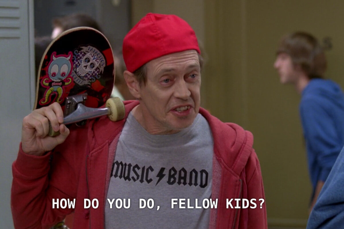
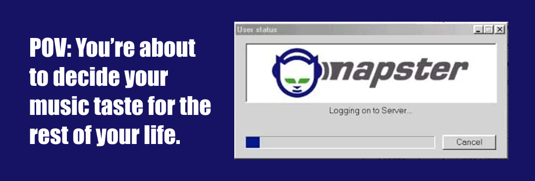
As I pass 40 years of living, I find myself nostalgic for the internet of the 90’s and early 2000’s. Back then, the internet felt like a place where you could stumble into just about anything. I spent my teenage years chatting with strangers online, discovering punk songs through Tony Hawk’s Pro Skater, posting art on DeviantArt and Tumblr, and falling down rabbit holes that somehow led to things like Homestar Runner and Slenderman. The internet felt weird, unpredictable, and full of possibility.
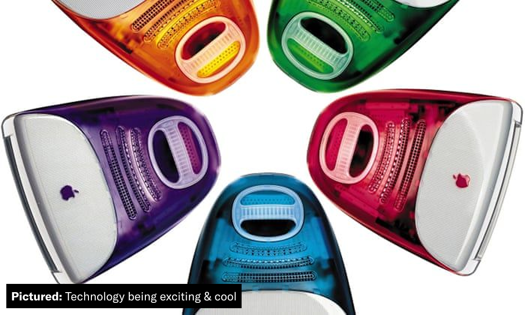
These days, technology feels more like a chore. Sure, we need it to stay informed and connected, but half the time we’re wading through ads, subscriptions, and platforms designed to keep us scrolling. Technology seems to have plateaued, and everything is starting to look the same and not exciting. Remember when computers and gaming consoles came in transparent neon colors? Now we’re stuck in a purgatory of blandness.
So, where do we go from here? Backwards, it seems.
Nostalgia isn’t new. Millennials are kind of infamous for it, but now Gen Z is joining in.
Streaming services keep getting more expensive while somehow offering less of what we actually want to watch. So people are dusting off DVD players, scouring thrift stores for old movies, and building physical collections again. The same pull toward something more tangible is showing up in the places where we spend our time. Post-covid, third spaces have dwindled, with even large chains seeming more interested in squeezing every last dollar out of people than giving them a reason to stick around. But many local spots are going the other direction, carving out their own niches by involving the community more.
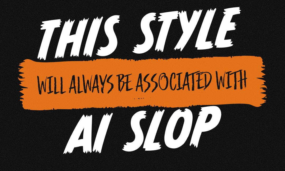
Then we have AI, with its promise of helping create designs or graphics, but being years behind trends (resulting in THAT same poster style we’ve seen a million times, with a dark background, screaming text, and a way-too-detailed artificial food photo). It’s been so bad that many local businesses have faced backlash to AI-use, instead seeing value in a handdrawn poster or candid photo taken by staff to get their message out.
This, I believe, is the biggest sign of the analog rebellion. For the longest time, brands were expected to look polished, professional, and perfectly curated, especially on social media. Every photo just right, every graphic designed, but not anymore.
It may sound weird from someone whose job revolves around branding and visuals, to say this, but let me explain. We don’t necessarily want things to look bad, but what we crave is authenticity. Trends are cyclical, we all know that. For the longest time, we’ve been transitioning away from the maximalist aesthetic of the early 2000s such as frutiger aero, with everything bold and hyper-designed. As humans, we tend to over-correct on trends we grew up with, so we rebelled with minimalism. We’ve all seen brands rebrand to a clean, sans serif logo. They look fine. But, as we saw with Cracker Barrel’s logo debacle, we crave personality and point-of-view. The logo was imperfect, but that’s what made it what it is.
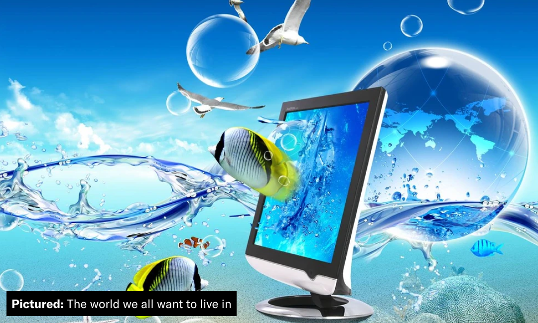
But it’s 2026, and I’m far from the first one to realize the appeal of authenticity. Imperfections can be faked and commodified. Adding grit or texture does not equal authenticity, but it can help communicate that message. Depending on your specific organization or brand, you may not need handmade or custom visuals, but most everyone can benefit from focusing on earnestly appealing to your audience.
The analog rebellion and valuing authenticity go hand-in-hand. As a people, we’re less concerned with a flashy, sparkly graphic and more concerned with what it is and what it means to us. Knowing your audience is key. Focusing on their interests, what they believe in and what they stand for should inform how you approach your messaging and brand. That isn’t to say you should needlessly try to be something you’re not, but more-so that your visual presence should be informed by and speak to your audience.
Groundbreaking right? A kids brand should look like a kids brand or a bank should look like a bank. That’s not fully what I mean, though. A brand and their visuals should be able to flex, too. Your brand should have a recognizable identity, but that doesn’t mean every Instagram post, website page, and presentation needs to look like it came from the same template. Sometimes a candid staff photo makes more sense than a designed graphic. Sometimes a polished campaign is exactly what the moment calls for. The trick is knowing the difference and making sure both still feel like you.
So, what am I ultimately saying here? Am I saying every brand needs completely custom handmade typefaces and textures? Do you need to create a carved linocut logo? Or even get a top expert to write your content? No, not necessarily, but every one of these should be considered when crafting your brand.
If you know your audience and make intentional choices about how you show up, authenticity becomes less of something you have to manufacture and more of something that comes through naturally. People can tell when something feels like it could have come from anyone. They can also tell when there’s a real point of view behind it.
Maybe the analog rebellion isn’t really about going backwards. Maybe it’s about bringing back some of the personality we lost along the way.