Skip to Content

Work

Amnesty International USA’s Annual General Meeting

An ongoing creative partnership built on one rule: never do what we did last year.
3 activists sit in front of a crowd with the AGM25 logo behind them.

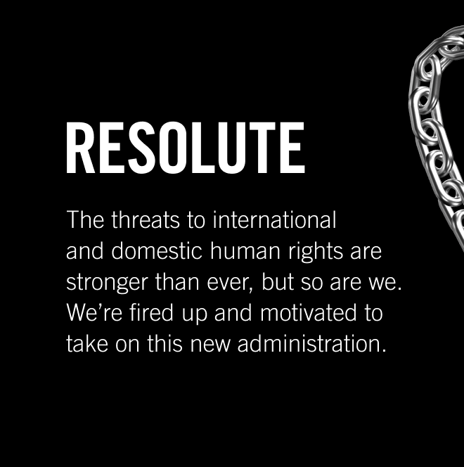
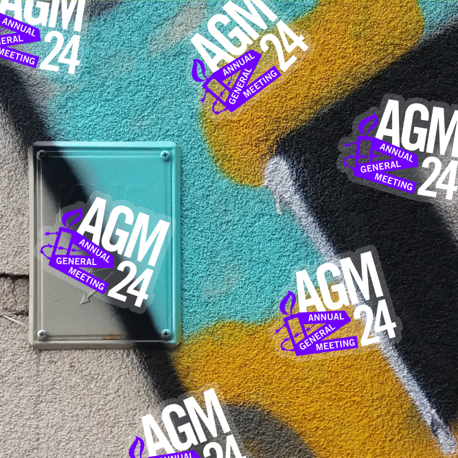
A Brand Built to Fight 

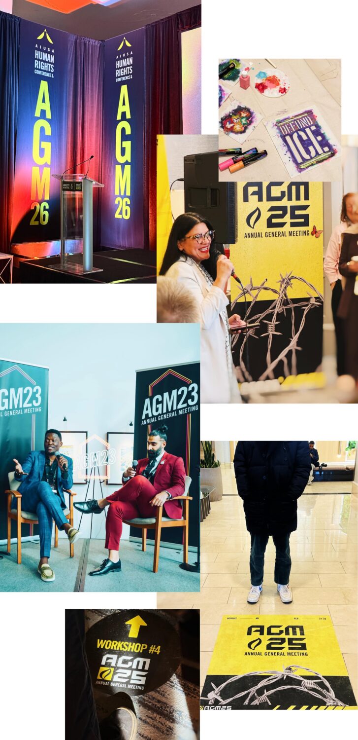
For five years, we’ve created event branding for America’s most recognized human rights organization, and a different visual language every time.

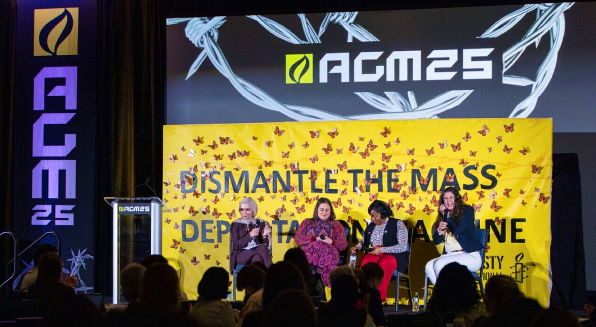
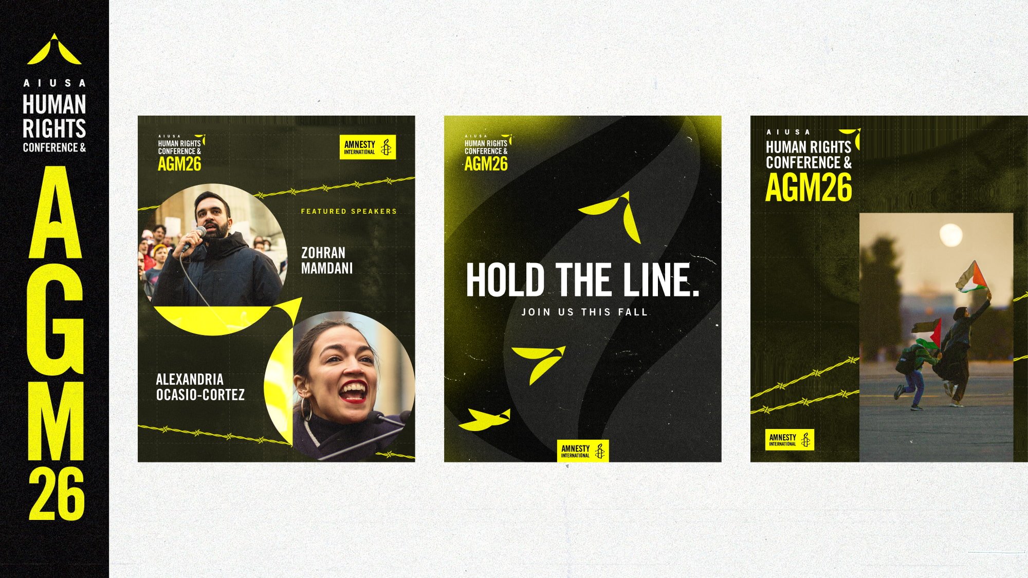
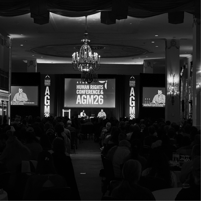
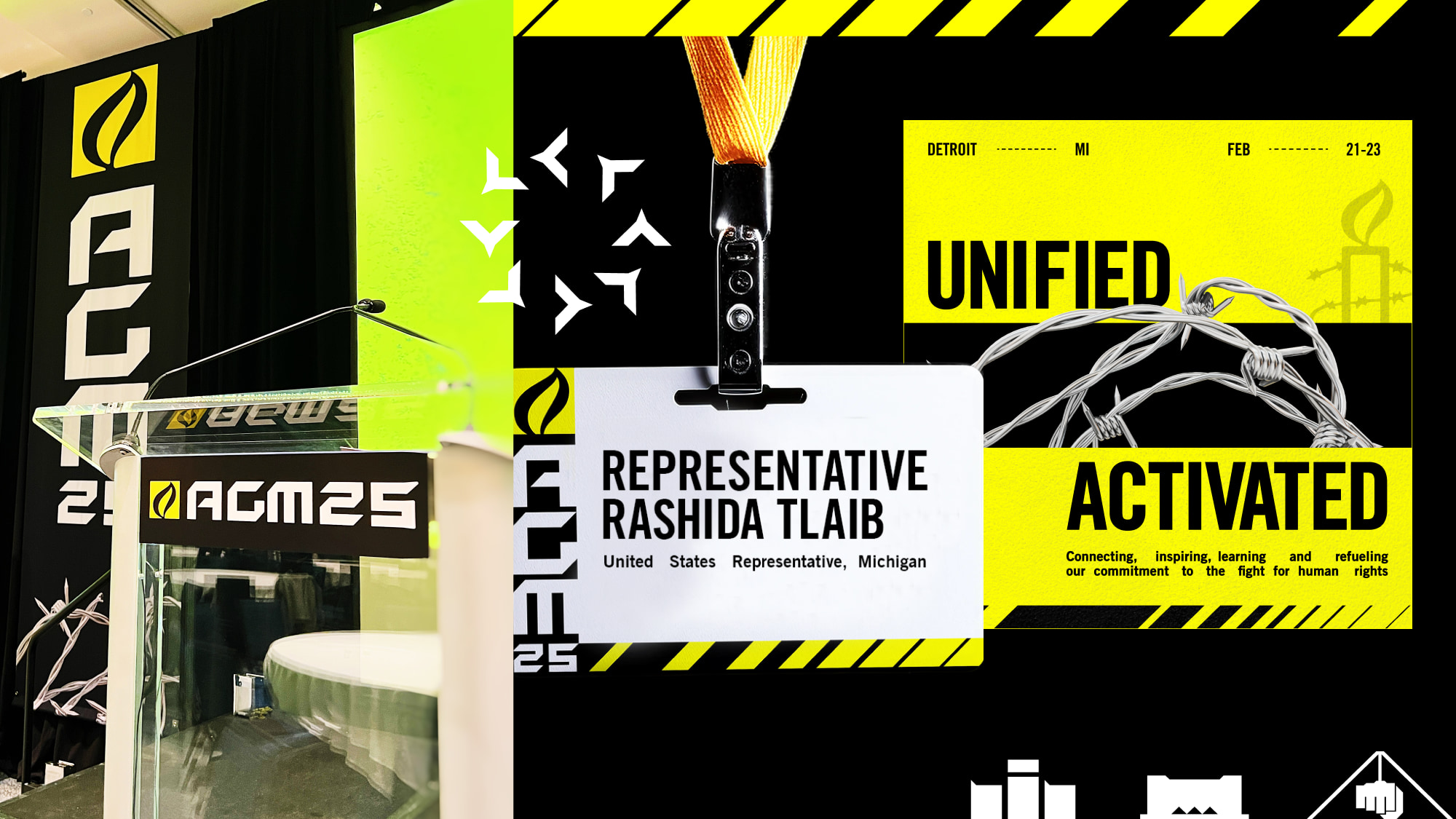
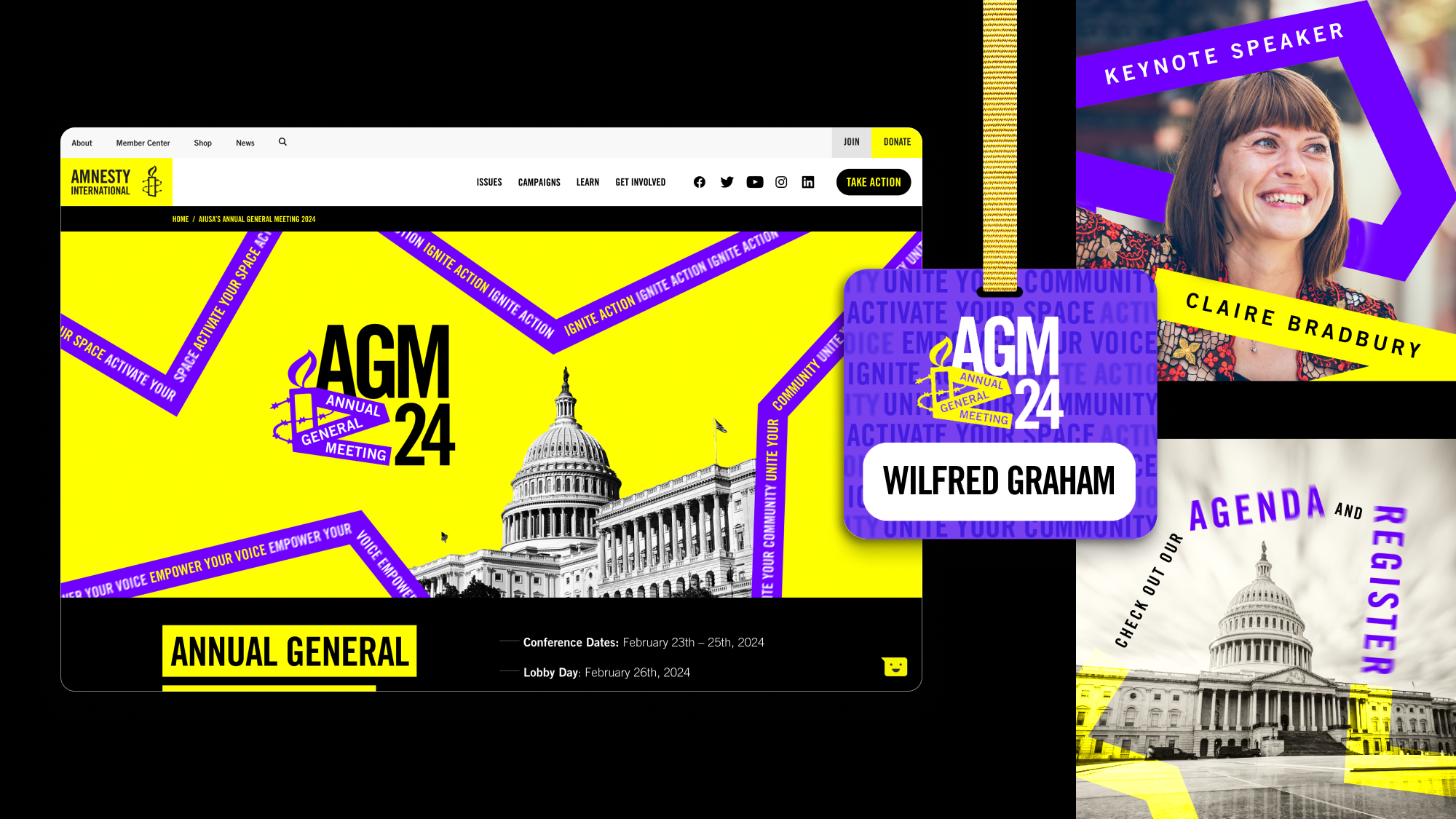
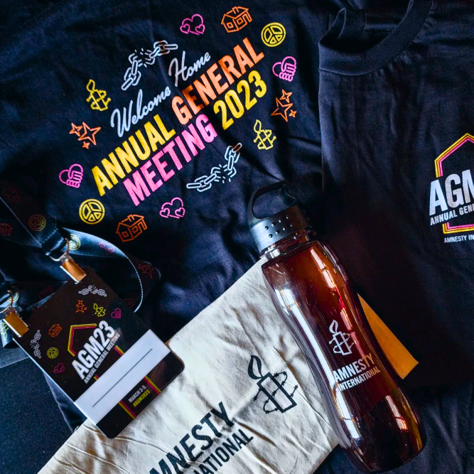
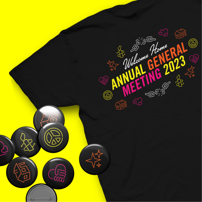
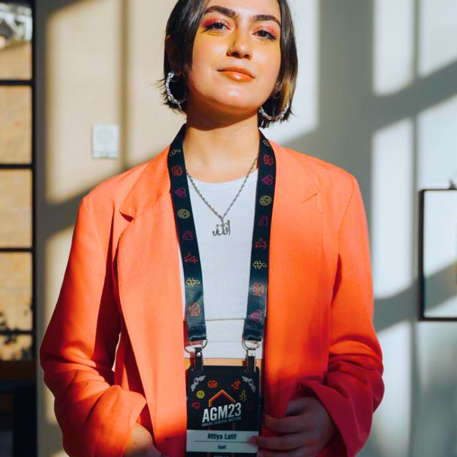
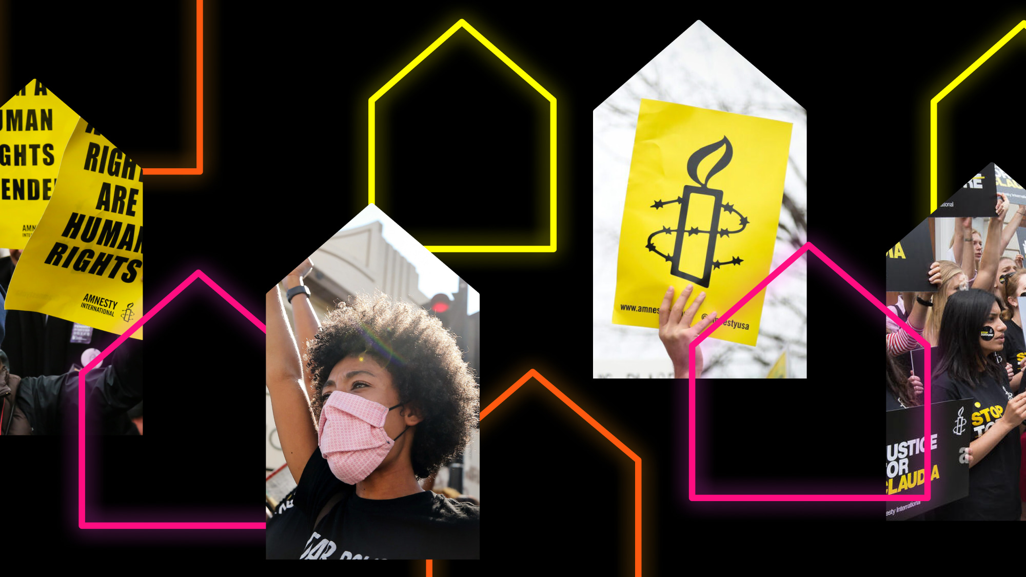
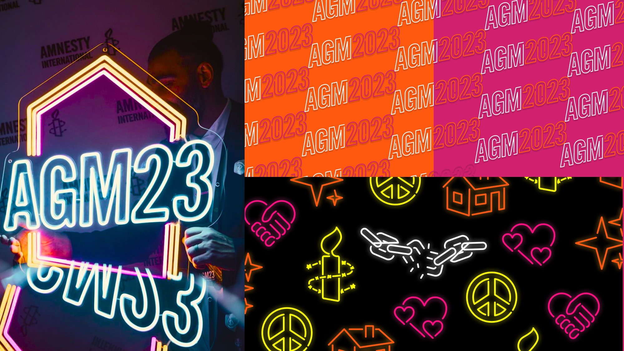
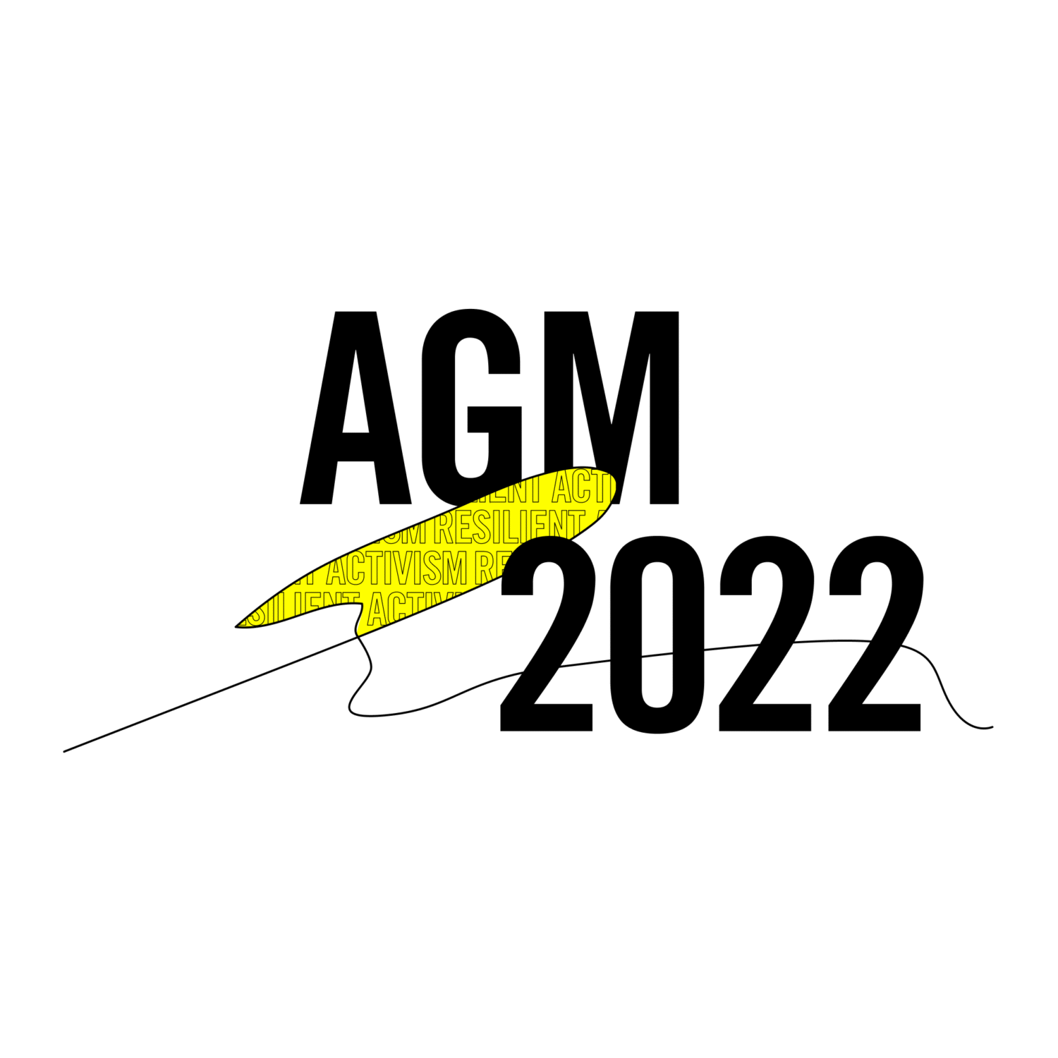
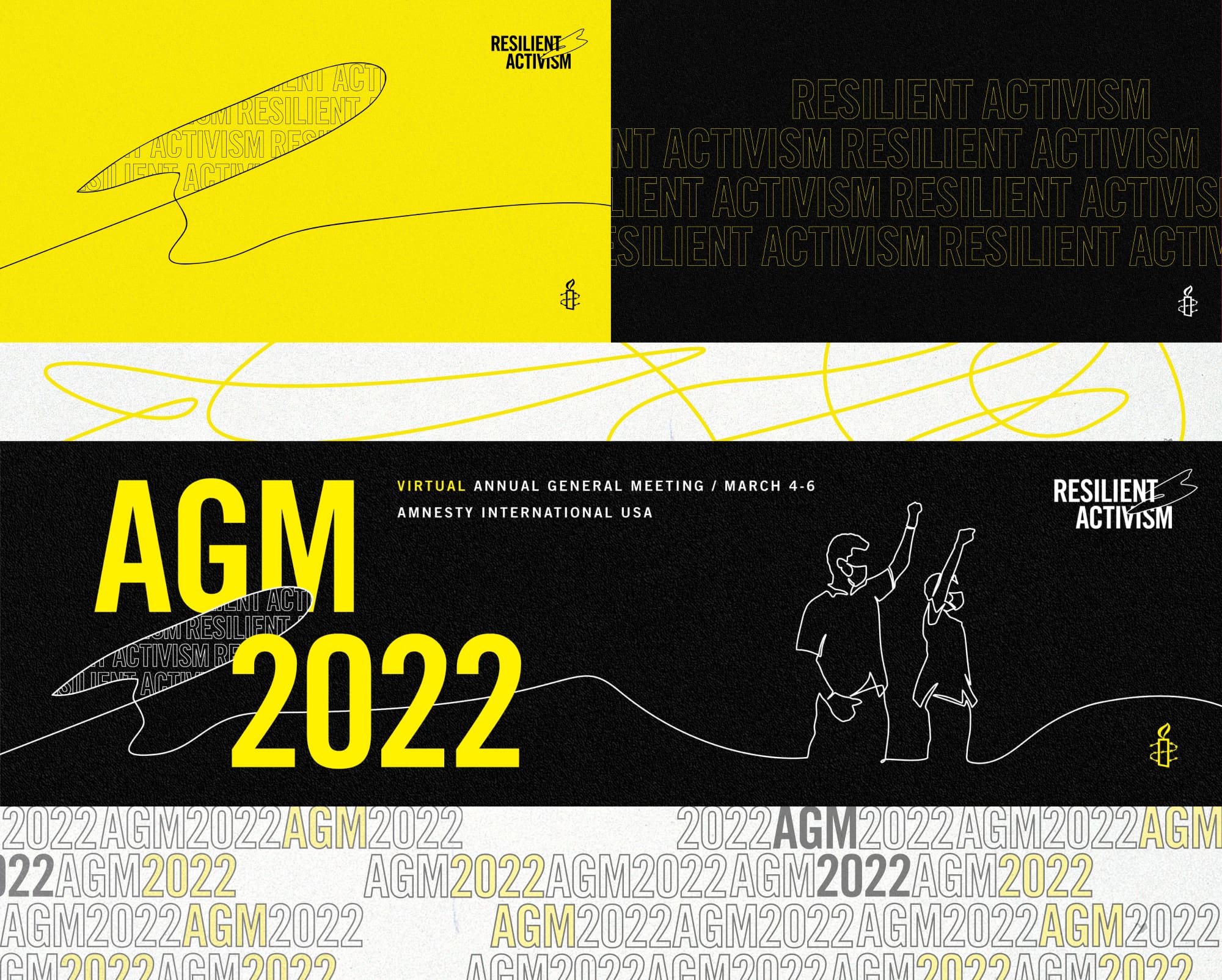
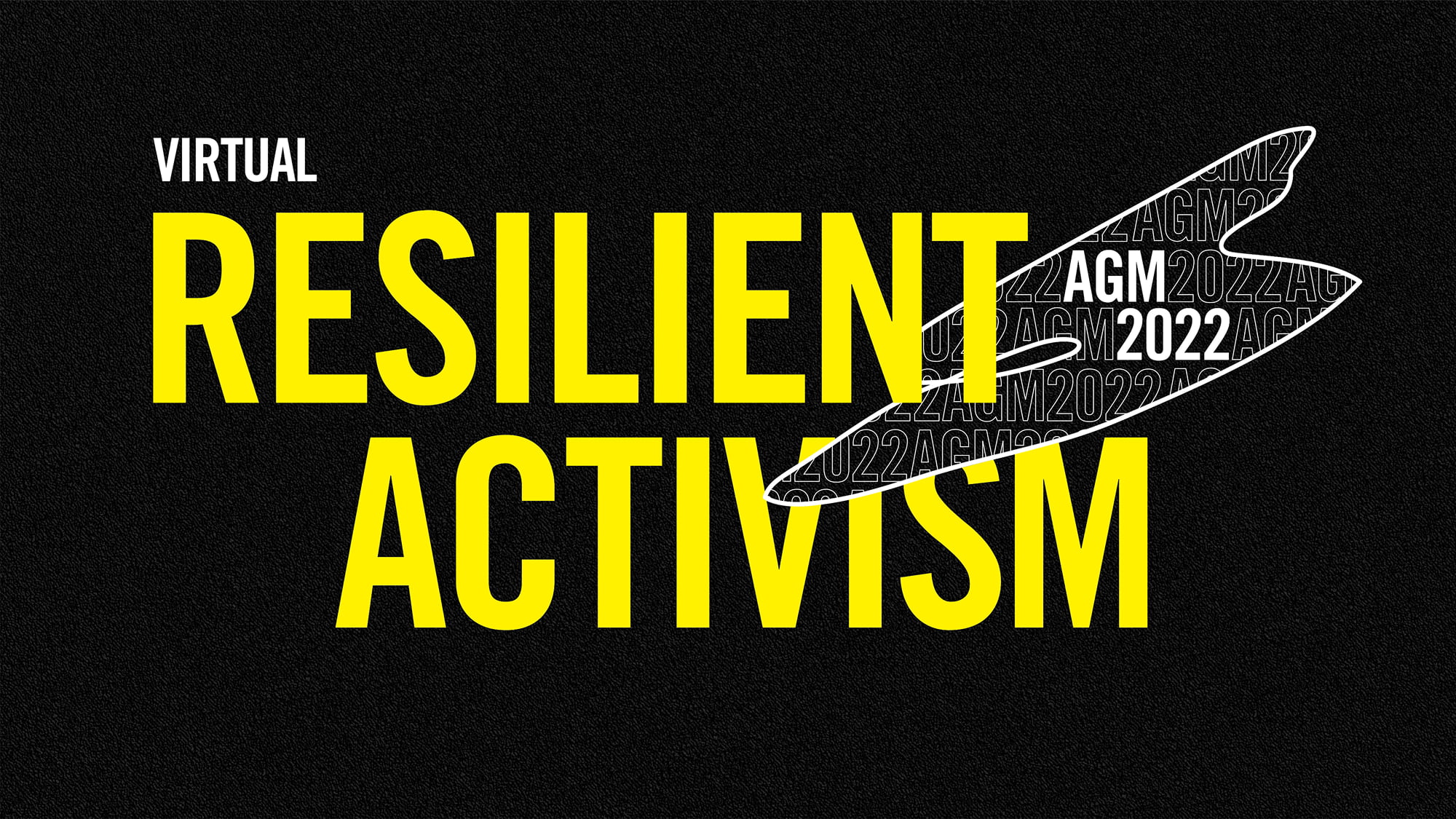
Amnesty International USA’s Annual General Meeting (AGM) is their largest gathering of human rights activists, members, movement leaders, and allies. Since 2022, Teal has provided flexible event branding across both physical and digital environments.Every year Amnesty comes to us with the same challenge: make something we haven’t seen before.

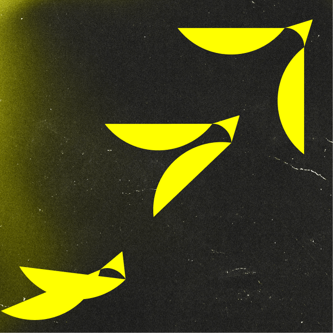
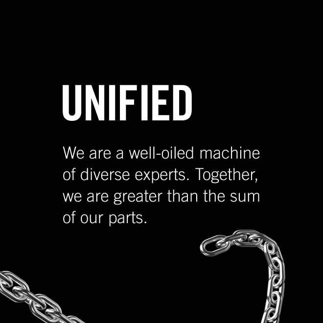
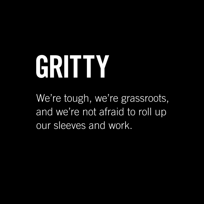
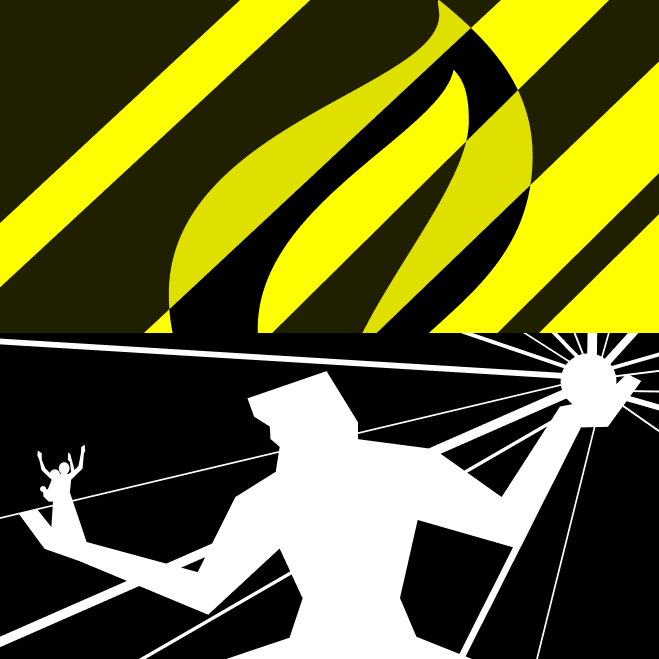
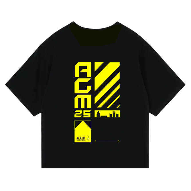
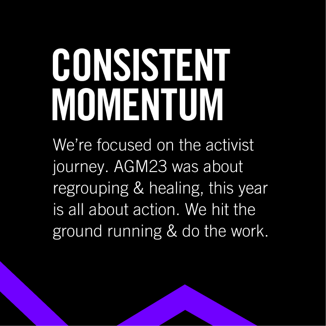
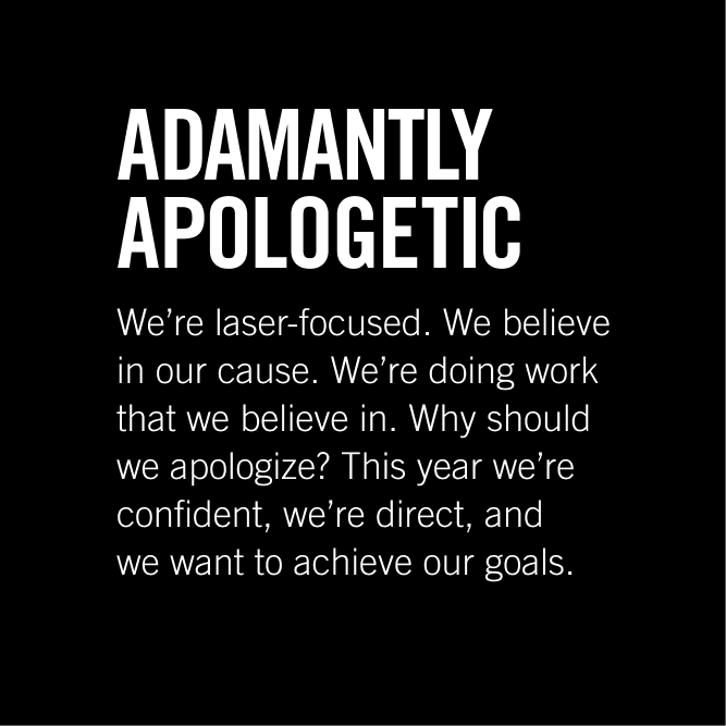
The process always starts with fast, collaborative working sessions to gut-check emerging ideas, establish brand guardrails, and narrow in on visual inspiration. A creative brief follows, centralizing an overall strategic vision before any design begins. The resulting identities balance Amnesty’s brand equity–the iconic yellow and Amnesty Trade Gothic typeface–with fresh graphic concepts grounded in the year’s specific causes and context.

AGM26 logo
AGM 2026

Hold the Line

In 2026, Amnesty’s message was unambiguous:  we do not yield to injustice, oppression, or intimidation. In the face of relentless pressure, Amnesty does not break. Amnesty holds the line with the conviction that a better future requires us to get down and dirty to defend it.

The thematic concept is inspired by dystopian films of the early 2000s, which are works full of fierce hope and rough-and-tumble aesthetics. The AGM26 logo embodies this concept through a dove-like symbol, which can stack, lock-together, and move across lay-outs. That same form transforms into flexible barbed wire that frames content and leads the eye, a deliberate reference to Amnesty’s iconic candle-wrapped-in-wire mark. Amnesty’s Trade Gothic font takes on subtle customizations to match the dove’s curvature. Subtle camo background-patterns represent grit and camaraderie. Grid lines draw from tactical schematics to anchor the layouts in a visual language that feels operational, not decorative.

Every element is designed to activate and ready folks for the fight at hand and the fight to come.

AGM26 social media designs and vertical logo stack.
AGM25 logo
AGM 2025

Shoulder to Shoulder. 

AGM 2025 was held in Detroit, and that choice was itself a statement. Detroit is a city that has stood at the center of American social movements — labor rights, civil rights, community organizing.

The AGM25 brand treated the city not as a backdrop but as a primary source. Industrial motifs grounded the identity in Detroit’s history as an automotive capital. Steel and chainlink elements add dimensionality to designs.

The labor movement’s spirit of collective power runs through a modular visual system, which came to life in downtown Detroit across podiums, signage, and merchandise. The result was a brand that didn’t describe solidarity. It looked like it.

Collage of event collateral including a podium, dove circular badge, nametag, social posts, and icons.
AGM24 logo
AGM 2024

Lighting a Way Forward

AGM 2024 made a simple argument: Each person is a small but necessary piece of a greater whole. Together, we light things up and activate our voices, our spaces, and our communities.

Teal translated that idea through connective lines that travel and pulse across the DC landscape. Glow and blur treatments suggest the magnetism of people in motion, while repetitive type treatments convey the disruptive and relentless resilience of social movements. Amnesty’s electrifying yellow is balanced against a deep indigo: playing on the contrast of darkness and light.

The empowerment, activation, and unity of activists is matched by a brand with the same spirit.

AGM24 event collateral including website landing page, nametag, and social posts.
AGM 2023

Activists’ Reunion. 

AGM 2023 was Amnesty’s first in-person conference since 2019. After years of virtual gatherings during the COVID-19 pandemic, the brand needed to make people feel like they were finally back together.

Two powerful words drove the identity: togetherness and energy. The logo is simultaneously comforting, through nested houses, and electrifying, through neon colors.  A handwritten accent font pulls in human warmth, while Amnesty Trade Gothic in italics provides drives forward-motion. A complimentary icon system lights up themes of peace and love.

People came together, from homes all over the country to reunite and recharge. Attendees experienced the brand: they wore it, posed with a custom neon sign, and took pieces of it home. For a community reconvening after years apart, that tangibility mattered.

Graphic collage of images cropped to house shape and outlined, neon houses overlapped.
Collage of AGM23 branded elements: photo of custom neon logo sign; typographic patterns; and icon-graphic patterns
AGM 2022

Tied Together

AGM 2022 tied activists and issues together through a literal thread. The thread loops and reveals “resilience activism,” which is what powers Amnesty and powers progress. Flexibility is found in the graphic element as it takes the form of activists and also becomes a vessel for repeated typography.

Next Project

The Labor Force
We Transform, We Unite, We Mobilize text banner graphic

The Labor Force

A brand, messaging architecture, and website for an organization redefining what worker power looks like.