An online magazine covering stories of marginalized people facing social, economic, and racial issues.
Stories of people on the sidelines
For too long the experiences of marginalized people struggling with social, economic, and racial have largely been underreported. Wide Margins, a project of the Center for American Progress, flips the narrative on its head by dedicating in-depth coverage of factors affecting people and their communities in the US.
Conceptualized as a quarterly magazine that covers a topic through different ways of storytelling (essays, poetry, cartoons, photography), it connects personal stories with policies that directly impact them. It’s an outlet that invites a more diversified representation of writers and nuanced and contextualized reporting.
This project has been put on indefinite hold.
Brand
As a new platform on the scene, Wide Margins needed a brand that uplifts its content and empowers storytellers. Teal Media created a new look that is a flexible and adaptable container, allowing for slight visual shifts between content types and quarterly issues. The design is visually appealing without distracting from the stories themselves.
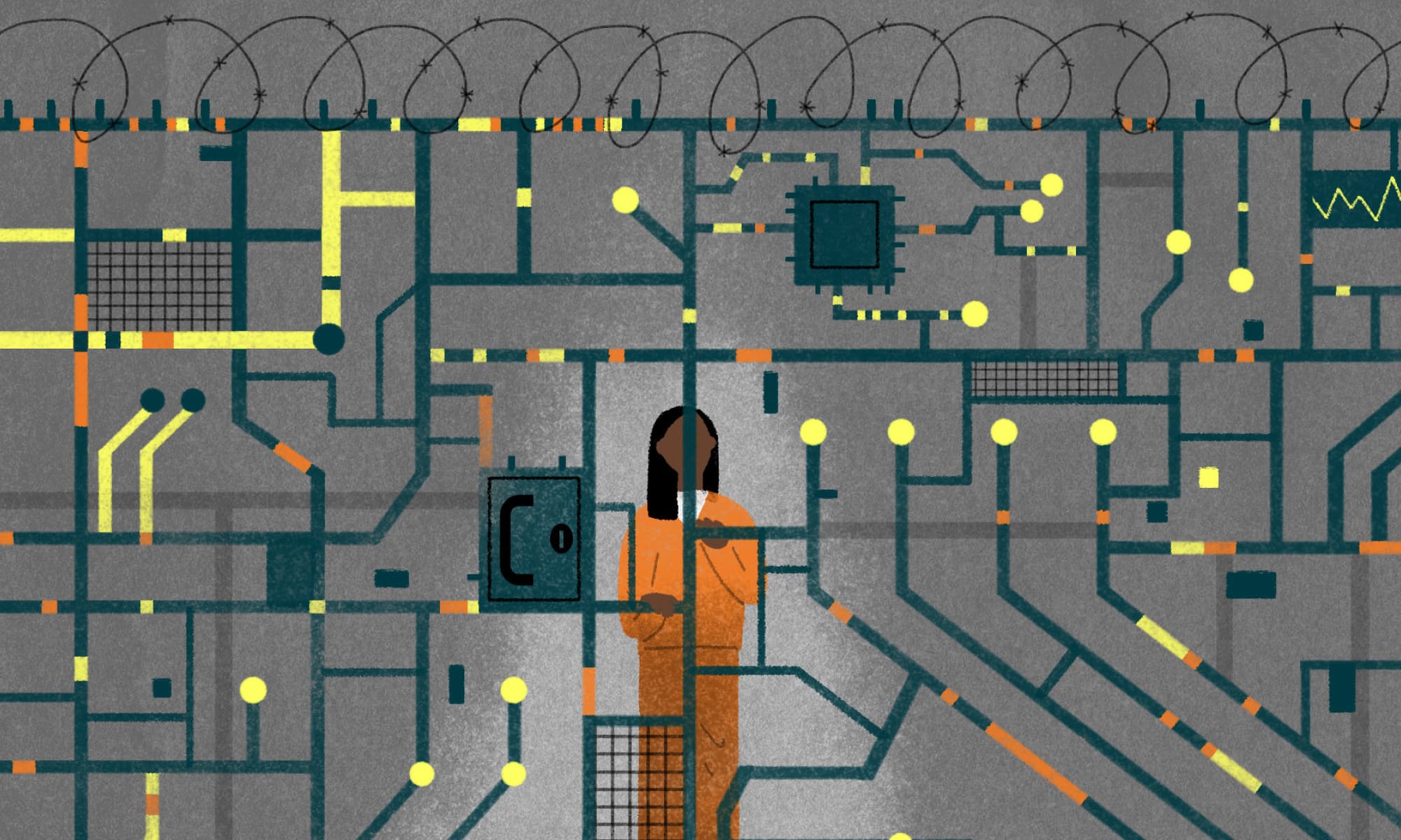
Illustrations used in the brand guide are for placement only and not commissioned by CAP.
Website
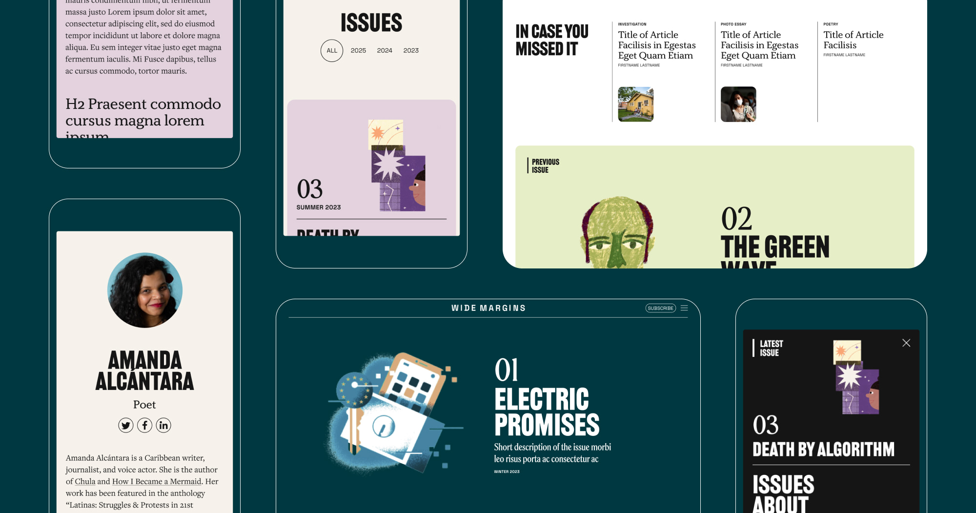
Teal Media designed an adaptable website where stories can be told in various ways including essay, photography, poetry, recipe, and cartoons, that revolve around a topic. While each issue of the online magazine is published quarterly, the website makes it easy for users to explore previous issues and articles.
In the backend we provided a comprehensive set of storytelling tools for authors to use, such as slideshow, image grid, video, pull quote, etc. Issue and article pages have customization options which gives each issue and its contents a distinct look. This includes the ability to change the background color and type style for article titles.
Illustrations used in the mockups above are for placement only and not commissioned by CAP.
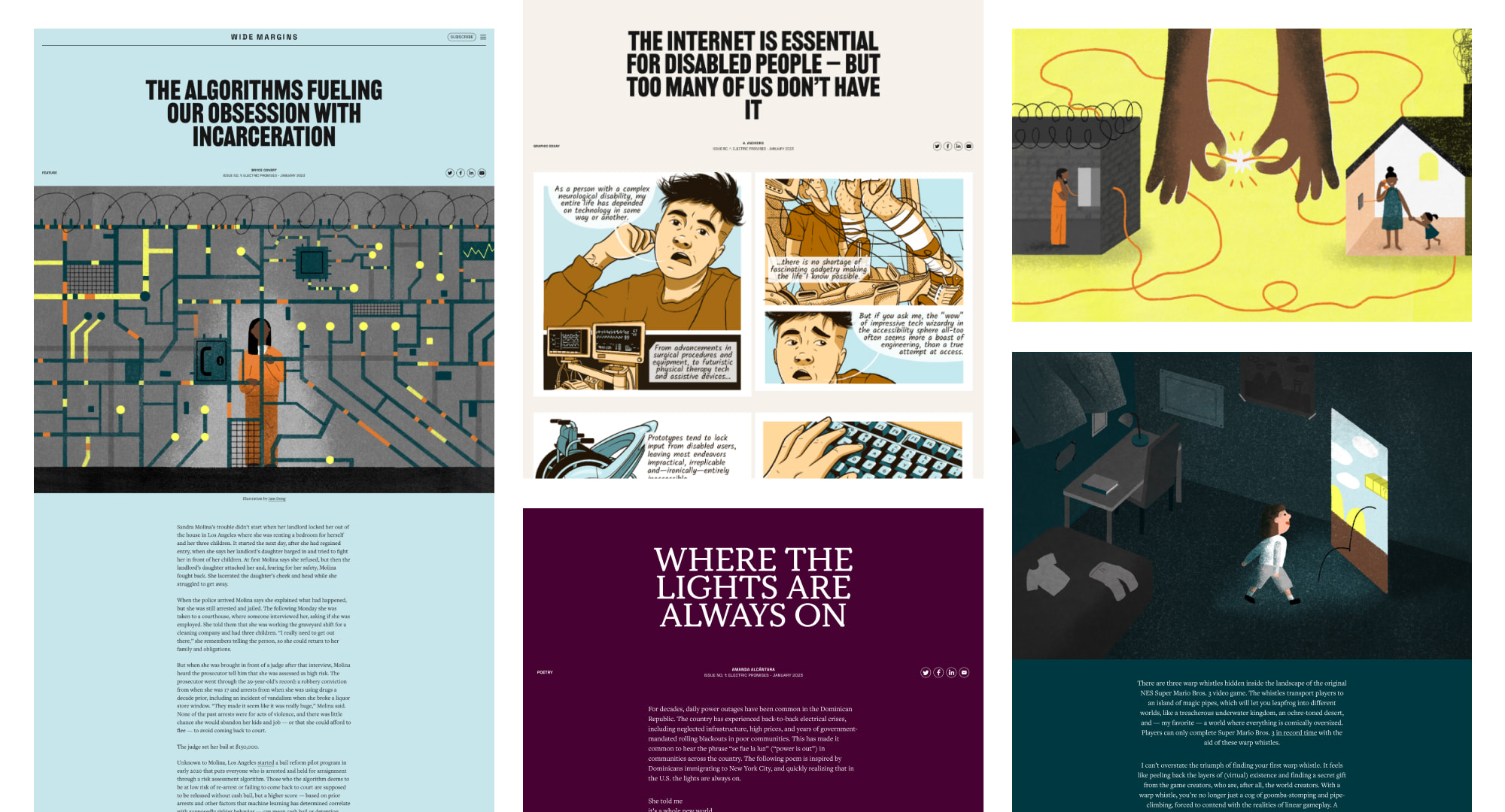
Custom illustrations commissioned by CAP for the first issue.
Issues
Services
Project Team
Teal Media is a woman-led creative agency that builds brands and websites for nonprofits, foundations, and mission-driven organizations. We have a core presence in Washington, DC and Detroit, MI.