
The Public Interest Network
Revitalizing The Public Interest Network for a healthier, safer world
Work
As the nation’s first and largest organization focused on supporting and advocating for LGBTQ+ people and those who love them, PFLAG has their fingerprints all over our nation’s progress toward LGBTQ+ rights. PFLAG today is an inspiring alliance of LGBTQ+ people, parents, families, and allies committed to creating a caring, just, and affirming world for their community.
When it became clear that PFLAG’s brand and website did not keep up with the people-powered progress of its hundreds of chapters and more than 325,000 members, they reached out to Teal for support. And we got to work—together.
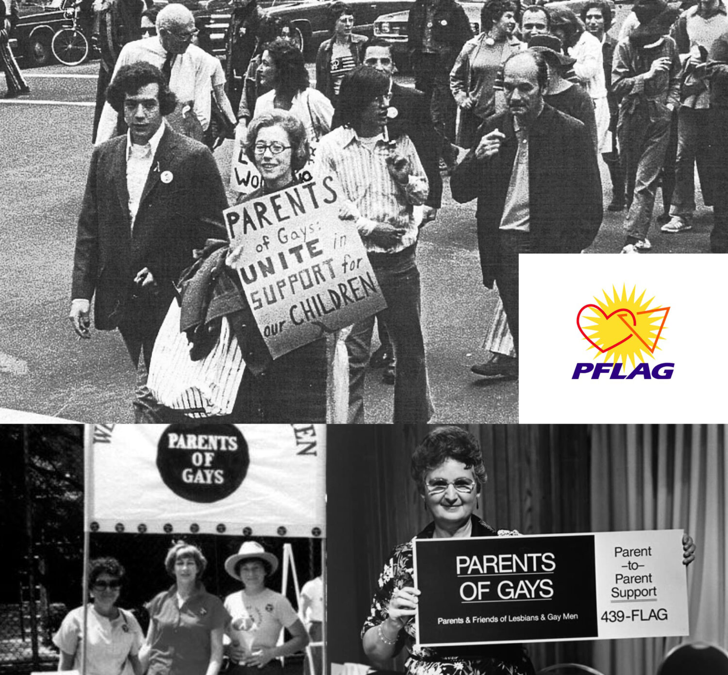
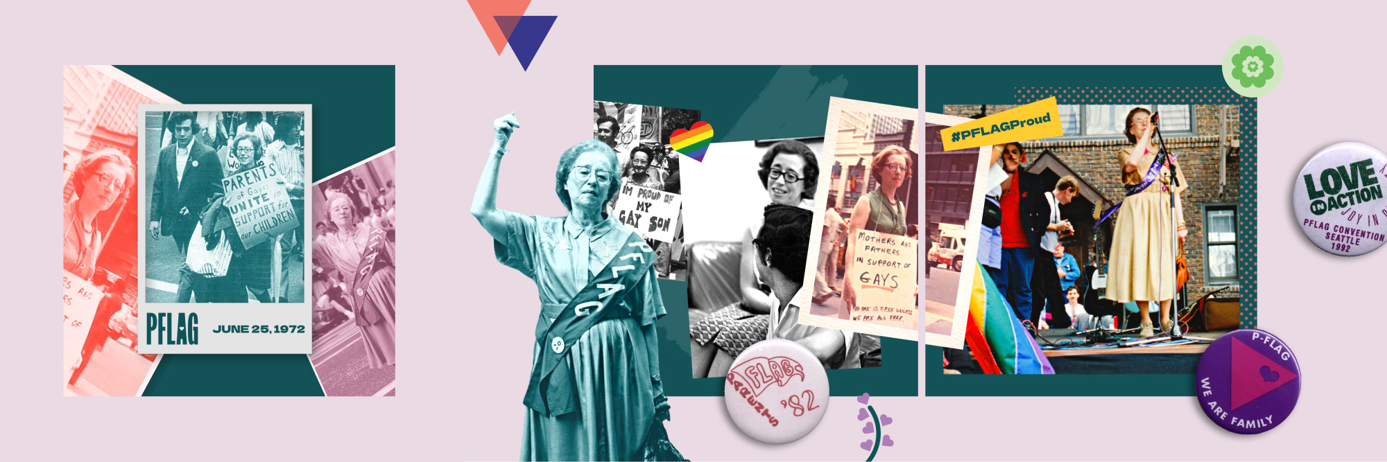
Founded by mother, Jeanne Manford, and her gay son, Morty, PFLAG has a 50-year story rooted in family, community, and a commitment to leading with love. They were the first national LGBTQ+ organization to mandate the full inclusion of transgender people as part of its expressed mission statement.
They fight for equality, for justice, for health, for kids and families—and they’re in it for the long haul. That rich history of powerful advocacy paired with love—fierce love, compassionate love—drives the new PFLAG brand.
Our work began with a deep discovery process that led us to a full reimagining of PFLAG’s messaging, mission and vision, and tagline. Keeping the equity of this storied brand, we brought out their core values of accountability, bravery, community and collaboration, inclusivity and belonging, and growth, and paired them with a powerfully simple new tagline:
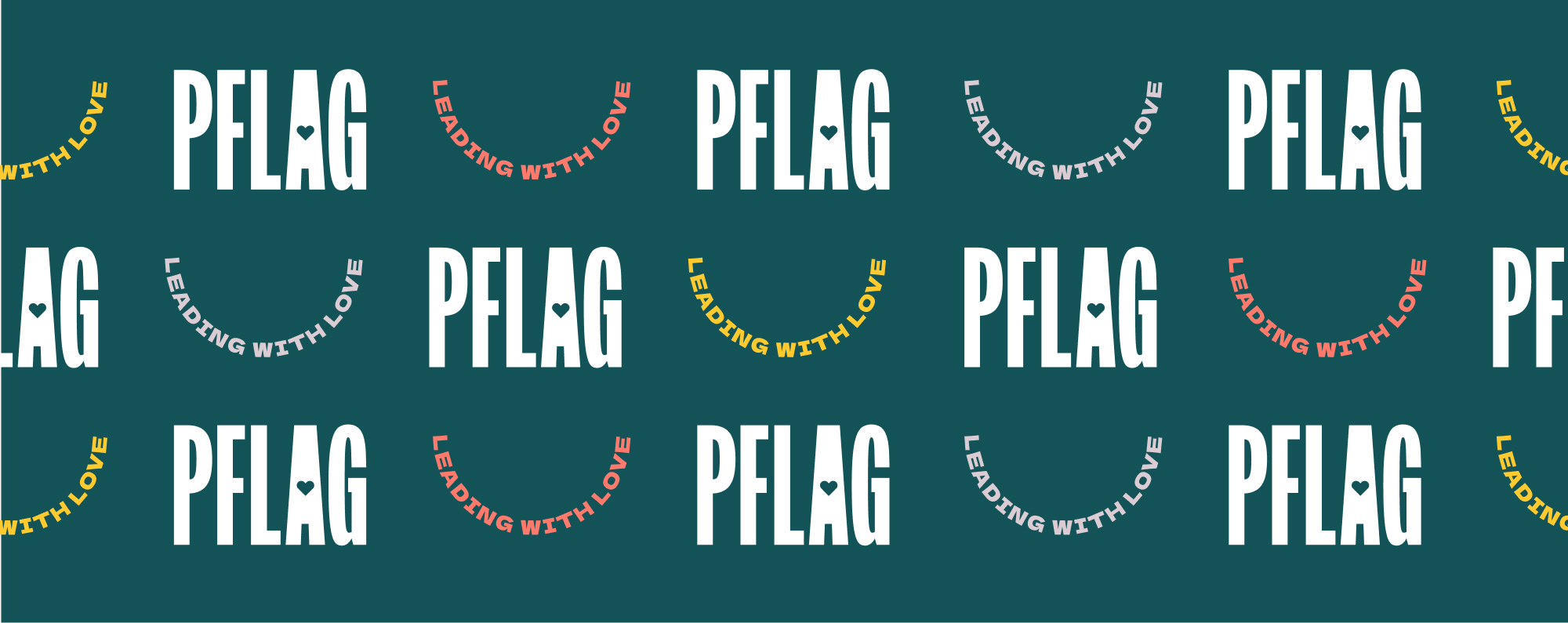
Leading with Love.
In the words of the PFLAG team, “Love is what brings people to PFLAG. It urges and inspires us, empowers us, and rouses our courage. In every sense, PFLAG is always leading with love.”
The visual identity flowed naturally from that insight: an iconic heart in the megaphone-like “A,” a distinctive sans serif type, and a memorably strong mark that pairs with myriad backgrounds, photos, and color treatments.

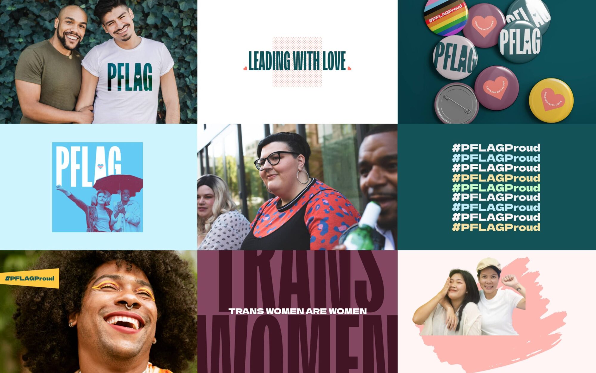
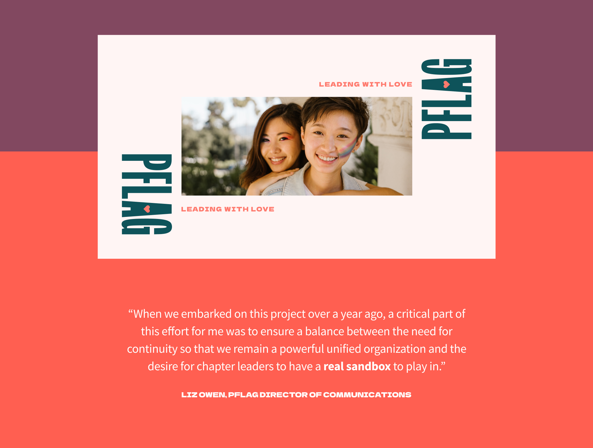
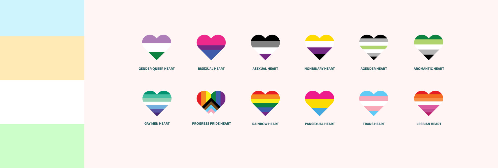
PFLAG’s hundreds of local chapters span size and geography. But the experience that LGBTQ+ people and their families had with that first chapter touchpoint was often too fragmented and inconsistent with the national brand.
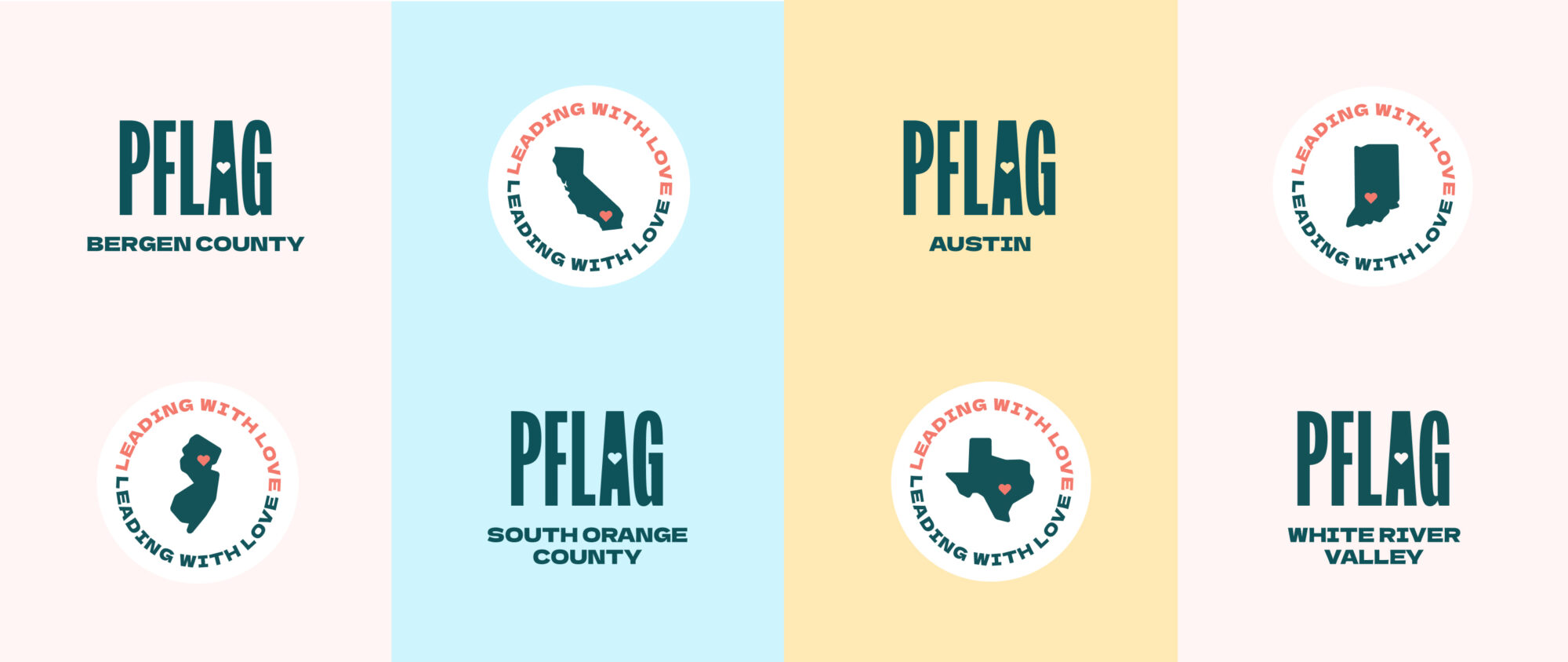
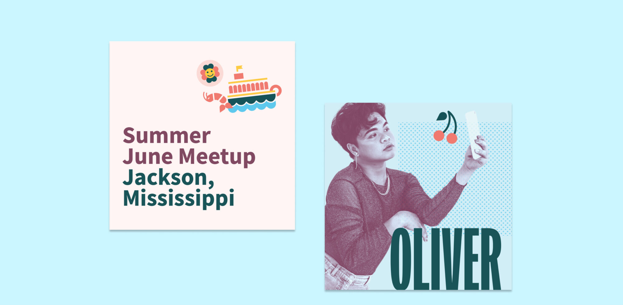
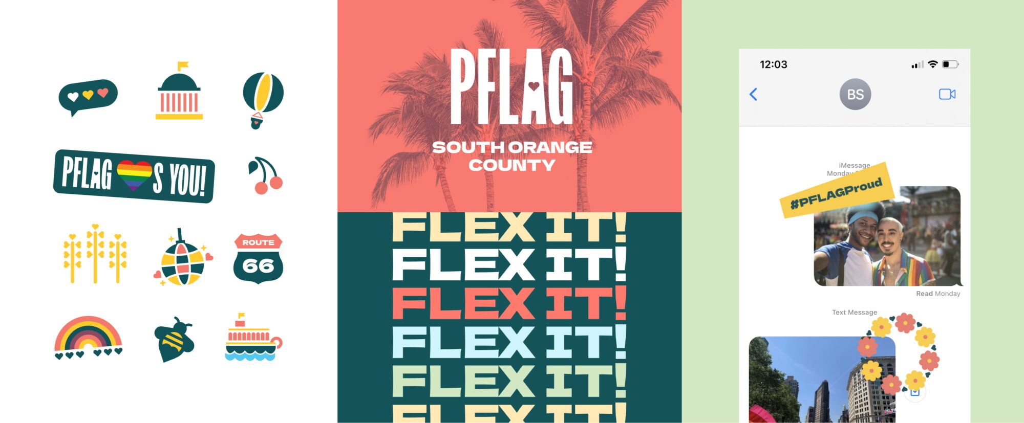
Our charge was clear: Give these chapters lots of love and attention through a “sandbox” of brand materials—from a logo builder and unique color palette to Canva templates and custom regional icons. The team also invested in training, showing chapter leaders how to find resources in a private section of the site, and how to create compelling content using the templates, free brand fonts, and more.
Paired with new chapter-specific landing pages, the result is a bold new way for local chapters to run with the new brand and personalize it to match the spirit and identity of their local community. What’s more, it all adds to a brand that feels cohesive and joyful—from the smallest local chapter all the way to the unified national organization.

Our website process started with the question: “How do you make updates to the site? And how is it working for your federated organization?” The previous site lived on Drupal and had become messy and unorganized with time and many authors. Teal started from scratch on WordPress to build one site, with a common atomic design system and feature set, to power the next phase of PFLAG’s growth. Key features:
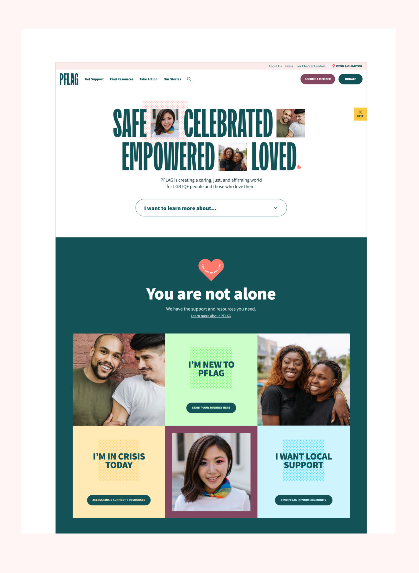
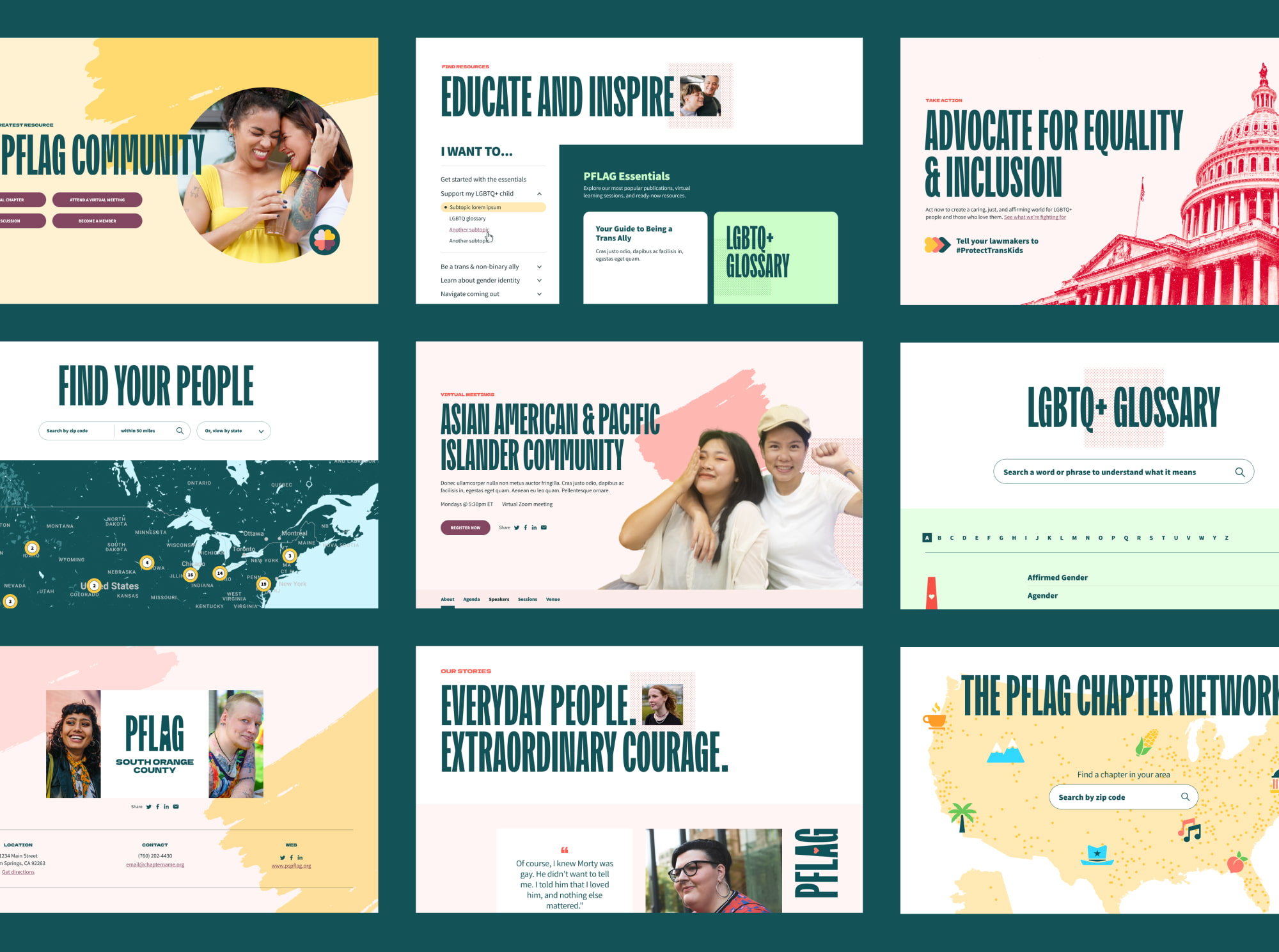

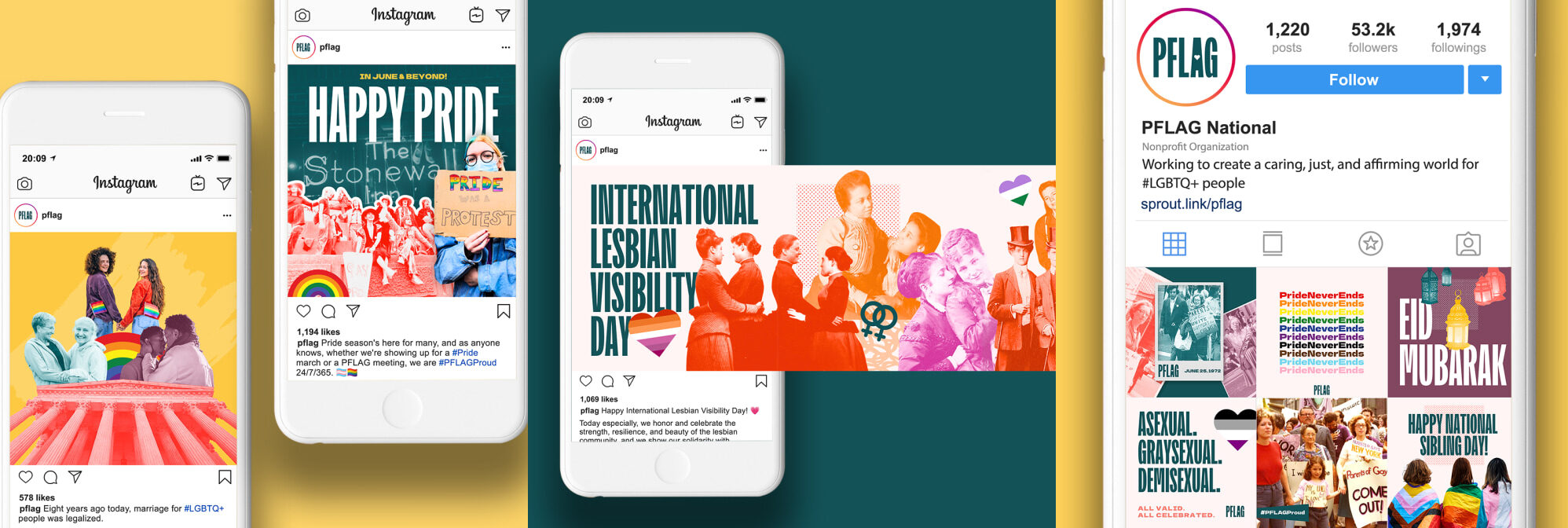
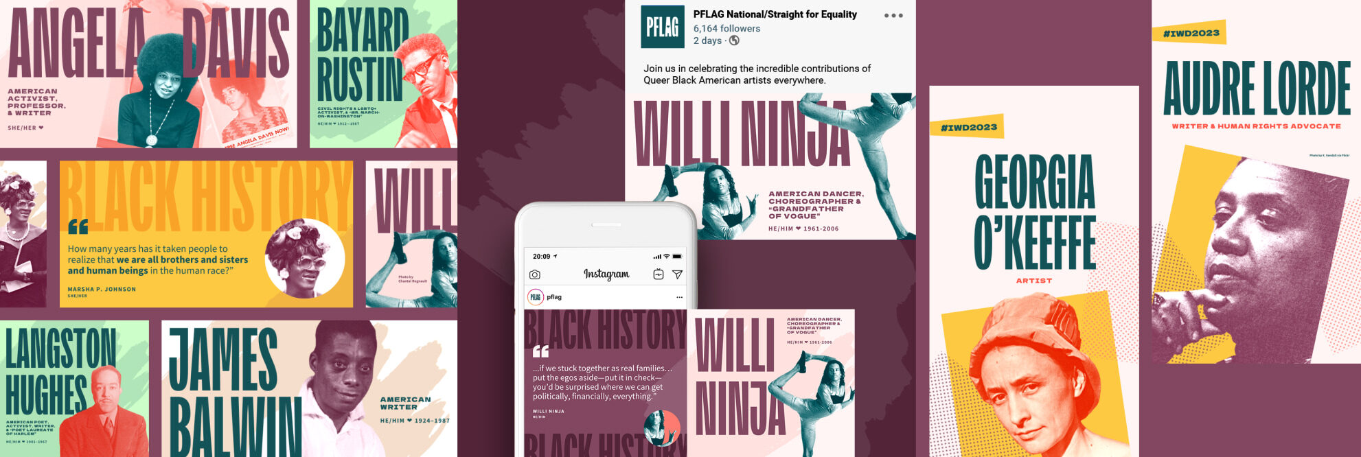
With the brand and new website launched and a 50th anniversary ahead, Teal partnered with PFLAG to showcase the new brand message through organic social and a focused digital marketing plan. Our work includes:
Follow @pflag to see this work in action!

Revitalizing The Public Interest Network for a healthier, safer world


The part where we ask you to cough up your email. So we can discuss all the amazing things we’re gonna do together. No pressure. Really.