Skip to Content

Work

+More Perfect Union

Building a More Perfect Union—Together
Black, woman Brickyard director and military veteran of +MPU, Mary Tobin places her hand while laughing joyfully on an older gentleman. They appear to be coming out of wood-stained doors with a bustling event happening behind them. Off to the side is Brickyard leader, Archie Nettles, who matches Mary in a green +MPU shirt and is seen smiling in their direction.

Civic Education: +More Perfect Union’s Secret Sauce

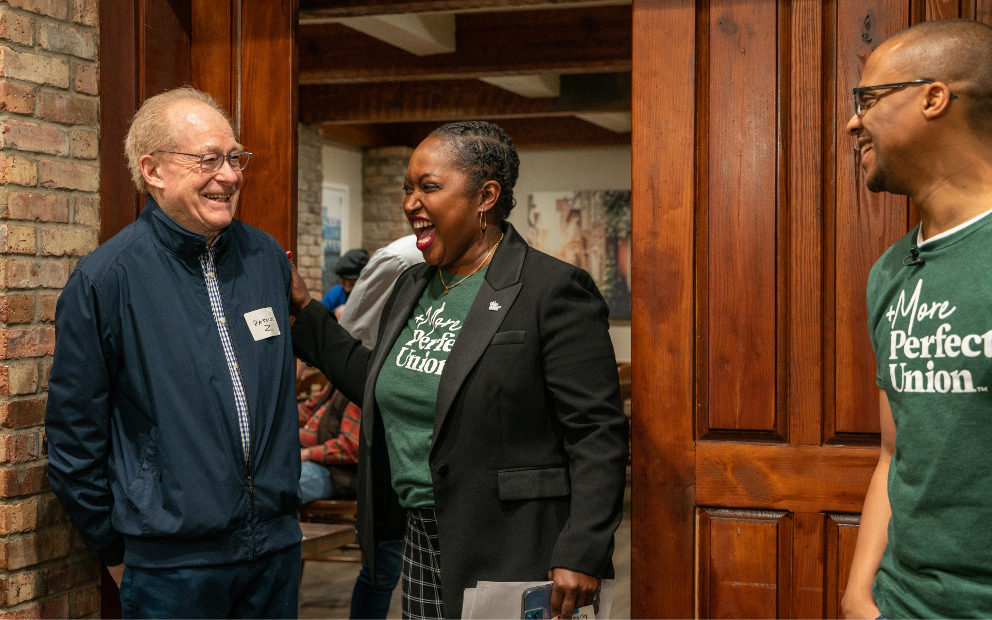
+MPU is a veteran-led organization working to bring Americans together through the power of service, community, courage, and connecting on common ground. They do this through local chapters called Brickyards.

+MPU’s mission is ambitious. They found themselves up against some serious obstacles, including a deepening divide in our nation’s social climate, the fact they share a name with a more established organization, and that there’s only so much their small yet mighty staff can do in a given day.

Teal Media partnered with +MPU in a variety of ways: from working on the first redesigns of their new website to providing ongoing strategic support to further grow their cause in local communities nationwide.

A large collage of design work for +MPU is featured. Within the collage is a screenshot of +MPU's event webpage which has a group image of +MPU employees smiling with a dark gray overlay including a headline saying, “+More Perfect Union Volunteer Events.” Another image of excited and talking event attendees sits below the headline. Off to the side is a small title reading “happening soon” where the words “+MPU LA Brickyard Art Walking Tour” are listed with a date and a green button to see more about the featured event. A map of the United States with coral location pins slightly overlaps the webpage screenshot; the bottom of the map overlaps on a small, light gray pattern of plus signs. Off to the side of the webpage and map is three Instagram social posts, one features a smiling portrait of Imari Poindexter with the descriptions “+MPU Chapter Leader Feature” and “Meet Imari” alongside her location of “Atlanta, Georgia” which are written on a dark gray and green bar. The other Instagram post is a calm and smiling old man with a striped shirt; a coral squiggly line runs above his head and the +More Perfect Union logo sits at the bottom of the page. The final Instagram square features two smiling women in black and white against a dark teal overlay, perhaps a Queer couple or friends. Four plus signs frame the women and the +More Perfect Union logo sits near the bottom of the square. A tiled collage of +MPU brand elements features an American farm and wheat field with a windmill; a group of two Black women and one white man with a long beard wearing +MPU t-shirts and sitting in a coffee shop; an elderly veteran in flannel and an Air Force cap; the US capitol building with a gray overlay; a pattern of plus signs on green; a Black man and white man wearing +MPU shirts doing service work at a build site; a megaphone icon on a light blue background; and two men, one white and one Black, hugging in a bar.

WEB DESIGN

  • Bringing an Idea to Scale

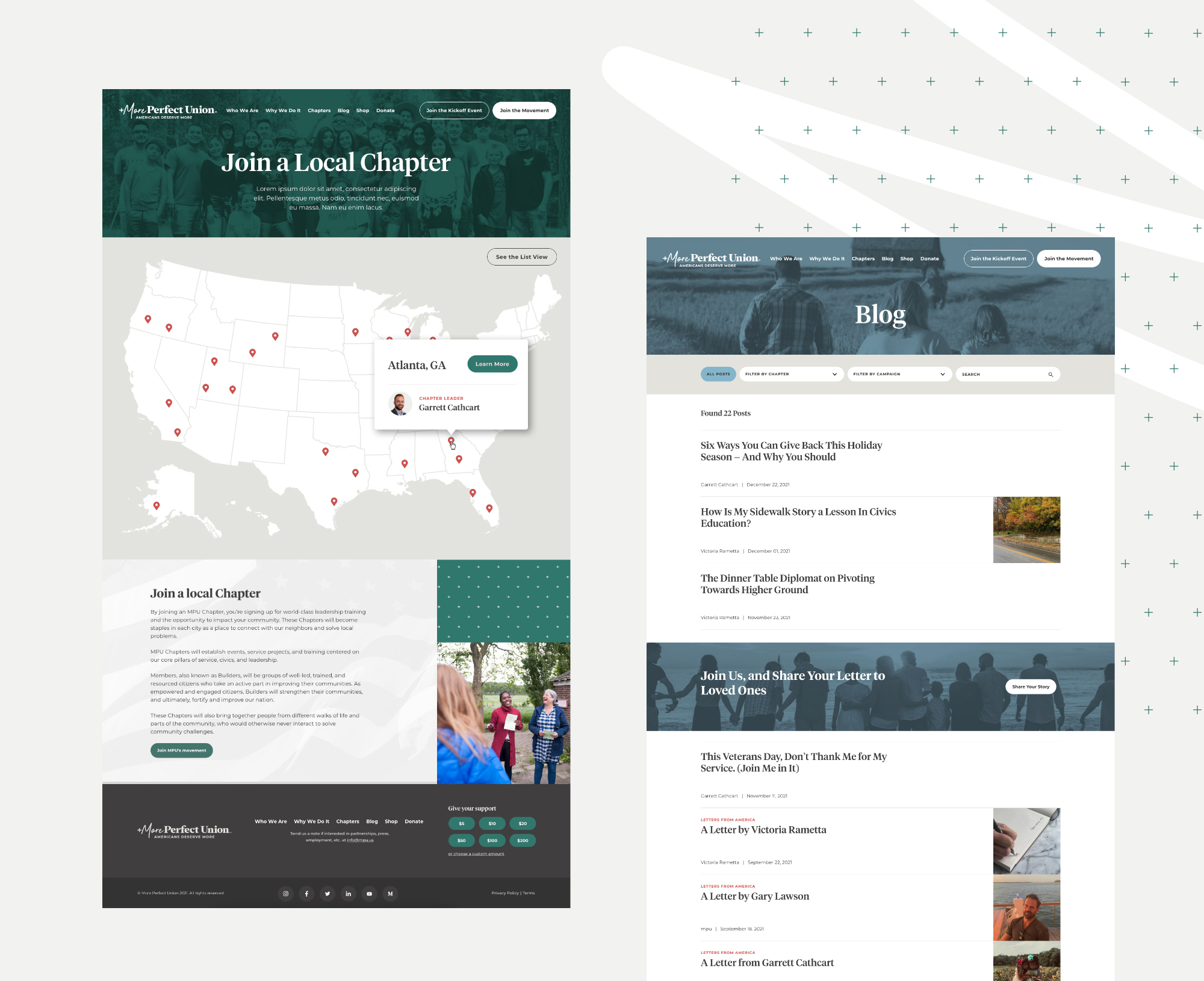
    With local chapters gaining traction, an established visual identity, and a platform that was inflexible, +MPU stood at an inflection point in its growth. They needed help to achieve their potential. Teal and +MPU worked quickly to plan and build a flexible new WordPress site. The new site provided clear, approachable, and people-centered ways for Brickyard members to get involved.

    A collage of the +MPU web page designs features: a chapter Page with a community photo on a swath of green and a map of the united states; a blog page with a photo of a family on a farm in light blue and lists of headlines describing articles with photos situated to the right.

    Key Features:

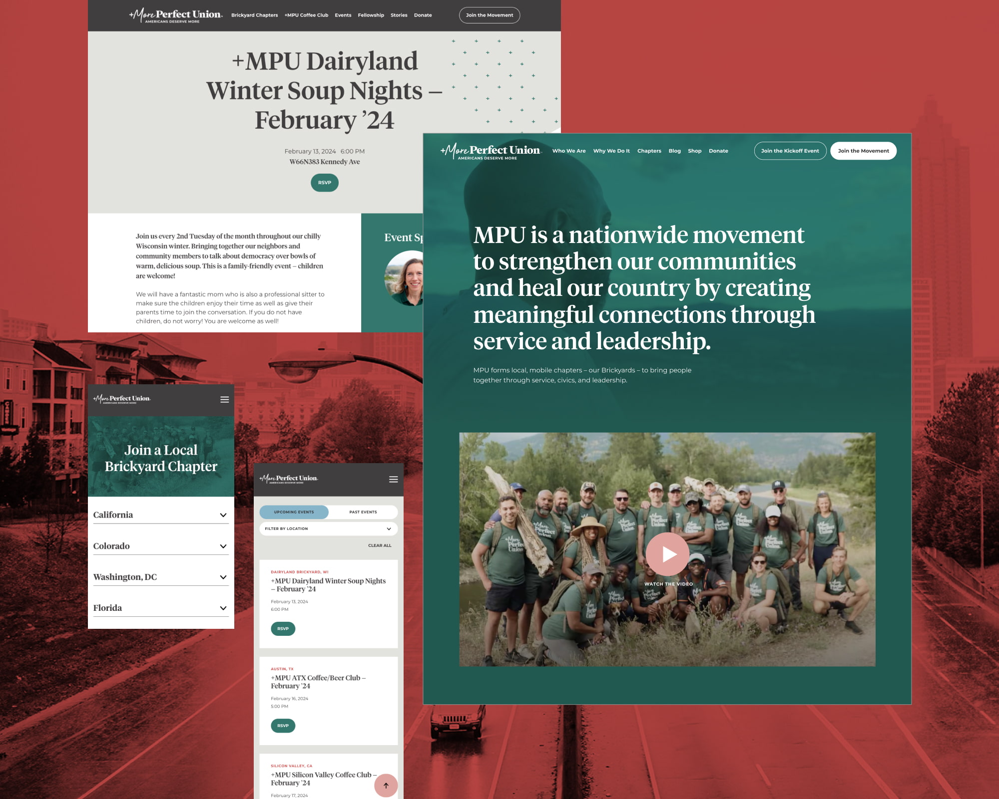
    • WordPress component system
      Teal created a flexible component system so MPU can build bespoke pages that stay responsive, accessible, and editable—without having to call Teal for help.
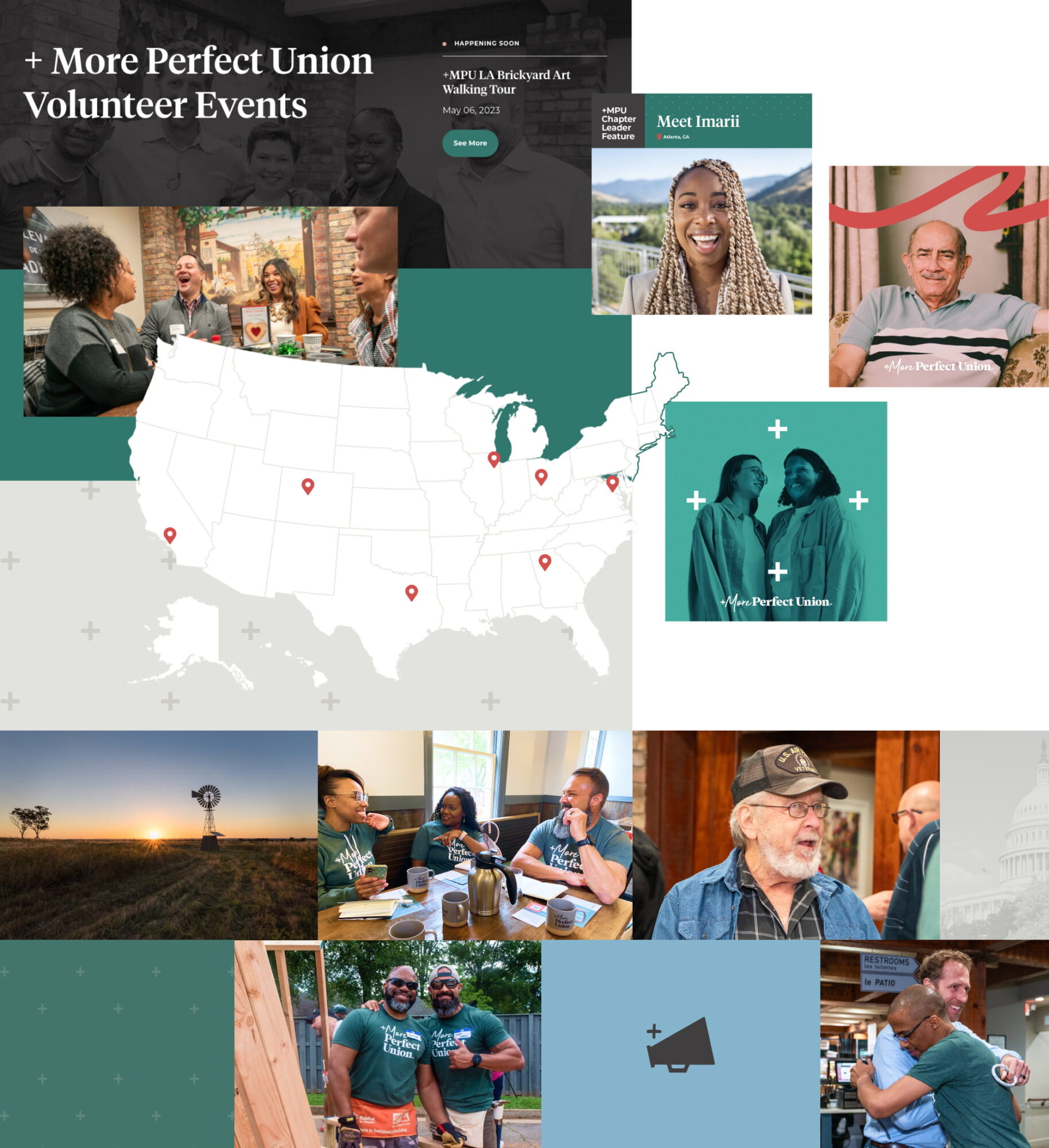
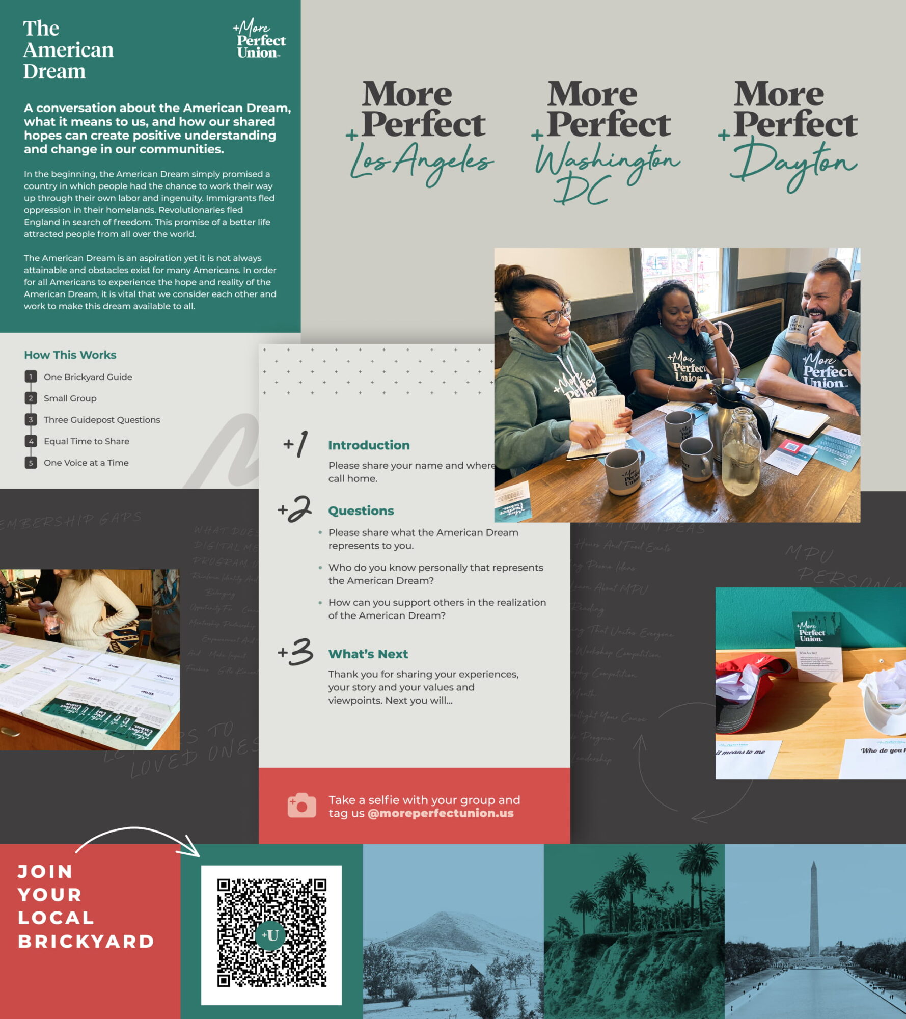
    • Dynamic Chapter pages
      Local Chapters are a staple of the MPU movement, with events, service projects, and trainings led by local citizens. Teal created flexible Chapter pages that can scale from basic information to full hubs of activity with easy ways for visitors to get engaged.
    • Stories feed
      To inform current members and inspire new ones, MPU’s Stories section features “Letters to America” with the personal journeys of MPU members—from breaking bread with neighbors to the true meaning of service.
    A collage of +MPU's single events page design with a headline sitting on a light gray background; +MPU's homepage with a swath of green and an image of a Black man looking into the distance; and two mobile design screens sit on top of a city scape which has a coral-colored overlay.

    Digital Marketing

  • Standing Out

    One of +MPU’s first priorities was to improve their search results ranking. Teal’s SEO experts jumped in with best practices and recommendations that helped +More Perfect Union stand out from the organization of the same name.

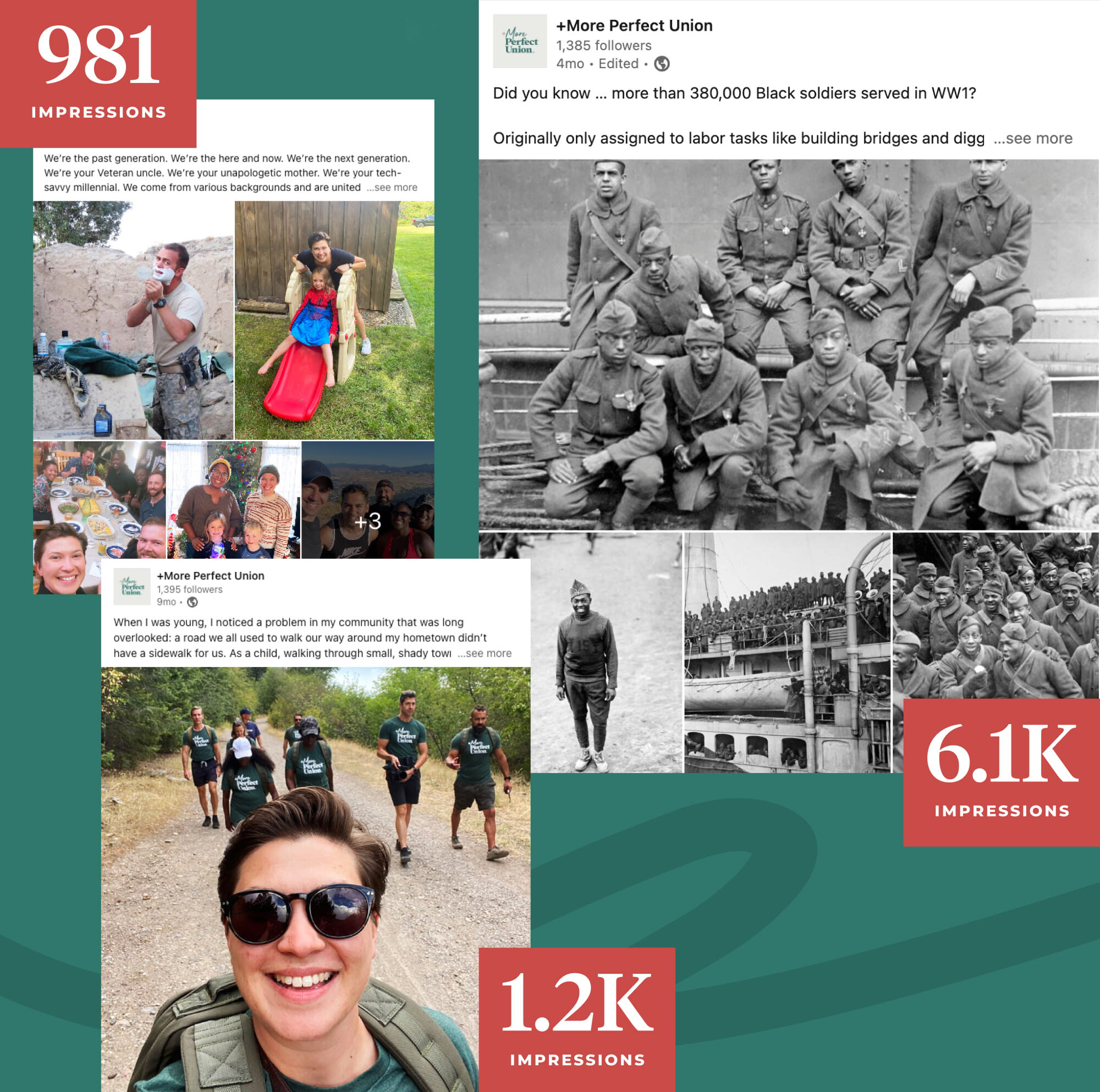
    5% is the average percentage of social engagement rates for nonprofits

    14% +MPU’s engagement rate while working with Teal

    2K+ +MPU members strong and counting

    A collage of featured MPU design work is layered. One item in the top left corner is a conversation card with green and light gray panels featuring the headline “The American Dream,” the +MPU logo stacked vertically, and a few paragraphs of body copy reading: “A conversation about the American Dream, what it means to us, and how our shared hopes can create positive understanding and change in our communities. In the beginning, the American Dream simply promised a country in which people had the chance to work their way up through their own labor and ingenuity. Immigrants fled oppression in their homelands. Revolutionaries fled England in search of freedom. This promise of a better life attracted people from all over the world. The American Dream is an aspiration yet it is not always attainable and obstacles exist for many Americans. In order for all Americans to experience the hope and reality of the American Dream, it is vital that we consider each other and work to make this dream available to all.” Underneath the body copy are steps of how the conversation card works reading: “1. One Brickyard Guide 2. Small Group 3. Three Guidepost Questions 4. Equal Time to Share 5. One Voice at a Time” Logos of various local +MPU Brickyard chapters sit to the right of the conversation card on a light gray background. Each features bold chunky type that says “More Perfect” and underneath in a loopy, handwritten font are the locations, which are “Los Angeles,” “Washington DC” and “Dayton.” Below the Brickyard logos is an image of three Brickyard members, two Black women who smile and appear to be deep in thought, with one white man holding an +MPU coffee cup and grinning over the brim. They are taking notes and sharing a conversation in a restaurant. 

The back of the conversation card sits below the image of the three members. It has a pattern of plus signs and big numbers next to small copy. It reads: “+1 Introduction Please share you name and where you call home.” Then it writes, “+2 Questions” and provides a bulleted list: “Please share what the American Dream represents to you; Who do you know personally that represents the American Dream?; How can you support others in the realization of the American Dream?.” The final step reads: “+3 What’s Next; Thank you for sharing your experiences, your story and your values and viewpoints. Next you will…” 

At the bottom of the back of the conversation card is a coral bar where a camera icon and type that reads, “Take a selfie with your group and tag us @moreperfectunion.us.” 

Around the conversation card are two other images within the collage. One features a woman in a cream sweater looking at physical, printed conversation cards on a marble countertop. The other image is two ball caps full of folded up paper with reflection questions placed in front of them on a piece of printer paper. An +MPU conversation card sits in the middle of the hats. 

The last portion of the collage is a panel of five squares. The first square is coral and has a hand-drawn arrow with a subhead that reads: “JOIN YOUR LOCAL BRICKYARD.” A QR code with a +U sits next to the coral square on a green background. The third square is the Colorado mountains with a light blue overlay. The fourth square is dark green and features palm trees. The fifth square is light blue and features the national monument located in Washington, DC. 


    A Flexible Partnership

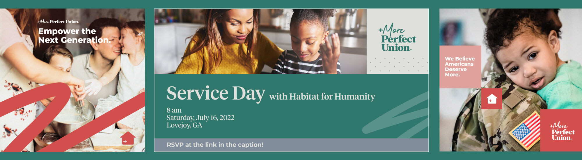
    We also worked with +MPU to overhaul their website, adding new features to showcase their work and creating user-friendly RSVP pages for local events.

    We developed platform-specific social media strategies to better understand and engage each of +MPU’s audiences in a data-driven way. And, we tracked the impact of the digital marketing strategy with analytics and reporting tools.

    A collage featuring three +MPU social media posts from LinkedIn sits on a dark green background. In the top left corner is a social post featuring family-like photos of the +MPU stage including the founder, Garett, shaving, Operations Director, Victoria, playing on a slide with her niece and a dinner table. The words “981 IMPRESSIONS” sit in a coral-colored rectangle and overlap the post. In the right hand corner is a social post featuring black and white, historic imagery of the Hellfighters, an all Black regiment that served during World War 1. Multiple images are groups of men in uniform. The words “6.1K IMPRESSIONS” sit in a coral-colored rectangle and overlap the post. The last post sits near the bottom of the page and features Operations Director, Victoria, smiling into the camera as they take a selfie with diverse +MPU members hiking behind them. Victoria has short brown hair, a large smile, and round, black sunglasses. Everyone walks on a first road in dark green shirts with the +MPU logo. The words “1.2K IMPRESSIONS” sit in a coral-colored rectangle and overlap the post. A big dark green squiggle layers beneath all the social posts.
    Three social post designs are featured in a row. The first design is square and made for Instagram. It shows a happy family covered in flour as they bake together. A mothers arm whisks a mixture in a metallic, silver bowl. A small, brown-haired boy stands at her waist. Behind them is a father giving his young daughter a kiss, as she giggles and looks into his eyes. She has blonde hair, wears a white dress, and her hand is completely covered in white flour. A coral squiggle decorates the bottom of the lay-out. The top of the lay-out features the horizontal version of +More Perfect Union logo. Underneath the logo is a headline in white that reads, “Empower the Next Generation.” 

The second social post design is long and horizontal. It features a Black mother in mustard yellow with her daughter who wears navy stripes. The image sits at the top of the lay-out next to a light gray square with the +More Perfect Union Logo on the right. Below the image and logo is a green panel with a big headline reading, “Service Day with Habitat for Humanity.” A light green squiggle sits off to the side from the headline. Below the headline it reads in smaller type, “8 am; Saturday, July 16, 2022; Lovejoy, GA.” A gray bar sits flushed at the bottom of the graphic which has a tiny tagline that reads, “RSVP at the link in the caption!” 

The final social graphic shows the side view of a Black woman in a U.S. Army uniform. Her face isn’t visible as it crops in on the U.S. flag patch on her uniform’s shoulder and the young baby with curly hair resting her head also on her shoulder. The child has their mouth slightly open with brown eyes, alight. On top of the image are stackable squares in light pink and coral. One reads, “We Believe Americans Deserve More.” Another squares has a house icon on top of it. The final square has +More Perfect Union’s stacked logo mark layered on top of it.

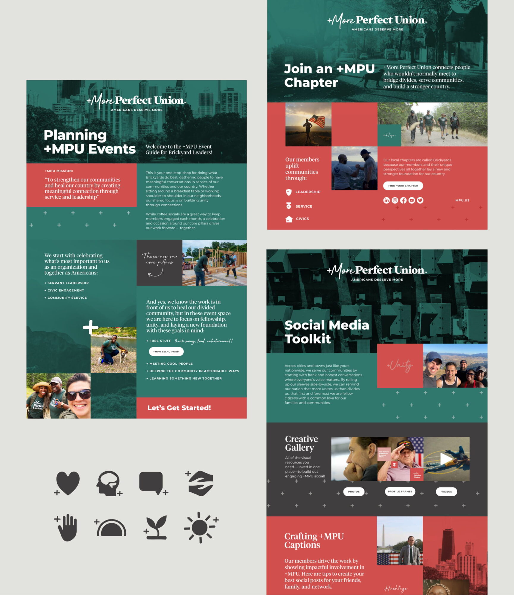
    Teal further supported the team’s internal capacity through hands-on staff training. Alongside staff support, the accessible and engaging toolkit designs we created gave Brickyard leaders the necessary foundation to feel confident and prepared in organizing  their own local chapters.

    A collage of featured “social media toolkit” designs and lay-outs sits on a light gray background. Each shows a scroll like view of the toolkits with big swaths of color as horizontal panels—mainly dark green and coral shades. The top of each toolkit has an image of a landscape with a dark green overlay. The first toolkit on the left side of the collage reads “Planning +MPU Events” on top of a cityscape. The design includes body copy that is too small to be legible in the collage view. It features three other images of +MPU Brickyard leaders and fellows in dark green t-shirts doing service like building houses. One black woman pets her beagle in front of a lake. Another image is Victoria Rametta (+MPU’s Director of Operations) in black, round sunglasses taking a selfie with two Black women while hiking together. Typography varies in size across the design and there are some plus sign patterns along with white buttons. 

The second toolkit on the right side of the collage reads “Join an +MPU Chapter.” It has a short height and shows a top image of a dog on a neighborhood street. Below the dog is a coral panel with three images and varying sizes of typography. One man runs with an American flag and is backlit by the sun. Another image shows two strong men gripping fists in a bro-like greeting in front of a mountain. They are in the shadows so it is hard to make out their facial features. The third image is long and horizontal, with a diverse group of +MPU fellows in dark green t-shirts, hiking. Three icons: a shield, a Medal of Honor, and a house also sit in this lay-out next to the images and small subheads. The last toolkit featured below the second one reads “Social Media Toolkit.” This headline sits on top of a an overhead view of a suburb. Images stack across the lay-out like building blocks featuring loopy sayings like “unity.” The images include a mountainous selfie of a diverse group of +MPU Fellows; a close-up of a middle-aged white man with brown hair deep in thought; an elderly white male veteran with a black Veterans hat doing a salute; two Black children relaxing and laying on a basketball court; and Garrett Cathcart (+MPU’s Cofounder) smiling in front of an American flag and the Washington Monument. Type sits alongside all of these images. A few images (the man in thought, the veteran, and the two Black children) feature white buttons beneath them. 

In the bottom left corner of the collage are solid, dark gray icons: a rounded heart, a face profile with the cut-out of a brain; a simple message bubble; two hands almost embracing from above and below; a palm; a sunset made out of a semi-circle; a budding plant with two leaves; and a circular sun with little circular rectangles mimicking beams of light radiating outwards.

    We found that it’s the voices of +MPU’s members themselves that are at the heart of the organization’s movement.

    This led to an organic approach to branding, messaging, and strategy. Subsequently, we emphasized content creation and measurement—that put the spotlight on +MPU members and the motivations behind their commitment to unifying America, brick by brick.

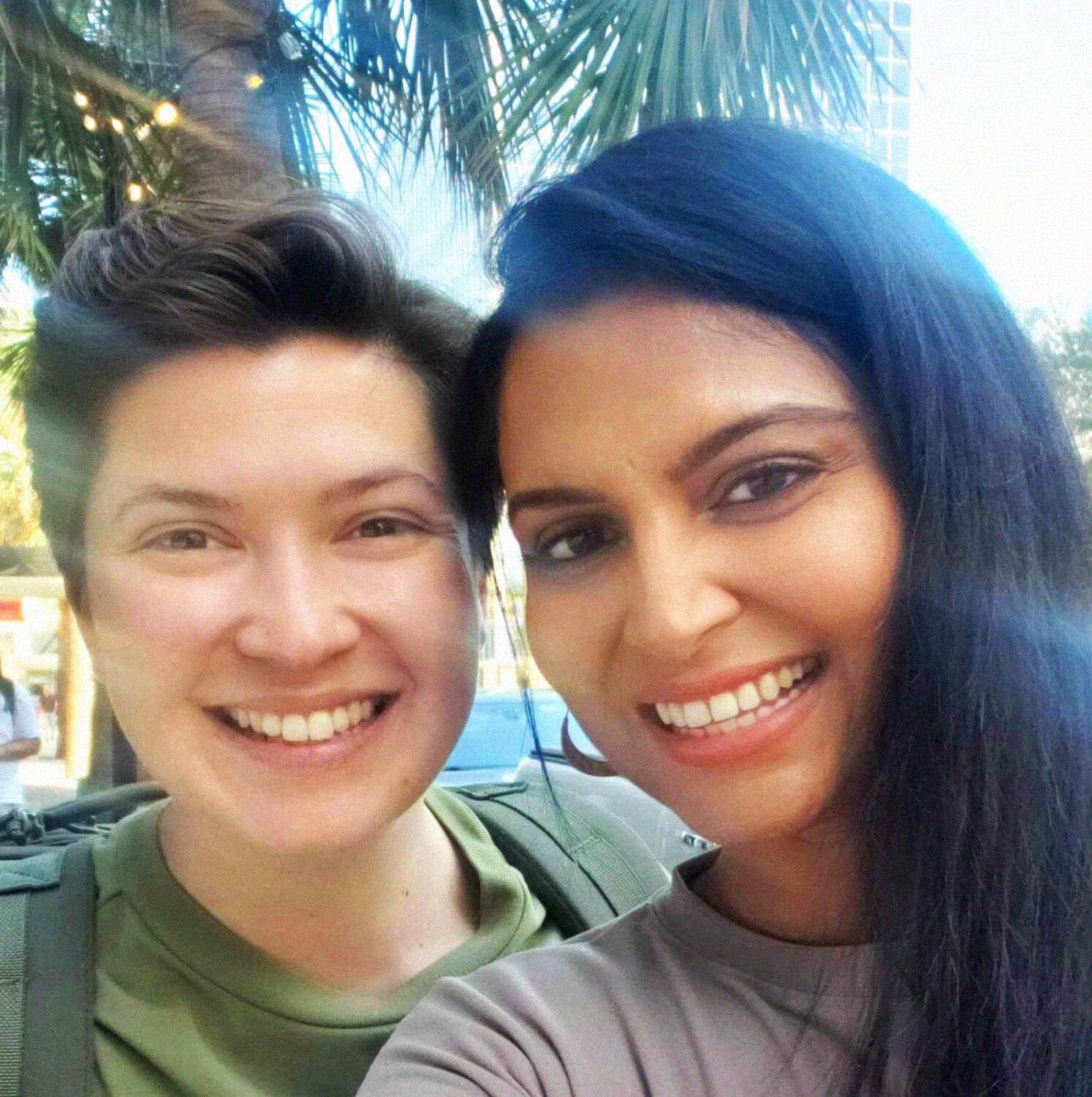
    Teal Project Manager, Bhumi Rajvi with +MPU Director of Operations, Victoria Rametta

    Teal is proud to support +MPU’s nationwide movement to train and inspire the next generation of leaders to serve their communities. In +MPU’s words, “when we create stronger communities, we create a stronger nation.” And together, we can create a +More Perfect Union.

    Next Project

    Americans United
    we the people means everyone
    4 women supporting the separation of church and state

    Americans United

    For 75 years, Americans United for Separation of Church and State (AU) has worked tirelessly to protect the wall of separation between church and state—so we can all live in a more fair, inclusive, and just society.